Artisanal Slovak Kitchen Landing Page Template
Bryndzov is a masonry-style Slovak restaurant landing page built around sensory storytelling. Staggered food photography cards, an inline reservation module, and a Tasting Box add-to-cart flow work together to turn a curious visitor into a confirmed guest. The Warm Stone color system and Haute Craft typography give every section the weight of a farmhouse kitchen in the Tatras.
by Rocket studio
Quick summary
Bryndzov is a single-page, masonry-layout landing page designed for a fine-casual Slovak restaurant. It leads with a cinematic lifestyle hero, moves through staggered food photography, ingredient origin stories, and a menu highlights grid, then closes with an inline reservation form and a Tasting Box product section. The result is a page that makes visitors hungry before it asks them to buy.
Who this template is for
This template is built for independent restaurateurs and hospitality creatives who want a page that does more than list a menu. It suits operators who believe atmosphere is part of the offering and who want their digital presence to match the warmth of their dining room.
- Slovak and Central European restaurant owners who serve regional cuisine with a strong provenance story
- Food-forward hospitality brands targeting homesick expat diners, adventurous foodies, and couples seeking a meaningful dinner experience
- Restaurant operators who want a direct-sales landing page that drives both table reservations and shipped product orders from a single scroll
What problem this template solves
Most restaurant pages fail visitors before the appetiser arrives. A static grid of dish names and a buried phone number do nothing to create appetite or trust. Visitors leave without booking because the page never made them feel the warmth of the room or the smell of the kitchen. That gap between curiosity and conversion is exactly what this template is built to close.
- The masonry food gallery with staggered, fade-up tiles builds desire dish by dish, the way a well-paced meal builds anticipation course by course
- The ingredient provenance section replaces vague quality claims with specific origin stories, turning cheese sourcing and herb selection into persuasive detail
- The dual conversion path, reservation module plus Tasting Box product cards, captures visitors at two different intent levels in a single page flow
What you get with this template
You receive a fully designed, single-page layout built around the Haute Craft visual language. Every section is pre-structured and ready to fill with your own photography, dish names, and pricing. The template ships as a cohesive design system, not a collection of loose components.
- A cinematic hero section with a glassmorphic navigation pill, a bottom-left serif headline placement, and a copper call-to-action button pinned in the top nav
- A five-section scroll flow covering the food gallery, sensory origins, menu highlights, reservation module, and a footer built on an Arc Browser Split pattern
- An inline reservation form with a date field, a party-size selector, and a toggle between Tasting Menu and À la Carte, plus individual Tasting Box product cards with single-click add-to-cart
Feature list
This template is built around features that serve appetite first and conversion second. Each component is rooted in the source brief and designed to feel like a natural extension of the dining experience rather than a sales mechanism bolted onto a menu page.
Masonry Food Gallery with Staggered Reveals
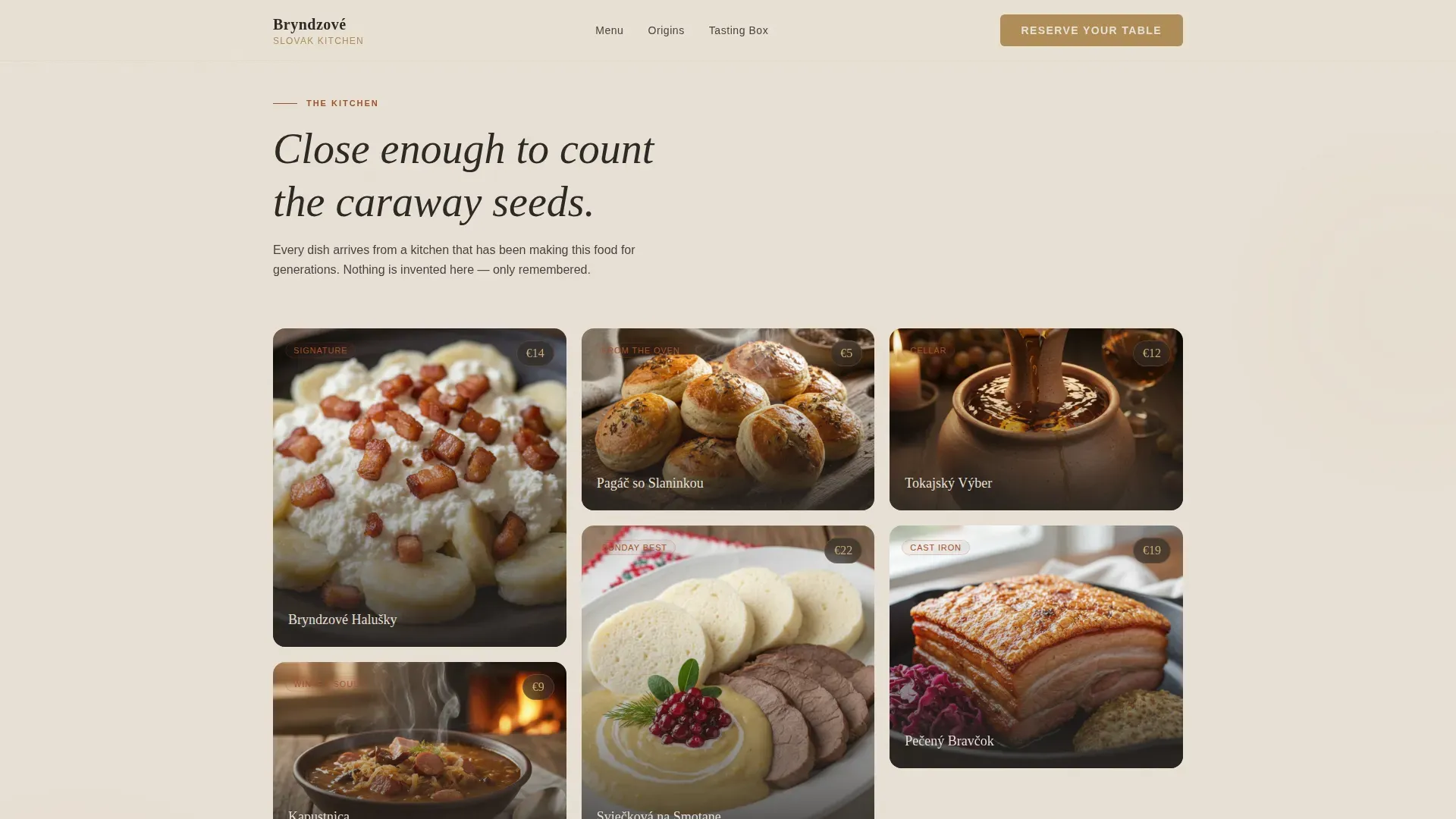
The gallery section uses a Pinterest-style masonry layout with cards of varying heights, arranged in groups that create visual rhythm and balance. Each tile loads with a subtle fade-up animation triggered by scroll position, so the food arrives on screen the way dishes arrive at a farmhouse table, one after another, building hunger with every card. Dish names and prices sit directly on the card, styled in the Warm Stone palette.
Cinematic Lifestyle Hero
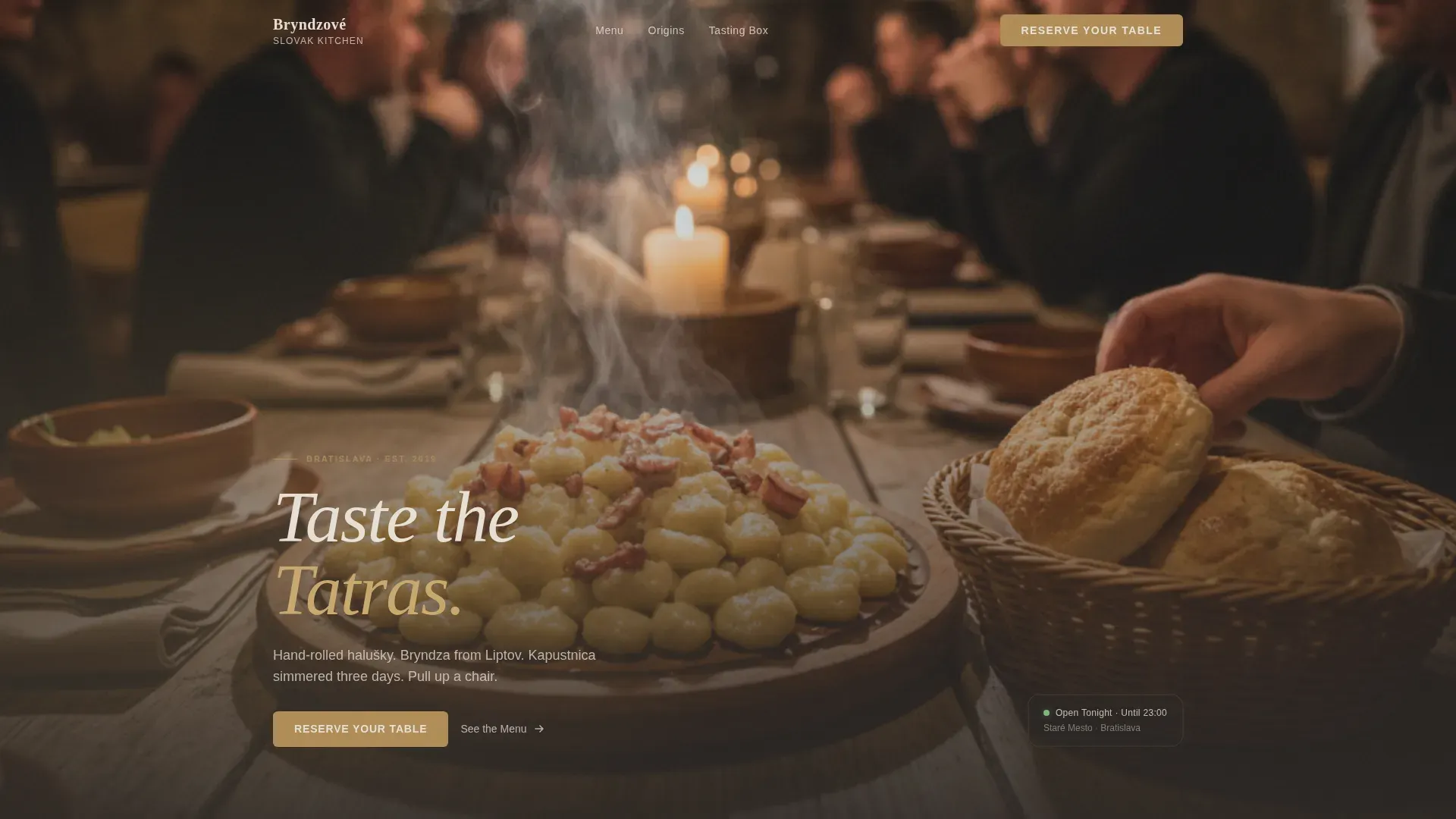
The hero is structured around a wide, shallow-depth-of-field lifestyle photograph taken from the end of a long farmhouse table. A wooden board of bryndzové halušky anchors the foreground, a clay carafe catches the light in the background, and a linen napkin sits crumpled at the edge of the frame. The headline "Taste the Tatras" appears in a refined Fraunces serif at the bottom left, barely interrupting the scene. A parallax scroll effect adds depth as the visitor moves down the page.
Sensory Origins Section
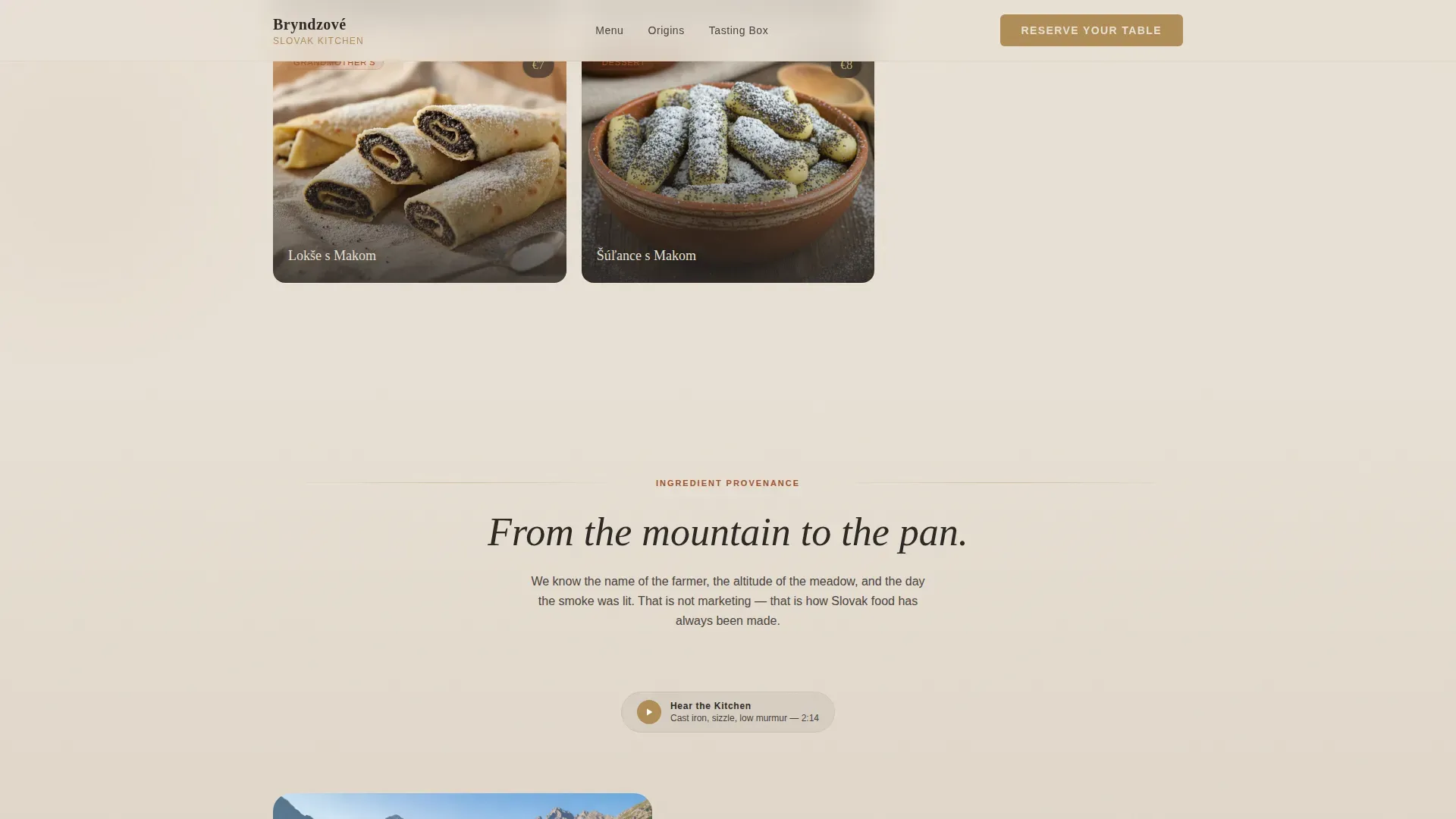
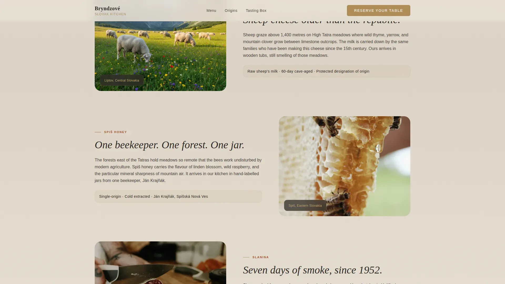
This section moves from sight to story. Ingredient provenance narratives are paired with illustrated scenes, including sheep grazing High Tatra meadows and wild garlic carpeting forest floors, to give each dish a sense of place. An embedded ambient audio snippet of the kitchen adds a layer of atmosphere that photography alone cannot carry. The result is a section that explains why the food tastes the way it does without ever reading like a supplier list.
Inline Reservation Module
The reservation form sits within the page flow rather than redirecting to a third-party booking tool. It captures date, party size, and a Tasting Menu or À la Carte toggle. A warm copper "Reserve Your Table" button appears pinned in the top navigation, again after the food gallery, and once more in the footer, giving visitors three natural moments to commit without ever feeling pressured.
Tasting Box Product Cards
Each Tasting Box card sits within the masonry layout and features a single-click add-to-cart interaction. The shipped box contains bryndza, slanina, and Spiš honey, giving visitors who cannot dine in person a way to eat their way into the restaurant's story from home. Card borders are styled in aged copper to distinguish them visually from the menu photography tiles.
Asymmetric Menu Highlights Grid
The menu section uses a bento-style asymmetric grid to present the Tasting Menu and À la Carte options side by side. The layout creates a natural visual hierarchy without relying on a traditional two-column menu format. Each dish entry can carry a short flavour note and a price highlighted in the aged copper tone.
Page sections overview
| Section | Purpose |
|---|---|
| Hero lifestyle shot | Establishes atmosphere and anchors the "Taste the Tatras" headline |
| Masonry food gallery | Builds appetite through staggered dish photography and pricing |
| Sensory origins | Tells ingredient provenance stories with illustrations and ambient audio |
| Menu highlights grid | Presents Tasting Menu and À la Carte in an asymmetric bento layout |
| Reservation module | Captures bookings inline with date, party size, and menu toggle |
| Tasting Box cards | Enables shipped product purchases directly from the page |
| Footer arc split | Displays logo, tagline, and navigation links in a split-pattern footer |
Design & branding system
The visual identity follows the Haute Craft theme, which combines the roughness of hand-pressed craft with the restraint of refined dining. The palette is called Warm Stone and it reads like running a hand along the wall of a centuries-old Spiš castle kitchen: chalky plaster, blackened iron, dried herbs hanging from oak beams, and a polished copper džbán catching candlelight. Typography pairs Fraunces serif for headlines with DM Sans for body text, giving every line of copy the right weight for its purpose.
- Limestone cream (#E8E0D5) dominates the background, charcoal (#2C2825) carries all body text, smoked paprika (#A0522D) marks section accents and hover states, and aged copper (#B08D57) gleams on buttons, card borders, and price highlights
- Masonry tile images are styled with warm amber toning to maintain a consistent aesthetic across the gallery, ensuring the artisan feel is never diluted by inconsistent photography treatment
- Hover states on cards include a subtle tilt animation, ambient glow blobs drift through background sections, and all motion uses CSS transforms only to keep the page feeling alive without feeling busy
Mobile & speed optimization
The template is desktop-first by design, reflecting the browsing habits of the primary audience. The masonry layout collapses gracefully on smaller screens, stacking cards into a single-column flow that preserves the fade-up reveal sequence. The parallax hero simplifies on mobile to a clean static image so the lifestyle photograph still anchors the experience without introducing scroll jitter.
- Intersection Observer controls all staggered tile reveals, so animations fire only when a card enters the viewport rather than on page load
- All motion relies on CSS transforms, which keeps the animation layer smooth without impacting the rendering of text and food photography
- The reservation module and Tasting Box product cards reflow into full-width stacked layouts on smaller screens, keeping every conversion path reachable with a thumb
How this template helps you convert
The page is engineered so that the visitor is always being warmed up, never being sold to prematurely. Every section adds a layer of desire before the next conversion moment appears. By the time the copper "Reserve Your Table" button surfaces after the third row of food photography, the visitor is not browsing anymore. They are deciding between tonight and tomorrow.
- The masonry gallery earns trust through specificity: close-cropped dish photography, dish names in Slovak, and EUR prices displayed clearly make the restaurant feel real and reachable before the visitor has read a single line of marketing copy
- The Sensory Origins section converts curiosity into intent by grounding the food in a place, a family of producers, a landscape, and a tradition that visitors cannot experience anywhere else, making the case for a reservation without stating it directly
- The dual call-to-action structure, reservation module for in-person dining and Tasting Box add-to-cart for remote visitors, means the page never loses a potential customer simply because they cannot visit the restaurant that evening
Other information about this template
This template draws on design and content principles that apply broadly to food and hospitality landing pages, particularly those built around artisan provenance and experiential dining. The following context helps frame where this template sits within the wider food culture it speaks to.
- The sensory storytelling approach used in the Ingredient Origins section is directly informed by the way central European food culture treats recipes as living documents passed between generations, not static instructions. Traditional food across this region carries the weight of family memory in every dish.
- Slovenian cuisine and Slovak cuisine share a Central European culinary thread. Both traditions value fermented dairy, hearty vegetables, and festive bread as expressions of cultural heritage. Slovenian food, for example, features potica, a festive bread filled with walnuts, poppy seeds, or cottage cheese, that is considered a national treasure and is traditionally made during Christmas and Easter. The dough for potica is leavened and rolled out thinly before being filled and shaped, making it a labor-intensive recipe that rewards patience.
- This template's gallery philosophy, images arranged in odd numbers with varying heights, mirrors best practice for artisan food presentation whether digital or physical. The same principle applies whether you are designing a masonry webpage or arranging a display of Slovenian desserts at a catering event.
- Slovenia is one of the top travel destinations in Europe for food and wine enthusiasts. Slovenia can be divided into three major wine regions, which are each further divided into districts. Cviček, a unique Slovenian wine made from a blend of red and white grapes, is known for its low alcohol content and distinct sour flavor. This broader central European wine culture, with a winemaking tradition considered older than that of Spain and France, is part of the world that restaurants in this template's niche are speaking to when they curate a wine list.
- Visitors can enjoy olive oil tasting tours in Slovenian Istria, particularly in towns like Piran and Koper. Slovenian olive oil is highly regarded, with the Istrian region producing some of the best olive oils in the world. Culinary tours in Slovenia highlight the sustainable production of olive oil, honey, and cheese. These tours often include visits to romantic wineries and traditional farms. The same appetite for provenance storytelling that drives those culinary tours is the appetite this template is designed to satisfy at a restaurant level.
- The Tasting Box conversion path in this template mirrors the way artisan food brands across Europe use shipped product to extend their restaurant story beyond the dining room. A catering gallery landing page template like this one functions as a one stop shop for both in-person and at-home food experiences, much like the potica artisan slovenian catering gallery landing page template concept, which combines rustic charm, high-resolution photography, and a simple booking call to action.
- The booking form in this template asks for Name, Email, Event Date, Type of Event, and Number of Guests, aligning with the standard fields that convert well on hospitality and catering landing pages. Social proof in the form of guest testimonials can be slotted into the masonry layout between food photography tiles, following the principle that positive reviews paired with images of the dish or the table perform better than text alone.
- Lake Bled is one of the most photographed destinations in Slovenia, and the broader appetite for lake bled-style scenic European experiences extends to the dining table. Visitors who have traveled to lake bled or dreamed of it are part of the same audience that responds to farmhouse Tatra cooking and artisan provenance stories. Lake bled represents the kind of travel experience that makes food meaningful, the same emotional register this template is designed to trigger. Visitors who connect with lake bled imagery are already primed to respond to the visual warmth of this template's limestone cream and aged copper palette.
- Honey plays a central role in central European food culture. Slovakia, like Slovenia, has a strong beekeeping tradition. Spiš honey, featured in the Tasting Box, carries the same provenance weight as Slovenian honey. Across the region, honey is used in baking, as a glaze for bread, as a component in festive dessert recipes, and as a pairing for cheese boards. The Tasting Box product card featuring Spiš honey positions the restaurant as a curator of regional ingredients, not just a food vendor.
- The template's color system, anchored by limestone cream and hearth charcoal, reflects the same warm, rustic tones recommended for artisan food imagery. Natural, soft lighting in food photography captures texture and warmth in the same way the palette does on screen. This is equally true whether you are photographing a slice of walnut-filled potica or a wooden board of bryndzové halušky.
- The facebook group community angle is worth noting for restaurant operators using this template: sharing dish provenance stories and behind-the-scenes kitchen content in a facebook group or community forum can extend the page's sensory storytelling into a longer-term relationship with guests. The template's narrative sections provide natural content to repurpose.
- For restaurants in Canada or other diaspora markets, this template adapts well to an expat audience seeking traditional food from eastern europe. The EUR pricing and European date format can be adjusted to local currency and date conventions, and the Slovak dish names translate naturally for an audience already familiar with the cuisine.
- The template's asymmetric bento menu grid is a practical tool for restaurants that want to present a tasting menu and an à la carte option without a traditional printed-menu aesthetic. The grid format works particularly well for food that deserves a visual introduction before a price appears.
Theme
Haute Craft
Creative direction
Sensory Appeal
Color system
Warm Stone
Style
Masonry/Pinterest
Direction
Direct Sales
Page Sections
Masonry Food Gallery with Fade-up Reveals
Cinematic Lifestyle Hero with Parallax Depth
Sensory Origins with Illustrated Provenance
Inline Reservation Module with Menu Toggle
Tasting Box Product Cards with Add-to-cart
Asymmetric Bento Menu Highlights Grid
Related questions
Can I use this template for a restaurant that serves a different cuisine?
Does the inline reservation module connect to a booking system?
Can I add guest testimonials inside the masonry grid?
Is the Tasting Box section required, or can I remove it?
What typography does this template use?



