Grandparent-Grandchild Program Landing Page Template
Bond is a warm, modular landing page template built for grandparent-grandchild connection programs. It guides visitors through a transparent, card-by-card tour of guided activities, how the program works, and real family stories. The design uses a soft, sun-bleached palette and a centered serif headline to build trust before directing families to enroll.
by Rocket studio
Quick summary
Bond is a single-page, card grid landing page template designed for programs that bring grandparents and grandchildren together through guided activities. The layout is warm, honest, and unhurried. Each card row answers the next natural question a visiting family member would ask, building confidence through clarity rather than urgency before the enrollment click.
Who this template is for
This template is built for organizations, specialists, and facilitators running structured grandparent-grandchild connection programs. It speaks directly to the adults who arrive with quiet concern and a real desire to help their family bridge a generational gap.
- Adult children who notice their kids and grandparents share little beyond a screen
- Retired grandparents who want meaningful time with grandchildren but feel uncertain how to start
- Blended families where the grandparent-grandchild relationship needs to be built from scratch rather than inherited
What problem this template solves
Families searching for this kind of program often arrive skeptical. They have seen slick sales pages that promise connection but hide the details behind a signup wall. This template solves that trust problem by putting everything in the open.
- Pricing, shipping timelines, and a sample activity are all visible on the page before any click is required
- The card-by-card layout answers questions in the order a skeptical visitor naturally asks them
- Nothing is hidden, rushed, or performed, the design earns the click through radical transparency
What you get with this template
You get a complete, ready-to-customize landing page built around a modular card grid. Every section serves a specific purpose in the visitor journey, from the opening headline through to the persistent enrollment call to action.
- A centered display headline section, three rows of modular activity and process cards, a family testimonial row, and on-page trust cards showing pricing, shipping, and a sample PDF
- A primary call-to-action button styled in apricot preserve with cream text, appearing twice: once beneath the header and once as a persistent bottom bar after the second card row
- A click-through structure that leads to an external activity browser, with no form required on this page
Feature list
This section describes the core design and structural capabilities built into the Bond landing page template.
Centered Display Headline Block
The header is a single oversized sentence set in a warm serif typeface at display scale. It sits centered on a clean fog-white field with generous line height and no competing imagery. The emptiness around the headline is intentional, it reads like the title page of a children's book before the story begins.
Modular Card Grid Layout
The page is organized into rows of modular cards that each reveal one layer of the program. The first row shows three activity types with illustrated thumbnails and one-sentence descriptions. Subsequent rows cover the process, real family stories, and on-page trust details. Cards appear still and honest, like photos pinned to a corkboard, with no flipping or animation.
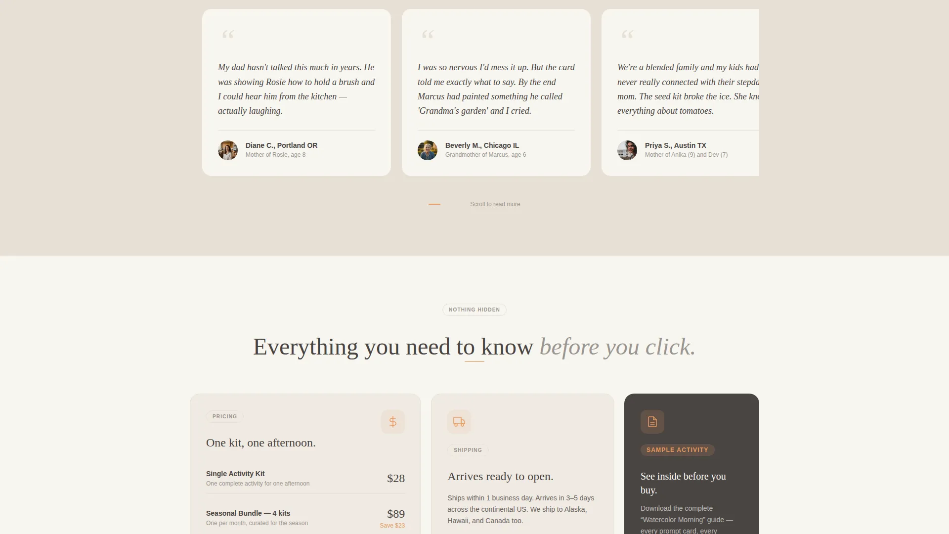
Transparent Trust Cards
Dedicated cards display pricing, the shipping timeline, and a downloadable sample activity PDF directly on the page. Visitors see every relevant detail before they reach the call-to-action button. This approach removes the friction that comes from hiding information behind a signup wall.
Dual Call-to-Action Placement
The primary call-to-action button, labeled "Pick Your First Activity," appears twice. It sits beneath the header on first view and returns as a persistent bottom bar after the second card row. Both placements use the apricot preserve accent color with cream text to stand out without disrupting the quiet visual tone.
Family Testimonial Row
A dedicated card row holds real family snapshots paired with pull-quotes written in a personal, voicemail-style voice. These are not polished marketing testimonials, they read like something a parent left on an answering machine. This row builds emotional credibility at the point in the scroll where a visitor is closest to deciding.
Alternating Background Sections
Page backgrounds alternate between morning fog white and faded linen to create a gentle visual rhythm without borders or heavy dividers. Body text sits in soft charcoal, which reads like graphite on cream stock. The palette feels like a sun-bleached photograph tucked inside a hardcover book, handled gently, touched by time.
Page sections overview
| Section | Purpose |
|---|---|
| Hero Headline Block | Opens with a centered serif display headline and pencil-gray subtext naming the program |
| Activity Type Cards | Three cards showing watercolor painting, seed planting, and letter writing with illustrated thumbnails |
| Process Detail Cards | Explains how activities are shipped, how difficulty scales by age pairing, and how guided prompts work |
| Family Snapshot Row | Real family photos with pull-quote testimonials in a personal, voicemail-style voice |
| On-Page Trust Cards | Cards showing pricing, shipping timeline, and a sample activity PDF link |
| Persistent Bottom Bar | Sticky enrollment call-to-action that reappears after the second card row |
Design & branding system
The visual identity follows a Family First theme built on the Soft Mist color system. Every tone has been chosen to feel warm, unhurried, and familiar, nothing shouts, nothing performs.
- Color palette: morning fog white (#F7F5F0) and faded linen (#E8E0D5) for backgrounds, pencil-sketch gray (#9B9590) for subtext, soft charcoal (#4A4543) for body copy, and apricot preserve (#E8985E) reserved for buttons, card borders on hover, and illustrated flourishes
- Typography: warm serif at display scale for the headline, with generous line height; body text set to read clearly on both fog-white and linen backgrounds
- Visual tone: illustrated thumbnails for activities, real family photography for the testimonial row, and restrained use of the apricot accent so it always draws the eye without overpowering the composition
Mobile & speed optimization
The modular card grid is structured to reflow cleanly on smaller screens. Each card row stacks vertically on mobile without losing its logical sequence or visual warmth.
- Cards maintain their illustrated thumbnails and pull-quote formatting at all screen sizes
- The persistent bottom bar call-to-action remains visible and tappable on mobile viewports
- Alternating background sections continue to provide visual separation even when the layout shifts to a single-column stack
How this template helps you convert
Bond is designed to move a skeptical, emotionally cautious visitor toward a confident enrollment click. Trust is built section by section before any action is requested.
- The transparent card structure answers every likely objection on the page, activity types, process, pricing, and a sample PDF, so the visitor arrives at the call-to-action already informed and reassured
- The dual placement of the "Pick Your First Activity" button meets the visitor at two natural decision points: right after the headline sparks interest, and again after the trust cards confirm the details
- The voicemail-style testimonial row provides emotional validation at the moment a visitor is closest to deciding, without resorting to high-pressure urgency language
Other information about this template
Bond is categorized under Elderly Care and Senior Living, specifically within the Senior Support Services subcategory. The template is purpose-built for the grandparent-grandchild program niche, where the emotional stakes are high and the audience arrives with genuine concern rather than casual curiosity.
- The template style is Card Grid (Modular), making it straightforward to reorder, replace, or expand card rows to suit your specific program offerings
- The click-through landing page direction means this page functions as a warm introduction that hands visitors off to a separate activity browser, no form, no friction, no commitment required on this page
- The Transparent Process creative direction is embedded in the structure itself, not applied as a stylistic choice, every card row exists to answer a real question a visiting family member would ask
- The Intersection Match Score for this template is 13, reflecting a strong alignment between the category, subcategory, niche, and the chosen design system


Theme
Family First
Creative direction
Transparent Process
Color system
Soft Mist
Style
Card Grid (Modular)
Direction
Click-Through
Page Sections
Centered Display Headline Block
Modular Card Grid Layout
Transparent On-page Trust Cards
Dual Call-to-action Placement
Family Testimonial Row
Soft Mist Color System
Related questions
Does this template include a signup form?
Can I change which activities are shown in the card grid?
What makes this landing page different from a standard program page?
Is this template suitable for blended families or non-traditional grandparent relationships?
Where does the call-to-action button lead?


