Dental Appointment Confirmation & Post-Booking Website Template
Booked is a dental practice confirmation landing page built for new patients who just submitted an appointment request. It uses a dark glass panel header, a live stats ticker, and anchor-nav spoke sections to turn post-booking anxiety into confident anticipation. The design pairs void black with electric mint and UV purple for a precise, high-trust visual experience.
by Rocket studio
Quick summary
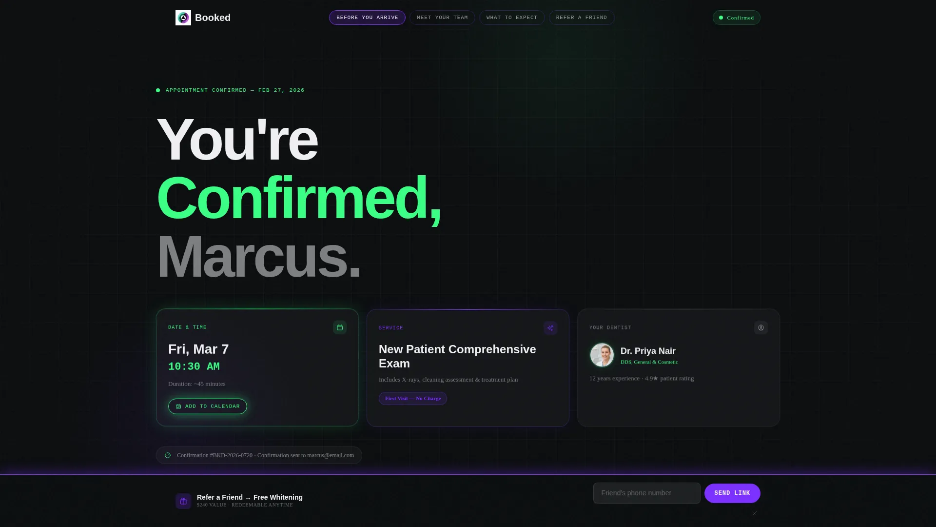
Booked is a single-page dental confirmation landing page with a hub-and-spoke anchor navigation structure. It greets new patients with a personalized "You're Confirmed" headline, three frosted dark glass panels showing appointment details, and a scrollable set of trust-building spoke sections. The page also drives a secondary referral conversion through a sticky bottom bar.
Who this template is for
This template is built for dental practices that want to do more than confirm an appointment. It works best for practices investing in patient experience from the very first digital touchpoint.
- Dental offices welcoming new patients who feel uncertain before their first visit
- Practice owners who want a referral loop built directly into the confirmation flow
- Teams looking to reduce no-shows with calendar integration and pre-visit information
What problem this template solves
Most appointment confirmation pages are plain, forgettable, and do nothing after the booking is complete. This template fills that gap by turning the confirmation moment into active patient preparation and secondary conversion.
- New patients often feel anxious after booking; the page addresses that with immediate, clear confirmation signals
- Practices miss referral opportunities at peak goodwill moments; the sticky referral bar captures that intent
- No-shows increase when patients lack pre-visit context; the "Before You Arrive" spoke section reduces that friction
What you get with this template
You get a fully designed, single-page confirmation experience with multiple layered sections, each serving a specific purpose in the patient journey. Every element is built around the post-booking mindset.
- A personalized confirmation header with three dark glass detail panels and an "Add to Calendar" button
- A horizontal stats ticker and four anchor-nav spoke sections covering pre-visit info, team credentials, visit timeline, and referrals
- A sticky UV purple referral bar with a single-field form offering a free whitening incentive
Feature list
This template delivers a focused set of design features and structural components grounded in the source brief.
Personalized Confirmation Header
The header displays a dynamic "You're Confirmed" headline with the patient's first name inserted. Three frosted dark glass panels float above the void-black background, each holding one confirmation detail: appointment date and time, selected service, and assigned dentist with a circular portrait. A mint-outlined "Add to Calendar" button sits inside the panel cluster.
Stats Ticker with Social Proof
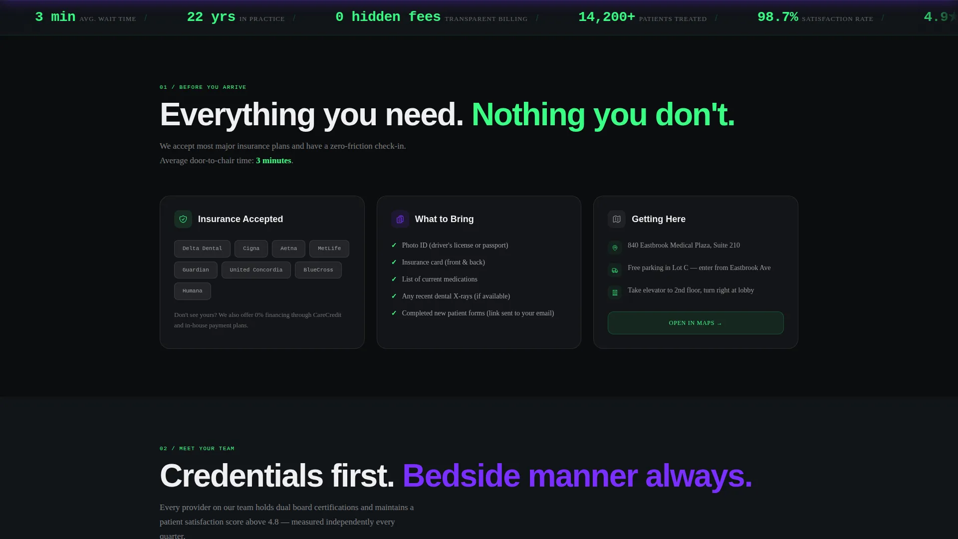
Immediately below the header, a horizontal ticker displays oversized electric-mint numerals showing practice-level proof points: 14,200 or more patients treated, a 98.7 percent satisfaction rate, a 4.9 Google rating, and a three-minute average wait time. The ticker sets a confident, data-first tone before the visitor reaches any spoke section.
Hub and Spoke Anchor Navigation
A sticky anchor navigation bar lets visitors jump directly to any spoke section. The nav uses UV purple for active and hover states, keeping orientation clear as the user scrolls through the page. Each spoke opens with a bold stat before expanding into supporting detail.
Four Trust-Building Spoke Sections
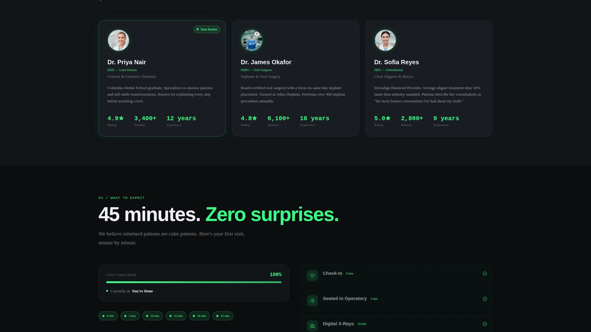
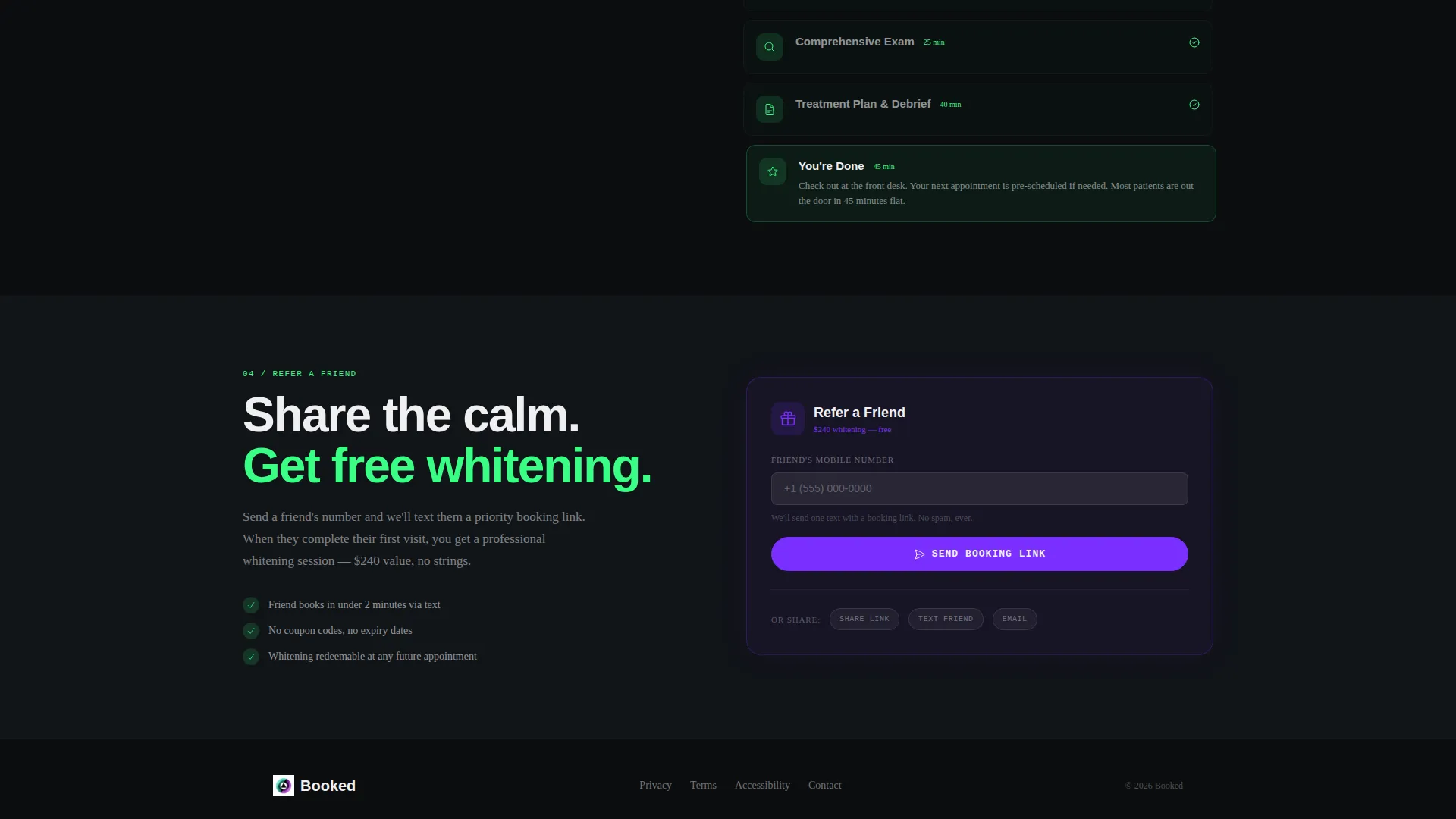
The four spoke sections cover everything a new patient needs before arriving. "Before You Arrive" lists accepted insurance, a parking map, and items to bring. "Meet Your Team" shows dentist credentials on dark glass profile cards. "What to Expect" presents a first-visit timeline as an animated progress bar. "Refer Someone" serves as the secondary conversion path.
Sticky Referral Bar
A UV purple sticky bottom bar appears after the visitor scrolls past the stats ticker. It holds a single-field form asking for a friend's phone number, paired with a "Refer a Friend, Get a Free Whitening" incentive. This turns the confirmation page into an active referral channel without interrupting the primary confirmation experience.
Acid Digital Visual System
Void black dominates all backgrounds. Electric mint marks confirmation states and key numerals. UV purple drives interactive and hover elements. Clinical white text and card surfaces sit on glass-morphism panels that appear to float above the dark field. The combined effect feels precise and modern without relying on stock dental imagery.
Page sections overview
| Section | Purpose |
|---|---|
| Confirmation Header | Personalized appointment details with dark glass panels and calendar button |
| Stats Ticker | Displays practice proof points in oversized electric-mint numerals |
| Anchor Navigation | Sticky nav linking to each spoke section with UV purple states |
| Before You Arrive | Pre-visit logistics including insurance, parking, and checklist |
| Meet Your Team | Dentist credentials displayed on dark glass profile cards |
| What to Expect | Animated first-visit progress bar timeline |
| Refer Someone | Secondary conversion spoke with referral prompt |
| Sticky Referral Bar | Single-field referral form with free whitening incentive |
Design & branding system
The visual identity follows a Startup Velocity theme using an Acid Digital color palette. Every color choice has a functional role, not just a decorative one.
- Void black (#0B0D0F) covers all page backgrounds, creating surgical depth and contrast
- Electric mint (#39FF85) highlights confirmation states, stat numerals, and success indicators; UV purple (#7B2FFF) drives anchor nav items, hover states, and the sticky bar
- Clinical white (#F0F0F2) carries body text and sits on glass-morphism card panels that float above the dark field with a faint mint edge glow
Mobile & speed optimization
The layout is structured for clean single-column reading on smaller screens, where the anchor nav and sticky bar remain accessible without crowding the confirmation details.
- The three dark glass header panels reflow naturally for narrower viewports, keeping appointment details readable on a phone screen
- The sticky referral bar stays fixed at the bottom of the viewport on mobile, maintaining the referral prompt without blocking primary content
- The animated progress bar in "What to Expect" is designed to function within a single-column flow, keeping the timeline clear on any screen size
How this template helps you convert
This template is built around two conversion goals: a confirmed appointment that sticks, and a referral that grows the practice.
- The "Add to Calendar" button inside the header panels removes the single biggest cause of no-shows by letting the patient commit immediately after confirming, while goodwill is highest
- The sticky referral bar with a free whitening incentive captures referral intent at the exact moment a new patient feels most satisfied with their decision to book
Other information about this template
This template sits inside the dental practice website templates category and is specifically designed for the thank-you page moment in a dental patient journey. It is a single-page, section-led hub-and-spoke layout, not a multi-page website.
- The template follows a Stats-First Impact creative direction, meaning every spoke section leads with a proof point before expanding into detail
- The Hub and Spoke structure with anchor navigation is well suited for practices that want depth without requiring multiple page loads
- The Lead Generation direction means the primary conversion is already complete at page arrival; all secondary elements focus on reducing drop-off and adding referral value
- The template uses glass-morphism card panels as a design component; no stock dental photography is used anywhere in the layout
Theme
Startup Velocity
Creative direction
Stats-First Impact
Color system
Acid Digital
Style
Hub & Spoke (Anchor Nav)
Direction
Lead Generation
Page Sections
Personalized Confirmation Header with Dark Glass Panels
Stats Ticker with Electric-mint Proof Points
Sticky Hub and Spoke Anchor Navigation
Four Spoke Sections for Patient Preparation
Sticky Referral Bar with Single-field Form
Related questions
Can I update the confirmation details shown in the header panels?
Does the referral form require a complex backend to work?
Is this template suitable for a practice with multiple dentists?
Can I replace the free whitening referral incentive with a different offer?
What makes this different from a standard booking confirmation email?



