High-Protein Food & Dining Specialist Professional Website Template
The Fuel Luxe Minimal High-Protein Snack Brand Landing Page Template is a full-width immersive landing page built for premium high-protein snack brands. It pairs a Japanese Zen color system with sensory-led sections, a live-swapping UGC photo grid, parallax drag reveals, flavor-profile wheels, and a city-selector event registration form to turn visitors into attendees.
by Rocket studio
Quick summary
This landing page template is built for high-protein snack brands that want to earn trust before they ask for a click. The design follows a Luxe Minimal aesthetic, restrained, textural, and unhurried. Every section is a full-viewport experience that guides users through sight, sound, texture, taste, and smell before presenting a clear call to action.
Who this template is for
This template is a perfect fit for founders and marketers in the food and beverage space who want a landing page that sells through sensation, not just specification. It suits brands whose snacks belong in a gym bag, on a hiking trail, or on a desk at 3 p.m.
- High-protein snack brands running live tasting events or sample campaigns
- Direct-to-consumer fitness and wellness food brands targeting active adults
- Food marketers who want website design that leads with experience over feature lists
What problem this template solves
Most food brand landing pages either over-explain or under-deliver visually. They list ingredients, stack badges, and ask for the sale too early. Users leave before they feel anything. This template solves that by sequencing sensation first and registration second.
- Visitors scroll through sensory sections before they ever see a form
- The design holds attention long enough for the product story to land
- High-protein snacks are positioned around real lifestyle moments, not supplement claims
What you get with this template
You get a fully structured, single-page website designed to drive event registrations for a live tasting series. Every section is pre-built and purpose-led, so you can start customizing immediately without designing from scratch.
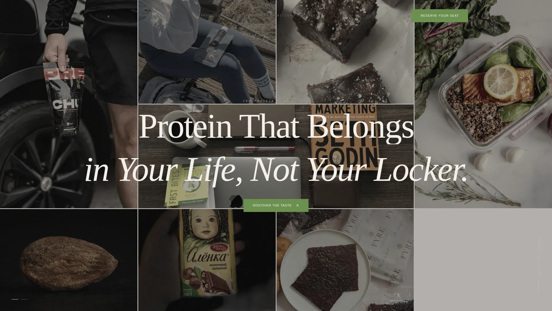
- A masonry UGC photo grid header with fade-swap tile animation and a serif headline overlay
- Five sensory scroll sections covering sight, sound, texture, taste, and smell at full viewport height
- A three-field event registration form with city selector, name, and email, plus a sample box fallback path
Feature list
This landing page website packs deliberate, conversion-ready features into a clean, skimmable structure.
Live-Swapping UGC Photo Wall
The header fills the viewport edge to edge with a masonry grid of real customer photos. Tiles fade and swap every few seconds using GSAP animation. Every image is color-graded to sit within the Zen palette, unifying diverse fitness lifestyles into one cohesive visual texture.
Sensory Scroll Sections
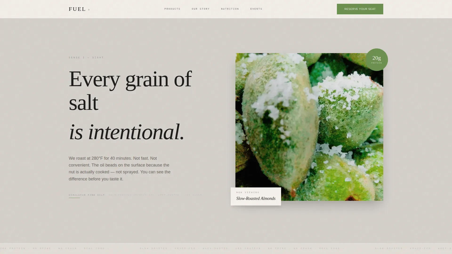
Five full-viewport sections escalate through the senses in sequence. The sight section uses macro photography of roasted almonds and Himalayan salt crystals. The texture section features an interactive parallax drag reveal showing the cross-section of a jerky crisp. High-end imagery throughout showcases the texture and quality of the product in a way that supports muscle gain storytelling without being clinical.
Flavor-Profile Wheel user interface Design
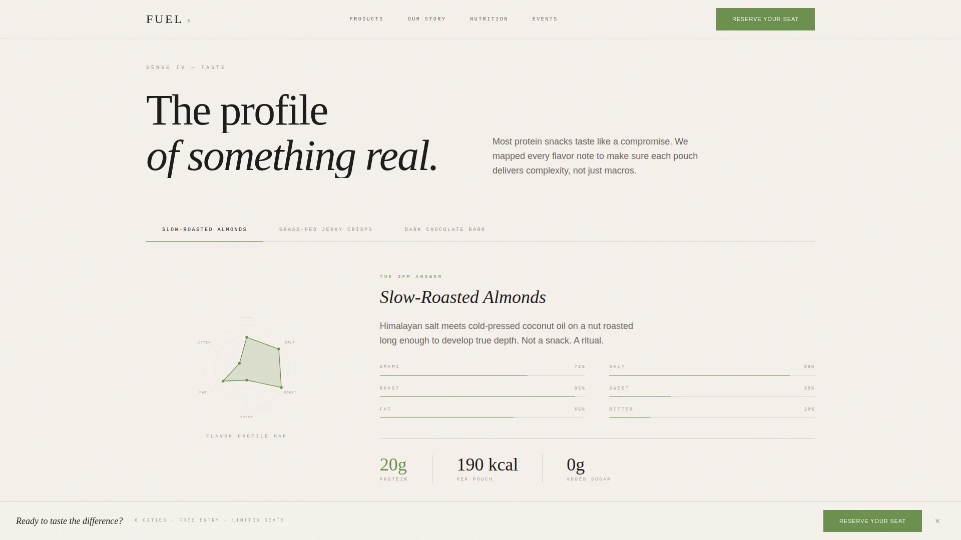
The taste section renders minimalist flavor-profile wheels as infographic-style ui design elements. Each product is mapped across dimensions like umami, smoke, cacao, and sea salt. The hover states use the matcha accent color to protect visual hierarchy and keep things readable.
Event Registration Form with City Selector
The primary call to action reads "Reserve Your Seat" in matcha green on ink black. A three-field form in sequence captures city selection with auto-populated dates, name, and email. A secondary path, "Send Me a Sample Box Instead," captures a shipping address for users outside event cities, ensuring no visitor leaves without an option to engage.
Social Proof Archetype Cards
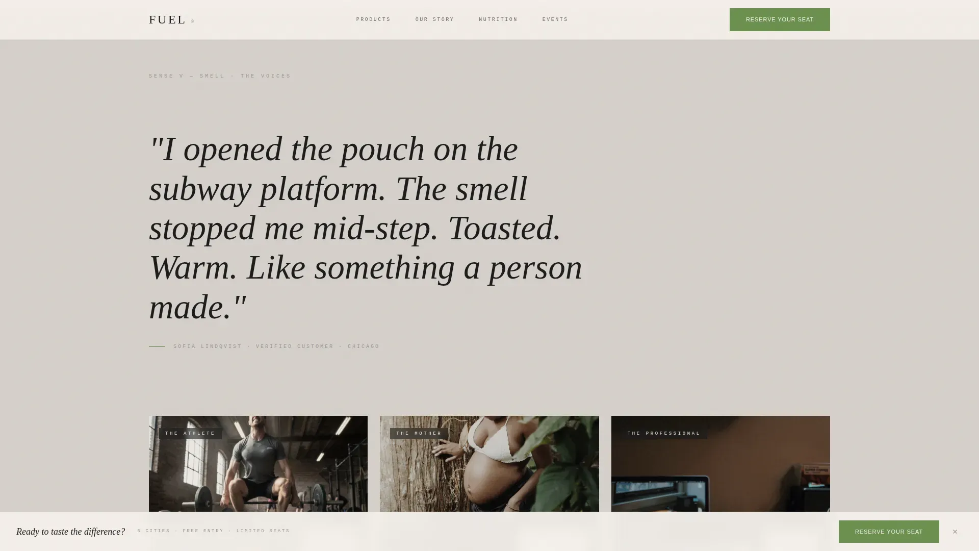
The social proof section pairs oversized italic customer quotes with three lifestyle archetype cards. Curated testimonials from real users build trust and credibility. This section reinforces the brand's dedicated positioning around fitness, recovery, and everyday snacking rituals without overstating product claims.
Sticky Bottom Bar call to action
After the taste section, the "Reserve Your Seat" call to action pins as a subtle bottom bar. It remains visible as users continue scrolling. The primary call to action is visible but not overpowering, protecting the sensory experience while keeping conversion accessible.
Page sections overview
| Section | Purpose |
|---|---|
| UGC Photo Wall | Opens the landing page with a live customer photo grid and brand headline |
| Sight Scroll Section | Delivers macro product photography to engage users visually |
| Sound Scroll Section | Uses an ambient audio clip of a bark square snapping to engage through sound |
| Texture Parallax Section | Interactive drag reveal shows jerky crisp cross-section and fiber detail |
| Taste Section | Flavor-profile wheels map each product across taste dimensions |
| Smell / Quote Section | Oversized italic customer quote conveys the scent experience |
| Social Proof Section | Archetype cards and testimonials build trust and support credibility |
| Event Registration Form | City selector form drives sign-ups for the live tasting series |
| Sample Box Path | Fallback form captures shipping address for out-of-city visitors |
| Footer | Horizontal flow footer closes the landing page cleanly |
Design & branding system
The website design follows a Japanese Zen color system that treats every visual decision like a deliberate brushstroke. Strategic white space protects the layout and creates calm, exclusivity, and focus across every section. Refined typography communicates health and sophistication using Fraunces for display headings, DM Sans for body text, and IBM Plex Mono for caloric callouts.
- Color palette: stone garden warm gray (#D5D0CA), sumi ink black (#1A1A1A), unglazed ceramic off-white (#F5F0EB), and matcha accent (#6B8F4E) for buttons and hover states
- Backgrounds alternate between warm gray and off-white, with matcha appearing sparingly so each instance feels intentional
- A limited color palette and minimal navigation system protect focus and prevent distractions throughout the page
Mobile & speed optimization
The landing page is built desktop-first with full mobile responsiveness across every section. Sensory sections are optimized for large screens while remaining usable on any device. The mobile design is clean, with large and easily tappable buttons for a seamless experience.
- GSAP ScrollTrigger handles scroll-driven reveals and tile fade-swaps across screen sizes
- Server Components power static sections while Client Components handle interactive animations
- Parallax and flavor wheel interactions adapt gracefully to the device being used
How this template helps you convert
This landing page balances aesthetic sophistication with high-conversion functionality. It earns the registration click by making users want to attend before the form ever appears.
- The sensory scroll sequence builds desire across five sections, so by the time users reach the event form, they are already engaged and motivated to act.
- A visible but restrained sticky call-to-action bar keeps the registration option accessible without disrupting the design experience.
- The sample box fallback path ensures that users outside event cities still have a clear next step, protecting conversion across all traffic segments.
Other information about this template
This template is well suited for brands that want to set a clear tone of premium quality from the first scroll. It pairs well with high-protein snack positioning that prioritizes muscle gain support, satiety, and athletic performance as aspirational benefits. High-protein snacks can aid in muscle growth and recovery, help control hunger, and support weight management by promoting satiety, so this landing page website naturally surfaces those benefits through lifestyle imagery and ingredient transparency rather than dense nutrition tables.
Ingredient transparency is built into the design language. Simple, clean icons can elegantly display premium certifications. The craftsmanship section within the sensory scroll gives dedicated space to rare or premium ingredients like grass-fed jerky and Himalayan salt, enhancing the product narrative through context rather than a spec sheet. This approach reflects a luxury marketing philosophy: focus on aspirational benefits rather than just product specifications.
The Fuel Luxe Minimal High-Protein Snack Brand Landing Page Template is a strong starting point for brands that want to work within a proven, sophisticated structure. It provides the skills and visual language needed to connect with fitness-minded consumers who want snacks that fit their lives, not just their macros.
- This template can support a wide range of high-protein snack brands, from CrossFit-focused lines to wellness-first lifestyle brands
- Users can access the city selector form and sample box path as two distinct conversion routes within a single landing page
- The design system and ui design components are set up for fast customization with clear placeholder sections for product photography and customer content
Theme
Luxe Minimal
Creative direction
Sensory Appeal
Color system
Japanese Zen
Style
Full-Width Immersive
Direction
Event Registration
Page Sections
Live-swapping UGC Photo Wall Header
Five-section Sensory Scroll Experience
Interactive Flavor-profile Wheels
Three-field Event Registration Form
Social Proof with Archetype Cards
Sticky Bottom Bar Call to Action
Related questions
Can I use this template for a brand that does not run tasting events?
Does this landing page support audio or video content?
How do the flavor-profile wheels work for users?
Is this landing page template responsive on mobile devices?
What typography and fonts does this template include?



