Hobby & Passion Supplies Advanced Professional Website Template
Bower is a fairy garden supply landing page built for shops that sell miniature doors, moss bridges, and hand-painted toadstools. It pairs a stamp-bordered gallery grid with flash-deal urgency, a slide-in cart, and a streamlined checkout. The Ink and Paper color system gives every section the quiet warmth of a Victorian naturalist's field journal.
by Rocket studio
Quick summary
Bower is a single-page gallery and detail landing page designed for fairy garden and miniature supply shops. It combines a curated discovery grid, a persistent flash-deal countdown, and a friction-light checkout into one cohesive layout. The Ink and Paper palette keeps the experience feeling handcrafted, tactile, and genuinely enchanting.
Who this template is for
This template suits any seller whose products reward close inspection and careful curation. It was built specifically with small-batch, handmade, and hobby supply shops in mind.
- Independent fairy garden and miniature supply shops selling physical kits and accessories
- Craft educators and teachers who want a simple storefront for sensory garden supplies
- Hobbyist makers offering limited-edition or seasonal collectible items to a passionate niche audience
What problem this template solves
Most generic shop templates feel transactional and cold. They push conversion through noise rather than atmosphere, and they lose buyers who need to linger before they commit.
- A cluttered or impersonal layout undercuts trust for handmade and artisan products
- No built-in urgency tools means limited-edition items sell slowly without promotional pressure
- A multi-step checkout with forced account creation causes drop-off before the purchase completes
What you get with this template
You get a fully designed, single-page shop layout that handles discovery, product detail, and checkout in one continuous scroll. Every component is ready to populate with your products and brand details.
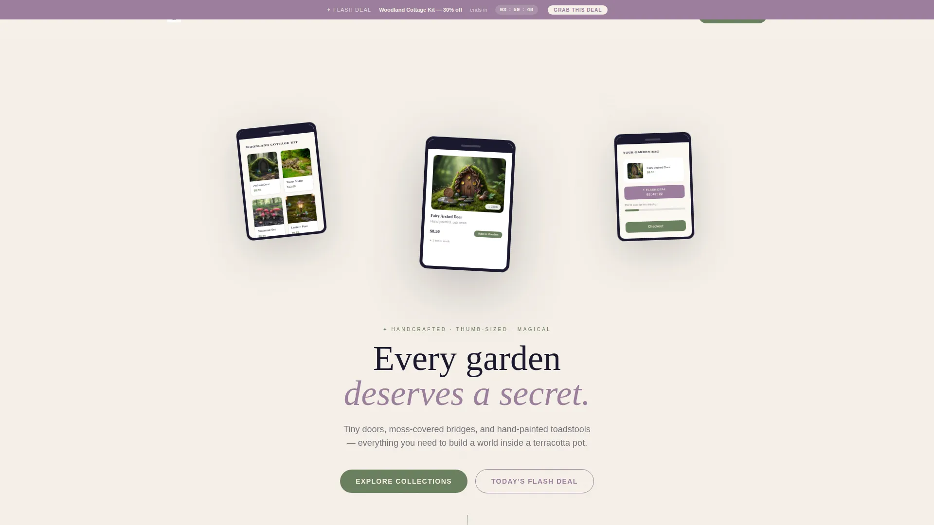
- A device-framed App Store Preview header with three tilted floating screens and a botanical ink illustration background
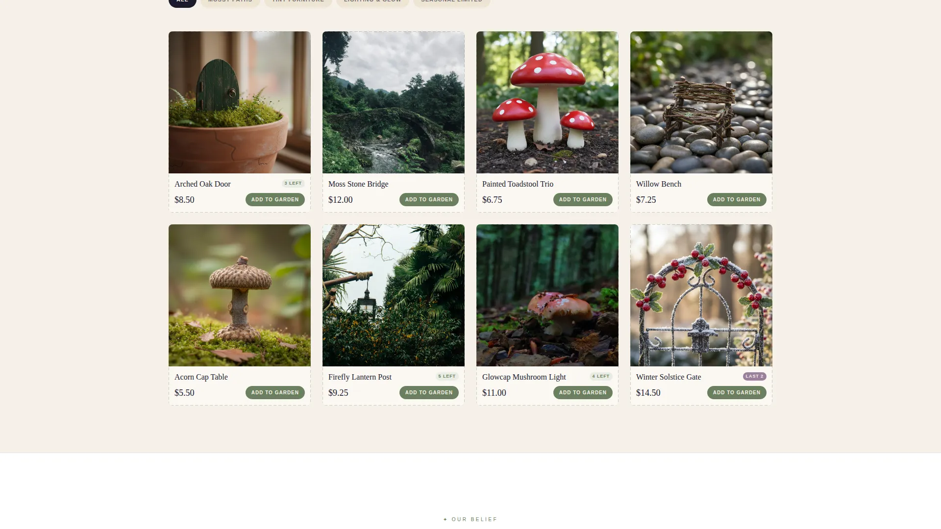
- A stamp-bordered gallery grid organized into four named discovery collections with a slide-open product detail panel
- A persistent flash-deal countdown banner, real-time stock count indicators, a bundle builder, and a slide-in cart with a free-shipping progress bar
Feature list
The Bower template ships with a tightly considered set of components. Each one serves a specific role in the path from browsing to buying.
App Store Preview Header
Three gently tilted device frames showcase the browsing experience as a collectible catalog. One screen displays a collection grid, one shows a product detail card on real moss, and one shows a cart with a pulsing countdown badge. A soft parchment texture and scattered botanical ink illustrations fill the background behind the screens.
Discovery Collection Gallery Grid
Products are organized into four named collections: Mossy Paths, Tiny Furniture, Lighting and Glow, and Seasonal Limited. Each thumbnail is hand-bordered like a passport stamp, giving the grid a tactile, curated feel. Clicking any item slides open a detail panel showing macro photography, a scale-reference coin, and a one-tap add-to-cart button.
Flash Deal Countdown Banner
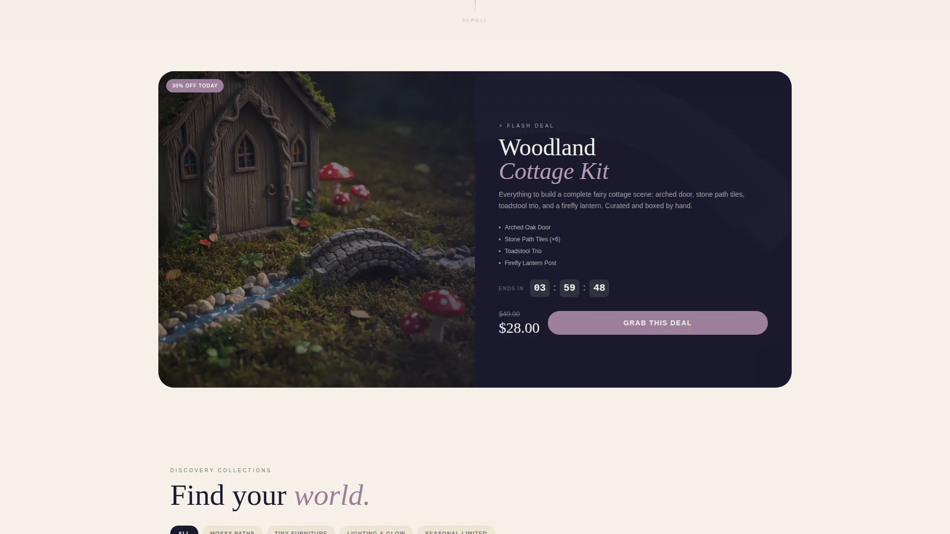
A persistent banner pins to the top of the scroll and ticks down a rotating four-hour deal on a featured kit. The banner carries its own call-to-action labeled "Grab This Deal" in pressed-flower mauve with the live countdown beside it. This keeps deal visibility constant as the visitor browses deeper into the page.
Urgency and Social Proof Layer
Stock count indicators show low availability ("3 left") directly on product cards. A "Just Sold" toast notification floats up like a firefly every thirty seconds, adding live social proof without disrupting the browsing flow.
Slide-In Cart with Bundle Builder
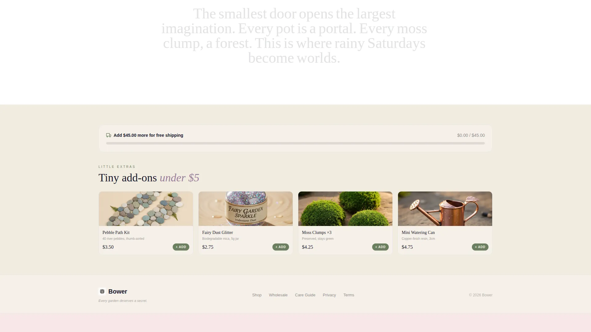
The cart slides in from the right and shows a progress bar toward free shipping at the $45 threshold. A suggested add-on row surfaces tiny accessories priced under five dollars. A bundle builder component unlocks free shipping when the buyer adds qualifying items together.
Streamlined Single-Page Checkout
Checkout collects only email, shipping address, and payment details. No account creation is required. The single-page flow is designed to remove friction and deliver the quiet thrill of completing a purchase in seconds.
Page sections overview
| Section | Purpose |
|---|---|
| Flash Deal Banner | Pins countdown and deal call to action at top of scroll |
| App Store Header | Frames store experience with three device screens |
| Headline Fade-In | Introduces brand mood with "Every garden deserves a secret" |
| Botanical Background | Grounds header with parchment texture and ink illustrations |
| Collection Gallery Grid | Organizes products into four discovery collections |
| Product Detail Panel | Shows macro photography, scale coin, and add-to-cart |
| Stock Count Indicators | Displays low-availability labels on product cards |
| Just Sold Toast | Floats social proof notification every thirty seconds |
| Bundle Builder | Unlocks free shipping with qualifying item combinations |
| Slide-In Cart | Shows cart, progress bar, and accessory add-on row |
| Single-Page Checkout | Collects email, shipping, and payment with no account step |
Design & branding system
The Ink and Paper color system anchors every design decision in this template. The palette draws from a Victorian naturalist's field journal, making the page feel soft, fibrous, and full of careful detail.
- Core colors: aged parchment (#F5F0E8) for backgrounds, fountain-pen black (#1A1A2E) for text, pressed-flower mauve (#9B7E9B) for deal calls to action and highlights, and dried-moss green (#6B7F5E) for product card buttons and tags
- Visual style: stamp-bordered thumbnails, hand-drawn botanical ink illustrations, and device-framed screens create a Directory and Discovery atmosphere
- Typography and texture work together to suggest something handmade and unhurried, inviting visitors to linger rather than rush
Mobile & speed optimization
The layout is structured to work cleanly on small screens without sacrificing the gallery's visual richness. Key interactive elements are sized and spaced for touch use.
- The slide-in cart and detail panel are designed to operate within a single-screen viewport on mobile devices
- Product thumbnails and collection grids reflow into a readable column layout on smaller screens
- The flash-deal banner and toast notifications remain visible and functional across screen sizes
How this template helps you convert
Every layer of the Bower template is built to move a curious browser toward a completed purchase. The design creates atmosphere first, then introduces urgency without breaking the mood.
- The persistent flash-deal banner and stock count labels create time and availability pressure that nudge hesitant buyers toward action before they leave the page.
- The slide-in cart with a free-shipping progress bar and a sub-five-dollar accessory row increases average order value naturally, turning a single-item purchase into a small bundle.
- The single-page checkout requiring only email, shipping, and payment removes every common drop-off point, so the final step feels as effortless as the browsing experience that led to it.
Other information about this template
Bower was designed with the Card Grid (Modular) template style, which means the gallery layout can be populated with any number of products without breaking the visual rhythm. The Neo-Retro theme ties the modern urgency mechanics to an older, more tactile aesthetic sensibility.
- The template style is Card Grid (Modular), making it easy to add or remove product cards without redesigning the layout
- The Curated Collection creative direction means each named collection functions as a mini editorial moment, not just a filter category
- The header concept draws from a Bundle Deal approach, pairing the device-framed preview with flash-deal context to signal value immediately on arrival
- The landing page direction supports a discovery-first flow, guiding visitors from browsing through product detail to checkout within a single scrolling session
Theme
Neo-Retro
Creative direction
Curated Collection
Color system
Ink & Paper
Style
Card Grid (Modular)
Direction
Quiz/Assessment
Page Sections
App Store Preview Header
Stamp-bordered Discovery Gallery
Persistent Flash Deal Banner
Urgency and Social Proof Tools
Slide-in Cart with Bundle Builder
Friction-free Single-page Checkout
Related questions
Who is the Bower template designed for?
Does the template include a checkout flow?
Can I organize my products into different collections?
How does the flash-deal countdown work on the page?
Is this template suitable for seasonal or limited-edition products?



