Trusted Brain Health Landing Page Template
Synapse is a neurology clinic landing page template built around a step-by-step patient journey. It uses comparison tables to guide anxious visitors from symptom recognition through diagnosis and treatment options. The warm, muted Soft Mist color palette and a monumental Stacked Type Tower header create a calm, trustworthy experience designed to move uncertain visitors toward booking a first consultation.
by Rocket studio
Quick summary
Synapse is a single-page neurology clinic template designed to reduce patient anxiety and drive consultation bookings. It walks visitors through four clear phases: Recognize, Consult, Diagnose, and Treat. Each phase uses structured comparison tables to answer unspoken questions before asking anything in return. The result is a page that feels like a quiet, unhurried conversation with a specialist.
Who this template is for
This template is built for neurology clinics and neurological care centers that want to connect with patients who are frightened, uninformed, and searching for answers online. It serves practices that need to earn trust before asking for a booking.
- Neurologists and specialty clinic teams launching a new patient acquisition page
- Healthcare marketing professionals managing content for a neurology practice
- Clinic administrators who want a structured, conversion-focused page without complex setup
What problem this template solves
People researching neurological symptoms are often anxious, confused, and unsure whether their experience warrants a specialist visit. Most clinic pages greet them with generic service lists and a phone number, which answers nothing. Synapse addresses this gap directly.
- Visitors see their own symptoms reflected in a structured comparison table before any ask is made
- The page removes uncertainty step by step, so visitors arrive at the call to action feeling informed rather than pressured
- The two-path conversion structure captures both ready bookers and those who need more time before committing
What you get with this template
You get a fully structured, single-page neurology landing page with five distinct content sections, two conversion touchpoints, and a complete visual system. Every component is built around the patient journey narrative described in the source design brief.
- A hero section with a Stacked Type Tower header, a four-phase journey layout with comparison tables, and a footer in a clean linear single-row pattern
- Two call-to-action placements: a primary booking prompt after the symptom table and a secondary email capture at the end of the page
- A cohesive Soft Mist color system and paired Fraunces serif plus DM Sans body typography applied consistently throughout
Feature list
This template includes a focused set of purposefully designed components. Each one serves the patient journey from first scroll to final conversion.
Stacked Type Tower Hero
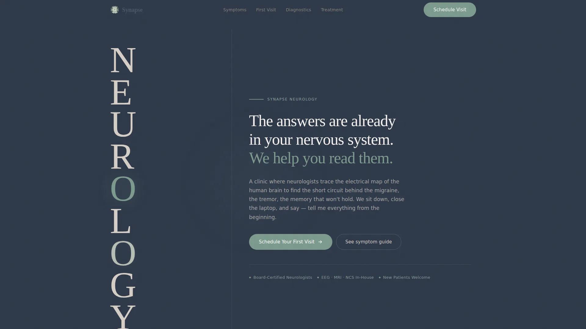
The word NEUROLOGY is set vertically down the left third of the viewport in a tall, light-weighted serif. Each letter appears in washed linen gray except the O, which pulses once in sage green like a slow, steady brainwave. The right two-thirds hold a single manifesto sentence in deep calming slate, creating a typographic hero with no imagery required.
Symptom Comparison Table
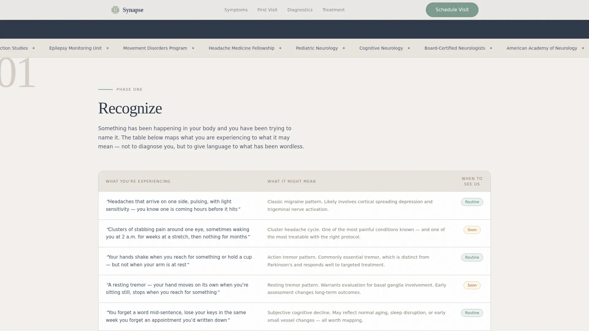
The Recognize section presents a structured two-column table contrasting "what you are experiencing" with "what it might mean." This table reflects the visitor's reality back to them in plain language before any clinical terminology is introduced.
Diagnostic Tools Comparison Table
The Diagnose section covers three core tools: electroencephalogram (EEG), magnetic resonance imaging (MRI), and nerve conduction study (NCS). Each tool gets its own comparison row showing what it measures, how long it takes, and what the experience feels like for the patient.
Treatment Paths Comparison Table
The Treat section lays three treatment approaches side by side: medication management, interventional procedures, and ongoing monitoring. Visitors can scan differences clearly without needing prior medical knowledge.
Dual Conversion Path
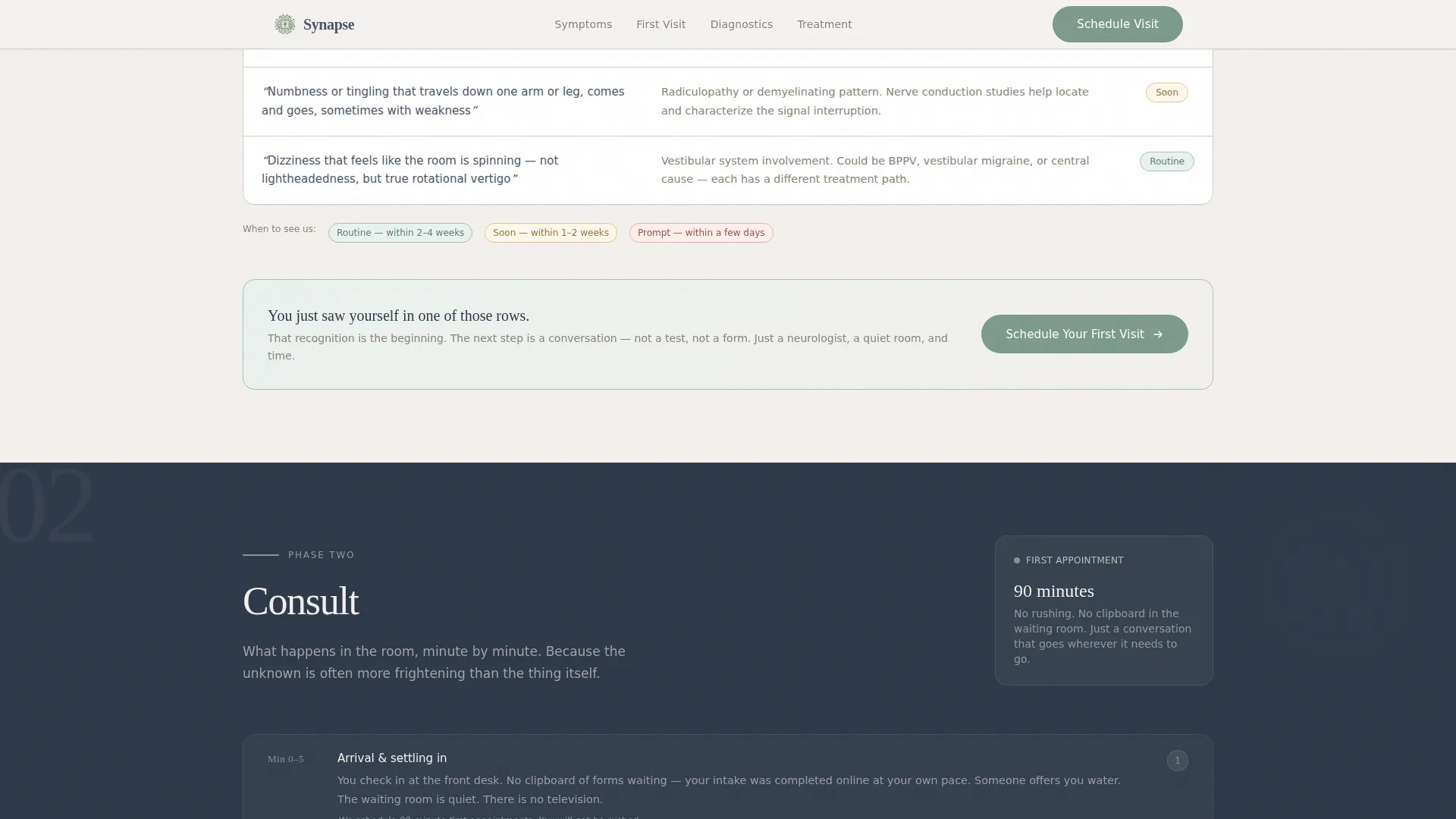
The primary call to action, "Schedule Your First Visit," appears twice: once after the symptom table and once anchored at the page bottom. A secondary path offers a downloadable new patient guide, captured with a first name field and a single condition-category checkbox.
Scroll-Triggered Section Reveals
Each of the four journey phases reveals on scroll with staggered table row animations. The sage green pulse on the hero O and the reveal timing reinforce the calm, unhurried pace of the page without adding unnecessary visual noise.
Page sections overview
| Section | Purpose |
|---|---|
| Hero: Stacked Type Tower | Establish clinic identity and tone with vertical typographic architecture |
| Recognize: Symptom Table | Reflect visitor symptoms back in plain language before any ask |
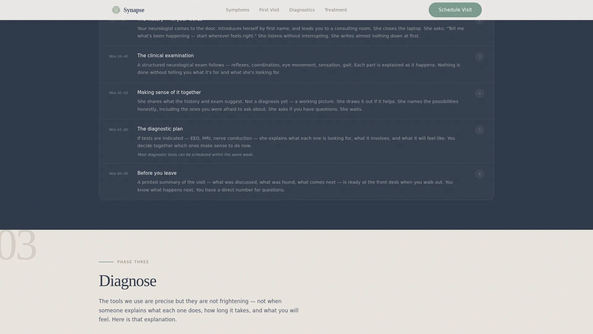
| Consult: Appointment Walkthrough | Walk through the first visit minute by minute to reduce appointment anxiety |
| Diagnose: Diagnostic Tools Table | Explain EEG, MRI, and NCS without jargon using a three-column comparison row |
| Treat: Treatment Paths Table | Compare medication, intervention, and monitoring options side by side |
| Footer: Linear Single-Row | Close the page with a clean, minimal single-row footer pattern |
Design & branding system
The visual identity follows a Healing Space theme built on the Soft Mist color palette. Every color choice serves a specific emotional function, keeping the page calm, readable, and warm without clinical coldness.
- Morning fog white (#F4F1EE) as the primary background, washed linen gray (#D6CFC7) for secondary surfaces and inactive type, deep calming slate (#4A5568) for all body text and headings
- Sage green (#7C9A8E) used exclusively for buttons, progress indicators, and trust signals to create a single living accent throughout the page
- Fraunces serif for all display headings to deliver monumental-yet-gentle authority, paired with DM Sans for body copy to keep clinical information easy to read
Mobile & speed optimization
The template is built desktop-first, with careful mobile adaptation applied across all comparison tables and the hero section. The design brief specifies a minimal JavaScript approach to keep the page responsive across device types.
- Comparison tables are structured to reflow clearly on smaller screens without losing the side-by-side context that makes them useful
- Scroll-triggered reveals and staggered table animations are handled with minimal JavaScript, keeping interactive behavior lightweight
- Server Components are used for all static content sections, reducing the processing load on the visitor's device
How this template helps you convert
The page earns its conversions by answering questions in the right order. No section asks for a booking before it has resolved the anxiety that belongs to that moment in the journey.
- The symptom comparison table in the Recognize section creates the first moment of recognition, placing the primary "Schedule Your First Visit" call to action at the exact point when a visitor has just seen their own experience described clearly.
- The secondary email capture at the bottom of the Treat section offers a low-commitment path for visitors who are not yet ready to call, collecting only a first name and a condition category to keep friction minimal.
Other information about this template
This template is designed for United States-based neurology practices operating in English with USD pricing context. It fits naturally into a business-to-consumer patient acquisition workflow.
- The page targets adults aged 30 to 65 experiencing unexplained neurological symptoms such as migraines, tremors, memory difficulties, and seizures, as well as parents of children with seizure disorders
- Social proof elements including credential badges, patient journey trust signals, and specialist certifications are built into the layout to reinforce clinical authority without disrupting the calm visual tone
- The footer follows Pattern 1, a linear single-row layout that closes the page cleanly without adding navigational complexity
Theme
Healing Space
Creative direction
Step-by-Step Guide
Color system
Soft Mist
Style
Comparison Table
Direction
Click-Through
Page Sections
Stacked Type Tower Hero Section
Symptom Comparison Table
Diagnostic Tools Comparison Table
Treatment Paths Side-by-side Table
Dual Conversion Path Design
Scroll-triggered Reveal Animations
Related questions
Is Synapse a single-page landing page or a multi-page website?
What conversion actions are built into this template?
How does the template explain diagnostic tools to patients?
Who is this template best suited for?
Does the template include pre-built comparison tables?



