French Dining Specialist Professional Website Template
Braise is a Haute Craft French meal kit landing page template built for premium direct-to-consumer subscription brands. It uses a modular card grid layout, a Desert Rose color palette, and cinematic sensory-led sections to guide ambitious home cooks from a macro hero image through a full tasting menu scroll toward one click: choosing this week's menu.
by Rocket studio
Quick summary
Braise is a single-page French meal kit landing page template designed for premium subscription food brands. The card grid layout moves visitors through a cinematic course-by-course reveal, ingredient provenance cards, unboxing photo strips, and subscriber testimonials. Every section funnels toward one brass-on-plum call to action. No forms. Just a confident click.
Who this template is for
This template is built for founders, food entrepreneurs, and creative teams who want to sell a premium French cooking experience online. It suits brands that lead with craft, sourcing detail, and sensory storytelling rather than discounts and feature checklists.
- Direct-to-consumer French meal kit brands targeting ambitious home cooks in their thirties and forties
- Premium subscription food businesses that want a landing page with upscale restaurant-level visual polish
- Gift-market food brands positioning their box as an experiential, haute cuisine alternative to ordinary meal kits
What problem this template solves
Most meal kit landing pages feel functional but flat. They list ingredients and show lifestyle photography without pulling the visitor into the experience of cooking. For a brand rooted in France's culinary tradition, that flatness is a conversion killer. Customers who want to cook filet mignon with a proper pan sauce, layer a tomato-based espagnole, or nail a beurre blanc need to feel the difference before they buy.
- Generic meal kit templates lack the sensory depth needed to sell a premium cooking experience
- Standard page layouts spread attention across too many calls to action, diluting the single click that drives subscription sign-ups
- Off-the-shelf food templates rarely reflect the sophistication of true French cuisine, leaving high-craft brands looking like any other delivery box
What you get with this template
You get a fully structured, Haute Craft single-page template built specifically for a premium French meal kit brand. The layout is modular, meaning each card section can be swapped, reordered, or restyled without breaking the overall flow. The design system, animation behavior, and copy structure are all mapped to one purpose: earning the click.
- A complete modular card grid landing page with five planned sections, from a cinematic macro hero through to a final no-commitment call to action
- A Desert Rose color system applied across every component, including deep blush card surfaces, warm parchment backgrounds, burnt plum headlines, and aged brass interactive elements
- GSAP ScrollTrigger animations, staggered card reveals, parallax layers, a sticky header, and a mobile sticky call-to-action bar built into the template structure
Feature list
This template includes several carefully designed capabilities grounded in the brief. Each one supports the goal of converting curious browsers into subscribers.
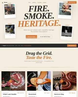
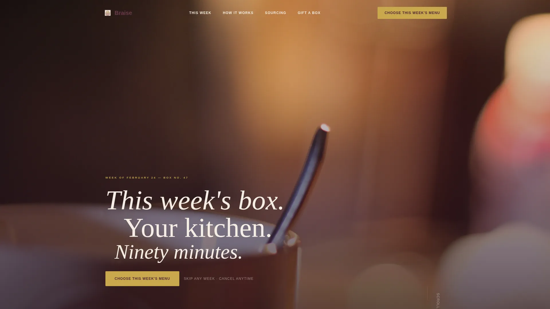
Cinematic Macro Hero Section
The hero opens with an extreme close-up of sauce breaking across a silver spoon. Shallow depth of field dissolves the background into warm amber. A thin serif headline in Fraunces type fades in after a beat: "This week's box. Your kitchen. Ninety minutes." The primary call-to-action button appears in aged brass on burnt plum immediately below. This opening creates a powerful first sense of the brand before a single ingredient is named.
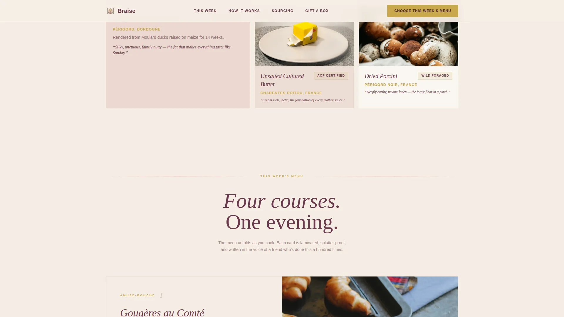
Course-by-Course Tasting Menu Scroll
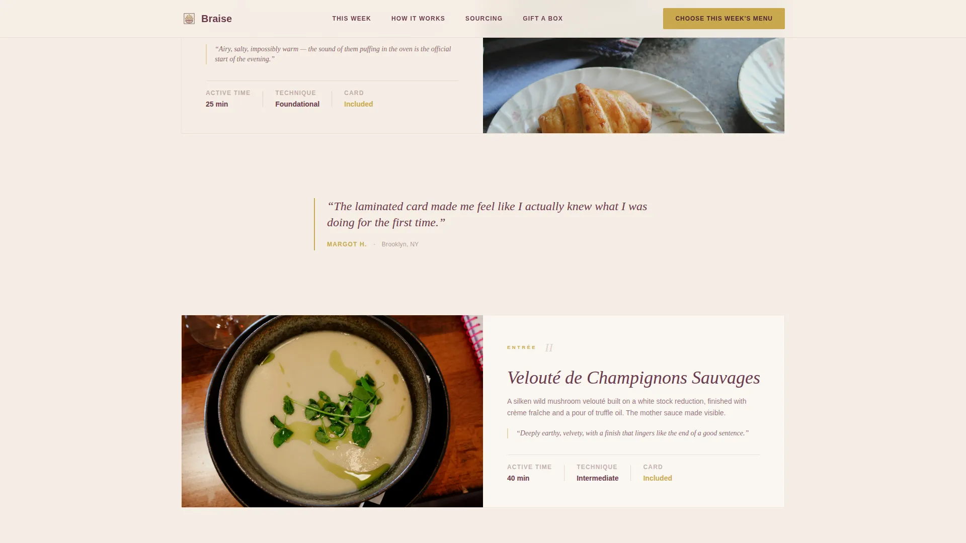
The page is structured like reading a tasting menu from top to bottom. Modular card rows reveal each course in sequence: amuse-bouche, entrée, plat principal, and dessert. Each card is written in taste language, describing flavors as briny, unctuous, or caramelized. Scrolling through the courses feels deliberate and indulgent, the same way dining through a full multi-course meal at a serious French restaurant does. This section is where the food itself becomes the argument for subscribing.
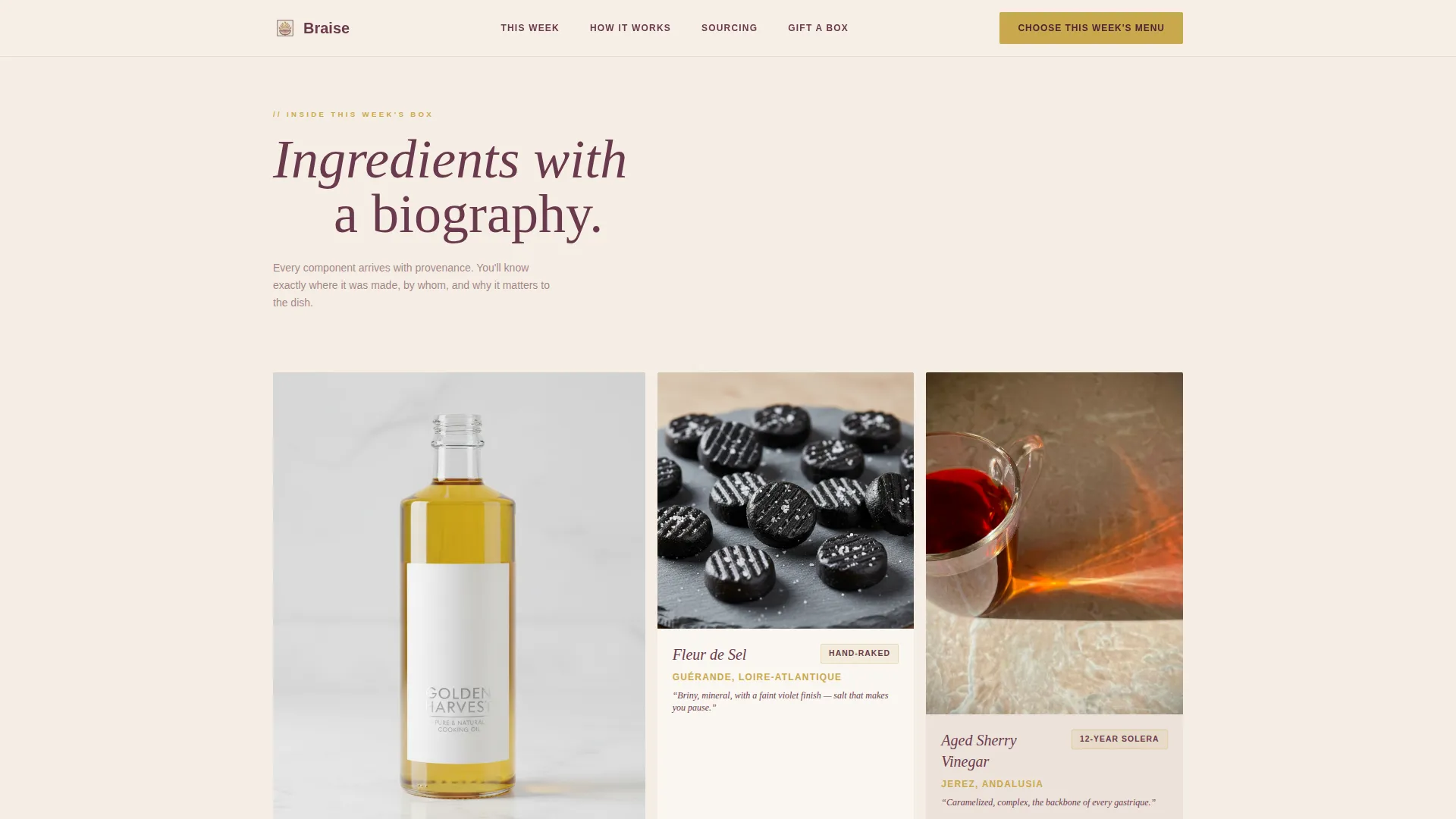
Ingredient Provenance Card Grid
A still-life bento grid presents each featured ingredient as its own card. Duck fat from Périgord, fleur de sel from Guérande, fresh herbs, lemon, garlic, butter, and seasonal vegetables each receive sourcing detail that builds trust without relying on lifestyle photography. The cards are photographed on raw marble in the manner of classical French still-life paintings, giving the food a beauty and weight that generic stock images cannot match.
Unboxing Photo Strip with Subscriber Testimonials
Between courses, a horizontal unboxing photo strip shows the "Inside the Box" experience. Single-sentence subscriber testimonials are placed between courses like palate cleansers. This pacing mirrors the rhythm of eating and resting between dishes at a fine French table, keeping the visitor engaged without overwhelming them with dense social proof blocks.
GSAP ScrollTrigger Animations and Interactions
The template uses GSAP ScrollTrigger for staggered card reveals, parallax depth layers, and hover micro-interactions on every clickable element. A sticky header persists across the full scroll. On mobile, a sticky bottom bar keeps the primary call-to-action visible at all times. Server Components handle static rendering while Client Components manage all animations, keeping the interactive experience smooth.
Single-Destination Click-Through Architecture
Every card, section, and button points to one destination: the menu selection page. There is no form on this landing page. The commitment is a click, not a fill. Trust is built through ingredient sourcing details, the unboxing strip, and a no-commitment promise placed directly beneath the final call-to-action button to dissolve hesitation at the critical moment.
Page sections overview
| Section | Purpose |
|---|---|
| Macro Hero | Cinematic sauce close-up with headline and primary call-to-action button |
| Ingredient Provenance Grid | Still-life card grid showing sourcing detail for each key ingredient |
| Tasting Menu Scroll | Course-by-course card reveal from amuse-bouche through dessert |
| Inside the Box Strip | Unboxing photo strip with single-sentence subscriber testimonials between courses |
| Final Call to Action | No-commitment promise paired with the primary brass-on-plum button |
| Minimal Footer | Horizontal flow footer with minimal navigation links |
Design & branding system
The visual identity uses the Desert Rose color system, which is inspired by a linen napkin beside a terracotta dish on a Provençal farmhouse table. The palette is sun-faded and deliberately restrained, creating a sense of expense through minimalism rather than decoration. Typography pairs Fraunces serif for all headlines with DM Sans for body text, giving the page an editorial weight that feels closer to a printed French menu than a typical food e-commerce page.
- Warm parchment (#F5EDE3) dominates all backgrounds; deep blush (#C48587) warms card surfaces; burnt plum (#6B3A4E) anchors headlines and body text; aged brass (#C9A84C) marks every button, price indicator, and interactive element
- Photography direction calls for macro close-ups and raw marble still lifes with no lifestyle staging, no hands, and no countertop clutter, keeping the food itself at the center of every frame
- All animations, hover states, and scroll behaviors are designed to reinforce the Sensory Appeal creative direction, pulling visitors through the page the way a great meal pulls a diner through each course
Mobile & speed optimization
The template is designed desktop-first, with explicit mobile adaptations built into its sticky call-to-action architecture. Responsive design is important for any food brand, since many home cooks will browse on their phones while planning the week's cooking. The sticky bottom bar on mobile ensures the primary call-to-action is always reachable, regardless of where a visitor is in the scroll.
- A sticky mobile bottom bar keeps "Choose This Week's Menu" permanently visible on smaller screens throughout the full page scroll
- Server Components handle all static sections for clean rendering, while Client Components manage GSAP animations and interactive card behaviors
- The modular card grid structure adapts naturally to narrower viewports, preserving the course-by-course reveal experience across screen sizes
How this template helps you convert
The entire architecture is built around a single conversion event: the click to the menu selection page. There are no distractions, no competing destinations, and no forms to fill out. Trust is built through specificity, sensory language, and a clear no-commitment promise, and then the visitor is given exactly one place to go.
- Three placements of the primary call-to-action button, in the hero, after the plat principal reveal, and as a mobile sticky bar, ensure the offer is never more than a glance away at any point in the scroll
- Ingredient sourcing cards and the unboxing photo strip earn trust through visible specificity rather than generic promises, giving the visitor concrete reasons to believe before they click
- The no-commitment promise placed directly beneath the final call-to-action button removes the last hesitation by making the stakes of clicking feel low, even for a visitor who is not yet fully convinced
Other information about this template
This template sits at an interesting intersection of French culinary culture and modern subscription e-commerce design. It draws on the same sensory craft that defines high-end French dining, where sophistication comes from restraint, provenance, and technique rather than volume or spectacle. Understanding that context helps explain some of the design and content choices made throughout the page.
- The five French mother sauces, béchamel, velouté, espagnole, tomato, and hollandaise, are the technical backbone of the laminated cooking cards included in the weekly box. Each sauce serves as the foundation for numerous derivative sauces, often called daughter sauces, and mastering them involves techniques that transform simple ingredients into complex flavors. The template's course-by-course card structure reflects that progression naturally.
- The food world this template serves extends across France and into broader European culinary traditions. A subscriber might cook chicken with a velouté one week, braise a lamb shoulder with tomato and onion the next, or prepare a buttery fish dish with fresh herbs and lemon the week after. The template's modular card design accommodates this variety without requiring layout changes week to week.
- Pairing wine with food is second nature in French cuisine. A box that includes a sauce built on a reduction of sauvignon blanc from the loire valley, or a braised beef dish that echoes the depth of a cabernet sauvignon, creates a natural opportunity to suggest pairings on each course card. The template's card structure supports that kind of contextual detail at the ingredient or course level.
- The brand competes in a market with serious competition from other premium meal kit services. What separates a haute cuisine approach is the specificity of sourcing, the educational value of the laminated technique cards, and the page's ability to make cooking feel like something earned rather than something assembled. Visitors who have outgrown basic meal delivery and want Tuesday night to feel like a french bistro experience at home are exactly the audience this template speaks to.
- The template is the braise haute craft french meal kit landing page template, built specifically for the French Dining subcategory within Food and Beverage. It is styled as a Card Grid (Modular) landing page using the Haute Craft theme, the Desert Rose color system, the Sensory Appeal creative direction, the Macro Close-Up header concept, and a Click-Through landing page direction.
- Comparable culinary contexts this template's content structure can draw from include multi-course tasting menus from upscale restaurants in france, ingredient-forward cooking traditions from italy, and the artisanal food culture of california wine country. Regions like napa valley and the columbia valley in california and Washington have built a food and wine culture that shares values with what Braise represents: provenance, restraint, and the pleasure of eating something prepared with real care.
- The template's ingredient cards can feature a wide range of classic French and European cooking staples: asparagus in spring, tomato and basil in summer, root vegetables and beef in autumn, rich cream and cheese sauces through winter. A course might feature a steak with a peppercorn sauce, a filet mignon with a hollandaise derivative, a pork tenderloin with a mustard cream, or a seafood dish built on a light velouté. The card format keeps each ingredient story readable and specific.
- Cocktails and aperitifs naturally complement the French dining experience. A card section could introduce a pre-dinner ritual with brandy, orange bitters, and a twist, nodding to the kind of thoughtful hospitality that turns a home kitchen into a comfortable space for real entertaining. Even a simple note about ice cream or vanilla ice cream alongside a warm tarte tatin, or a scoop of vanilla ice cream beside a chocolate fondant for dessert, reinforces the idea that the full meal is considered from aperitif through to the final dessert course.
- Families and gift-givers are a secondary audience. Family recipes handed down through generations often include the same techniques this template teaches: how to build a sauce from a roux, how to braise beef low and slow, how to finish a plate with butter and fresh herbs. The template's gift positioning supports conversion from this audience without requiring a separate page layout.
- Classic French dishes like coq au vin, boeuf bourguignon, and ratatouille are natural fits for the tasting menu scroll section. So are dishes from neighboring culinary traditions: a pasta with a cream and tomato sauce inspired by the italian regions bordering southern france, or a dish pairing asparagus with a hollandaise that would be as comfortable in new york or york as it would be in Lyon. The template's flexibility allows the brand to rotate menus weekly without touching the underlying structure.
- The hero subheadline and each course card use sensory language as a matter of design principle. Descriptions like "velvety," "smoky aroma," "unctuous," and "caramelized" are baked into the copywriting direction for this template, not added as optional extras. That sensory specificity is what makes the page feel alive and what makes eating something prepared from the box feel like something anticipated.
Theme
Haute Craft
Creative direction
Sensory Appeal
Color system
Desert Rose
Style
Card Grid (Modular)
Direction
Click-Through
Page Sections
Cinematic Macro Hero with Animated Headline
Course-by-course Tasting Menu Card Scroll
Ingredient Provenance Still-life Card Grid
Unboxing Strip with Testimonial Palate Cleansers
Single-destination Click-through Architecture
GSAP Scrolltrigger Animations and Sticky Navigation
Related questions
Can I change the weekly menu content without rebuilding the layout?
Does this template include a form or checkout flow?
What cooking skill level does this template assume for its audience?
Can I adapt the template for a different food category?
How does the mobile experience work for this template?