Pool Emergency Landing Page Template for B2B
Breach is an editorial-style landing page built for pool emergency response crews targeting general contractors, property managers, and insurance adjusters. It leads with a testimonial pull-quote, unfolds three escalating case studies in longform magazine format, and drives B2B partnership with a vendor-list sign-up form and a gated emergency response SLA download.
by Rocket studio
Quick summary
Breach is a single-page, editorial magazine landing page designed for pool emergency repair services. It replaces generic contractor marketing with documented case study storytelling. The page speaks directly to general contractors, property management firms, and insurance adjusters who need a certified remediation partner they can trust and name in a claim file.
Who this template is for
This template is built for pool emergency response businesses whose clients are other professionals, not homeowners browsing social media. It suits operations that respond to structural failures, code violations, and water-loss emergencies on commercial and residential projects alike.
- Pool emergency repair crews serving general contractors and property managers
- Certified remediation specialists who need to qualify as a named vendor on insurance claims
- Pool construction companies building a separate B2B emergency response service arm
What problem this template solves
Most pool contractor pages are built for homeowners comparing quotes. This template is built for the moment a site foreman carries liability on a half-finished aquatic project and needs to reach someone competent immediately. Generic marketing pages lose those buyers instantly.
- Standard contractor websites lack the documentation rigor B2B buyers need to justify adding a vendor to their approved list
- Insurance adjusters and project managers cannot evaluate a partner from a photo gallery and a contact form
- No clear proof of response times, certifications, or warranty language means no signed partnership agreement
What you get with this template
You get a fully structured landing page that functions like a professional incident dossier. Every section is designed to demonstrate authority, not just claim it. The layout earns trust through specificity rather than stock imagery or vague promises.
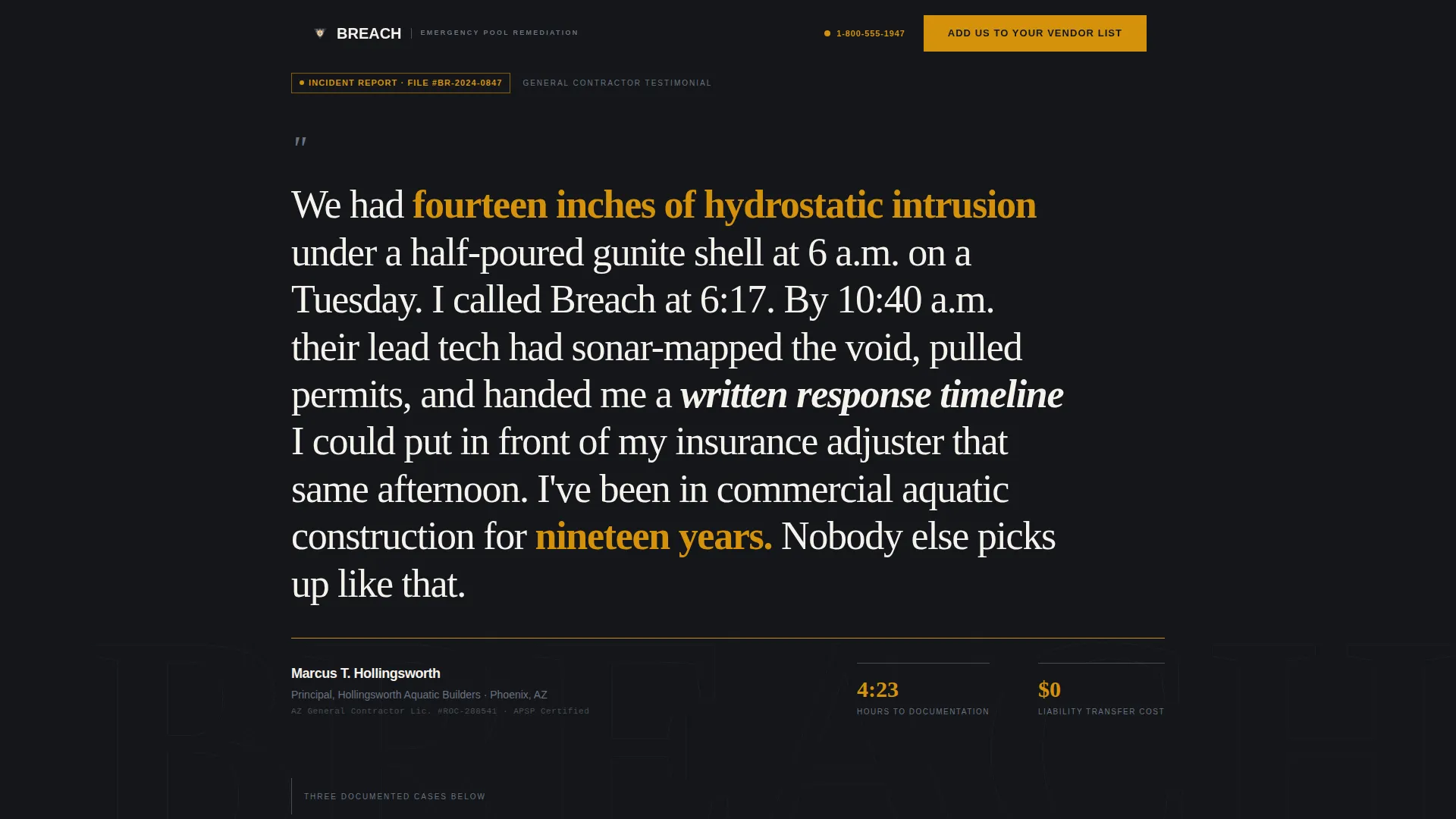
- A testimonial header card featuring a named general contractor pull-quote with company and license number visible
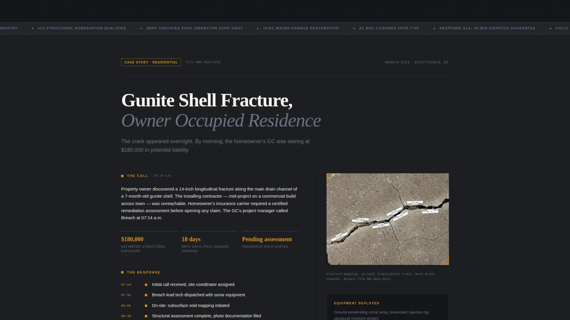
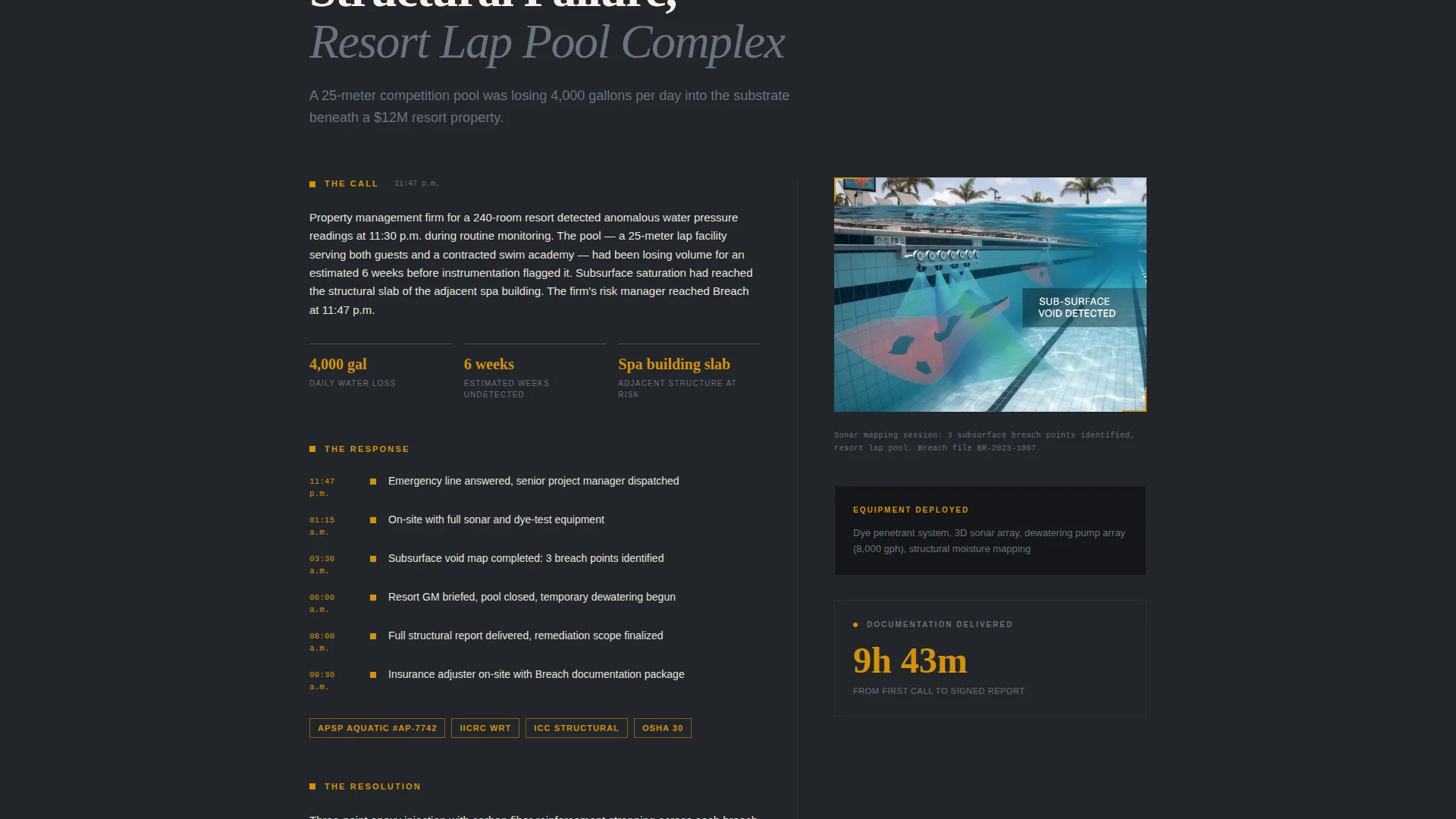
- Three scrolling case study sections documenting a residential crack, a commercial structural failure, and a municipal code violation remediation
- A B2B partnership form collecting company name, license number, service region, and relationship type, plus a secondary gated PDF download path for the Emergency Response SLA
Feature list
This template includes purposeful components built specifically for a B2B emergency services audience. Each element earns its place the same way a jobsite incident binder earns its place on a foreman's desk.
Testimonial Header Card
The header opens with a single oversized pull-quote from a named general contractor. White text sits on deep charcoal, with the contractor's company name and license number displayed. A thin amber rule runs beneath, signaling that this page is evidence, not advertising.
Three-Case Study Narrative Flow
Each of the three scroll sections documents a real emergency engagement in longform magazine style. Section one covers the call, section two covers the response and mobilization timeline, and section three covers the resolution, repair methodology, and warranty terms. Cases escalate in complexity as the visitor scrolls.
Documentary-Style Photography Layout
The template frames space for rebar grids, sonar scans of subsurface voids, and before-and-after cross-section images. Pull quotes from adjusters and project managers break the editorial columns, giving the page the rhythm of professional trade journalism rather than a service brochure.
B2B Vendor List Partnership Form
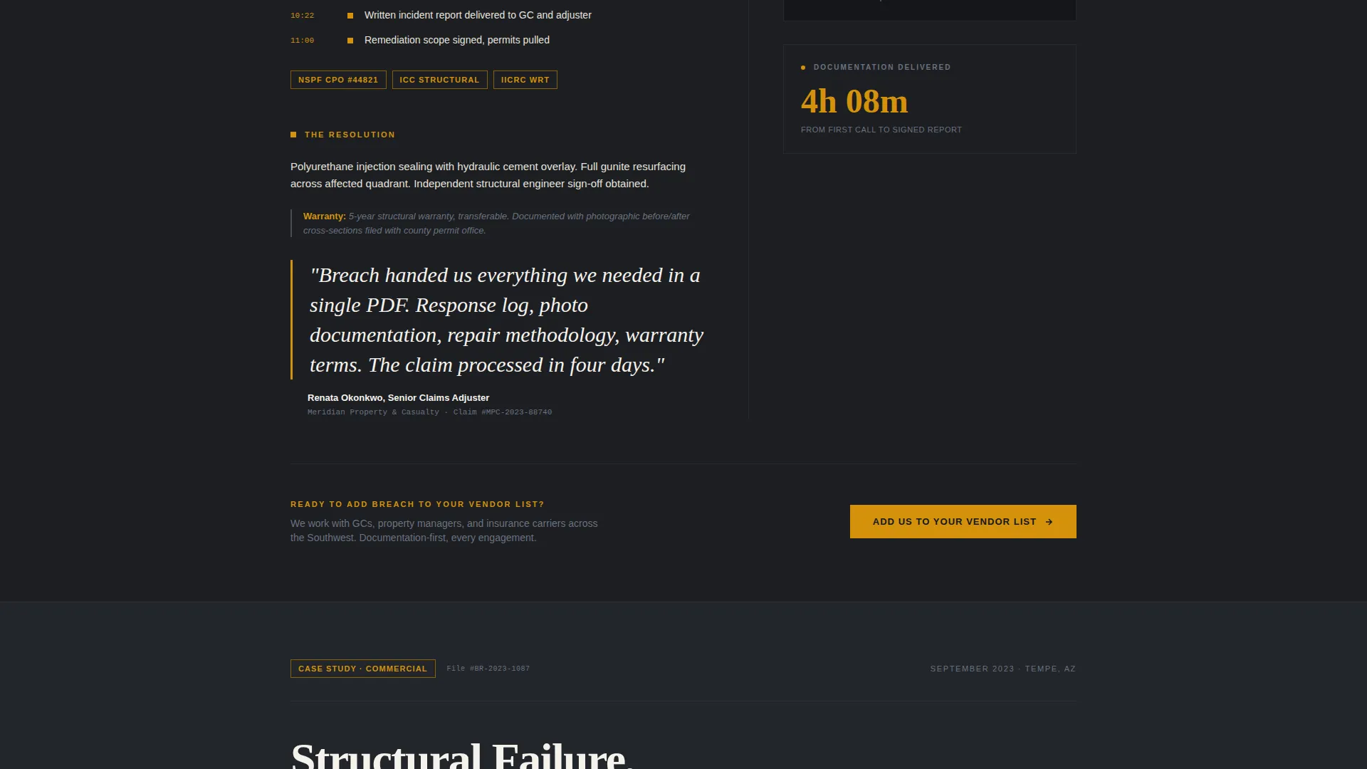
The primary call to action reads "Add Us to Your Vendor List." The form collects company name, license number, service region, and a relationship-type dropdown covering general contractor, property management, insurance, and municipal categories. It appears after the first case study and again at the page bottom.
Gated SLA Download Path
A secondary conversion path offers the Emergency Response SLA as a downloadable PDF. It requires only a business email address. This path captures buyers who are researching partnership options but are not ready to submit a full vendor application.
Amber-Flagged Urgent Callout System
Actionable elements and urgent callouts are marked in caution-tape amber throughout the page. This visual system ensures that response-time data, certification references, and warranty language stand out against the charcoal and aggregate gray editorial columns.
Page sections overview
| Section | Purpose |
|---|---|
| Testimonial Header Card | Opens with contractor proof, no stock imagery |
| Case Study One | Documents residential crack call and resolution |
| Vendor List call to action | First B2B partnership form placement |
| Case Study Two | Documents commercial structural failure response |
| Case Study Three | Documents municipal code violation remediation |
| SLA Download Offer | Secondary gated PDF conversion path |
| Anchored Bottom call to action | Repeats vendor list form at page close |
Design & branding system
The Charcoal and Amber color system is built around four specific values that work together like pages in a jobsite incident binder. Every color choice is functional. Nothing is decorative for its own sake.
- Charcoal (#1C1E22) dominates backgrounds and typographic weight; exposed aggregate gray (#4A4E54) separates editorial columns; caution-tape amber (#D4920B) marks every actionable element and urgent callout; contract-paper white (#F5F2EC) opens breathing room in long-read sections
- Typography is weighted for authority: pull-quotes are oversized, certification numbers are visible, and response-time data is clearly called out rather than buried in paragraph text
- The overall aesthetic feels like flipping open a formal incident dossier under halogen work lights, authoritative and unadorned, with every element present because it has to be
Mobile & speed optimization
The single-column flow keeps the scrolling experience clean on any screen size. Editorial columns and pull-quote callouts restack naturally without losing the longform narrative rhythm.
- Single-column template style ensures case study sections read clearly on smaller screens without requiring horizontal scrolling
- Amber callout blocks and the testimonial header card retain their visual hierarchy on mobile, keeping conversion elements prominent
- The gated PDF download path and vendor form are accessible without requiring the visitor to navigate away from the main scroll experience
How this template helps you convert
This template converts B2B buyers by making the documentation work feel done before they even reach the form. Every case study detail signals that this is a partner who simplifies paperwork, not one who creates it.
- The testimonial header card with a named contractor, company, and license number establishes credibility in the first scroll, before any service claim is made, reducing the friction that typically stops B2B buyers from engaging.
- Placing the primary "Add Us to Your Vendor List" call to action after the first case study catches buyers at peak trust, right after reading specific response times and certification references, not at the bottom of a generic pitch.
- The gated SLA download captures high-intent researchers who are not yet ready to commit, giving you a qualified business email from a buyer who has already self-identified as a potential partner.
Other information about this template
This template was designed under an Editorial Magazine theme with a Stats-First Impact creative direction. It pairs naturally with professional services marketing that prioritizes proof over personality.
- The template style follows a Single Column Flow, which suits longform case study content and keeps the reading experience linear and authoritative
- The header concept is a Dark Full-Bleed design with the charcoal background carrying the testimonial card from edge to edge, replacing the typical hero image with documented human proof
- This layout works well for pool emergency response businesses looking to build a qualified vendor network rather than drive individual service bookings
- The relationship-type dropdown in the partnership form makes the template adaptable to different B2B audience segments without requiring separate landing pages for each
Theme
Editorial Magazine
Creative direction
Stats-First Impact
Color system
Arctic White
Style
Single Column Flow
Direction
Booking/Scheduling
Page Sections
Testimonial Header Card with Contractor Credentials
Three Escalating Case Study Sections
B2B Vendor List Partnership Form
Gated Emergency Response SLA Download
Amber Urgent Callout System
Documentary Photography Layout
Related questions
Who is this landing page template designed for?
Does this template include a contact or application form?
What makes this layout different from a standard contractor website?
Can I use this template for both residential and commercial pool emergency services?
What photography style does this template call for?



