Clinical Trials Landing page Template
A warm, structured landing page that helps people with treatment-resistant depression find clinical trials enrolling near them. The three-question eligibility screener lives above the fold, a zigzag checklist layout dismantles common fears section by section, and a progressive-disclosure form captures qualified leads with minimal friction, built for patients, caregivers, and therapists alike.
by Rocket studio
Quick summary
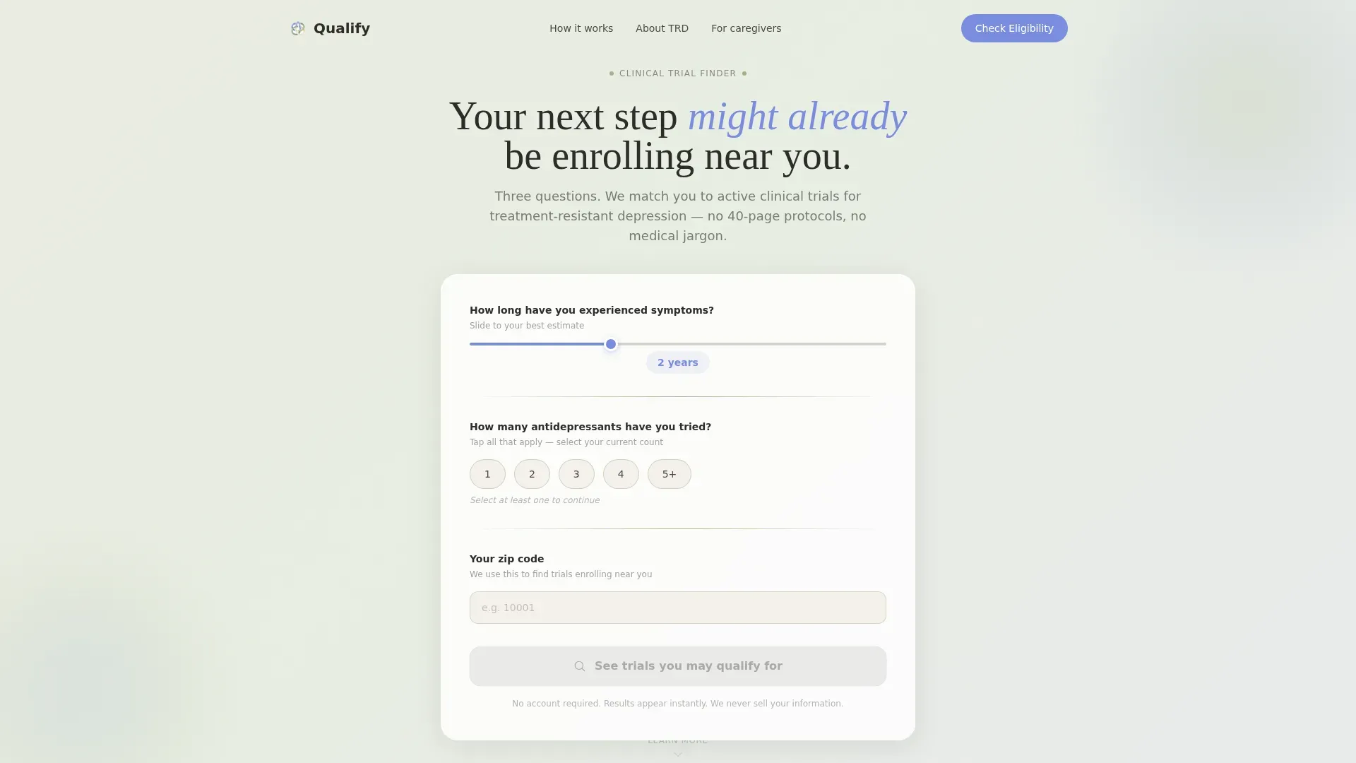
This landing page template is built for one clear purpose: connect people living with persistent depression to clinical trials that are actively enrolling near them. A three-question screener opens the page. Zigzag sections guide visitors through self-assessment, trial timelines, and myth-busting. The result is a lead generation page that earns trust before it asks for anything.
Who this template is for
This template serves anyone trying to find a credible next step when current depression treatment is not working. It is designed with real emotional context in mind, not just a generic medical audience.
- Mid-treatment patients whose second or third antidepressant has stopped working
- Caregivers searching late at night on behalf of a loved one
- Therapists looking for referral options beyond standard prescribing paths
What problem this template solves
Matching patients to depression clinical trials is slow, confusing, and often gatekept behind 40-page protocol documents. Most people give up before they find a trial that fits. This template removes that barrier by putting a simple screener first and answering the hardest objections before a visitor has to ask.
- Patients abandon trial searches because forms are too long and outcomes feel uncertain
- Caregivers searching after hours need a calm, mobile-ready experience, not a clinical portal
- Therapists need a shareable resource they can point patients toward with confidence
What you get with this template
You get a fully structured, single-page lead generation layout designed specifically for a depression clinical trial finder. Every section has a defined job, and nothing is decorative for its own sake.
- A three-question eligibility screener with a slider, pill selectors, and zip code autocomplete
- Five zigzag content sections covering self-assessment, trial timelines, myth-busting, and social proof
- A progressive-disclosure form that pre-fills step one from the screener answers
Feature list
This template includes the following built-in components and layout capabilities.
Three-Question Eligibility Screener
The page opens with a compact estimator tool above the fold. Visitors set a symptom-duration slider from six months to ten-plus years, tap pill selectors for medication count, and enter a zip code with auto-detected city name. A pulsing periwinkle button invites them to see matched trials immediately.
Progressive-Disclosure Lead Form
The full intake form uses three steps to reduce abandonment. Step one pre-fills the screener answers already given. Step two uses autocomplete to capture current medications by name. Step three collects a phone number and preferred contact time, nothing more.
Zigzag Checklist Layout
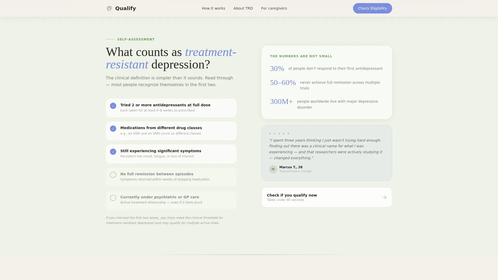
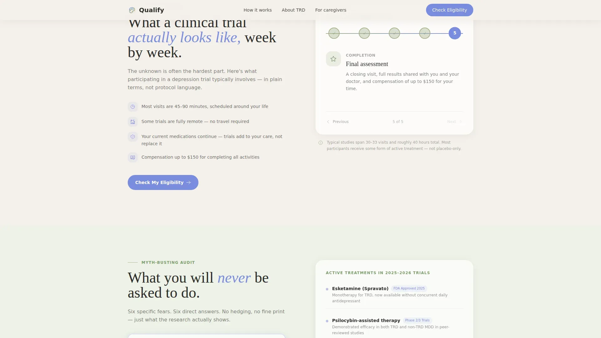
Each alternating section reframes the visitor's situation as a structured self-assessment. Sections cover treatment-resistant depression criteria, a week-by-week trial timeline, and a myth-busting audit that addresses specific fears like placebo-only protocols or locked commitments.
Myth-Busting Audit Cards
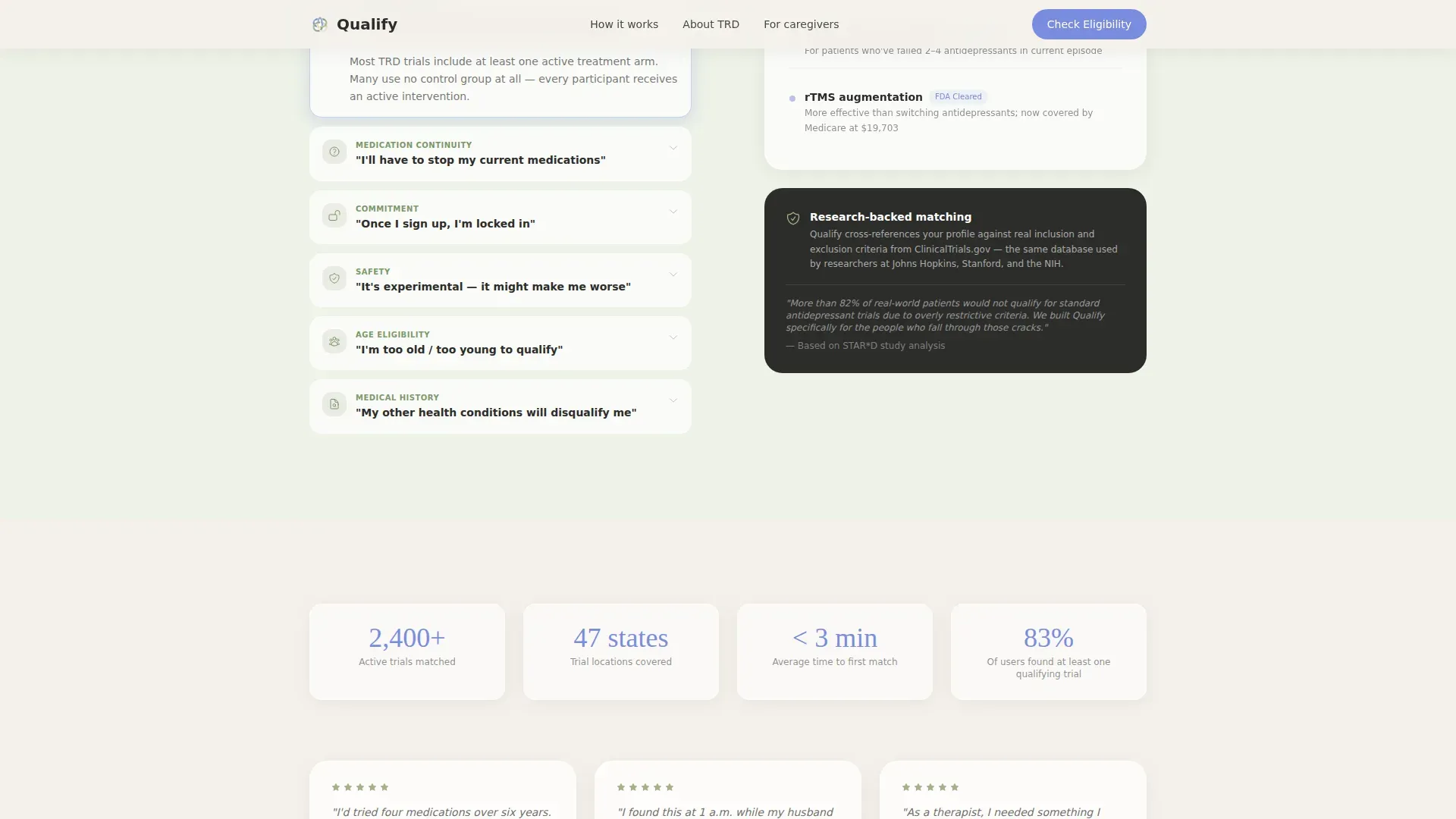
The "What you'll never be asked to do" section uses accordion-style cards to name and resolve real patient anxieties. Each card targets one specific concern and dissolves it clearly, reducing the reasons a visitor might close the tab.
Shareable Caregiver Link
A secondary call-to-action labeled "Send This to Someone You Care About" generates a shareable link with a personal note field. This path acknowledges that the person searching is often not the person who needs care.
Floating Mobile Call-to-Action Bar
On mobile, a fixed bottom bar keeps the primary "Check My Eligibility" call to action visible throughout the scroll. This ensures the conversion path stays reachable at every point in the page journey.
Page sections overview
| Section | Purpose |
|---|---|
| Hero Estimator Tool | Opens with a three-question screener above the fold |
| Treatment-Resistant Definition | Zigzag left: visual self-assessment checklist |
| Week-by-Week Timeline | Zigzag right: horizontal trial journey walkthrough |
| Myth-Busting Audit | Zigzag left: accordion cards resolving patient fears |
| Social Proof + Share | Testimonials, trial metrics, and caregiver share link |
| Minimal Footer | Single-row linear footer with essential links |
Design & branding system
The visual identity follows an Organic Flow theme using the Cloud Canvas color system. The palette is intentionally warm and quiet, nothing sterile, nothing alarming.
- Background alternates between soft overcast white (#F4F1EB) and a barely-there sage tint (#EDF2E7) across zigzag sections
- Muted sage (#A3B18A) marks section dividers and progress indicators; warm graphite (#4A4A48) is used for all body text
- Gentle periwinkle (#7B8CDE) is reserved exclusively for interactive elements, calls to action, and the pulsing estimator button; Fraunces serif sets headlines while DM Sans handles body copy
Mobile & speed optimization
The template is designed mobile-first because caregivers and patients frequently search on phones late at night. Layout decisions prioritize one-thumb usability and fast first impressions.
- The floating bottom bar keeps "Check My Eligibility" accessible without scrolling back to the top
- Scroll-linked reveals, staggered checklist animations, and the slider interaction use client-side components only where interactivity is needed
- Static-first architecture means interactive estimator pieces load separately without blocking the rest of the page
How this template helps you convert
Every design and copy decision on this page exists to move a skeptical visitor toward completing the eligibility form. The approach is systematic rather than urgent.
- The screener eliminates the blank-slate problem by giving visitors something to do in the first five seconds, lowering resistance before a form ever appears.
- Each zigzag section removes a specific objection, what treatment-resistant depression means, what a trial week looks like, and what will never be required, so the visitor arrives at the form already reassured.
- The pre-filled step one and the caregiver share path together cover two very different conversion journeys on a single page, widening the total audience without adding visual clutter.
Other information about this template
This template was designed at the intersection of healthcare lead generation and clinical research patient matching. A few additional details are worth noting for teams evaluating it.
- The page is localized for English-language audiences in the United States, using USD references and US date format conventions
- Social proof elements include anonymous patient quotes with condition context, active trial count metrics, and partner research institution logo placement
- Typography pairing of Fraunces for headlines and DM Sans for body copy supports a warm, readable tone across all screen sizes
- The template style is Zigzag/Alternating, which means each section pair creates visual rhythm without requiring heavy imagery or contrast-heavy backgrounds
Theme
Organic Flow
Creative direction
Checklist & Audit
Color system
Cloud Canvas
Style
Zigzag/Alternating
Direction
Lead Generation
Page Sections
Three-question Eligibility Screener
Progressive-disclosure Lead Form
Zigzag Checklist Layout
Myth-busting Accordion Cards
Shareable Caregiver Link
Floating Mobile Call-to-action Bar
Related questions
Who is the primary audience this landing page is designed for?
Does the screener pre-fill the lead form automatically?
Can this page support caregivers who are not the patient?
What does the myth-busting section address?
Is this template suitable for mobile users?



