Engineering Consulting Portfolio Website Template
Breakwater is a single-page landing page template built for marine and coastal engineering consultancies. It combines an authoritative Educational Guide theme with a Case Study Narrative structure, using side-by-side comparison tables set inside real project contexts. The layout drives leads through a focused form and a gated PDF download, all styled in a precise Ink and Paper palette.
by Rocket studio
Quick summary
Breakwater is a lead generation landing page template for coastal and marine engineering consultancies. It presents engineering case studies as comparison tables, builds credibility through technical narrative, and moves qualified prospects toward a coastal assessment request or a gated PDF download. The design feels like a well-thumbed coastal engineering manual: authoritative, unhurried, and precise.
Who this template is for
This template is built for specialist engineering practices that need to earn trust before a client picks up the phone. It suits firms whose work is technical, high-stakes, and difficult to explain in a generic services brochure.
- Marine and coastal engineering consultancies offering seawall, jetty, revetment, or dredging services
- Engineering firms advising port authorities, municipal engineers, or coastal resort developers
- Practices that want to demonstrate analytical depth before asking for contact details
What problem this template solves
Most engineering consultancy pages list services without showing thinking. Potential clients, port commissioners, municipal engineers, resort developers facing regulatory compliance, need more than a credential list. They need evidence that the firm has already solved a problem like theirs.
- Generic portfolio pages fail to show the reasoning behind engineering decisions
- Visitors leave before they understand the firm's depth of expertise in coastal erosion, permitting, or structural design
- Lead capture forms placed too early lose prospects who are still comparing approaches
What you get with this template
You get a fully structured single-page layout designed around the Case Study Narrative approach. Every section has a defined role, from the commanding header to the gated download offer at the base of the page.
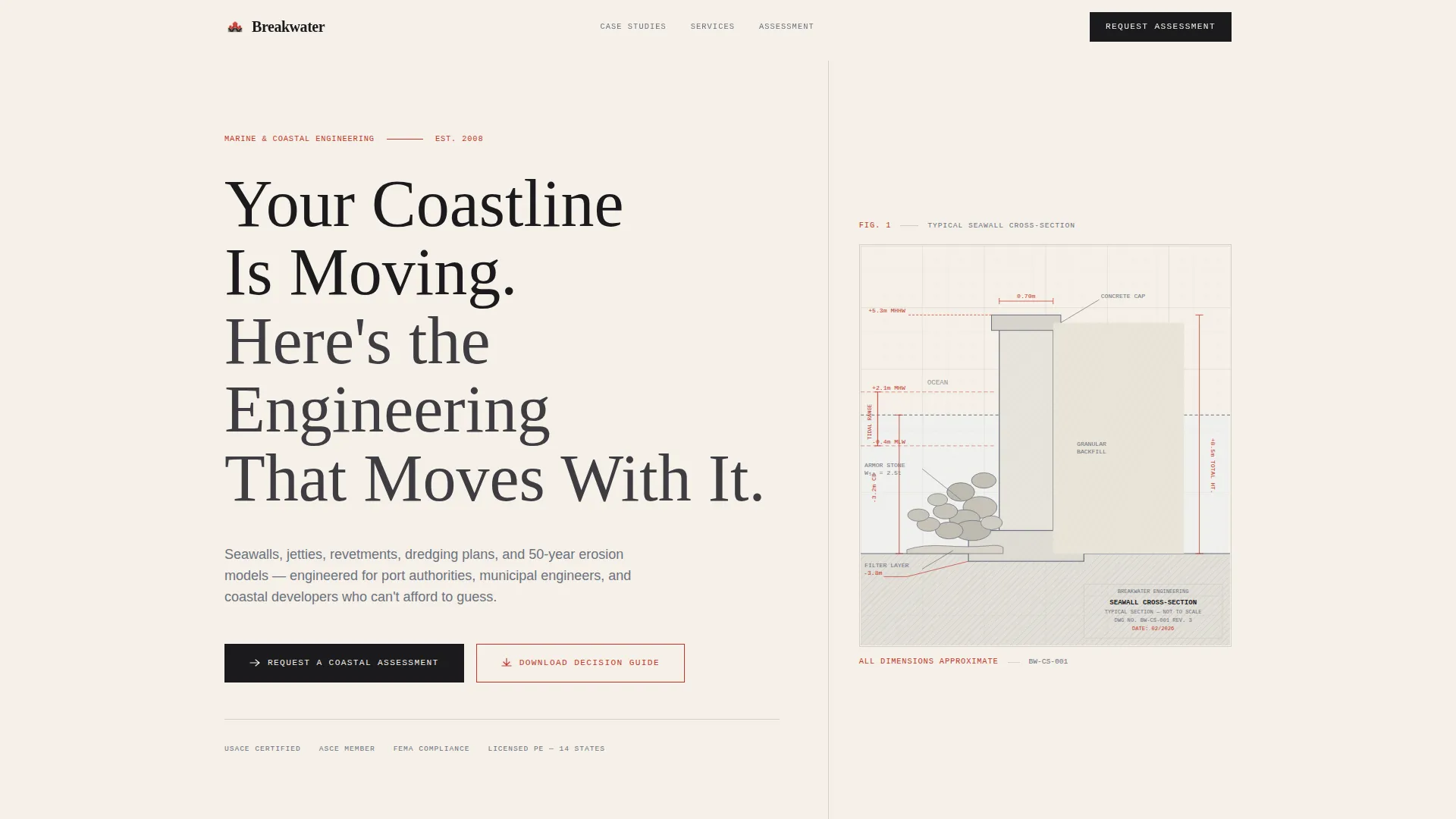
- A Giant Headline Left header with an annotated seawall cross-section diagram replacing hero photography
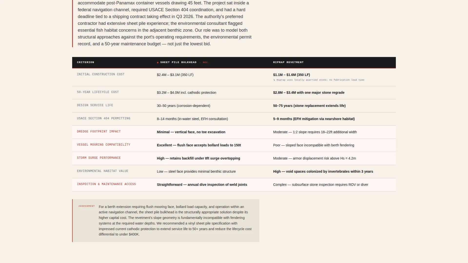
- Two full comparison table case studies with preceding narrative paragraphs, each comparing real engineering approaches
- Two lead capture touchpoints: a detailed project assessment form and an email-gated PDF download
Feature list
A paragraph introducing the features: each element in this template has been designed for a specific conversion or credibility role. Nothing is decorative for decoration's sake.
Giant Headline Left Header
The header occupies the left sixty percent of the viewport with large serif type set in archival black on warm vellum. The right side holds a single technical cross-section diagram of a seawall, annotated with depth markers, tidal ranges, and armor stone gradients in thin gray lines with surveyor's red dimension callouts. No photography is used; authority comes from the precision of the drawing itself.
Contextual Comparison Tables
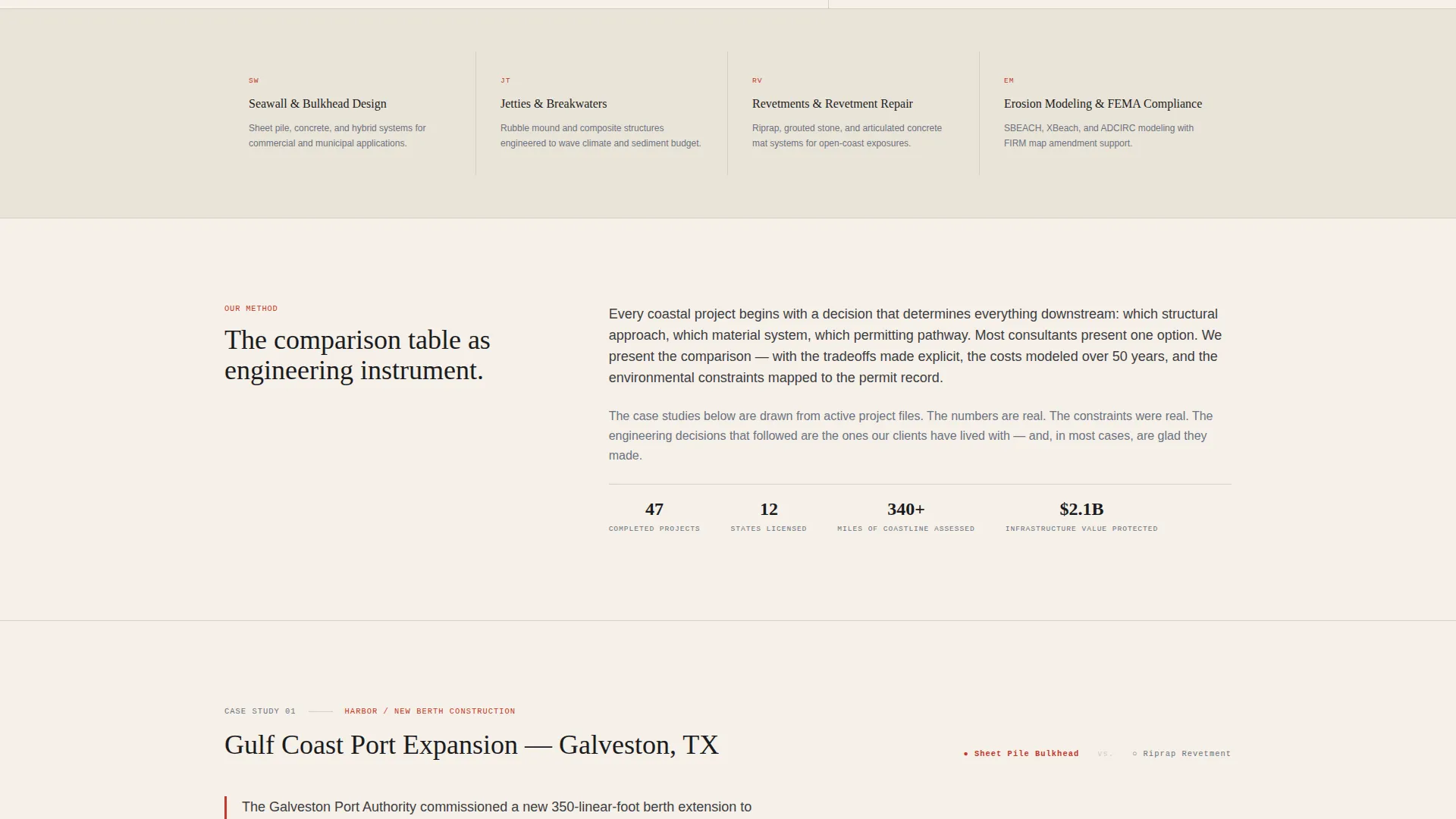
Each comparison table is preceded by a short narrative paragraph that sets the project scene, the problem, the stakeholder pressure, and the environmental constraints. One table contrasts sheet pile bulkheads versus riprap revetments for a Gulf Coast port expansion. Another compares beach nourishment versus offshore breakwaters for a Caribbean resort project. The tables compare across cost, lifespan, environmental impact, and permitting timeline.
Dual Lead Capture Paths
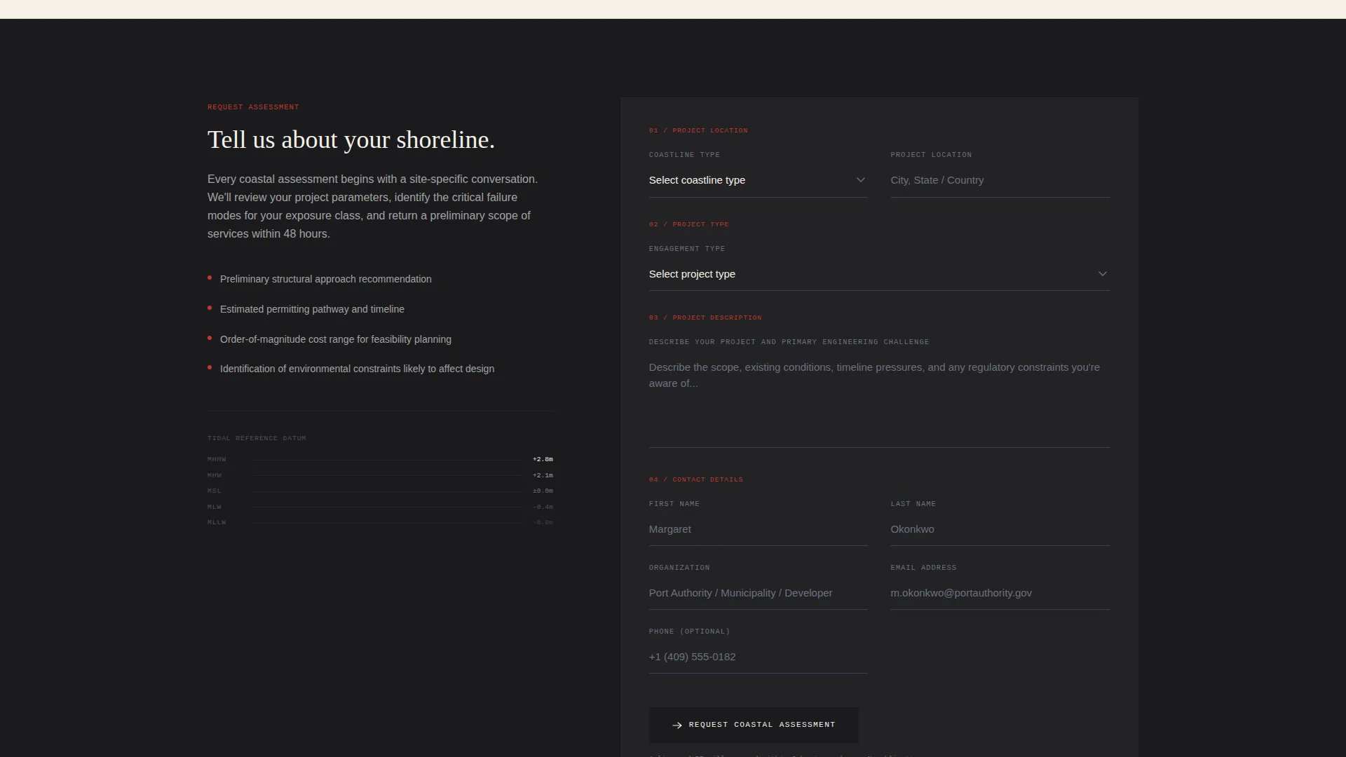
The primary call to action, "Request a Coastal Assessment," appears after the second case study and again at the bottom of the page. The form asks for project location first, including a coastline type dropdown covering open ocean, estuarine, harbor, and riverine contexts. It then collects project type, a free-text project description, and contact details last.
Gated PDF Download
A secondary conversion path offers a downloadable PDF titled "Download Our Seawall versus. Revetment Decision Guide." This asset is gated behind email only, capturing earlier-stage leads who are still comparing approaches before they are ready to request a full assessment.
Ink and Paper Color System
The palette uses deep archival black for body type, technical diagram gray for supporting annotation, warm vellum as the page background, and surveyor's red reserved for callouts, table highlights, and interactive accents. The color system reinforces the educational guide aesthetic without relying on imagery.
Educational Guide Theme Layout
The scroll structure builds cumulative expertise. Each case study adds a layer of context, so that by the third section a visitor understands they are reading the reasoning of engineers who have already solved a problem like theirs. The layout prioritizes readability and analytical depth over visual decoration.
Page sections overview
| Section | Purpose |
|---|---|
| Header with diagram | Establish authority and set the analytical tone |
| Case study one | Compare bulkhead versus. revetment in a port context |
| Case study two | Compare nourishment versus. breakwater for resort project |
| Primary call to action form | Capture qualified leads ready for assessment |
| Gated PDF offer | Capture earlier-stage leads via email only |
| Page bottom call to action | Provide a final assessment request touchpoint |
Design & branding system
The visual identity follows an Educational Guide theme built on the Ink and Paper color system. Every design choice references the aesthetic of a technical field document rather than a marketing brochure.
- Deep archival black (#1B1B1E) for headlines and body copy, technical diagram gray (#6B7280) for annotations, and warm vellum (#F5F0E8) as the page ground
- Surveyor's red (#C0392B) used selectively for callouts, table row highlights, and interactive accents to direct attention without cluttering the layout
- Large serif typography for the headline, thin gray line illustration for the seawall diagram, and a restrained palette that reads like a well-used site office manual
Mobile & speed optimization
The template layout is built to remain readable and functional across screen sizes. The Giant Headline Left structure and the comparison tables adapt to narrower viewports without losing their hierarchy.
- The header transitions from a split two-column layout on wide screens to a stacked single-column format on mobile, keeping the diagram and headline both visible
- Comparison tables are structured to scroll horizontally on small screens so all data columns remain accessible without truncation
How this template helps you convert
The layout is structured to move a hesitant technical buyer from skepticism to contact request through a specific sequence of credibility and relevance signals.
- The header establishes immediate expertise through precise technical illustration rather than stock imagery, signaling to specialist clients that this firm operates at a professional engineering level.
- The case study narrative tables let visitors self-identify with a project type, Gulf Coast port, Caribbean resort, eroding boardwalk, before they reach any form, so the lead capture feels like a natural next step rather than an interruption.
- The dual conversion paths serve two distinct buyer stages: the assessment form captures decision-ready prospects, while the gated PDF captures researchers who need more time, ensuring neither audience leaves empty-handed.
Other information about this template
This template is designed as a single landing page and does not include multi-page navigation or an internal site structure. It is intended for consultancies that want one focused, high-converting destination for paid traffic, referral links, or directory listings.
- The coastline type dropdown in the lead form covers open ocean, estuarine, harbor, and riverine project contexts, allowing the firm to pre-qualify leads before first contact
- The free-text project description field is placed before contact details, which lowers the friction of the form and encourages more detailed, useful submissions
- The template style is Comparison Table and the landing page direction is Lead Generation, making it well suited for firms competing on demonstrated expertise rather than price or brand recognition
- The seawall cross-section diagram is a designed illustration component within the template, not a photograph, reinforcing the educational and technical positioning throughout
Theme
Educational Guide
Creative direction
Case Study Narrative
Color system
Ink & Paper
Style
Comparison Table
Direction
Lead Generation
Page Sections
Giant Headline Left Header with Technical Diagram
Contextual Comparison Table Case Studies
Two-stage Lead Capture System
Ink and Paper Color System
Educational Guide Scroll Structure
Gated PDF Download Component
Related questions
Who is this landing page template best suited for?
Can I adapt the comparison tables to my own project types?
How does the gated PDF download work?
Does this template include more than one page?
Can the lead form fields be customized?



