Mental Health Awareness Campaign Landing Page
Breathe is a nature-inspired editorial landing page for mental health awareness campaigns. It pairs anonymous first-person testimonials with painterly nature photography, guiding quietly struggling visitors toward a resource hub without pressure or clinical language. The Soft Mist color palette, asymmetric mosaic layout, and a single golden-hour amber call to action make the page feel like an invitation, not a form.
by Rocket studio
Quick summary
Breathe is an editorial-style mental health awareness landing page template built for nonprofit campaigns. It uses nature photography, anonymous testimonials, and a scroll-linked amber call to action to guide emotionally ready visitors toward a resource hub. The design feels unhurried and human, making visitors feel seen before they are asked to act.
Who this template is for
This template is built for nonprofit organizations, advocacy groups, and community campaigns working in the mental health awareness space. It fits teams that want to lead with story and empathy rather than clinical urgency.
- Mental health nonprofits running public awareness campaigns
- Community organizations reaching adults quietly dealing with burnout, anxiety, or grief
- Advocacy teams who want a polished editorial presence without a hard sales pitch
What problem this template solves
Most mental health campaign pages feel transactional. They lead with forms, statistics, or clinical language that can push away the very people they are trying to reach. The person Googling "am I okay" at 2 a.m. does not want to be funneled. They want to feel less alone.
- Removes friction by replacing forms with a single, low-pressure click-through call to action
- Bridges the gap between anonymous struggle and named support through personal pull quotes
- Grounds emotion in scale with epidemiological stat callouts that inform without overwhelming
What you get with this template
You get a complete, single-page editorial layout ready to adapt for your campaign. Every section is purposefully sequenced to move visitors from quiet recognition to confident action.
- A full-bleed hero with a delayed animated text reveal
- An asymmetric testimonial mosaic with three story spreads and paired nature photography
- A fixed bottom call-to-action bar that fades in gently after 60 percent scroll depth
Feature list
This template includes a focused set of purpose-built features. Each one serves the campaign's core goal: earning trust before asking for a click.
Delayed Hero Text Reveal
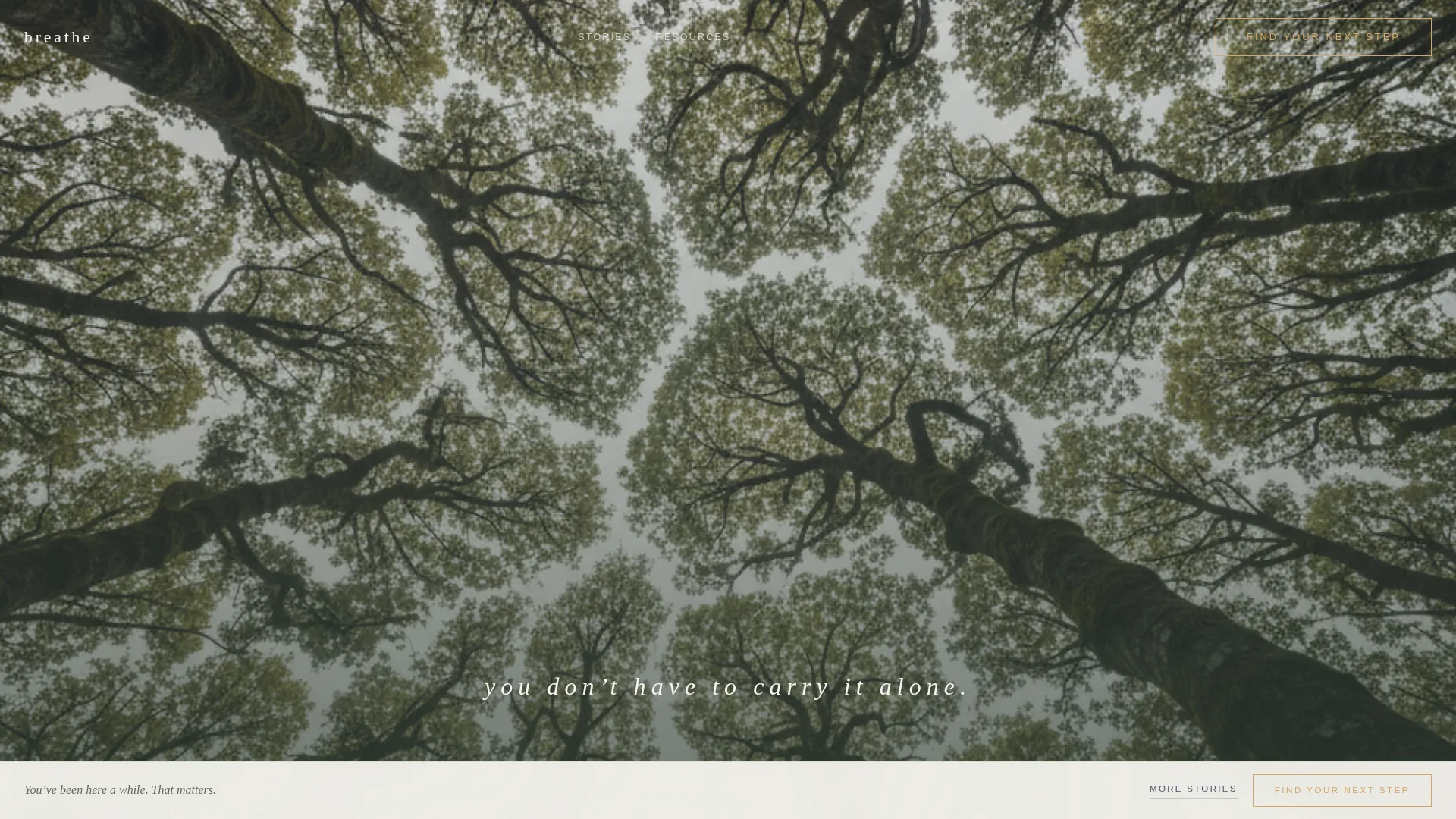
The hero section opens with a full-bleed canopy photograph. After a two-second pause, the line "You don't have to carry it alone." fades in at the center of the image. The type is thin, lowercase, and wide-letterspaced. It does not announce itself loudly. It waits.
Asymmetric Testimonial Mosaic
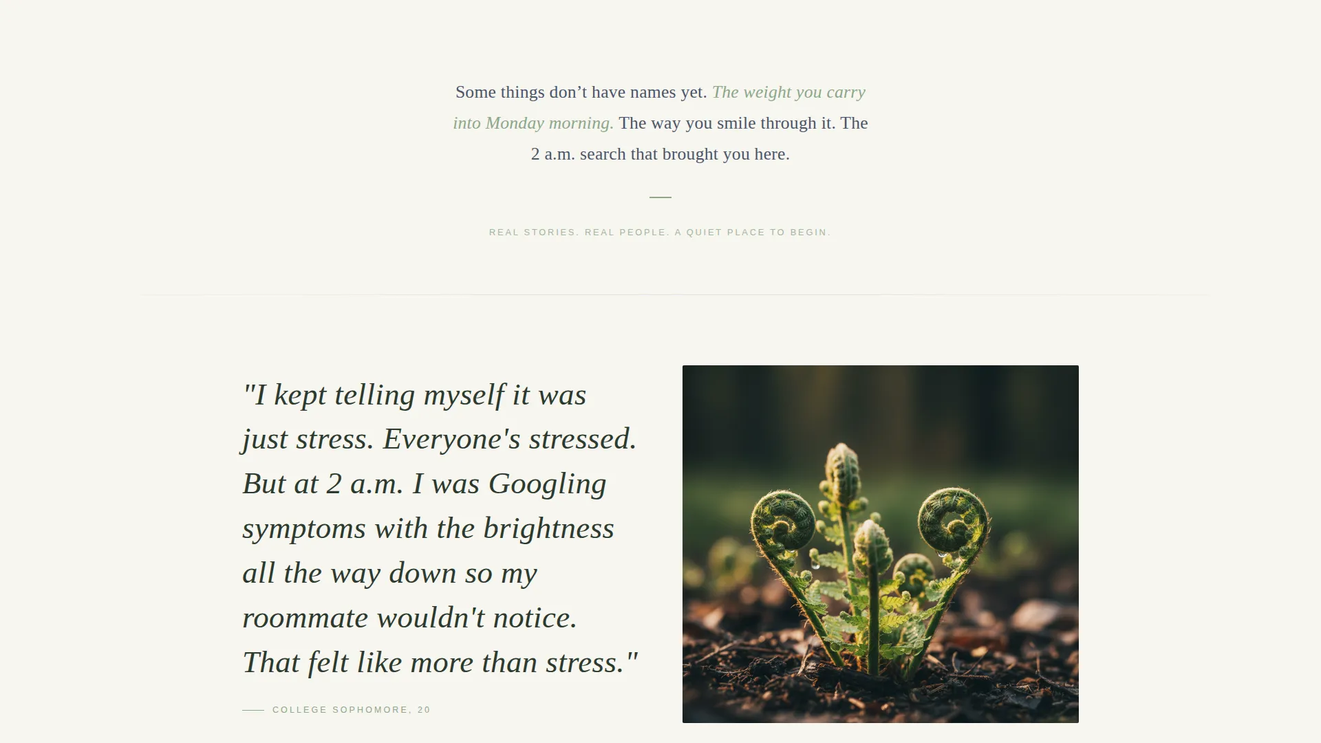
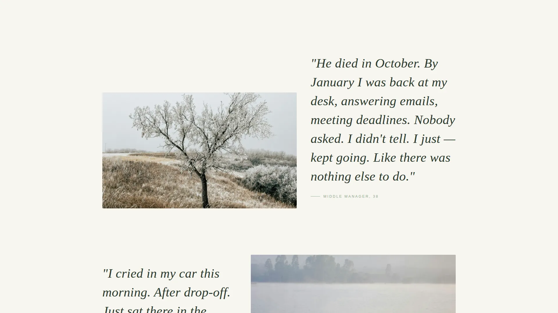
Three editorial spreads feature anonymous, first-person pull quotes set in large Fraunces serif type. Each quote is paired with a nature photograph that mirrors the emotional tone of the story. Stories are staggered asymmetrically, so the page feels like a gallery rather than a grid.
Stat Callout Blocks
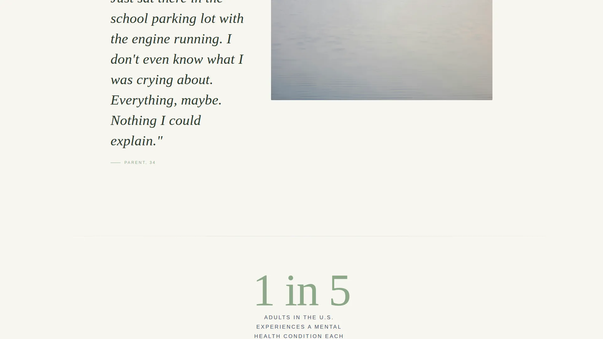
Between testimonial spreads, single-statistic callouts appear in lichen green. These ground the personal stories in broader context without introducing clinical coldness. The format is minimal: one number, one short phrase.
Scroll-Linked Fixed Call-to-Action Bar
After a visitor reaches 60 percent scroll depth, a fixed bottom bar fades in gently. It carries the primary call to action in golden-hour amber. The bar is persistent but quiet, appearing only after the page has done its emotional work.
Dual Navigation Paths
The primary call to action, "Find Your Next Step," routes visitors to a resource hub with therapist directories, crisis lines, and self-assessment tools. A secondary path, "Read More Stories," loops visitors deeper into the mosaic for those who are not yet ready to act.
Amber Interactive Accent System
Golden-hour amber (#D4A76A) is used exclusively for interactive moments: buttons, hover states, and the glow around a clicked story. Every other color in the palette stays soft and non-directive. The amber appears as a warm signal, not a command.
Page sections overview
| Section | Purpose |
|---|---|
| Hero Canopy Photo | Opens with a full-bleed overhead canopy image and a delayed tagline reveal |
| Testimonial Mosaic I | Anxiety story paired with a fern photograph in an asymmetric editorial spread |
| Stat Callout I | "1 in 5 adults" displayed in lichen green between the first and second testimonials |
| Testimonial Mosaic II | Grief story paired with a single winter oak in a mirrored layout |
| Stat Callout and call to action | Second statistic block with first appearance of the amber "Find Your Next Step" button |
| Testimonial Mosaic III | Burnout story paired with a morning fog lake photograph |
| Minimal Footer | Horizontal flow footer with essential links and no visual clutter |
Design & branding system
The visual identity follows a Nature-Inspired theme built around the Soft Mist color system. Every palette choice references a specific moment in the natural world, keeping the page emotionally consistent from top to footer.
- Morning fog gray (#D6DDE3), birch bark white (#F7F5F0), lichen green (#8BA888), and still-water slate (#4A5568) form the base palette
- Golden-hour amber (#D4A76A) is reserved strictly for interactive elements, creating a clear and warm visual signal without visual noise
- Typography uses Fraunces serif for pull quotes and DM Sans for body text and labels, pairing editorial warmth with quiet legibility
Mobile & speed optimization
The template is built mobile-first because the target visitor is often on a phone late at night, not sitting at a desktop. The layout adapts the mosaic flow for smaller screens without losing its editorial character.
- Images are lazy-loaded to reduce initial load time on mobile connections
- Scroll behavior uses native CSS scroll-behavior for smooth, dependency-light performance
- The fixed call-to-action bar is designed to sit cleanly at the bottom of a mobile screen without blocking content
How this template helps you convert
This template converts by making the visitor feel understood before it asks anything of them. The click feels less like seeking help and more like accepting an invitation that was always open.
- The three-testimonial sequence builds emotional recognition progressively, so the call to action appears only after the visitor has already seen their own experience reflected in someone else's words
- The dual-path structure removes decision paralysis by giving hesitant visitors a second option that keeps them engaged rather than bouncing
Other information about this template
This template is categorized under Community and Nonprofit, with a specific focus on the Mental Health Awareness niche. It is designed for English-language, United States-based campaigns.
- The template style is Editorial/Magazine, making it suitable for organizations that want a polished, publication-quality presence
- Animation is set to a medium level: the delayed text reveal and scroll-linked fade are intentional and unhurried, consistent with the campaign's tone
- The footer follows a minimal horizontal flow pattern with no visual clutter, keeping the exit experience as calm as the entry
Theme
Nature-Inspired
Creative direction
Testimonial Mosaic
Color system
Soft Mist
Style
Editorial/Magazine
Direction
Click-Through
Page Sections
Delayed Hero Text Reveal
Asymmetric Testimonial Mosaic
Lichen Green Stat Callouts
Scroll-linked Fixed Call to Action Bar
Dual Visitor Navigation Paths
Amber Interactive Accent System
Related questions
Does this template include a contact form or sign-up form?
Can I replace the testimonials with my organization's own stories?
What does the call-to-action button link to?
Is this template suitable for a crisis intervention campaign?
Can the color palette be adjusted to match our organization's brand?