Patient Portal Landing page Template
Breathe is a single-page allergist patient portal landing page built to turn symptomatic visitors into booked appointments. A guided three-step form opens the experience, followed by three diagnostic comparison tables that audit over-the-counter habits against clinical allergy care. The design uses a calm Organic Flow visual system with soft mist tones, hand-outlined icons, and scroll-reveal checkmarks.
by Rocket studio
Quick summary
Breathe is a lead-generation landing page for allergy clinics. It opens with a three-step symptom form, then walks visitors through three side-by-side comparison tables that expose the gap between guessing and getting a real diagnosis. Every design choice, from drifting pollen animations to chamomile gold call-to-action buttons, moves a hesitant visitor toward booking an appointment.
Who this template is for
This template is built for board-certified allergists and allergy clinics that want a patient-facing landing page designed to generate appointment requests and email leads. It fits practices treating a broad range of patients who have been managing symptoms on their own for too long.
- Parents of young children who experience food or skin reactions after meals or daycare
- Adults with chronic seasonal allergies who rely on over-the-counter antihistamines year after year
- Active adults such as runners and athletes who notice symptoms triggered by exercise or high-pollen environments
What problem this template solves
Most allergy sufferers spend years managing symptoms without ever getting a clinical diagnosis. They buy antihistamines, avoid certain foods by instinct, and carry vague anxiety about reactions they cannot explain. This template meets those visitors at that exact moment of frustration and gives them a structured way to understand what professional allergy care actually looks like.
- Visitors arrive without clarity on what is causing their symptoms or what a real diagnosis involves
- The cost and process of immunotherapy feels unknown compared to a familiar box of daily pills
- Anaphylaxis risk feels abstract until it is placed beside a written emergency action plan
What you get with this template
This template delivers a complete single-page layout structured around a diagnostic comparison framework. Every section is purposefully sequenced to build trust before asking for personal information.
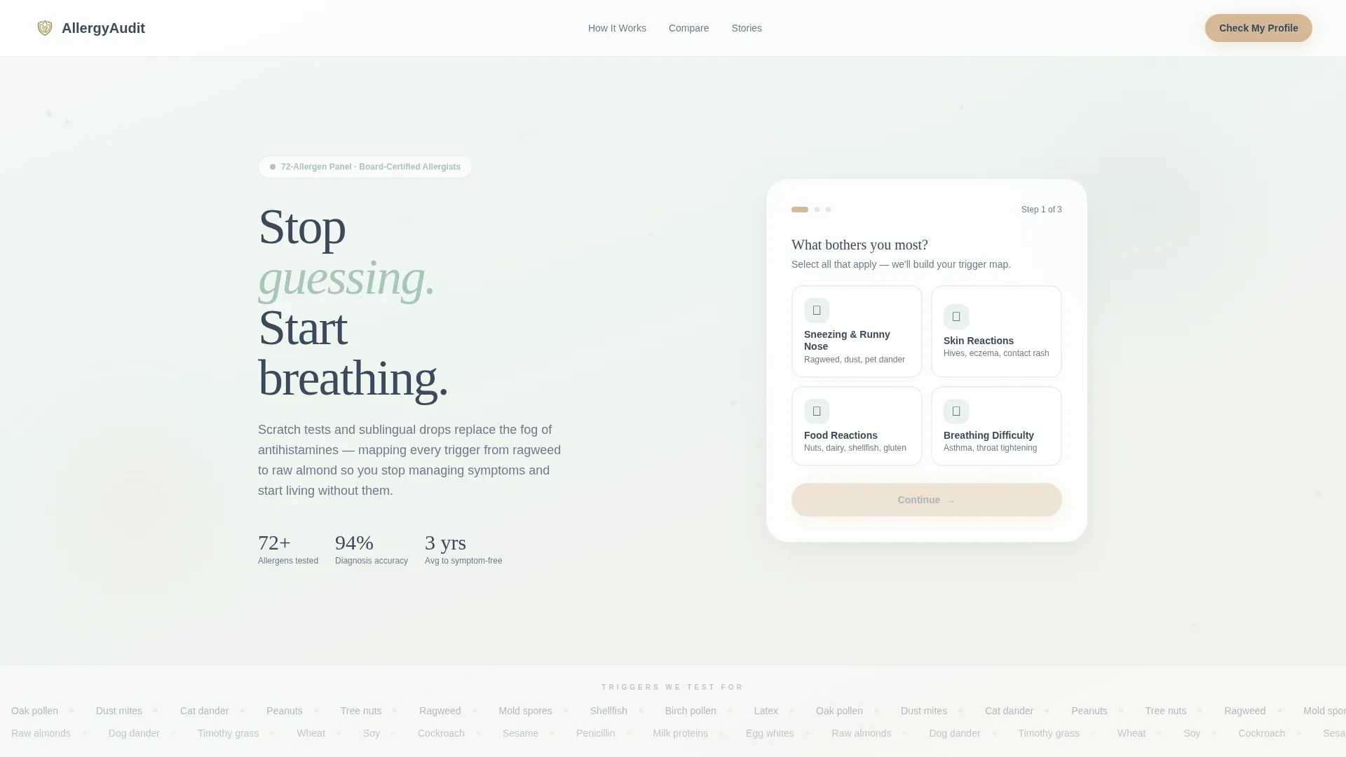
- A three-step multi-step form hero with illustrated symptom tap-targets and a softly animated pollen particle background
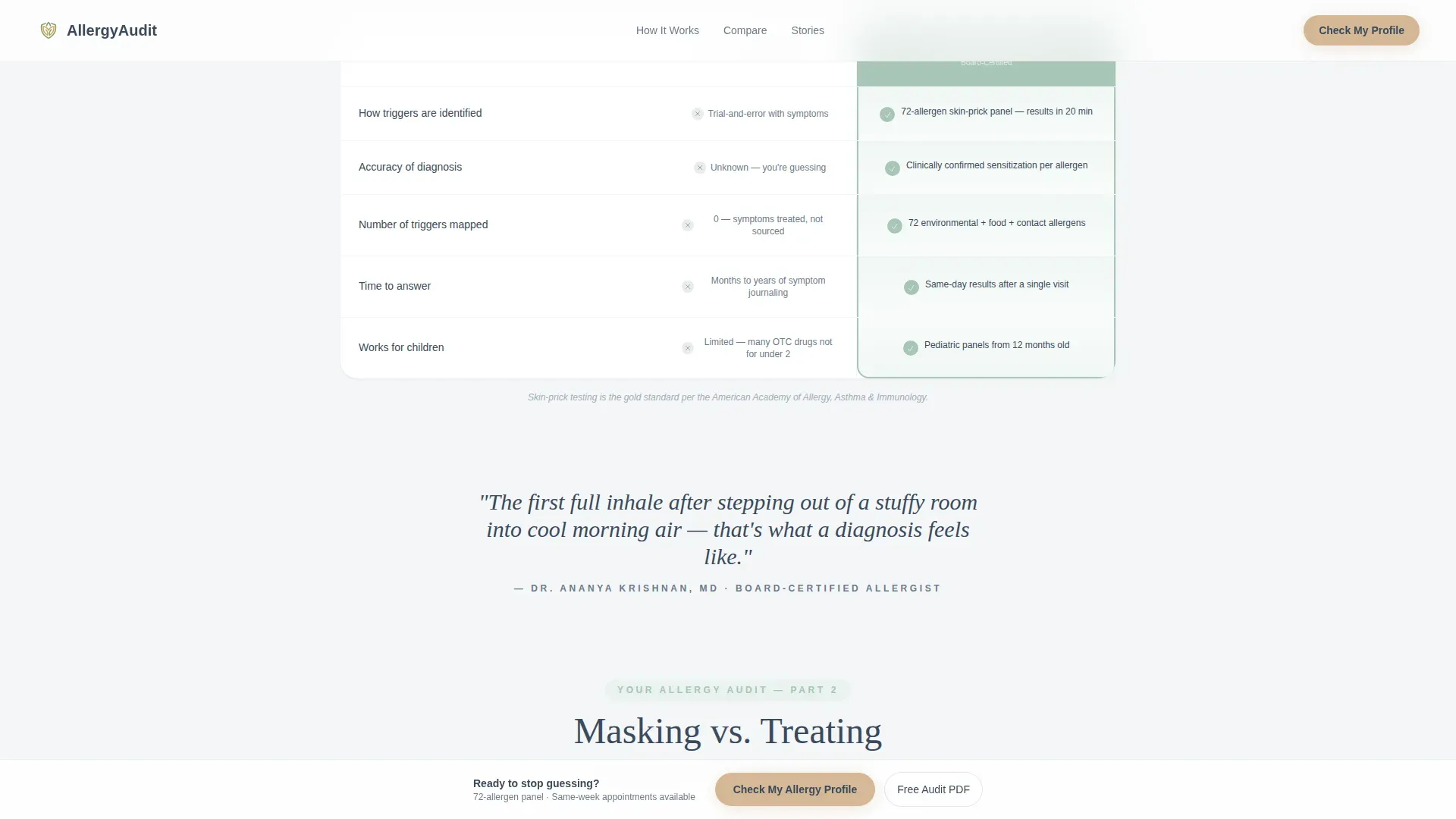
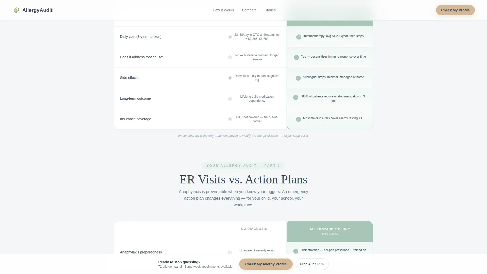
- Three scroll-driven comparison tables covering allergen identification, cost over time, and emergency preparedness
- A primary call-to-action flow plus a secondary email capture gate for a downloadable allergy audit PDF
Feature list
This landing page combines high-interactivity components with a calm visual tone. Each feature below is drawn directly from the template brief.
Three-Step Symptom Intake Form
The hero section opens with a guided form rather than a static headline. Step 1 presents illustrated tap-targets for sneezing, skin reactions, food reactions, and breathing difficulty. Step 2 uses a sliding scale to capture symptom duration from weeks to years. Step 3 collects name, zip code, and insurance provider before submitting.
Animated Pollen Particle Background
The form floats over a canvas-rendered background of drifting pollen particles. The particles are translucent gold and green and move slowly enough to feel like breath rather than motion graphics. This animation runs only in the hero section and is built using GSAP.
Scroll-Reveal Comparison Tables
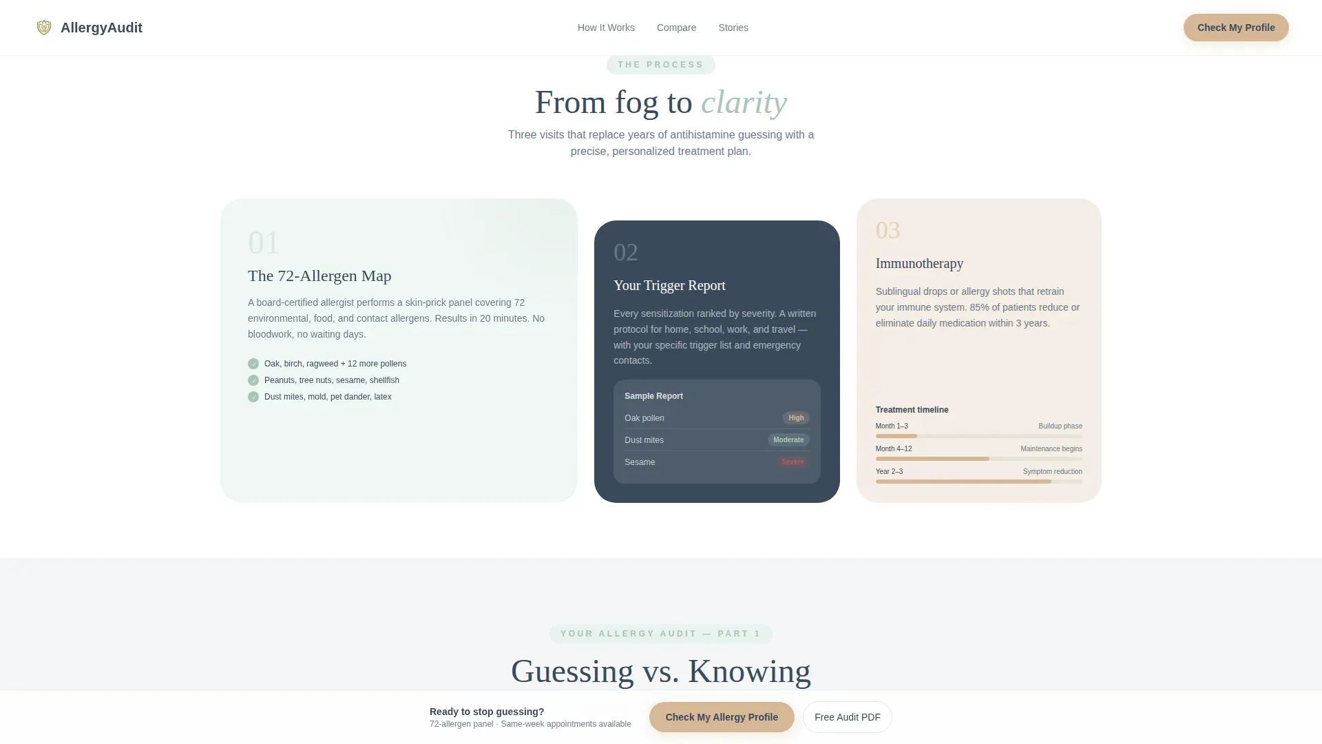
Three diagnostic comparison tables drive the scroll experience after the form. Each table audits a common patient habit against what a clinical allergist provides. Scroll-triggered checkmarks appear row by row, turning the page into a living gap analysis the further a visitor reads.
Sticky Bottom Call-to-Action Bar
After a visitor scrolls past the first comparison table, a sticky bar surfaces at the bottom of the screen. It presents the primary call to action, "Check My Allergy Profile," so the invitation to act is always visible without interrupting the reading flow.
PDF Lead Capture Gate
A secondary conversion point near the bottom of the page offers a downloadable allergy audit PDF. Visitors provide only an email address to receive it. This captures leads who are not yet ready to book an appointment but are actively researching their options.
GSAP Stagger Animations
Section content uses GSAP stagger animations to reveal elements as the visitor scrolls. Checkmarks, table rows, and text blocks animate in sequence, creating a sense of clinical precision that reinforces the template's authority without feeling cold.
Page sections overview
| Section | Purpose |
|---|---|
| Hero Form | Greet visitors with a guided three-step symptom intake form |
| Guessing versus. Knowing | Compare over-the-counter antihistamine habits to a 72-allergen skin-prick panel |
| Masking versus. Treating | Stack daily pill costs over three years against immunotherapy timelines |
| ER Visits versus. Action Plans | Place anaphylaxis risk beside epinephrine training and written emergency protocols |
| Social Proof + PDF Gate | Display patient testimonials and capture email leads with a downloadable audit |
| Footer | Single-row linear footer with clinic navigation and contact details |
Design & branding system
The visual identity follows an Organic Flow theme built around the Soft Mist color system. The palette is intentionally calm, evoking a windowsill herb garden rather than a sterile clinic waiting room. Typography pairs Fraunces serif headlines with DM Sans body text for a balance of warmth and readability.
- Background washes use morning fog white (#F4F6F8) and the palest eucalyptus green (#A8C5B8) tint; body text sits in river stone gray (#6B7B8D) and headlines in deep slate (#3A4A5C)
- Chamomile gold (#D4B896) appears exclusively on call-to-action surfaces, active form states, and progress indicators, making every interactive moment feel warm rather than clinical
- Icons and illustrated tap-targets are drawn in a loose, hand-outlined style that feels organic rather than medical
Mobile & speed optimization
The template is built mobile-first, reflecting the reality that its primary audience searches for allergy care on their phones during busy moments. The layout scales cleanly from small screens upward, and interactive components are touch-friendly by design.
- The multi-step form uses large illustrated tap-targets sized for thumb interaction on small screens
- Static sections such as the comparison tables and footer use server components, while the form and animations are handled client-side to keep the page responsive
- The sticky call-to-action bar is particularly useful on mobile, keeping the primary action reachable without requiring a scroll back to the top
How this template helps you convert
This template is engineered around a give-before-you-ask lead generation philosophy. The form earns trust by making visitors feel heard before a single personal detail is requested.
- The symptom selector and duration scale in steps 1 and 2 validate the visitor's experience, lowering resistance before step 3 asks for contact information.
- Each comparison table adds clinical authority row by row, so by the time a visitor reaches the call-to-action button, the appointment request feels like an informed decision rather than a cold inquiry.
- The PDF audit gate provides a second conversion path for visitors still in research mode, capturing their email while delivering immediate value.
Other information about this template
This template is part of a Health and Medical category collection designed specifically for allergist patient portals. It is built for the Allergist Website subcategory and reflects the specific intent of converting symptomatic visitors into clinical leads at a local or regional practice level.
- The template style is Comparison Table, making it well suited for any clinic that wants to position diagnostic testing against self-managed symptom care
- The Checklist and Audit creative direction is intentional: each table row functions as a scored gap in the visitor's current approach, building urgency without pressure tactics
- The header concept is a Multi-Step Form, chosen specifically because it delays the personal information request until the visitor has already engaged with two non-threatening steps
- The landing page direction is Lead Generation, with two distinct conversion paths: a direct appointment request and an email-gated PDF download
Theme
Organic Flow
Creative direction
Checklist & Audit
Color system
Soft Mist
Style
Comparison Table
Direction
Lead Generation
Page Sections
Three-step Symptom Intake Form
Animated Pollen Particle Background
Scroll-reveal Comparison Tables
Sticky Bottom Call-to-action Bar
Email-gated PDF Lead Capture
Organic Flow Visual System
Related questions
Can I edit the comparison table content to match my clinic's specific services?
What happens when a visitor completes the three-step form?
Is the PDF allergy audit document included in the template?
Does the sticky call-to-action bar appear on mobile devices?
Can this landing page work for a clinic treating both adult and pediatric allergy patients?



