Asthma Telehealth Landing Page Template
Breathe is a single-page asthma telehealth landing page built for direct-to-patient pulmonology services. It guides visitors from a warm physician portrait through a five-step visit walkthrough, an honest comparison table, and a gated action-plan resource, closing with a low-friction insurance-friendly booking prompt. The design feels open and calm, not clinical or cold.
by Rocket studio
Quick summary
Breathe is a content-led asthma telehealth landing page. A portrait-centered physician hero builds immediate trust. Visitors scroll through a five-step visit guide, review a side-by-side care comparison table, and download a free asthma action plan PDF before being invited to book a first visit at no cost with most insurance.
Who this template is for
This template is built for pulmonology practices, asthma telehealth startups, and direct-to-patient respiratory care services that need to earn trust before asking for a booking. It works especially well for teams whose patients are hard to reach through traditional clinic scheduling.
- Night-shift nurses and shift workers who cannot attend daytime appointments
- Parents managing a child's asthma flare-ups between school pickups and errands
- Remote workers in wildfire-smoke regions whose rescue inhaler supply is running low
What problem this template solves
Most asthma care pages push the booking form too early. Patients with respiratory conditions arrive anxious and skeptical. They need to understand the visit process, trust the provider, and see how the service compares to alternatives before they commit.
- Patients don't know what a telehealth pulmonology visit actually involves
- The cost and wait-time gap between telehealth, an emergency room visit, and an in-person specialist is invisible without a clear comparison
- Visitors leave before converting because there is no low-risk first step to take
What you get with this template
You get a fully structured single-page layout with every section needed to move an asthma patient from first impression to booked appointment. The page is designed around a resource-first conversion path, not a hard sell.
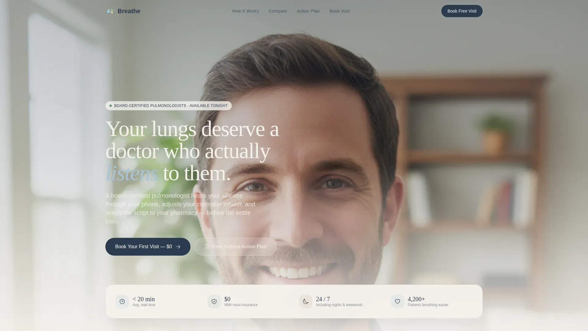
- A portrait-centered hero section with a physician photo, floating stats card, and a minimal hamburger navigation menu
- A five-step "How It Works" guide with scroll-reveal cards and an inhale-exhale animation between steps
- A three-column comparison table embedded mid-page, a gated PDF resource form, a sample-visit video link, and an insurance-friendly final call to action
Feature list
This template includes a focused set of components designed for asthma telehealth conversion.
Portrait-Centered Physician Hero
The hero leads with a warmly lit shoulders-up physician photograph set against a creamy bokeh living room background. A single reassuring headline appears beneath the portrait. A floating stats card displays patient metrics. The hamburger navigation stays minimal and out of the way.
Five-Step Visit Walkthrough
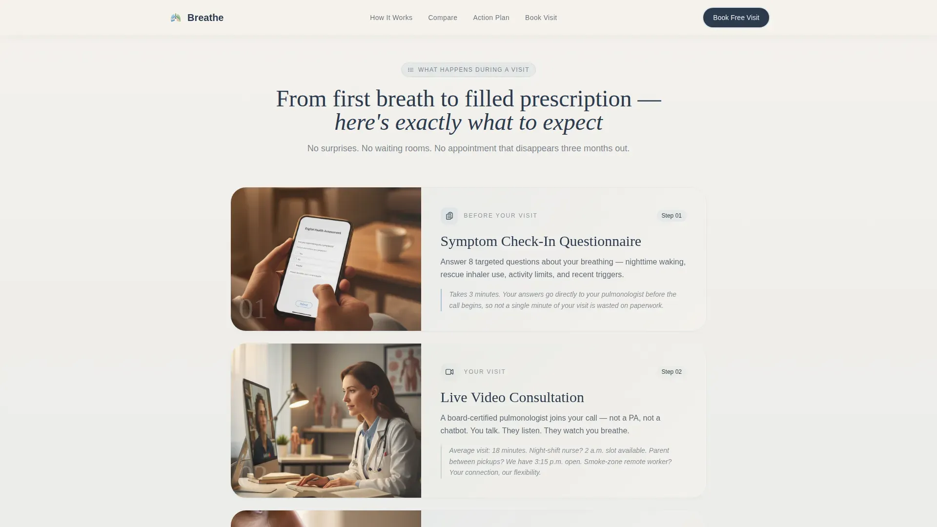
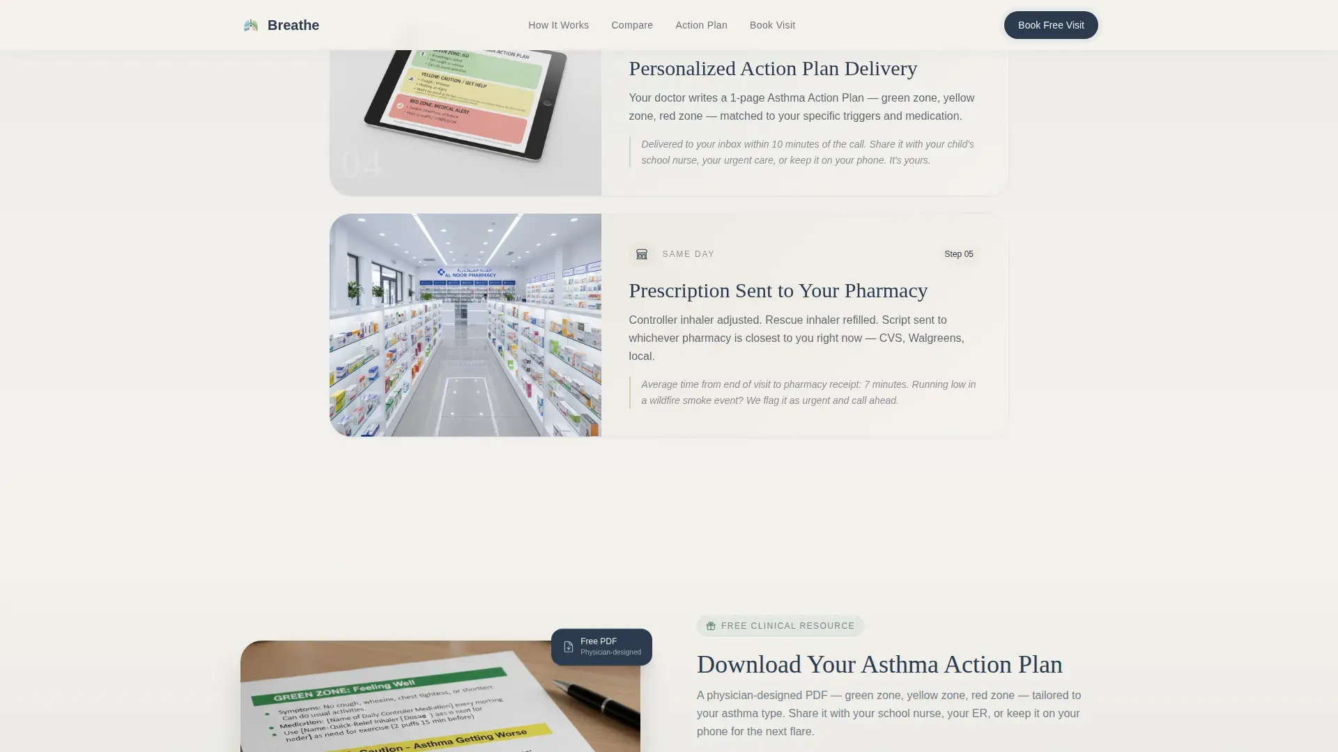
The "How It Works" section presents each consultation step as a horizontal scroll-reveal card. Steps cover the symptom check-in questionnaire, live video consultation, phone spirometry for lung-function assessment, personalized action-plan delivery, and prescription dispatch to the patient's pharmacy. Each card animates with a subtle inhale-exhale keyframe on scroll entry.
Embedded Comparison Table
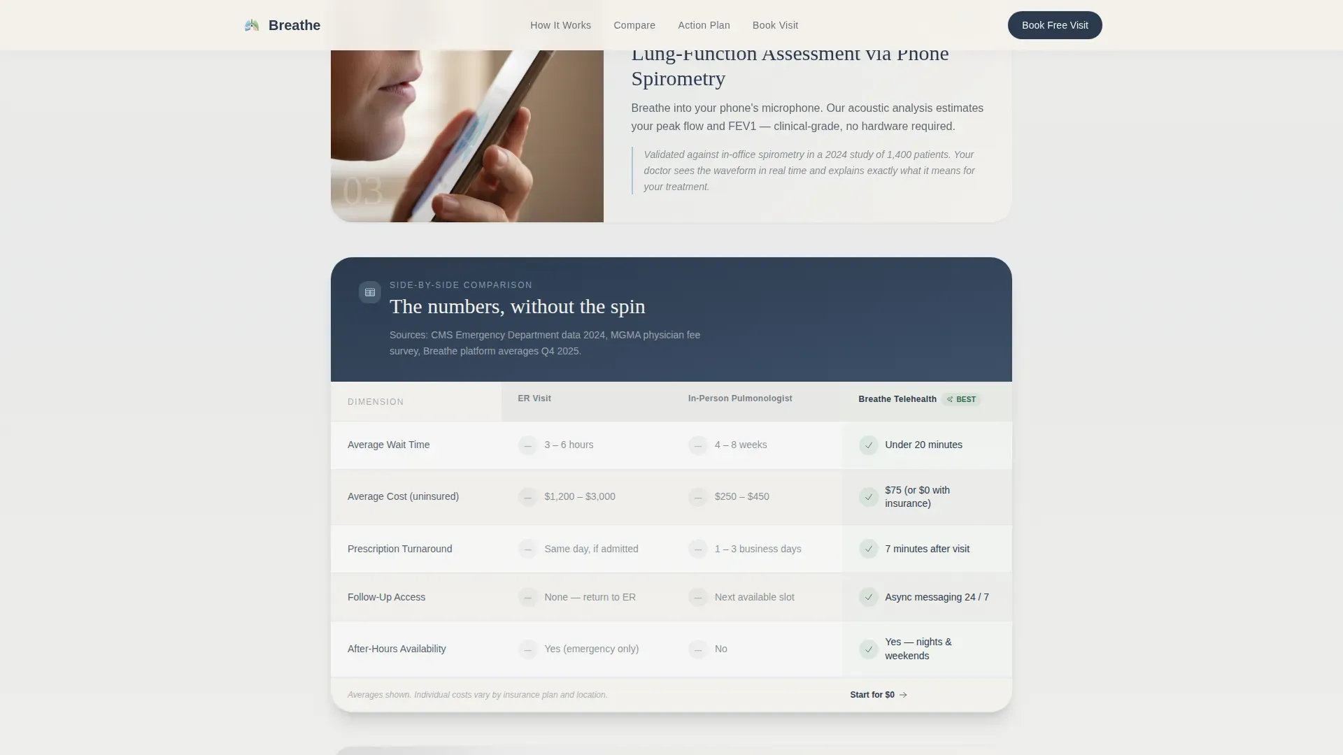
A three-column table appears between steps three and four of the walkthrough. It contrasts an emergency room visit, an in-person pulmonologist, and the telehealth service across five dimensions: wait time, average cost, prescription turnaround, follow-up access, and after-hours availability. Green check badges mark the telehealth column. The table presents the data calmly, without attacking alternatives.
Gated Asthma Action Plan Form
A two-field form gates a free physician-designed PDF. Visitors enter their first name and select their asthma type from four radio-button options: intermittent, mild persistent, moderate, or severe. Once the PDF is delivered, an inline prompt invites the visitor to book their first visit.
Resource-to-Booking Conversion Path
After the PDF delivery, an inline booking prompt reads "Book Your First Visit, $0 With Most Insurance." A secondary call-to-action link labeled "Watch a Sample Visit" connects to a two-minute video walkthrough. The flow moves from education to commitment without pressure.
Organic Flow Design System
The layout uses soft gradient washes between sections rather than hard dividing lines. Cards and badges alternate between eucalyptus mist and morning-sky blue. Deep inhaler-navy is reserved for text and call-to-action buttons. Fraunces serif headlines and DM Sans body copy create a calm, credible reading experience.
Page sections overview
| Section | Purpose |
|---|---|
| Physician hero portrait | Establish immediate human trust with a physician face and a single reassuring headline |
| Floating stats card | Surface patient metric highlights directly in the hero without disrupting the portrait focus |
| Hamburger navigation menu | Keep the header clean so nothing competes with the physician photograph |
| Five-step visit guide | Walk visitors through every moment of the consultation from symptom check-in to prescription dispatch |
| Comparison table embed | Let wait time, cost, and access data make the case for telehealth without editorial commentary |
| Action plan PDF gate | Deliver clinical value upfront through a free resource before any booking commitment is requested |
| Sample visit video link | Offer a no-commitment preview of what a real consultation looks like |
| Insurance booking close | Convert educated visitors with a low-friction "first visit free with most insurance" prompt |
| Single-row footer | Provide essential links and legal context in a clean linear layout |
Design & branding system
The visual identity follows an Organic Flow theme built around the Cloud Canvas color system. Every color choice and typographic decision reinforces the feeling of calm, clean air rather than a sterile clinic.
- Colors: soft atmospheric white (#F4F1EC) and warm stone (#D6C9B6) for backgrounds; morning-sky blue (#A8C4D8) and eucalyptus mist (#C5D5CB) for cards, badges, and progress indicators; deep inhaler-navy (#2B3A4E) reserved exclusively for text and call-to-action elements
- Typography: Fraunces serif for headlines to add warmth and authority; DM Sans for body copy to maintain readability and modern clarity
- Sections flow together through gentle gradient washes, with no hard ruled lines between content blocks
Mobile & speed optimization
This template is built with a mobile-first layout priority. The target audience includes patients who need care from a phone during a night shift, a school parking lot, or a wildfire evacuation.
- Scroll-reveal animations use IntersectionObserver so cards only animate when they enter the viewport, keeping interactions smooth on mobile devices
- The form component and scroll animations are handled as client-side components, while static content sections are built as server components to reduce unnecessary loading overhead
- All five step cards stack cleanly on narrow screens, and the comparison table is designed to remain readable at phone widths
How this template helps you convert
This template is structured around the idea that trust must come before commitment, especially in healthcare. The layout earns the visitor's confidence before asking for anything.
- The physician portrait and stats card establish credibility in the first scroll, so visitors feel they are dealing with a real specialist, not a generic telehealth platform.
- The five-step walkthrough removes uncertainty about the visit process, which is often the main reason patients abandon telehealth sign-up flows.
- The free PDF resource gives visitors something genuinely useful before any booking prompt appears, making the final "Book Your First Visit" call to action feel like a natural next step rather than a sales push.
Other information about this template
This template is a strong fit for any asthma telehealth service that wants to position specialist access as simple, affordable, and available after hours. A few additional notes for teams evaluating this layout:
- The comparison table is designed to be editable, so services can update the wait-time and cost figures to reflect their own real data
- The footer follows a Pattern 1 Linear Single-Row layout, keeping the bottom of the page clean and professional without a heavy multi-column footer
- The page supports a US English localization context with USD pricing references and US insurance language built into the copy structure
- The template is categorized under Health and Medical, specifically the Asthma Care subcategory, and is well suited for direct-to-patient pulmonology, respiratory SaaS platforms, and asthma specialty clinics moving services online
Theme
Organic Flow
Creative direction
Step-by-Step Guide
Color system
Cloud Canvas
Style
Comparison Table
Direction
Content/Resource
Page Sections
Portrait-centered Physician Hero
Five-step Visit Walkthrough
Embedded Three-column Comparison Table
Gated Asthma Action Plan Resource
Resource-to-booking Conversion Flow
Organic Flow Visual Design System
Related questions
Can I update the physician photo and stats in the hero section?
How does the comparison table work within the page layout?
Is the PDF resource form connected to an email delivery system?
Does the template work for both pediatric and adult asthma patients?
What footer layout is included with this template?



