COPD Care FAQ Website Template
Breathe is a hub-and-spoke COPD landing page template built for digital therapy apps. It opens with an animated metrics dashboard, then walks anxious patients through five plain-language FAQ sections that dissolve fear one honest answer at a time. Every section ends with a single call-to-action button, making the path from first visit to free session as clear as a full breath of clean mountain air.
by Rocket studio
Quick summary
Breathe is a single-page, anchor-nav landing page template for a COPD digital therapy app. It pairs an evidence-first header with five FAQ-driven spoke sections, guiding recently diagnosed patients and long-term sufferers from fear to confidence. The Alpine Fresh color system and animated counters build clinical trust while keeping the experience calm and approachable.
Who this template is for
This template is built for digital health teams and developers launching a COPD therapy app that needs to earn trust before asking for a sign-up. It speaks directly to patients and the people who care for them.
- Recently diagnosed adults searching for answers at 2 a.m., unsure what their rescue inhaler cannot fix
- Long-term chronic obstructive pulmonary disease (COPD) patients whose exercise tolerance has quietly narrowed over time
- Caregiving spouses and family members who monitor a loved one's breathing and need reassurance that a digital tool is safe and credible
What problem this template solves
COPD patients arrive at a landing page already anxious. Generic hero images and vague benefit statements push them away. This template replaces that pattern with a scroll built entirely around the questions patients actually type into search engines.
- Fear and mistrust stop newly diagnosed patients from trying digital therapy tools, even when those tools could help them
- Patients worry about safety, medication conflicts, and what happens if their condition worsens mid-session
- Standard landing pages bury pricing and friction behind email capture forms, creating resistance instead of confidence
What you get with this template
You get a complete, ready-to-customize landing page structure with every section planned, sequenced, and designed to move a cautious patient toward a single low-friction action.
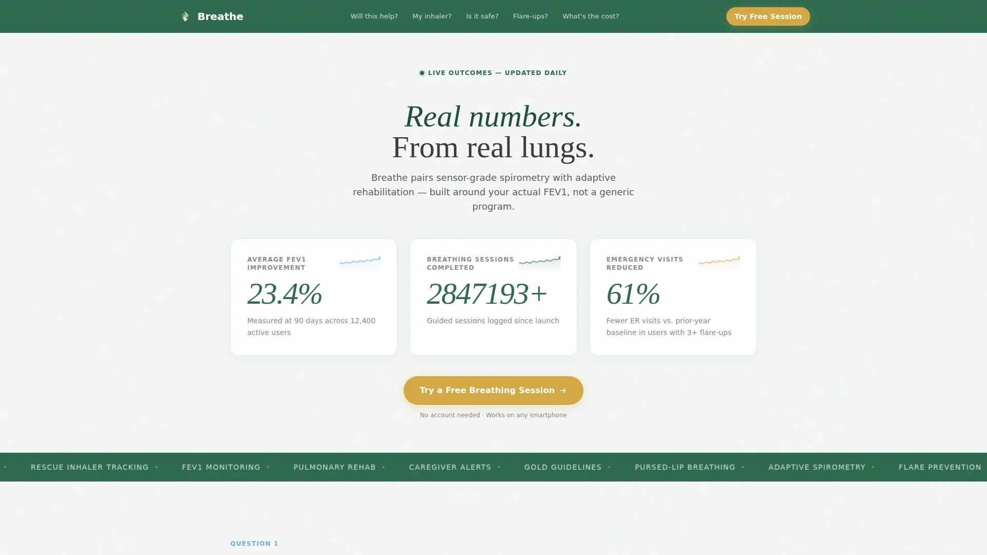
- An animated metrics dashboard header with three live counters and sparkline trend indicators, all set against a frost-white field
- Five FAQ-driven spoke sections, each opening with a plain-language patient question and closing with a meadow-gold call-to-action button
- A sticky mobile call-to-action bar that follows the user after the first scroll, keeping the free session link one thumb-reach away
Feature list
This template includes a focused set of interactive and structural components drawn directly from the project brief.
Animated Metrics Dashboard Header
The header skips lifestyle photography entirely. Instead, three animated counters rise in real time against a frost-white background, each paired with a sky-blue sparkline showing an upward trend. The numbers do the persuading before a single claim is read.
Anchor Navigation Bar
A persistent evergreen navigation bar lists the five FAQ section titles as plain-language anchor links. Visitors can jump directly to the question most relevant to their concern, reducing scroll fatigue and keeping the experience patient-centered.
FAQ-Driven Spoke Sections
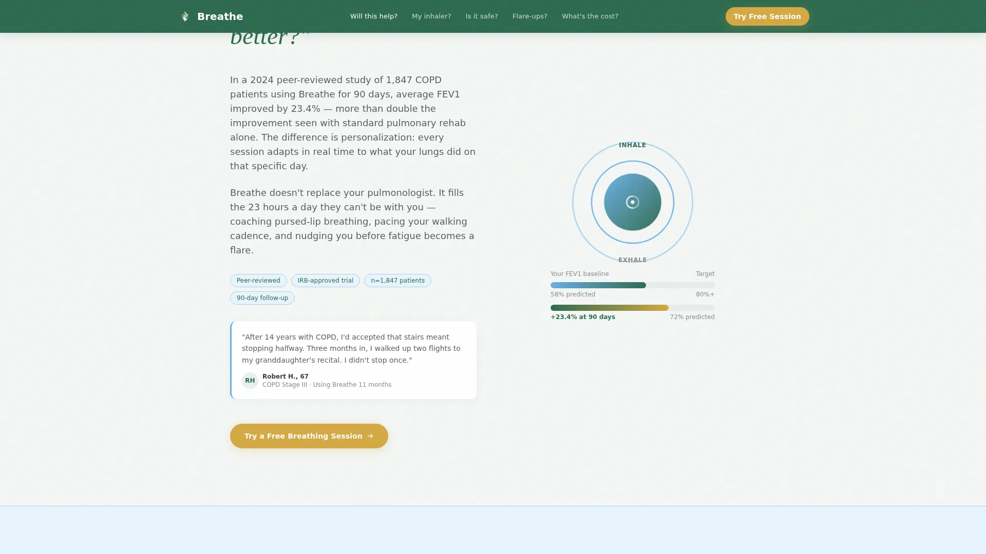
Each of the five spoke sections opens with an oversized patient question in Fraunces display type, answers it with a short paragraph, supports the answer with a single animation or diagram, and closes with a named patient micro-testimonial that includes age and COPD stage.
Meadow-Gold Call-to-Action Buttons
Every spoke section ends with the same high-visibility button in meadow gold (#D4A843). The consistent placement and single destination remove decision fatigue and funnel every motivated visitor toward the app's free onboarding session.
Sticky Mobile Call-to-Action Bar
After the first scroll on a mobile device, a fixed bottom bar appears with the primary call-to-action button. It stays visible throughout the session so the exit point is always accessible without scrolling back to the top.
Named Patient Micro-Testimonials
Social proof appears in every spoke section, not just at the bottom of the page. Each testimonial names the patient, their age, and their COPD stage, making the evidence feel specific and credible rather than generic.
Page sections overview
| Section | Purpose |
|---|---|
| Header Metrics Dashboard | Opens with animated FEV1, session, and emergency-visit counters to establish evidence-first trust |
| Anchor Nav Bar | Lets visitors jump to any FAQ spoke from the top of the page |
| Will This Help? | Answers the core efficacy question with FEV1 improvement evidence and a patient testimonial |
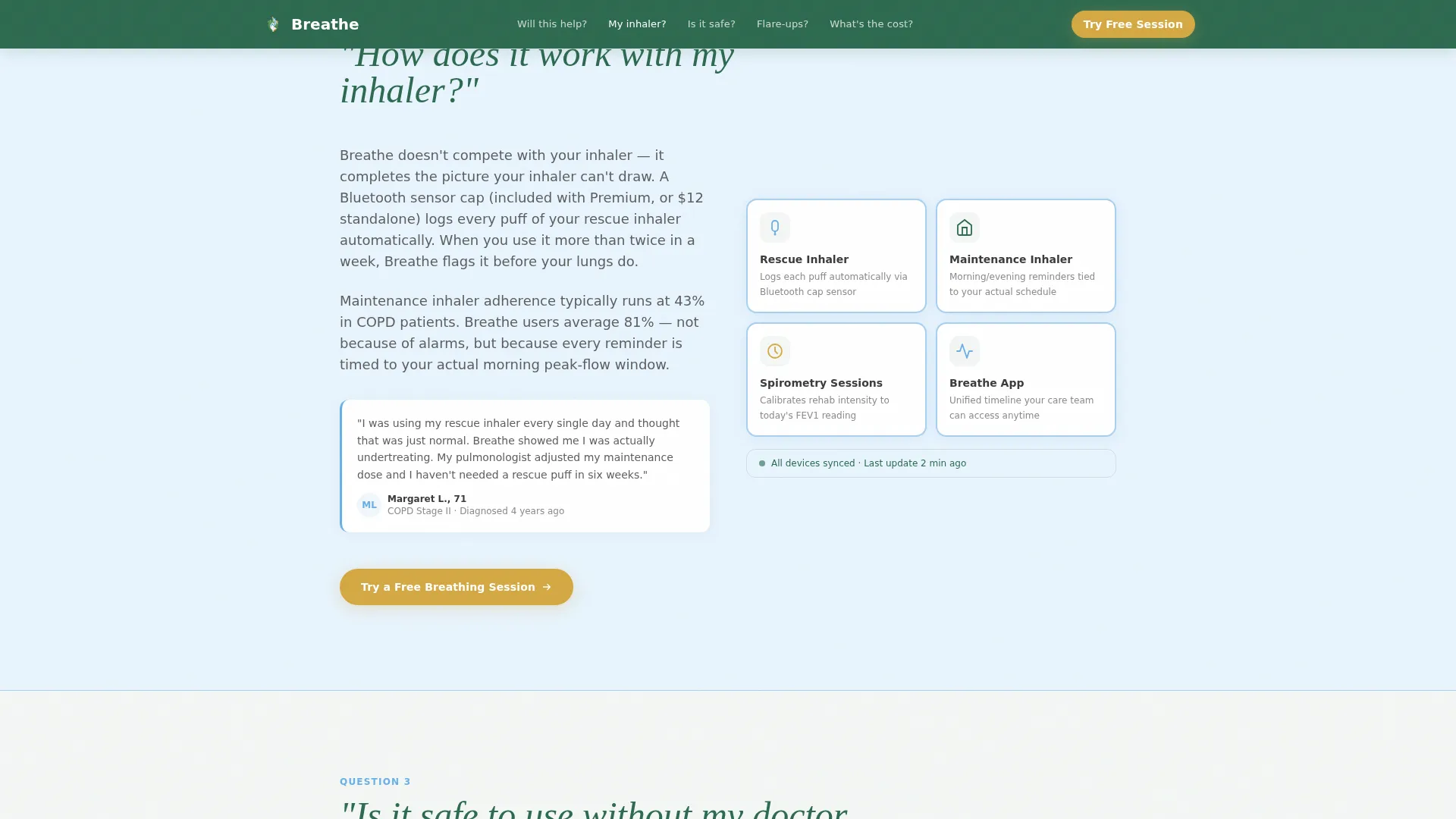
| Inhaler Compatibility | Explains how the app works alongside existing medication using a spirometry diagram |
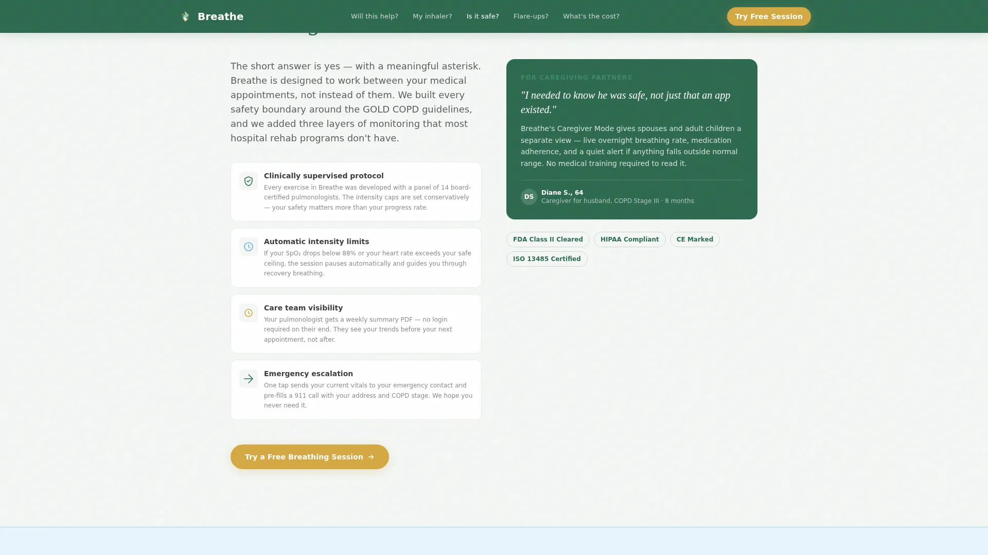
| Safety Without Doctor | Addresses clinical oversight concerns with a clear explainer and named testimonial |
| Flare-Up Response | Shows the flare detection flow and reassures patients about what happens during an episode |
| Pricing Transparency | Presents cost information openly with no hidden friction or email gate |
| Linear Footer | Provides a single-row footer with essential links |
Design & branding system
The Alpine Fresh color system is the visual spine of this template. It blends clinical clarity with the calming quality of a high-altitude natural setting, creating a page that feels trustworthy without feeling cold or institutional.
- Frost white (#F4F7F5) dominates all backgrounds with generous whitespace that suggests open air; evergreen (#2D6A4F) anchors the navigation bar and primary headings; sky blue (#6AAFE6) fills section dividers, sparklines, and illustration washes
- Meadow gold (#D4A843) is reserved exclusively for active states and call-to-action surfaces, ensuring the eye is drawn to the conversion point in every section
- Typography pairs DM Sans for body text with Fraunces display for the FAQ question headlines, giving each spoke section a warm, human anchor at the top
Mobile & speed optimization
The template is designed mobile-first, reflecting the reality that most patients search for COPD support on a phone, often late at night. Every layout decision prioritizes thumb-friendly navigation and readable type at small sizes.
- Animated counters and scroll-triggered reveals are built as client components, while static structural sections use server components to keep initial load light
- The sticky mobile call-to-action bar activates after the first scroll, ensuring the free session button is always one tap away without interfering with reading
How this template helps you convert
The conversion strategy is built on objection removal rather than pressure. By the time a visitor reaches the final spoke section, every major concern has been answered directly and honestly.
- The FAQ structure mirrors the exact questions patients type into search engines at their most anxious moments, so the page immediately feels relevant and trustworthy rather than promotional
- The single, repeated call-to-action button with no form, no email capture, and no secondary offers means every click goes to the same place, reducing decision fatigue and making the next step feel natural
Other information about this template
This template is part of a broader Health and Medical category collection focused on digital therapy and condition-specific care. A few additional details are worth noting for teams evaluating it.
- The template is localized for English-language audiences using USD pricing and United States date formatting
- Animation intensity is set to high by default, covering counter animations, sparkline draws, and scroll-triggered section reveals; development teams can adjust these settings during build
- The footer follows a linear single-row pattern, keeping the page exit clean and uncluttered
- The hub-and-spoke structure with anchor navigation makes this template suitable for any condition-specific digital health app where patient trust must be built before conversion is attempted
Theme
Healing Space
Creative direction
FAQ-Driven
Color system
Alpine Fresh
Style
Hub & Spoke (Anchor Nav)
Direction
Click-Through
Page Sections
Animated Evidence-first Header
Five FAQ Spoke Sections
Persistent Anchor Navigation
Single Repeated Call-to-action Design
Sticky Mobile Call-to-action Bar
Named Patient Micro-testimonials
Related questions
Can I customize the FAQ questions for a different condition?
Does this template include the actual therapy app or its content?
How does the animated metrics dashboard work?
Is there a form or email capture anywhere on this page?
Who is this landing page template best suited for?



