Drive-Through Business Pricing Website Template
Breeze is a single-page drive-through café landing page built around a scroll-reveal layout and a playful geometric visual identity. It guides visitors from a simple base order to a fully loaded combo through animated card flips, side-by-side upgrade cards, and a sticky upsell bar. The template is warm, fast-moving, and designed to earn the upgrade before naming the price.
by Rocket studio
Quick summary
Breeze is a drive-through café landing page that turns a quick morning stop into a delightful upsell journey. The layout stacks sections like overlapping postcards, each one nudging visitors toward the loaded combo. Ink-and-paper tones, coral accents, and animated illustrations make the page feel handcrafted and inviting from the very first scroll.
Who this template is for
This template suits independent café owners and small food-and-beverage operators running a drive-through or hatch-style service. It works especially well when the goal is to increase average order value without pressure-selling.
- Drive-through café and coffee hatch owners who want a visually engaging landing page
- Breakfast and brunch spots offering combo upgrades alongside their core drinks menu
- Small food businesses looking to capture loyalty sign-ups alongside their online ordering flow
What problem this template solves
Most drive-through cafés rely on a static menu board and hope regulars self-upgrade. A flat landing page with a price list does nothing to make the loaded option feel worth it. Breeze solves the gap between showing what you have and making visitors genuinely want the better version.
- Visitors see the upgrade before the price, so the extra cost feels small rather than surprising
- The animated reveal keeps attention moving forward instead of bouncing at the first scroll
- A two-field loyalty capture turns a casual visit into a returnable customer relationship
What you get with this template
You get a complete, single-page landing page layout built for a drive-through café. Every section is purposeful, and the visual flow is designed to escalate from simple to indulgent naturally.
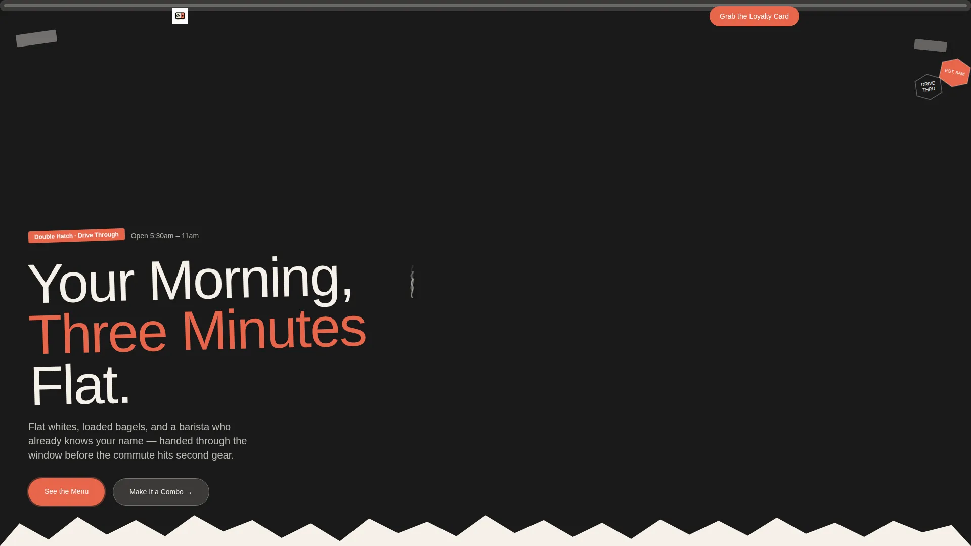
- A full-bleed scrapbook-style hero section with headline, geometric border frame, and hand-drawn detail
- Scroll-triggered section reveals that overlap like stacked postcards, with micro-burst animations for coffee bean, bagel assembly, and combo confetti
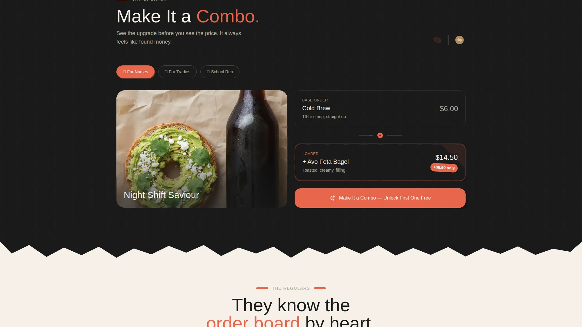
- Side-by-side upgrade cards with a coral price-difference badge and a sticky bottom bar that updates as visitors scroll past add-on sections
Feature list
This template ships with a focused set of visual and structural tools built specifically for a drive-through café upsell flow.
Full-Bleed Scrapbook Hero
The header fills the screen with a passenger-window café shot: shallow depth of field, morning steam, tattooed barista arm, and geometric brand stickers on the ledge. A hand-drawn geometric border frames the image, and the headline is set in a chunky tilted sans-serif that reads "Your Morning, Three Minutes Flat."
Scroll-Reveal Postcard Layout
Each section slides in at a slightly unexpected angle and overlaps the previous one, mimicking a stack of postcards. The effect keeps the page feeling alive and propels visitors through the upsell sequence without any hard sell.
Animated Combo Reveal Cards
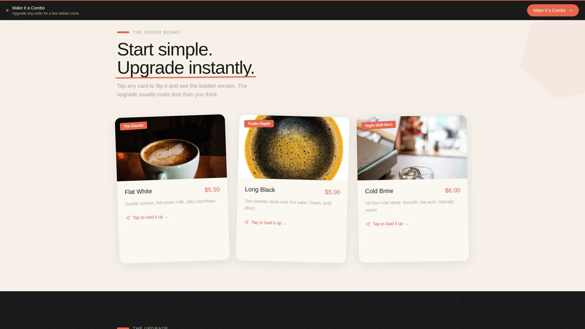
A basic coffee order appears first. A playful card flip then reveals the loaded version: extra shot, oat milk, and a toasted bagel. Micro-burst illustrations animate in quick sequence, a spinning coffee bean, a self-assembling bagel, and geometric confetti when the combo is unlocked.
Sticky Upsell Bottom Bar
A fixed bar sits at the bottom of the viewport and updates its content as visitors scroll past each add-on section. The primary call-to-action button, labeled "Make It a Combo," stays visible throughout, reducing friction at the point of decision.
Side-by-Side Upgrade Comparison
Tap a base drink and two cards appear: the regular order on one side and the loaded version on the other. A coral price-difference badge shows exactly how much more the upgrade costs, making the decision feel easy rather than expensive.
Loyalty Card Capture Form
A secondary call-to-action, labeled "Grab the Loyalty Card," collects an email address and phone number in two fields. Completing the form unlocks a first-visit bonus combo, giving visitors a clear, immediate reward for signing up.
Page sections overview
| Section | Purpose |
|---|---|
| Full-Bleed Hero | Opens the page with a car-window café shot and the headline |
| Headline & Badge | Sets the "three minutes flat" tone and brand promise |
| Base Order Reveal | Shows the simple starting order to anchor the upsell |
| Combo Card Flip | Animates the upgrade from basic to loaded version |
| Upgrade Comparison Cards | Presents regular versus loaded with a coral price badge |
| Geometric Confetti Burst | Celebrates the combo reveal with micro-burst illustration |
| Loyalty Capture Form | Collects email and phone for the first-visit bonus combo |
| Sticky Upsell Bar | Keeps "Make It a Combo" visible throughout the scroll |
Design & branding system
The visual identity is built on an Ink and Paper color system that feels like a zine screen-printed in a garage. Every color choice is deliberate: dark ink for authority, warm stock for comfort, and a single coral pop where the eye needs directing.
- Color palette: newsprint black (#1A1A1A), warm unbleached stock (#F5F0E8), pencil-sketch gray (#B0A999), and rubber-stamp coral (#E8654A) used only on buttons, badges, and callout shapes
- Typography: chunky, slightly tilted sans-serif headline paired with bold ink body text for high contrast and fast readability
- Backgrounds stack in torn-paper layers of cream over off-white, with hand-drawn geometric borders and illustration details that give the page a tactile, hand-touched quality
Mobile & speed optimization
The template is built with a mobile-first scroll experience in mind. The sticky upsell bar, large tap targets on the upgrade cards, and two-field loyalty form all work naturally on a small screen.
- Scroll-reveal animations are timed for thumb-scroll pacing, so each postcard overlap lands cleanly on a phone
- The two-field loyalty form is compact and fast to complete on a mobile keyboard
- Large, coral call-to-action buttons remain easy to tap throughout the full page length
How this template helps you convert
The page is structured around a single principle: show the upgrade before naming the price, so the extra dollar feels like found money rather than a loss.
- The animated combo reveal builds desire first, then the side-by-side card introduces the price difference only after the loaded version already looks irresistible.
- The sticky "Make It a Combo" bar stays in view at all times, so there is never a moment when the visitor has to scroll back up to act.
- The loyalty capture form closes the loop by converting a one-time visitor into a returnable customer through a bonus combo reward tied to sign-up.
Other information about this template
Breeze sits within the Retail and E-Commerce category, specifically targeting the Drive-Through Business and Drive-Through Bakery niche. The template style is Scroll Reveal with a Progressive disclosure structure, meaning content unfolds in sequence rather than presenting everything at once. The creative direction is Surprise and Delight, which aligns with the playful geometric theme and the unexpected card-flip animation moments. The intersection match score for this template against its target niche is 9 out of 10.
- Template category: Retail and E-Commerce, Drive-Through Business subcategory
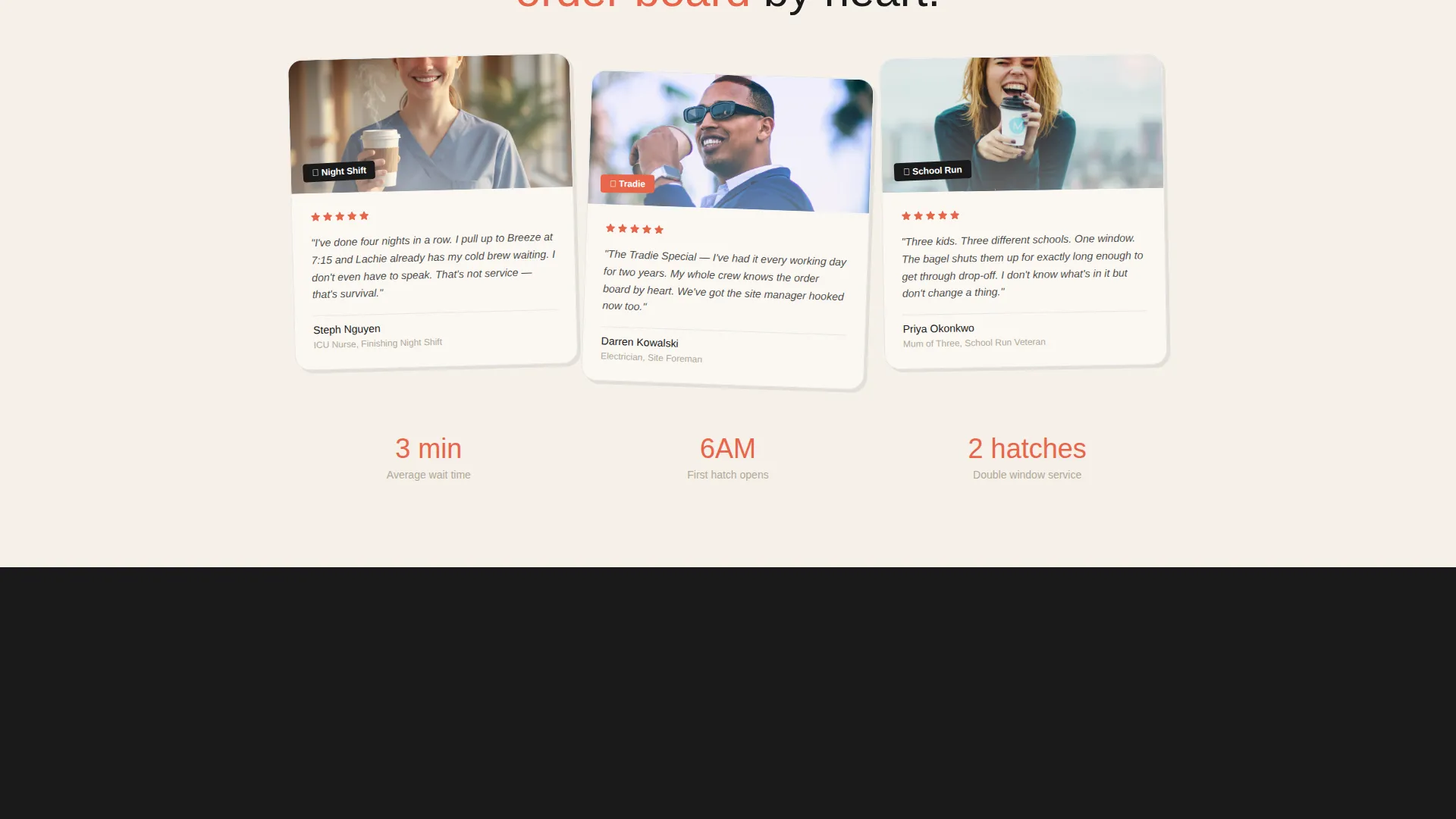
- Niche alignment: Drive-Through Bakery with a morning commuter audience including nurses, parents, and tradespeople
- Landing page direction: Click-Through with a layered overlap layout and postcard-stack visual structure
- The Playful Geometric theme and Ink and Paper palette are intentional contrasts to polished corporate food brands
Theme
Playful Geometric
Creative direction
Surprise & Delight
Color system
Dopamine Pop
Style
Scroll Reveal (Progressive)
Direction
Click-Through
Page Sections
Full-bleed Scrapbook Hero Section
Scroll-reveal Postcard Layout
Animated Combo Card Flip
Sticky Upsell Bottom Bar
Side-by-side Upgrade Cards
Two-field Loyalty Capture Form
Related questions
Can I change the menu items shown in the combo cards?
Does the loyalty form connect to a mailing list or contact tool?
Is the sticky upsell bar visible on mobile devices?
Can I use this template for a café that is not a drive-through?
How many calls-to-action does the template include?



