Cozy Virtual Café Landing Page Template
Brew is a cozy virtual café landing page template built for browser-based ambiance platforms. It combines a masonry card grid, a living photo-wall header, and a flash deal engine to turn browsers into paying members. Warm Neo-Retro visuals, neon-pink deal badges, and a persistent membership bar work together to create a scroll experience that sells atmosphere.
by Rocket studio
Quick summary
Brew is a single-page landing page template designed for virtual café and study-room platforms. It blends Neo-Retro warmth with a card-grid deal engine, giving visitors a sensory preview of the product before any commitment is asked. The layout moves between cozy browsing and timed urgency, converting both impulse visitors and returning regulars.
Who this template is for
This template suits founders and creators who are building browser-based ambiance or virtual co-working products. It works best when the offering includes multiple rooms, membership tiers, or seasonal content bundles that benefit from a marketplace-style display.
- Virtual café and study-room platform builders who need a sales-ready landing page
- Independent creators selling lo-fi ambiance packs, Pomodoro room passes, or group session bundles
- Remote-community builders targeting freelancers, students, and creative soloists who work odd hours
What problem this template solves
Selling an ambient digital experience is hard because visitors cannot feel the product until they are already inside it. Standard landing pages use static screenshots and bullet-point lists that fail to communicate warmth or sound. Brew solves this by letting the page itself act as a preview environment.
- Visitors get a five-second audio hover preview on every card, proving the atmosphere before any purchase
- Flash deal cards with countdown timers break the endless-browse loop and create natural decision moments
- A persistent membership bar appears after the third scroll pause, catching visitors who skipped earlier cards
What you get with this template
The template ships as a fully structured single-page layout. Every section is purpose-built to reflect the source brief, from the photo-wall header down to the persistent bottom membership bar.
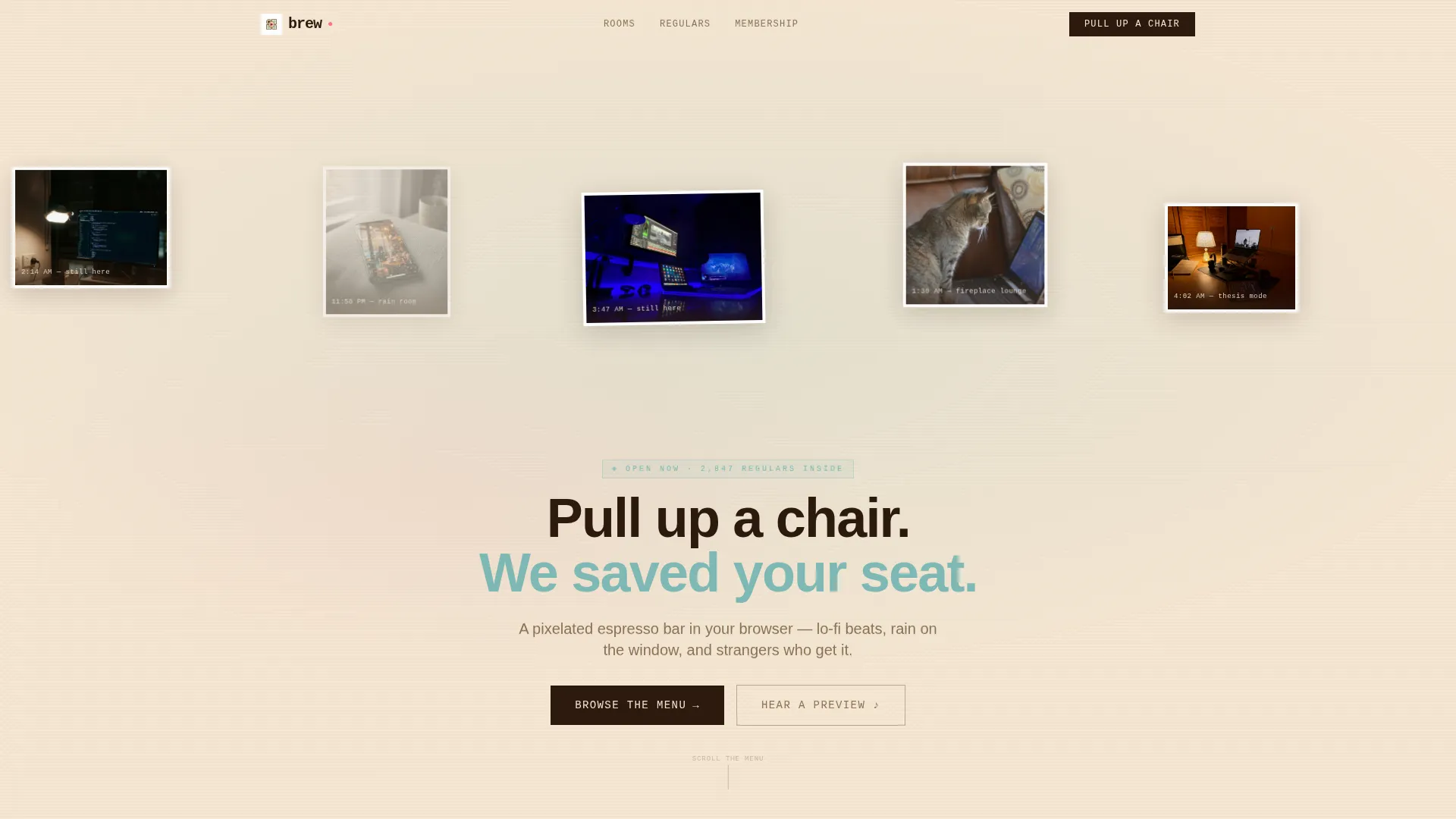
- A mosaic header with gently shifting user-generated screenshots, torn-paper edge treatments, and timestamp overlays
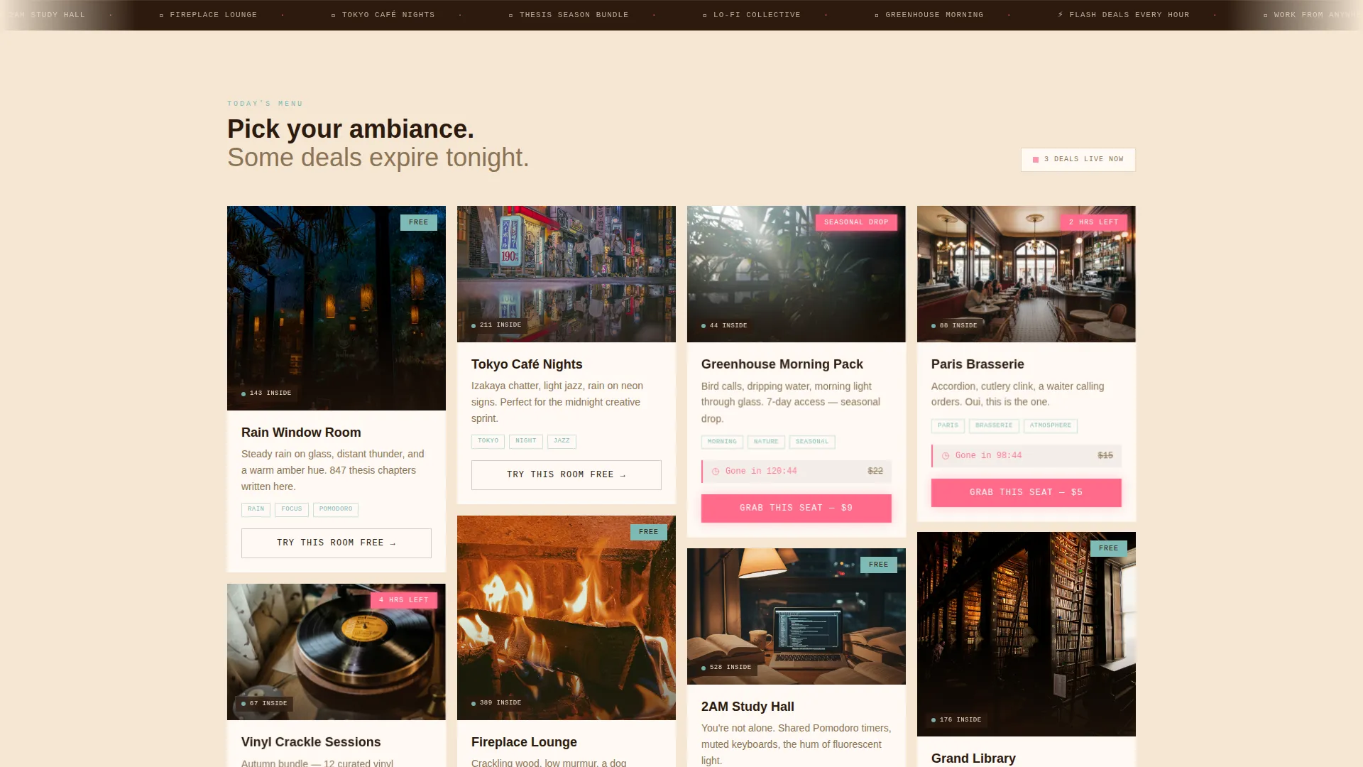
- A masonry card grid alternating between room previews, playlist bundles, and membership tier cards with neon-pink deal badges
- An inline one-click checkout experience on deal cards and a dual-call to action system pairing "Grab This Seat" with "Try This Room Free"
Feature list
This template includes a carefully designed set of interactive and visual components drawn directly from the creative brief.
UGC Photo Wall Header
The header is a living mosaic of real-feel user screenshots displayed at slight angles. Some images carry torn-paper edges and timestamp overlays such as "3:47 AM still here." A hand-lettered headline materializes only after the viewer's eye settles, making the first impression atmospheric rather than sales-forward.
Masonry Card Grid Layout
Cards are arranged in a Pinterest-style masonry grid that subtly rearranges on scroll. Each card represents a room, a playlist bundle, or a membership tier. The variable card heights and gentle reordering create a sense of ongoing discovery that keeps visitors scrolling.
Flash Deal Engine with Countdown Timers
Every third card pulses softly and displays a neon-pink badge marking a limited-time offer. A visible countdown timer shows the remaining window, turning a leisurely browse into a now-or-never decision. This rhythm alternates between calm room previews and time-pressured deal cards.
Five-Second Audio Hover Preview
Hovering over any room or ambiance card triggers a brief audio sample of the featured atmosphere, whether rain, vinyl crackle, or café murmur. Visitors hear the product before they pay, removing the biggest barrier to purchase for a sound-driven offering.
Inline One-Click Checkout on Deal Cards
Deal cards expand inline to reveal a compact checkout flow. Visitors choose solo or group pass, pick their preferred vibe, and complete payment without leaving the page. This removes friction at the exact moment purchase intent peaks.
Persistent Membership Bottom Bar
A bottom bar slides up after the third scroll pause. It presents a single email field and a toggle between monthly and annual membership, offering the "Unlimited Rooms, One Membership" path to visitors who prefer a subscription over individual purchases.
Page sections overview
| Section | Purpose |
|---|---|
| UGC Photo Wall | Opens with atmosphere using real user screenshots and timestamp overlays |
| Hand-Lettered Headline | Materializes after initial scroll to deliver the brand welcome message |
| Masonry Card Grid | Displays rooms, playlist bundles, and tiers in a discovery-led layout |
| Flash Deal Cards | Drives urgency with countdown timers and neon-pink limited-offer badges |
| Inline Deal Checkout | Expands deal cards with pass selection, vibe picker, and payment |
| Membership Bottom Bar | Captures subscription sign-ups with email field and billing toggle |
Design & branding system
The visual identity follows a Neo-Retro theme that pairs nostalgic grain with modern glow. The Cloud Canvas color system anchors warmth in every surface while neon accents appear sparingly in high-intent moments.
- Core palette: soft latte foam (#F5E6D3), muted diner teal (#7EBAB5), deep espresso (#2C1A0E), and flickering neon pink (#FF6B8A) reserved for deal badges and hover states
- Texture language: Polaroid-era grain layered over contemporary glow, creating a vaporwave-filtered 1980s café feel
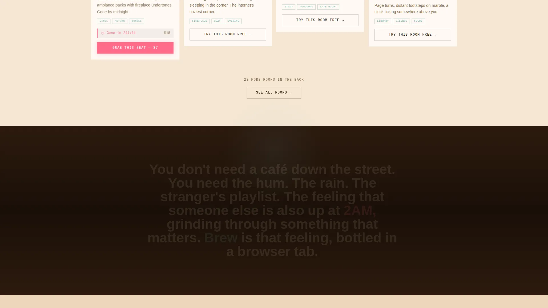
- Type treatment: hand-lettered headline style for the primary welcome message, contrasting with clean card typography for room names and pricing
Mobile & speed optimization
The masonry grid and audio preview components are designed with a single-page flow in mind, keeping the layout coherent across screen sizes.
- Card grid reflows cleanly for narrower viewports, preserving the masonry rhythm on tablet and mobile displays
- The persistent bottom membership bar adapts to mobile bottom navigation patterns, remaining accessible without blocking card content
- Inline checkout expansion on deal cards is touch-friendly, allowing pass selection and vibe picking without a separate modal page
How this template helps you convert
Brew uses a layered conversion strategy that matches different visitor mindsets at different scroll depths.
- The audio hover preview lets visitors experience the product immediately, building trust before any pricing is shown.
- Countdown-timer deal cards create urgency that interrupts passive browsing and drives first purchases from impulse-ready visitors.
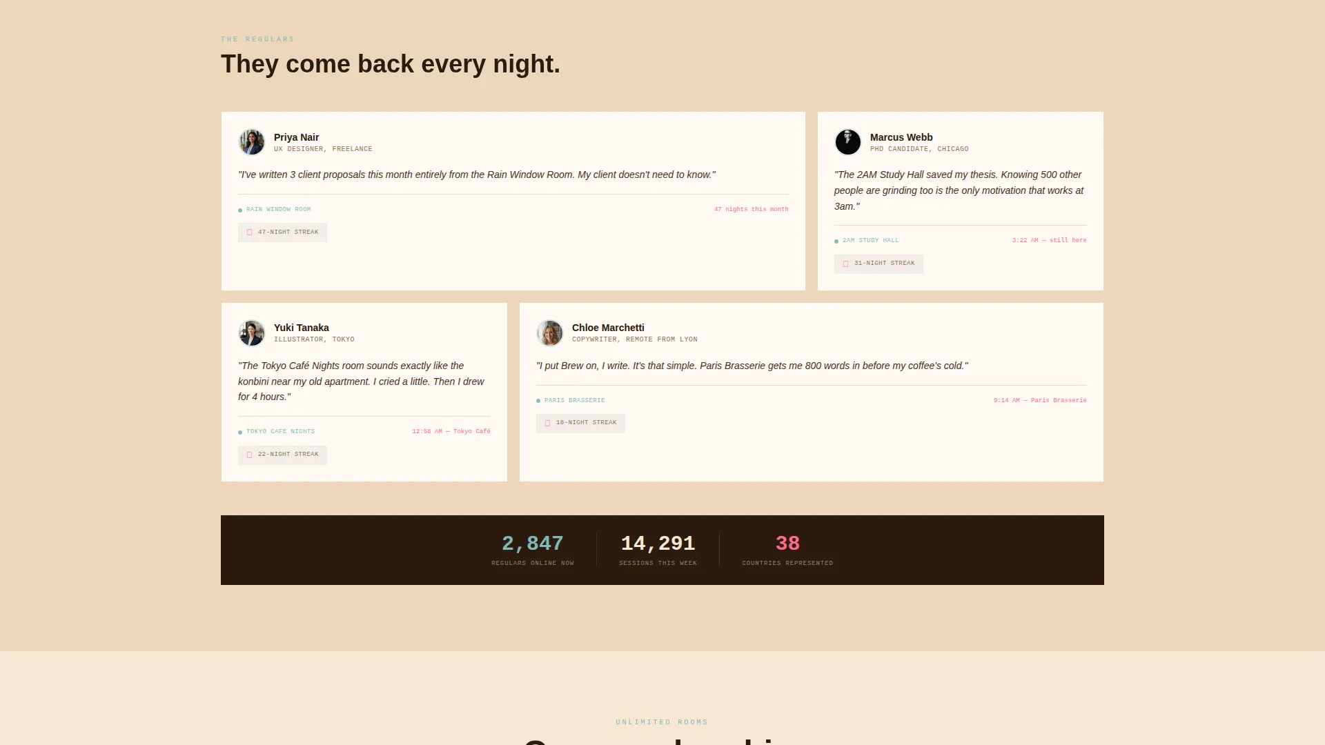
- The persistent membership bar catches considered buyers who scrolled past individual deals and prefer a single all-access subscription.
Other information about this template
Brew sits at the intersection of retail e-commerce and virtual business, making it a strong fit for any creator monetizing a browser-based atmosphere product.
- Template style is Card Grid (Modular), aligned with the matched intersection context for this niche
- The creative direction is Limited Time, reflected throughout the flash deal engine and countdown badge system
- The header concept follows an App Store Preview approach, using real-environment screenshots rather than polished marketing renders
- The landing page direction is Direct Sales, with every call to action tied to a clear purchase or sign-up action
- This template supports a dual conversion model: individual room or bundle purchases alongside a recurring membership subscription
Theme
Neo-Retro
Creative direction
Limited Time
Color system
Citrus Burst
Style
Card Grid (Modular)
Direction
Direct Sales
Page Sections
UGC Photo Wall Header
Masonry Card Grid with Scroll Reorder
Flash Deal Engine with Countdown Timers
Five-second Audio Hover Preview
Inline One-click Deal Checkout
Persistent Membership Bottom Bar
Related questions
Can I use this template without audio functionality?
Is this template suitable for a membership-only product with no individual room sales?
How many room or product cards does the template support?
Who is the intended visitor for this landing page?
Can I adjust the color palette or change the neon-pink accent?



