Pre-Retiree Coverage Gap Landing Page Template
Bridge is a single-column landing page template built for pre-retiree health insurance consultancies. It uses an animated data hero, a Problem-to-Solution scroll arc, and a three-field free-audit form to turn anxious 55-to-64-year-olds into booked consultation clients. The Corporate Precision design system pairs deep navy authority with decision-point teal, creating calm urgency at every step.
by Rocket studio
Quick summary
Bridge is a focused, single-column landing page template for pre-retiree health coverage consultancies. It opens with an animated cost counter that makes the financial risk of a coverage gap impossible to ignore. A structured Problem-to-Solution Arc then guides visitors from alarm to understanding to action, ending in a free coverage audit form that converts lighter intent into a paid consultation pipeline.
Who this template is for
This template is designed for health insurance consultants, financial advisors, and benefits strategists who serve adults aged 55 to 64. If your company helps clients navigate the years between employer coverage and Medicare, Bridge gives you a landing page that speaks directly to their anxiety and offers a clear path forward.
It fits professionals who need to:
- Reach operations managers, early retirees, and dual-income couples facing sudden plan disruptions
- Demonstrate the financial risk of inaction using real, specific numbers rather than generic claims
- Capture leads through a free-audit offer and nurture them toward a paid consultation
What problem this template solves
The gap between employer health insurance and Medicare eligibility is one of the most expensive and confusing stretches of a person's financial life. Most adults in this window do not fully understand their current situation, cannot assess which plan options protect them, and have no clear action plan for what to do next. A generic website does nothing to address that confusion.
Bridge solves the communication and conversion problem head-on:
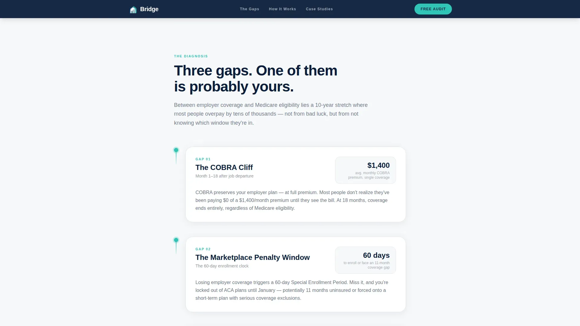
- It names the three most common coverage gaps (the COBRA cliff, the marketplace penalty window, and the spousal plan domino) in plain language with visual timeline diagrams
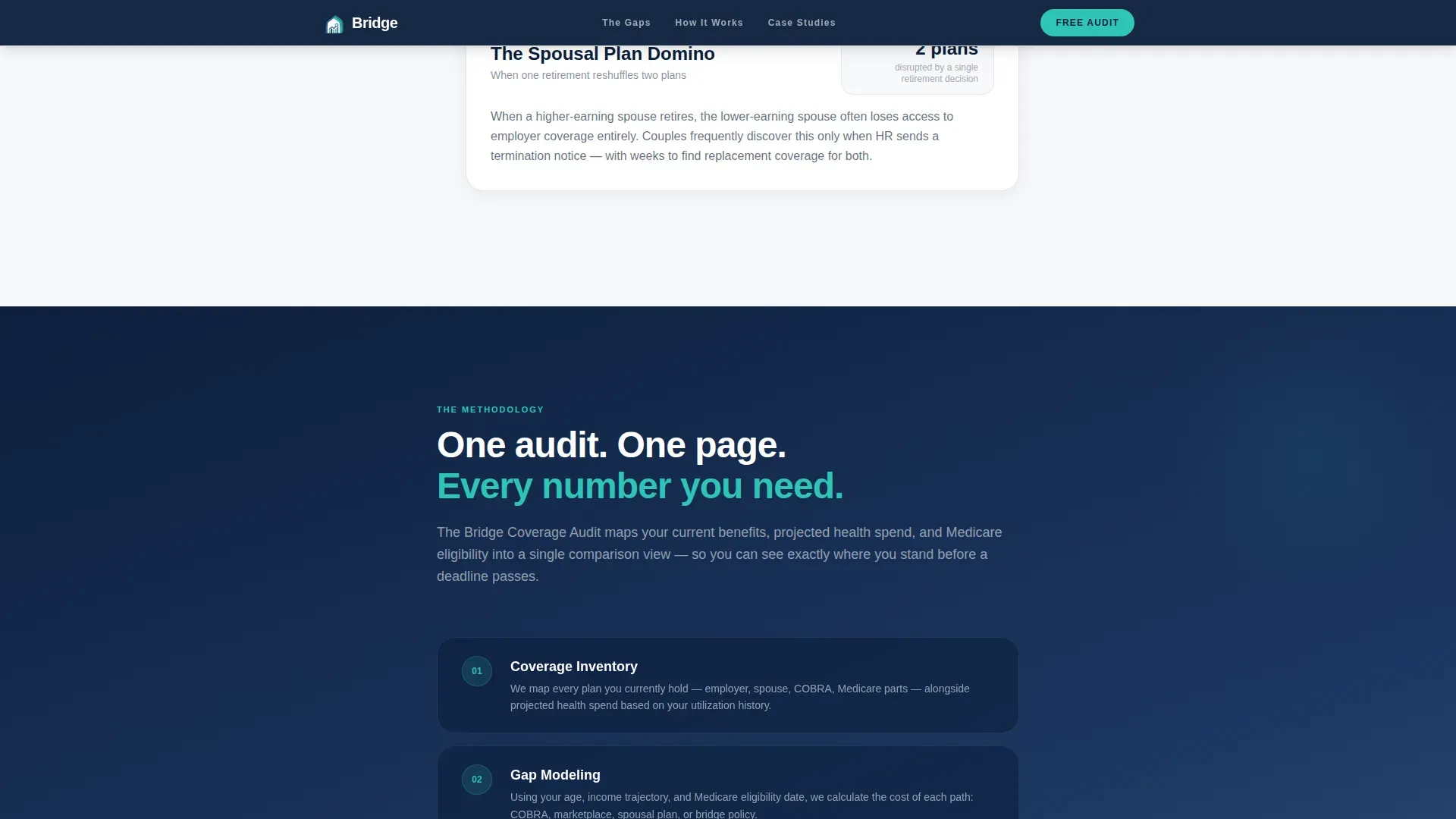
- It presents a proprietary coverage audit methodology that maps current benefits, projected health spend, and Medicare eligibility into one clear comparison view
- It gives visitors two conversion paths: a free personalized gap snapshot for high-intent visitors, and a downloadable checklist for those who need more time
What you get with this template
This template is a complete, ready-to-deploy landing page layout. Every section is purposefully sequenced to reduce visitor anxiety and build enough trust to achieve a form submission. The design, copy structure, and interactive elements all focus on one goal: helping a confused pre-retiree understand their current state and take the first step toward their desired state.
What is included in this template:
- A full single-column page layout with six distinct, scroll-triggered sections built on the Corporate Precision design system
- An animated counter hero, three-gap timeline section, methodology explanation, anonymized case study section, a dual-path conversion form, and a linear single-row footer
- A sequential three-field audit form and a secondary email-only checklist capture path for lighter-intent visitors
Feature list
This section details each core capability built into the Bridge template, drawn directly from the design brief.
Animated Data Counter Hero
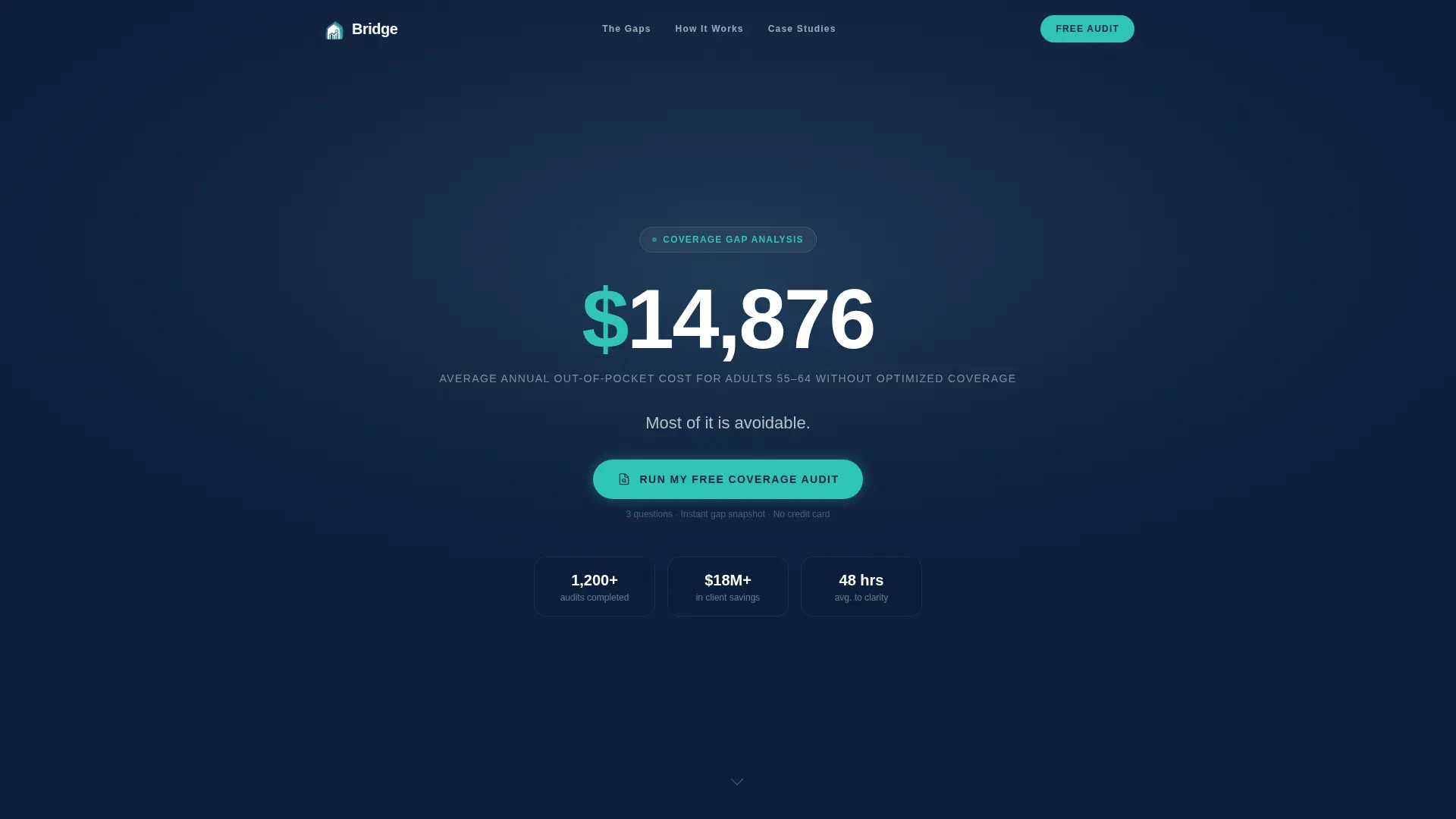
The header opens with a single animated counter that ticks from $0 to $14,876 over two seconds. The number represents the average annual out-of-pocket cost for adults aged 55 to 64 without optimized coverage. Each thousand-dollar milestone triggers a subtle pulse. Below the counter, a quieter line of text appears: "Most of it is avoidable." No stock photography interrupts the moment. The visitor's own concern does the work. This is one of the most powerful tool choices in the template: a data-only hero that forces the visitor to confront the gap before anything else is said.
Three-Gap Timeline Diagrams
Section two names and visually maps the three coverage gaps that most pre-retirees face. The COBRA cliff, the marketplace penalty window, and the spousal plan domino are each rendered as a simple timeline diagram. The visitor recognizes their own current situation inside the diagram. This is how the template starts to identify gaps with clarity rather than jargon, giving the consultant's team a structured way to explain complex material quickly.
Proprietary Coverage Audit Methodology Section
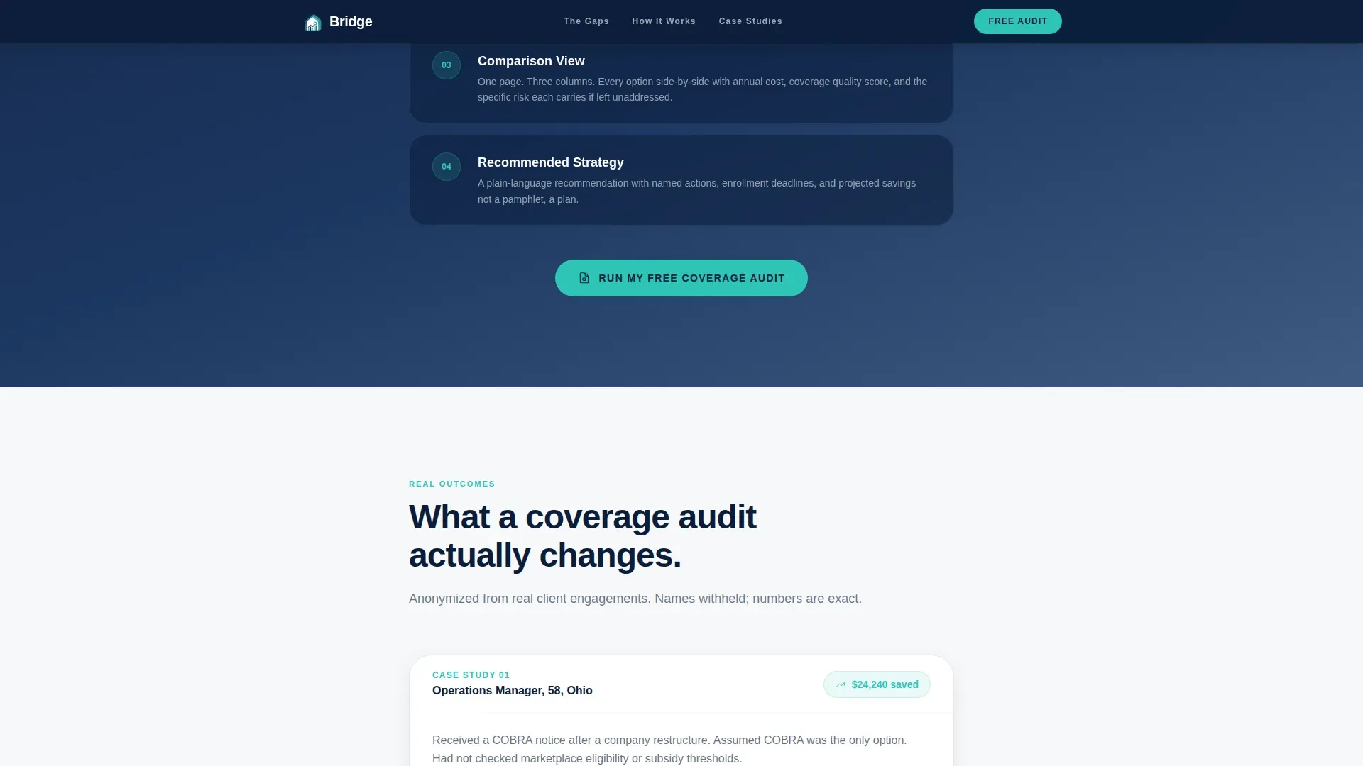
Section three introduces the audit process. It explains how the consultancy maps a client's current benefits, projected health spend, and Medicare eligibility into a single comparison view. This section builds credibility by showing process and detail. It helps the visitor understand that a gap analysis is not just a conversation but a structured, repeatable method with a clear output. This is a crucial step in moving the visitor from passive reading to active interest.
Anonymized Case Study Section
Section four presents before-and-after annual cost figures using anonymized client stories. Each case study names the specific strategy used to fill the coverage gap. Dollar amounts are concrete and compelling. This section functions as social proof while also reinforcing the gap analysis process. It shows the visitor what success looks like and makes the desired future state feel genuinely achievable rather than theoretical.
Dual-Path Conversion Form
The primary call-to-action form asks three sequential fields: current age, current coverage type (employer, COBRA, marketplace, or uninsured), and email address. Submitting the form generates an instant personalized gap snapshot delivered by email. A secondary path captures lighter-intent visitors with just an email address in exchange for a downloadable 55-to-65 Coverage Checklist. This checklist then feeds a five-day nurture sequence that moves those visitors toward the full audit funnel.
Corporate Precision Visual System
The template uses a tightly controlled four-color palette. Deep command navy anchors the header and footer. Pressed-shirt slate panels carry secondary sections. Clean-room white surfaces carry the educational mid-page content so it reads effortlessly. Decision-point teal appears exclusively on interactive elements and calls to action, making every button feel like a door forward. Typography uses DM Sans at serious weight with professional tracking throughout.
Page sections overview
| Section | Purpose |
|---|---|
| Animated Cost Hero | Opens with the $14,876 counter and primary call to action |
| Three Gaps Timeline | Names and diagrams the COBRA cliff, penalty window, and spousal domino |
| Audit Methodology | Explains the coverage audit process and comparison view output |
| Case Study Panel | Before-and-after cost figures with named strategies per gap |
| Dual-Path Form | Sequential three-field audit form plus email-only checklist capture |
| Linear Footer | Single-row footer with navigation anchors and contact details |
Design & branding system
Bridge follows a Corporate Precision theme. The palette and typographic choices are deliberate: every detail signals authority without intimidation. The design feels like the lobby of a serious financial institution, calm and structured, not cold or clinical.
Core design elements include:
- Four-color Navy Authority palette: deep command navy (#0B1D3A) for primary backgrounds, pressed-shirt slate (#3D5A80) for secondary panels, clean-room white (#F7F8FA) for content surfaces, and decision-point teal (#2EC4B6) for all interactive elements and calls to action
- DM Sans typography at serious weight with professional tracking, delivering readable hierarchy across hero, body, and form sections
- Scroll-triggered staggered reveals on section elements, counter animation in the hero, and hover states on all interactive elements to keep the audience engaged throughout the scroll
Mobile & speed optimization
The Bridge template is built desktop-first because the target visitor is typically making a significant financial decision and is more likely to do so at a desk. Full mobile support is included so the page remains accessible and conversion-ready across all screen sizes.
Key performance and layout choices include:
- Static sections are built as Server Components, reducing initial load weight on content-only blocks like the case study panel and the methodology section
- The animated counter and sequential form are isolated as Client Components, keeping interactivity scoped and preventing unnecessary re-renders on static content
- Single-column flow ensures the mobile layout requires no reflow or grid restructuring, keeping the reading experience consistent from desktop to phone
How this template helps you convert
Bridge is designed around a single conversion philosophy: reduce anxiety, build trust incrementally, and present one clear action at each point in the scroll. The gap analysis process embedded in the page structure does not just describe the service, it demonstrates it.
Here is how the template drives conversion at each stage:
- The animated counter creates immediate emotional engagement by putting a specific dollar figure on the cost of inaction. The visitor arrives uncertain and leaves the hero section alarmed enough to keep reading. Placing the primary call-to-action button directly below the counter captures high-intent visitors before the scroll even begins.
- The three-gap timeline and case study sections lower the emotional temperature progressively. By the time the visitor reaches the form, they feel informed enough to act. The sequential three-field form reduces friction by asking for information one step at a time. The secondary checklist path ensures the team also captures visitors who are not yet ready to commit, filling the top of the nurture funnel.
Other information about this template
Bridge is a focused single-page resource, but the structural logic it uses maps closely to how experienced business analysts and project managers think about closing performance gaps in any complex organization. A gap analysis is a method that compares an organization's current state to its desired future state, identifies root causes of the difference, and produces an action plan to fill that gap. Bridge applies exactly this logic to health coverage, turning a bewildering current situation into a documented plan with a clear path to a desired state.
This broader framework is worth understanding because it reveals why the template is well structured the way it is. Each scroll section mirrors one stage of the gap analysis process: assess the current state, identify the gap, understand the root causes, map the desired future state, and execute an action plan. Visitors move through that sequence naturally without realizing it, which is why the emotional temperature drops so reliably by the time they reach the form.
For teams building similar consultancy pages, the Bridge template offers several practical advantages worth noting:
- The template layout can serve as a great starting point for any financial advisory or insurance consultancy that needs to identify gaps in a client's current coverage, benefits, or retirement plan
- Sections are easily editable, allowing your team to swap in different coverage types, updated cost figures, case study details, and brand colors to align with your specific company identity
- The dual-path conversion structure is a powerful tool for managing two distinct audience segments at once: high-intent visitors who are ready for the audit, and lighter-intent visitors who need nurturing before they commit
- The template supports a gap analysis template approach to page design: every element maps to a specific stage of the decision journey, making it easy for multiple people on your team to understand how the page works and why each section is placed where it is
- For consultancies that produce annual reports or use strategic planning documents internally, the same gap analysis framework used in this template can help align your team around client outcomes and desired performance benchmarks
- The action plan embedded in the page flow (hero to problem to methodology to proof to form) functions as a one stage process for the visitor: they arrive confused, move through a structured discovery arc, and exit with a clear next step
Regarding broader template ecosystem context: while Bridge is a standalone landing page template, the gap analysis approach it models is widely used in business performance improvement. Tools like swot analysis frameworks help organizations understand internal and external factors affecting their desired outcomes. A skills gap analysis, for example, helps a company assess where its team currently sits versus where it needs to be. These strategic planning techniques have parallels in the coverage advisory space, where the goal is always the same: assess the current state, identify gaps, and create a realistic plan to reach the desired state.
For consultancies exploring presentation-ready versions of their methodology, it is worth knowing that gap analysis content is also commonly adapted into formats like ppt templates, gap powerpoint templates, and presentation templates for use with clients during review sessions. Slides built on those formats can help keep the audience engaged during live consultations and ensure everyone leaves on the same page about next steps. Teams that want high resolution images and engaging visuals for those decks often look at ppt design resources alongside their landing page templates.
If you simply download the Bridge template and begin customizing it, you will find the editable features are organized to make the process straightforward. You can easily download and deploy the page without needing deep technical knowledge, since no-code and low-code platforms make it possible for non-technical team members to build and update the page. Simply download, swap content, and publish. Immediate download is available after purchase, so your team can begin adapting it for upcoming presentations, client audits, or new service launches right away.
Theme
Corporate Precision
Creative direction
Problem→Solution Arc
Color system
Navy Authority
Style
Single Column Flow
Direction
Freemium/Trial
Page Sections
Animated $14,876 Data Counter Hero
Three-gap Timeline Diagram Section
Coverage Audit Methodology Block
Before-and-after Case Study Panel
Dual-path Sequential Conversion Form
Corporate Precision Design System
Related questions
Who is the Bridge template specifically designed for?
What conversion paths does the template include?
Can I update the cost figures and case study details to match my clients?
Does the template work for a solo advisor or only for larger firms?
What makes this template different from a generic insurance landing page?



