Digital Equity Community Foundation Landing Page
Bridge is an editorial landing page template built for digital equity community foundations. It pairs a warm botanical color palette with a magazine-style origin story layout to guide visitors from emotional connection to event registration. The design earns trust through participant voices, layered storytelling, and a focused "Save Your Seat" conversion path.
by Rocket studio
Quick summary
Bridge is a single-page editorial template for neighborhood digital equity foundations. It opens with a handwritten-feeling testimonial card, unfolds like a community journal through an origin story scroll, and closes with a focused event registration form. The botanical color system and generous spacing make every section feel warm, unhurried, and genuinely human.
Who this template is for
This template is built for mission-driven community organizations working at the intersection of digital access and human connection. It suits groups that host workshops, distribute devices, and want to turn a one-time website visit into a committed RSVP.
- Neighborhood foundations and digital equity nonprofits running regular community events
- Volunteer coordinators and program staff who need a page that speaks to both learners and supporters
- Organizers whose audiences include public librarians, school counselors, single parents, and retired volunteers
What problem this template solves
Most nonprofit landing pages ask for trust before they've offered anything. They lead with a logo and a donate button, and the visitor leaves without understanding why the work matters. Bridge solves this by leading with story and earning the conversion slowly.
- Visitors without prior context land on a page that feels like a place, not a pitch
- The origin story format replaces abstract mission statements with specific, human moments
- The registration path feels like an invitation rather than a form, reducing hesitation for first-time visitors
What you get with this template
Bridge delivers a fully structured editorial landing page with five distinct content sections, a floating call-to-action button, and a focused registration form. Every element has a defined role in moving a visitor from curious reader to confirmed attendee.
- A hero section with an off-center testimonial card, paper shadow treatment, and a cinematic warm-light photograph
- An origin story scroll section, a community portraits section with image treatment shifts, a lilac pull quote and stats section, and a closing registration spread
- A minimal footer following a horizontal flow pattern, a floating "Save Your Seat" button that appears after the third scroll section, and a secondary "Donate a Device" text link beneath the form
Feature list
This section covers the core built-in capabilities that make Bridge ready to use and easy to adapt.
Off-Center Testimonial Card Header
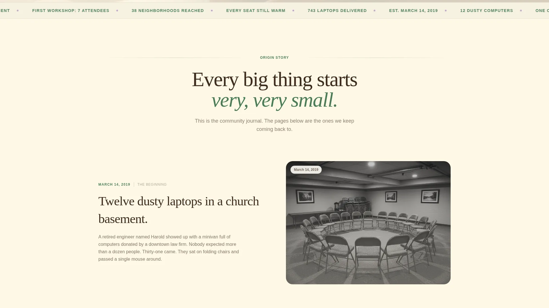
The hero opens with a large-format card placed slightly off-center in a magazine editorial style. It carries a handwritten-feeling participant quote and sits over a soft-focus photograph of hands resting on a keyboard in warm window light. A subtle paper shadow completes the tactile, printed-page effect.
Origin Story Scroll Layout
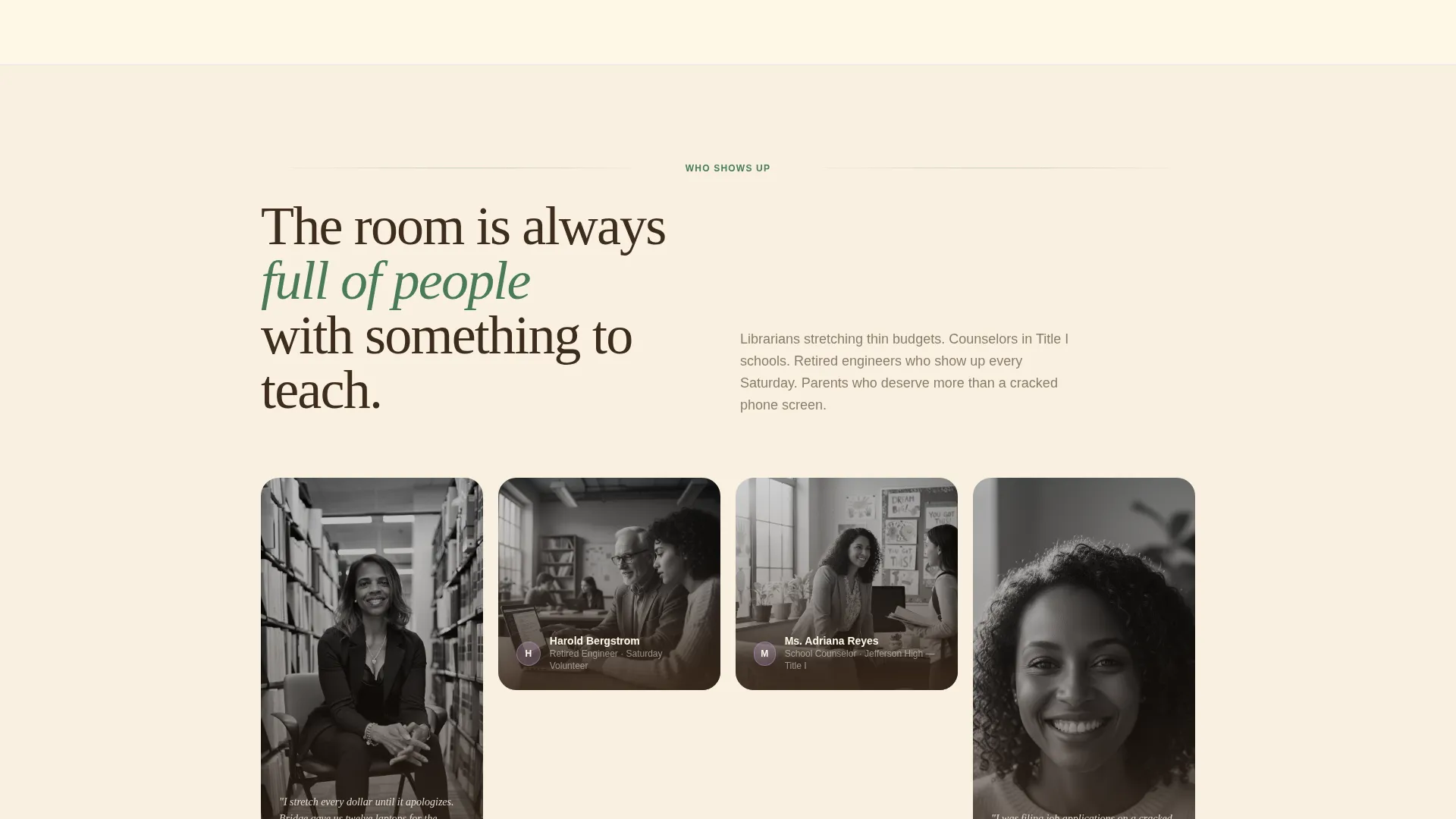
The page is structured as a community journal. It begins with a specific founding moment and deepens through the first workshop, the first Zoom call, and the first college acceptance. Photography transitions from grainy early snapshots to vivid present-day portraits as the reader scrolls, reflecting the foundation's own growth.
Lilac Pull Quote and Stats Section
A dedicated callout section uses the quiet bloom lilac accent color to surface participant quotes and accumulated proof points. These blocks appear in the column like marginalia, drawing the eye without interrupting the narrative flow. They reinforce the "infrastructure, not charity" argument through accumulation rather than drama.
Event Registration Form with Role Dropdown
The closing registration spread includes a focused three-field form: first name, email address, and a single dropdown asking "I'm coming as a..." with options including Volunteer, Learner, Donor, Neighbor, and Just Curious. A secondary "Donate a Device" text link sits beneath the form for visitors who want to contribute hardware instead.
Floating Call-to-Action Button
A "Save Your Seat" button in fern green appears as a gentle floating element after the visitor passes the third scroll section. It remains accessible without being intrusive, surfacing the primary conversion path at the moment engagement is highest.
Scroll Animation System
The template includes scroll-fade-blur reveals, staggered text entrances, and image grayscale-to-color transitions. These medium-weight animations are applied selectively to reinforce the editorial pacing without slowing the reading experience.
Page sections overview
| Section | Purpose |
|---|---|
| Hero Testimonial Card | Opens with participant voice and warm hands photograph to establish human connection immediately |
| Origin Story Scroll | Narrates the founding moment and early milestones in a community journal format |
| Community Portraits | Shows who shows up, with a grayscale-to-color image treatment that signals present-day vitality |
| Pull Quote and Stats | Uses lilac callout blocks to surface proof points and reinforce the infrastructure argument |
| Registration Spread | Delivers the primary "Save Your Seat" form and secondary "Donate a Device" path |
| Minimal Footer | Closes the page with a horizontal flow pattern, keeping focus on the conversion above |
Design & branding system
The visual identity follows a Healing Space theme rooted in a Botanical color system. Every color has a specific role, and the palette is deliberately restrained so no single element competes for attention.
- Deep loam brown (#3E2C1E) for body text, sun-warmed cream (#FFF8E7) for background fields, living fern green (#4A7C59) for navigation and interactive states, and quiet bloom lilac (#C3A6D1) reserved for callouts and pull quotes
- Typography pairs Fraunces serif display headings with DM Sans body text, creating a magazine editorial rhythm that feels both authoritative and approachable
- Generous white space separates columns the way light filters through a canopy, keeping each section easy to read and visually restful
Mobile & speed optimization
The template is built desktop-first with full mobile responsiveness carried through every section. The editorial layout adapts gracefully so the testimonial card, portrait grid, and registration form remain clear and usable on smaller screens.
- Scroll animations and image transitions use client-side rendering selectively, while static sections use server components to keep initial load efficient
- The floating call-to-action button repositions cleanly on mobile so it does not obscure the reading area
- Image grayscale-to-color transitions are handled to preserve visual quality across screen sizes without unnecessary overhead
How this template helps you convert
Bridge is designed around a single insight: people register for things they already feel invited to. Every structural decision serves that goal.
- The testimonial card in the hero does the emotional work before any ask is made, so visitors feel welcomed rather than solicited from the first second on the page
- The origin story scroll builds accumulated trust through specific moments, real people, and tangible outcomes, so by the time the registration form appears, the reader already understands the value of showing up
- The role dropdown in the form ("I'm coming as a...") signals that the event has room for everyone, removing the hesitation that comes from not knowing if you belong
Other information about this template
Bridge is categorized under Community and Nonprofit, specifically within the Digital Divide Nonprofit subcategory and the Digital Divide Community Foundation niche. It is localized for United States audiences, uses English-language copy, and is designed around USD-denominated donation and registration contexts.
- The template style is Editorial and Magazine, making it well-suited for foundations that want to communicate depth and credibility without a corporate feel
- The creative direction is Origin Story, meaning the page structure is intentionally narrative rather than feature-led, which suits organizations whose strongest asset is their history and their people
- The intersection match between the Community and Nonprofit category and the Digital Divide Community Foundation niche is reflected throughout, from the specific participant voices in the hero to the volunteer and learner options in the registration dropdown


Theme
Healing Space
Creative direction
Origin Story
Color system
Botanical
Style
Editorial/Magazine
Direction
Event Registration
Page Sections
Off-center Testimonial Card Hero
Origin Story Scroll Narrative
Lilac Pull Quote Callout Blocks
Event Registration Form with Role Dropdown
Floating Save Your Seat Button
Scroll Animation and Image Transitions
Related questions
Can I adapt the registration form options for a different event format?
Does this template work for nonprofits outside the digital equity space?
How does the floating call-to-action button behave on mobile?
Can I replace the Donate a Device link with a different secondary action?
Is the grayscale-to-color image treatment required in the Community Portraits section?


