Senior Technology Training Landing Page Template
Bridge is a warm, split-screen landing page template built for senior technology training services. It combines a trust-badge header, a Vision and Mission scroll narrative, and a content-led conversion path. The Desert Rose color system and large, unhurried typography make the page feel approachable for older adults, their families, and retirement community directors alike.
by Rocket studio
Quick summary
Bridge is a single-page landing page template designed for senior technology training. It pairs a split-screen layout with a Healing Space visual identity and a content-first conversion strategy. Visitors receive value before they are ever asked for anything, building trust through three embedded tutorial clips, warm copy, and a free downloadable starter guide.
Who this template is for
This template is made for anyone offering technology education and support to older adults. Whether you run a private practice, manage a community program, or create educational content for seniors, Bridge gives you a page that feels as welcoming as the service itself.
- Adult children looking to promote senior tech support for an isolated parent
- Retirement community directors seeking enrichment programming resources
- Independent instructors or small organizations teaching digital skills to older adults
What problem this template solves
Many senior technology services struggle to earn trust online. Their pages feel clinical, rushed, or aimed at the wrong audience. Bridge solves that directly by making the page itself a demonstration of patience and clarity.
- Older visitors and their families often feel overwhelmed by busy, jargon-heavy pages
- Service providers lack a ready-made design that speaks to seniors without being condescending
- Generic templates fail to communicate warmth, credibility, and a clear next step all at once
What you get with this template
Bridge delivers a fully structured landing page ready to represent your senior tech training service. Every section, color choice, and layout decision reflects the teaching philosophy baked into the brief: no rushing, no jargon, and genuine warmth throughout.
- A 50/50 split-screen layout with a trust-badge header and a paired photograph panel
- A Vision and Mission scroll narrative that moves visitors from fear to confidence
- A content hub with three embedded tutorial clips, a free guide form, and a video lesson library path
Feature list
Bridge is built around a set of purposeful design and content decisions. Each feature below comes directly from the template structure described in the brief.
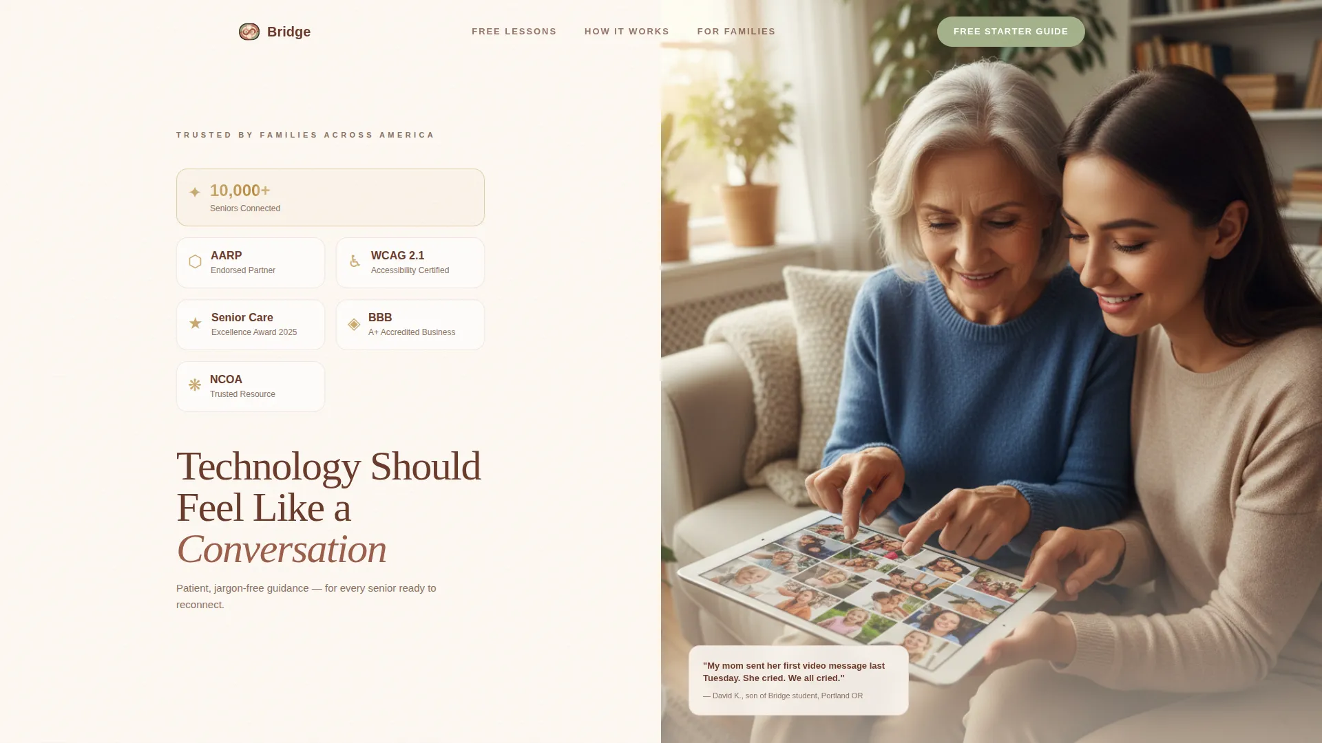
Split-Screen Header with Award Badge Display
The header divides the viewport evenly. The left panel arranges trust seals, accessibility certifications, and milestone badges on a warm linen background, each with a subtle gold foil shimmer. The right panel holds a warm overhead photograph of two hands resting on a tablet. A headline eases in after three seconds, giving the visual space to land first.
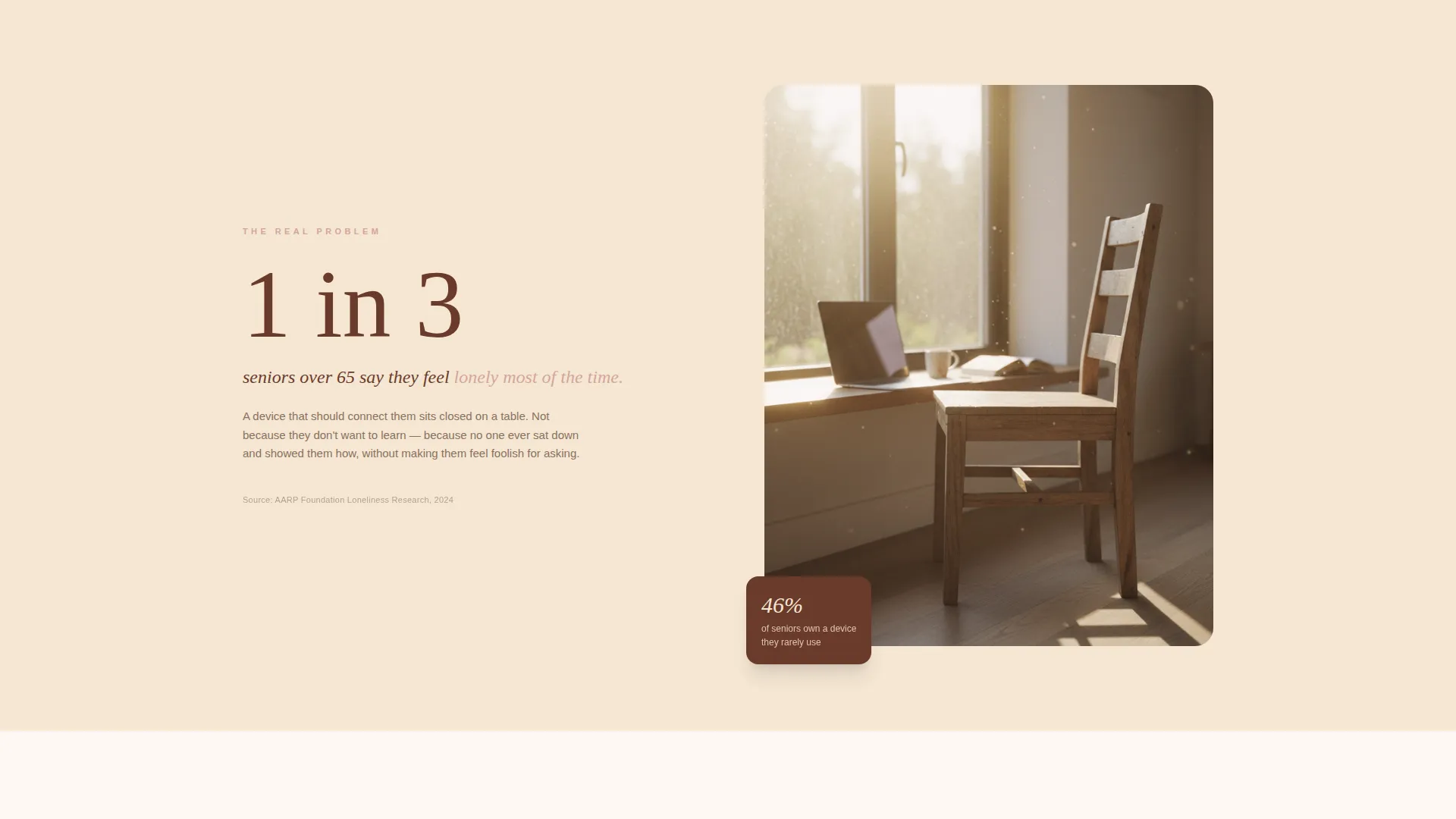
Vision and Mission Scroll Narrative
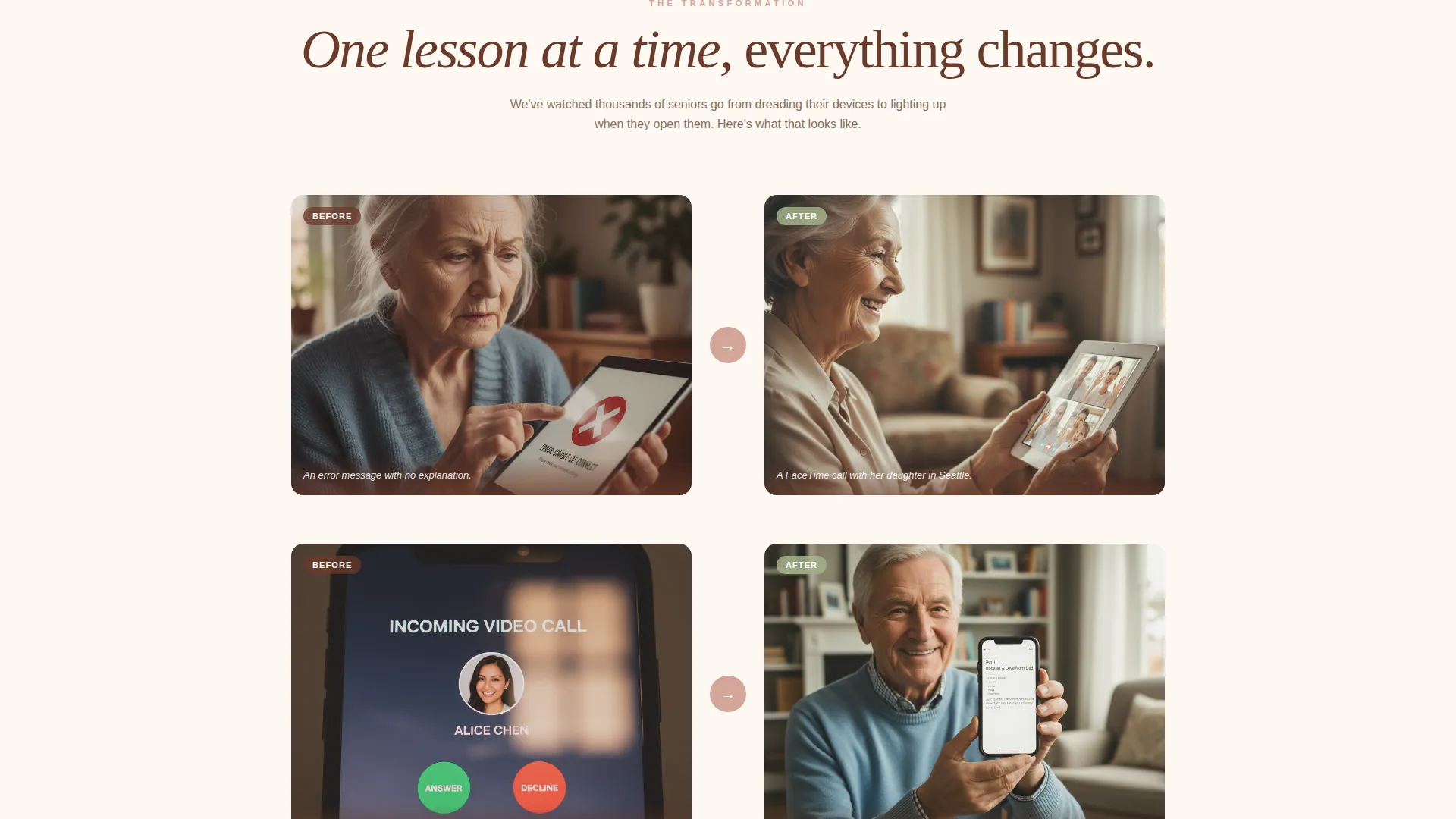
The page opens with a single isolation statistic paired with an empty chair image. It then unfolds through split-screen pairings that contrast the before and after of learning technology. Each transition dissolves from one reality to the next, modeling patience in its pacing.
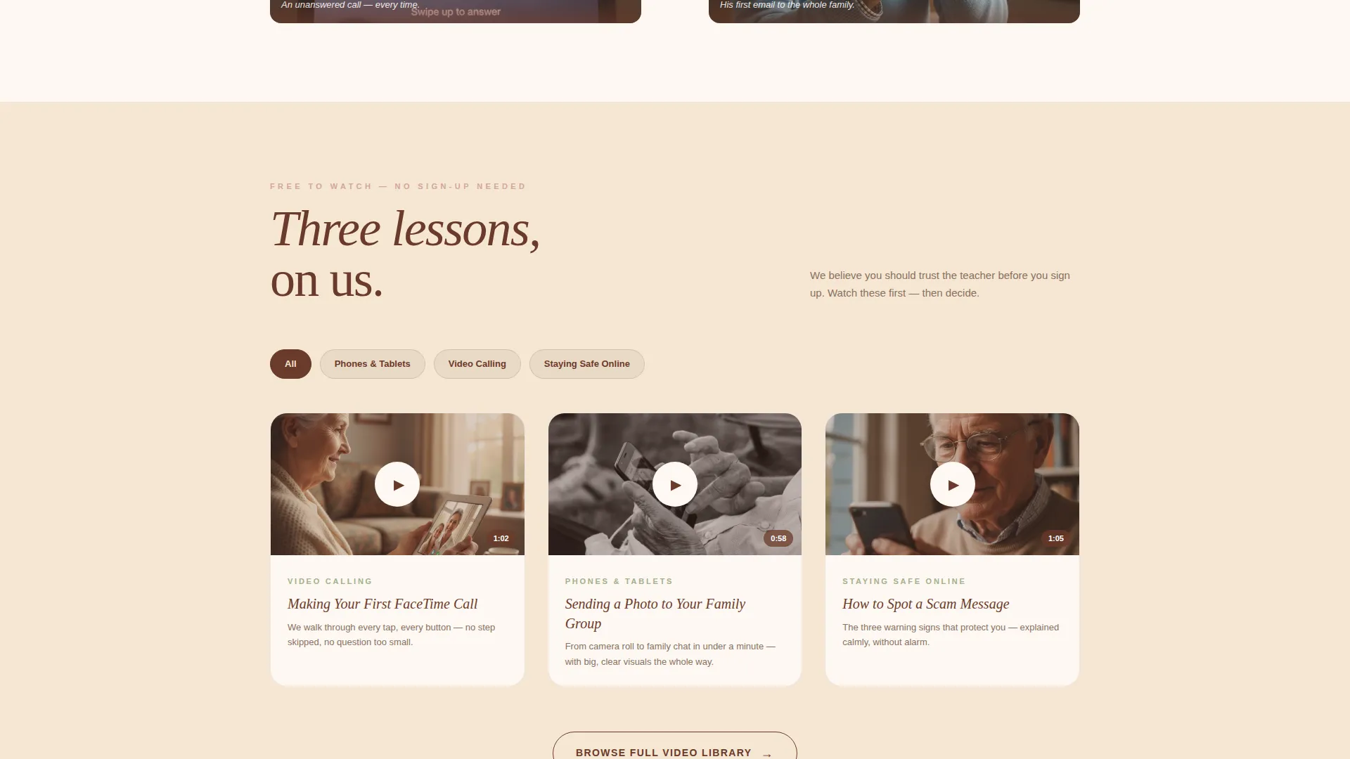
Embedded Tutorial Clip Section
Three sixty-second video tutorials are embedded on the page before any call to action appears. Visitors experience the teaching style firsthand. This approach earns trust before asking for a name or email address.
Free Starter Guide Lead Form
The primary call to action asks only for a first name and email address. The form includes a large-print toggle beside the input fields, making it practical for older adults to complete independently. The form fields are kept minimal and clear.
Categorized Video Lesson Library Path
A secondary call to action links visitors to a browsable library organized by topic: Phones, Tablets, Video Calling, and Staying Safe Online. This gives visitors a low-commitment next step that keeps them engaged with the content.
Large-Print Toggle and Accessibility Consideration
A large-print toggle is visible directly beside the lead capture form. This small but meaningful detail signals that the service genuinely considers the comfort of older users, reinforcing the warmth of the brand before any transaction occurs.
Page sections overview
| Section | Purpose |
|---|---|
| Split-Screen Header | Establish credibility with trust badges and a human photograph |
| Headline Reveal | Introduce the core message after a short visual pause |
| Isolation Statistic Block | Open the Vision arc with an emotionally resonant single fact |
| Before and After Pairs | Show the fear and the resolution through side-by-side imagery |
| Embedded Tutorial Clips | Demonstrate teaching quality with three free sixty-second videos |
| Free Guide Form | Capture first name and email with a large-print toggle option |
| Video Lesson Library call to action | Offer a no-commitment path to categorized free lessons |
Design & branding system
Bridge follows a Healing Space theme built around the Desert Rose color system. Every color choice reinforces calm, trust, and warmth without feeling clinical or childish.
- Soft terracotta pink (#D4A59A) as the primary warmth tone, sun-bleached sand (#F5E6D3) for open backgrounds, and deep adobe (#6B3A2A) for grounding headers and body text
- Gentle sage (#A3B18A) on buttons and interactive highlights, with a gold (#C9A96E) foil shimmer applied to the badge display
- Large, unhurried typography and generous whitespace throughout, reflecting the same patience the service teaches
Mobile & speed optimization
The template is designed with older users in mind, which means clarity and comfort on any screen size. Large touch targets, open layouts, and readable type sizes are built into the structure.
- The 50/50 split-screen stacks gracefully on smaller screens, keeping key visuals and text legible without scrolling horizontally
- Large-print considerations extend beyond the form toggle to the overall type hierarchy, supporting readability across device sizes
How this template helps you convert
Bridge earns conversions by giving generously before it asks. The page is structured so that visitors already feel helped before they encounter any call to action.
- Three embedded tutorial clips demonstrate teaching quality upfront, so visitors trust the instructor before seeing a form
- The free starter guide form asks only for a first name and email, keeping the barrier low and the value exchange clear
- A secondary path to the free video lesson library keeps hesitant visitors engaged rather than sending them away
Other information about this template
Bridge is a strong fit for any senior technology training service that needs a professional online presence without a heavy build investment. The template is niche-specific, which means the layout, copy structure, and visual choices are already aligned to the audience.
- The Healing Space theme and Desert Rose palette are pre-built into the template, so no color system decisions are needed from scratch
- The content hub direction means the page functions as both a trust-building experience and a lead generation tool simultaneously
- Bridge suits services that sit within the Senior Activity and Lifestyle space, including digital literacy programs, one-on-one tech coaching, and community center workshops
Theme
Healing Space
Creative direction
Vision & Mission
Color system
Desert Rose
Style
Split Screen (50/50)
Direction
Content/Resource
Page Sections
Split-screen 50/50 Layout
Vision and Mission Scroll Arc
Three Embedded Tutorial Clips
Low-friction Lead Capture Form
Categorized Free Lesson Library Path
Desert Rose Healing Space Branding
Related questions
Who is this landing page template designed for?
Does the template include the video content for the tutorial clips?
What is the large-print toggle on the lead capture form?
Can someone without design experience use this template?
What makes Bridge different from a general service landing page?


