Alternative Lending & Finance Professional Website Template
Bridgeclose is a high-converting landing page template built for bridge loan providers. It pairs a dark fintech visual identity with a four-step qualification quiz, a live capital counter, and an animated comparison table. The result is a page that turns urgent real estate borrowers into qualified leads before they pick up the phone.
by Rocket studio
Quick summary
Bridgeclose is a single-page template designed for bridge loan lenders. It opens with a bold problem-solution headline, walks visitors through a side-by-side loan comparison table, and funnels them into a four-step qualification quiz that delivers a personalized rate range and estimated funding date before asking for contact details.
Who this template is for
This template is built for alternative lenders who move faster than conventional banks. It speaks directly to borrowers in time-sensitive real estate situations and positions the lender as the obvious solution the moment a visitor lands.
- Bridge loan providers and private lenders funding six- and seven-figure deals
- Real estate investors managing simultaneous closings or auction wins
- Homeowners and small developers who need capital faster than a traditional bank can approve it
What problem this template solves
Conventional loan landing pages lose urgent borrowers in seconds. A real estate investor with a closing deadline does not have time to read paragraphs of fine print. They need to see speed, clarity, and proof that the lender can deliver before they scroll away.
- Borrowers cannot instantly compare bridge loan terms against bank loan or hard money options
- Generic contact forms ask for commitment before delivering any value, killing conversion
- No visual urgency exists to communicate that a deal can close in days, not months
What you get with this template
This template gives lenders a complete single-page structure that moves visitors from problem recognition to qualified lead in one focused scroll. Every section serves a specific moment in the borrower's decision process.
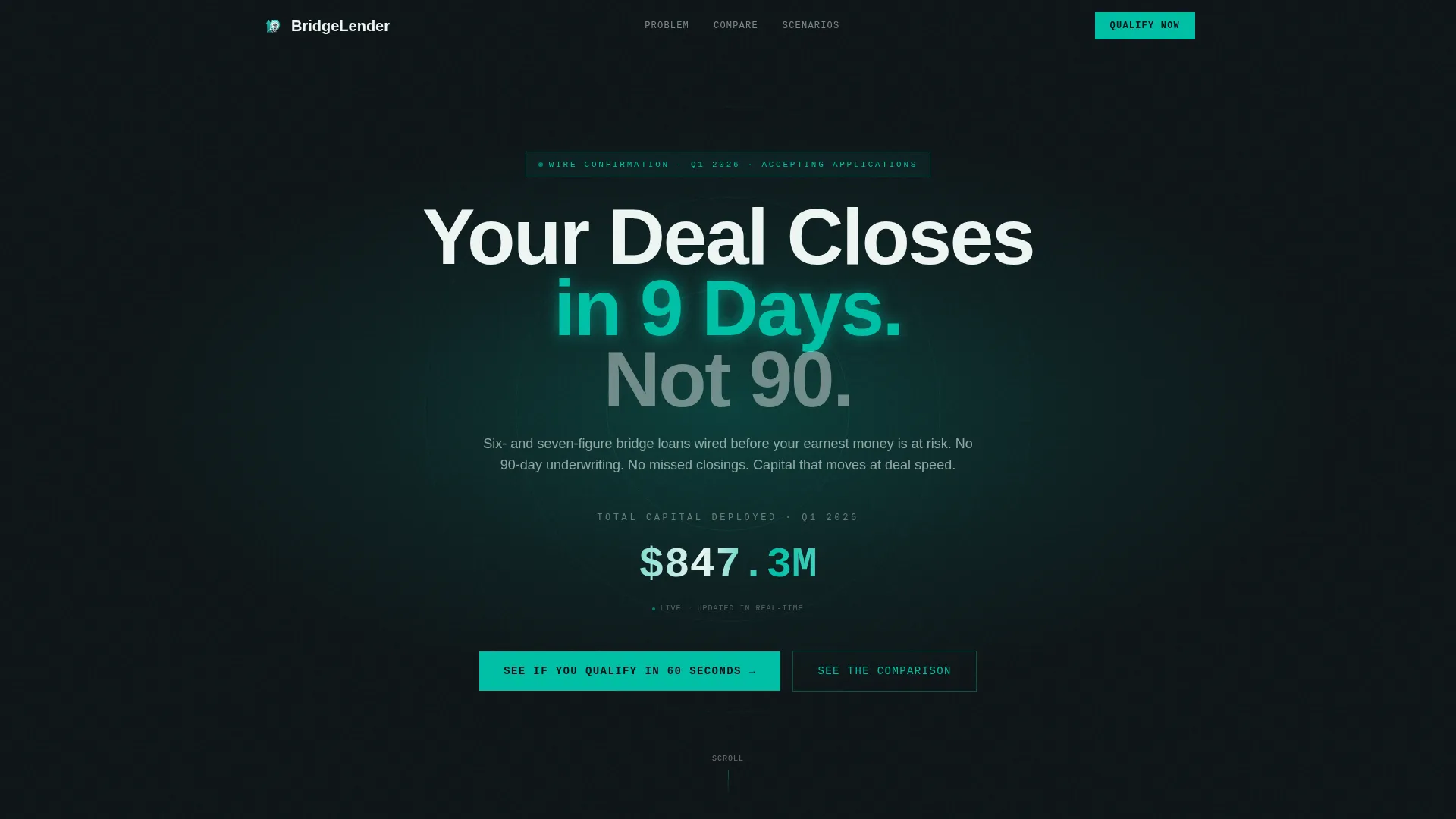
- A full-bleed dark header with an animated capital counter and a teal glow effect
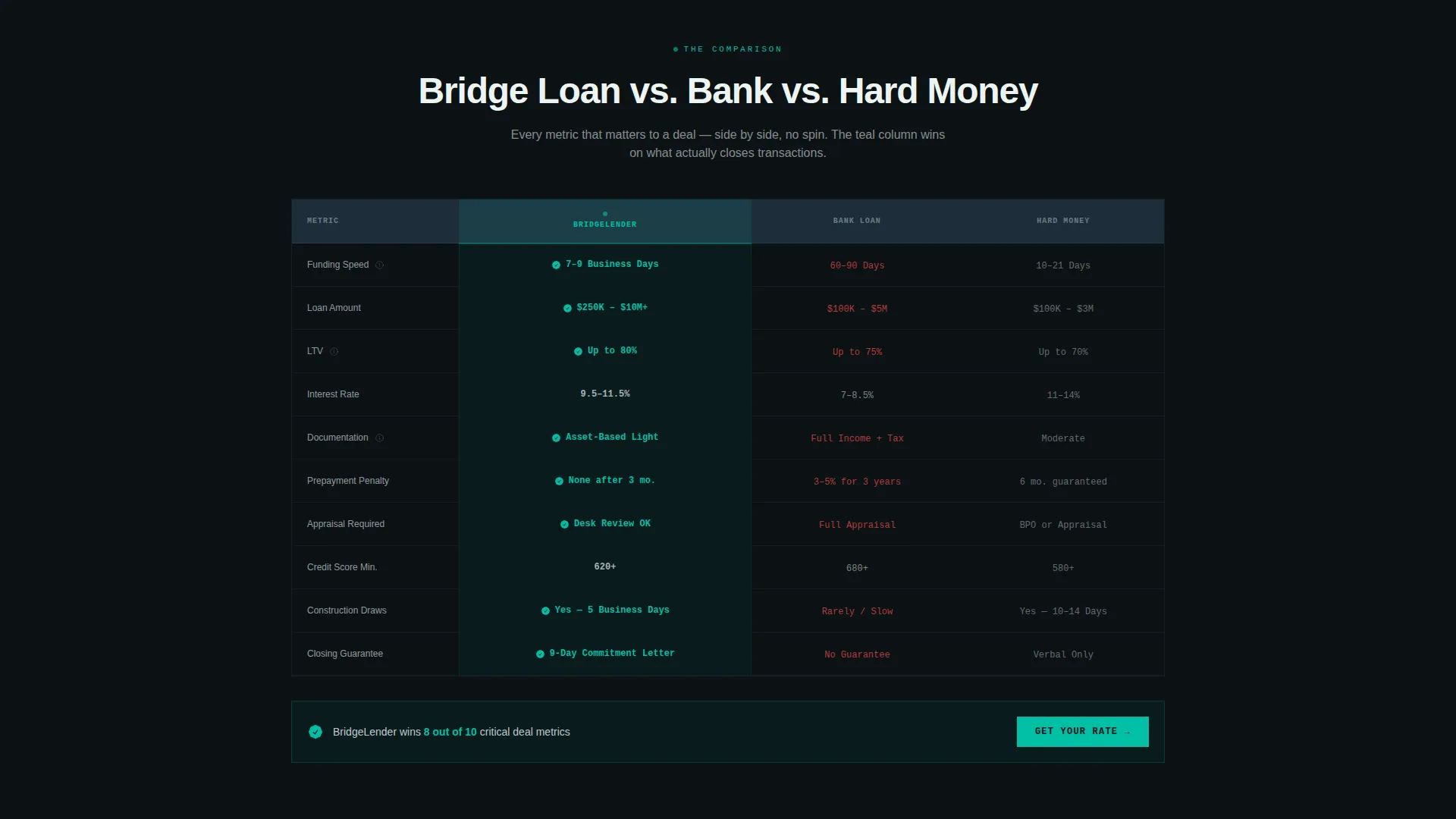
- A scrolling, animated comparison table covering speed, rate, loan-to-value ratio, documentation, and prepayment penalties across three lending types
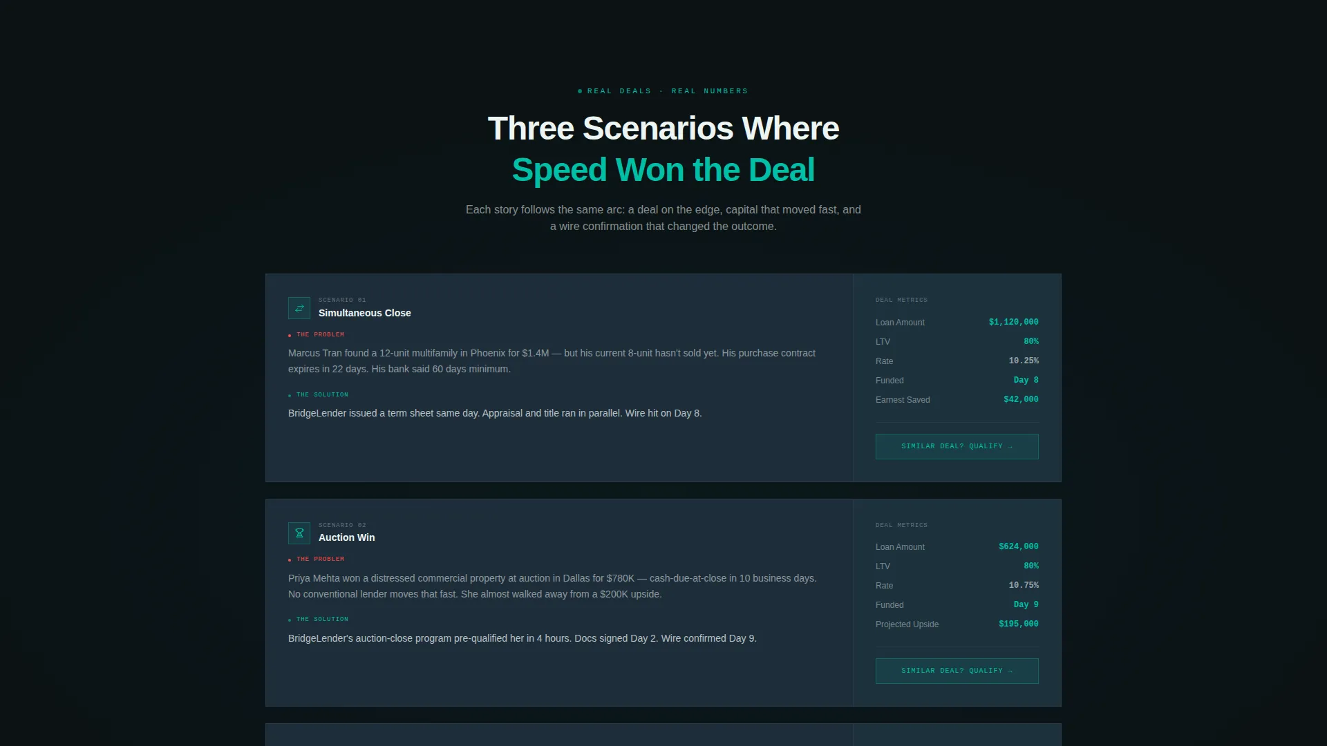
- Three real-deal scenario blocks showing simultaneous close, auction win, and rehab flip use cases with actual numbers
- A four-step qualification quiz with a progress bar, property type selector, loan amount slider, timeline picker, and exit strategy field
- A sticky teal call-to-action bar anchored to the viewport at all times
Feature list
This template packages every persuasion layer a bridge lender needs into one structured, scrollable page. Below are the core components built into the design.
Animated Loan Comparison Table
The centerpiece of the page is a three-column table comparing bridge loans, bank loans, and hard money across five key metrics. Each row animates in on scroll, and the bridge loan column highlights every winning metric in electric teal, building a visual case cell by cell.
Four-Step Qualification Quiz
The primary conversion path is a guided quiz that opens from the sticky call-to-action bar. Visitors select property type, set a loan amount with a slider, pick a closing timeline, and choose an exit strategy. The result screen shows a personalized rate range and an estimated funding date.
Deal Scenario Story Blocks
Three mini problem-solution story blocks follow the comparison table. Each scenario covers a real borrower situation, including a simultaneous close, an auction win, and a rehab flip, and pairs real numbers with a concise resolution narrative.
Dark Full-Bleed Header with Live Counter
The header uses a deep command-center background with a radial teal glow behind the primary headline. An animated counter ticks upward showing total capital deployed this quarter, giving the page a live, real-time signal that the lender is actively funding deals.
Sticky Call-to-Action Bar
A teal bar stays anchored to the bottom of the viewport throughout the scroll. It holds the primary quiz trigger and keeps the conversion entry point visible at every stage of the page without interrupting the reading flow.
Problem Timeline Visual
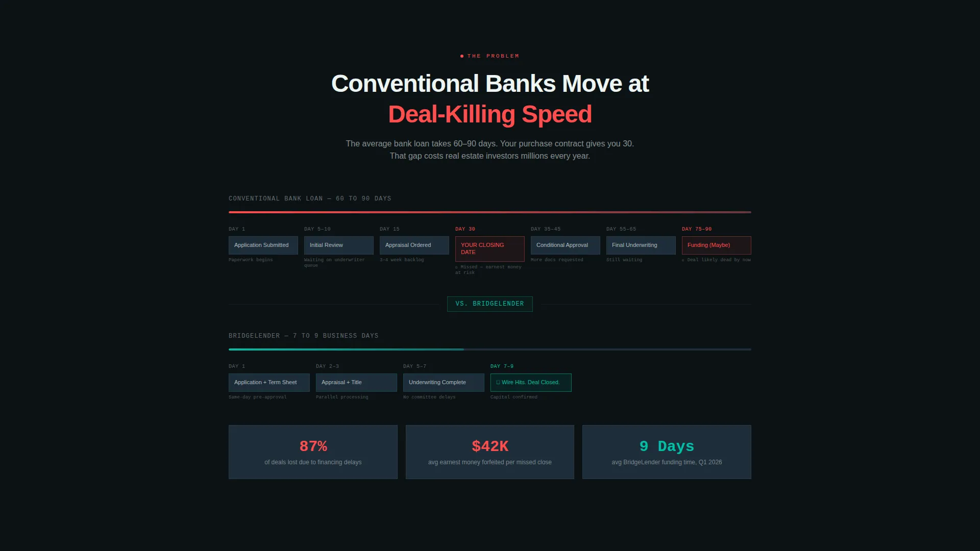
The scroll opens with a visual timeline showing a conventional bank loan dragging across 60 to 90 days. Red flags mark missed closing dates, lost earnest money deposits, and collapsed deals, framing the lender's speed as the direct solution to a recognized pain.
Page sections overview
| Section | Purpose |
|---|---|
| Dark Header Block | Headline, teal glow, and animated capital counter set urgency immediately |
| Problem Timeline Visual | Visualizes bank loan delays and the cost of missed closings |
| Comparison Table | Side-by-side bridge versus. bank versus. hard money across five metrics |
| Deal Scenario Blocks | Three real-number borrower stories show the template in action |
| Qualification Quiz | Four-step guided flow delivers a personalized rate and funding estimate |
| Sticky call to action Bar | Persistent call-to-action keeps the quiz entry point always visible |
Design & branding system
The visual identity follows a Startup Velocity theme built around a Teal Catalyst color system. The palette feels like a fintech trading floor at midnight: dark, precise, and alive with purposeful color signals.
- Deep command-center black (#0B1215) as the page background, cool slate (#1E2D3A) for card surfaces and table rows, and clean signal white (#EDF5F3) for all body typography and data
- Electric teal (#00BFA6) used exclusively for interactive glows, accent highlights, progress bar fills, and every winning metric in the comparison table
- Oversized white headline typography in the header, paired with a soft radial teal light at 30 percent opacity emanating from behind the primary text
Mobile & speed optimization
The layout is structured for a single-page scroll, which means every section loads in sequence and each interaction point remains reachable without page navigation. The sticky call-to-action bar and quiz modal are designed to work within a compact vertical viewport.
- Comparison table rows and deal scenario blocks are sized for vertical scrolling on smaller screens
- The four-step quiz uses a slider and tap-friendly selector controls suited to mobile interaction patterns
- The animated counter and scroll-triggered row animations are contained within the single-page structure
How this template helps you convert
Every design and content decision in this template is aimed at one outcome: turning an anxious borrower into a qualified, contactable lead. The conversion architecture earns trust before it asks for anything.
- The problem timeline creates immediate recognition for visitors who have experienced or fear a failed closing, making the lender's speed feel personally relevant within the first scroll.
- The animated comparison table removes the need for the visitor to research alternatives elsewhere by answering the "why not a bank or hard money lender" question directly on the page.
- The quiz delivers a personalized result, including a rate range and estimated funding date, before requesting name, email, or phone number, so the visitor exchanges contact details for something genuinely useful.
Other information about this template
This template fits naturally into the alternative lending and finance space, where speed and credibility are the two deciding factors for borrowers under deadline pressure. A few additional details worth noting:
- The template is designed as a single landing page, not a multi-page website, keeping the visitor focused on one action
- The quiz funnel is structured around four borrower-defined inputs: property type, loan amount, closing timeline, and exit strategy, matching the way real borrowers think about their deal
- The creative direction follows a Problem-to-Solution arc, a structure well suited to high-stakes financial decisions where the visitor needs to feel understood before they trust a lender
- The color system and dark theme are deliberately different from conventional bank aesthetics, signaling speed and innovation to an audience that has already been let down by slow institutional lenders
- This template is built for lenders operating in the bridge loan space, covering residential, multifamily, and commercial property types as defined by the quiz flow
Theme
Startup Velocity
Creative direction
Problem→Solution Arc
Color system
Teal Catalyst
Style
Comparison Table
Direction
Quiz/Assessment
Page Sections
Animated Loan Comparison Table
Four-step Qualification Quiz
Deal Scenario Story Blocks
Dark Header with Live Capital Counter
Persistent Sticky Call to Action Bar
Problem Timeline Visual
Related questions
What type of lender is this template designed for?
What does the qualification quiz actually do?
Does the comparison table content come pre-filled?
Can this template work for residential and commercial bridge loans?
What makes this template different from a standard finance landing page?



