Horse Insurance Provider Landing Page Template
Bridle is a masonry-style landing page built for horse insurance providers. It combines an animated hand-drawn illustration header, an origin-story scroll, and a friction-reducing booking flow into one cohesive page. The design uses a nature-inspired dopamine pop palette to make a specialist financial product feel personal, warm, and immediately trustworthy to horse owners at every level.
by Rocket studio
Quick summary
Bridle is a single-page template designed for equine insurance providers. It opens with a self-drawing illustration, moves through a founder origin story told across a masonry grid, and closes every section with a clear call to action. The result is a booking-focused landing page that earns trust before it asks for anything.
Who this template is for
This template is built for specialist horse insurance providers who need to communicate genuine expertise fast. It works equally well for independent equine underwriters, boutique insurance brokers, and stud farm cover specialists who serve clients with real skin in the game.
- Competition riders and event yard managers who need reliable cover for high-value horses
- Stud farm operators managing seasonal breeding risk and foaling cover
- Pony club families who have invested significantly in a schoolmaster and need straightforward protection
What problem this template solves
Generic insurance landing pages feel cold. They list policy features in bullet tables and ask visitors to fill in long forms before they feel understood. Equine owners are a skeptical audience. They know their horses are both irreplaceable companions and serious financial assets, and they want to see that the provider understands both sides of that reality.
- Standard templates do not reflect the emotional and financial stakes of horse ownership
- Most booking flows ask too many questions too early, causing drop-off before a call is ever booked
- A page without a clear trust narrative cannot convert a cautious horse owner into a first enquiry
What you get with this template
You get a fully designed landing page with every section, visual component, and interaction pattern already in place. The structure moves visitors from curiosity to booking without friction, using storytelling and smart layout choices to do the heavy lifting.
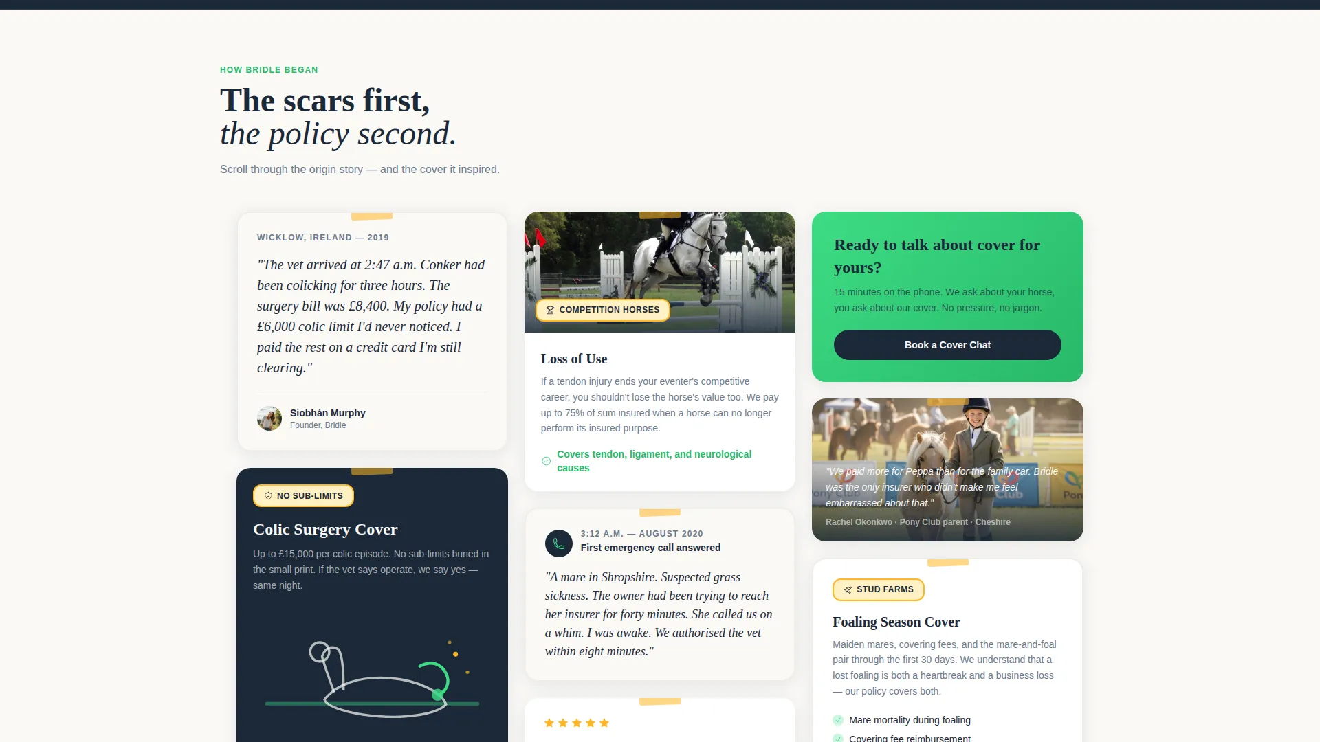
- A masonry grid layout with alternating origin-story cards and product information tiles
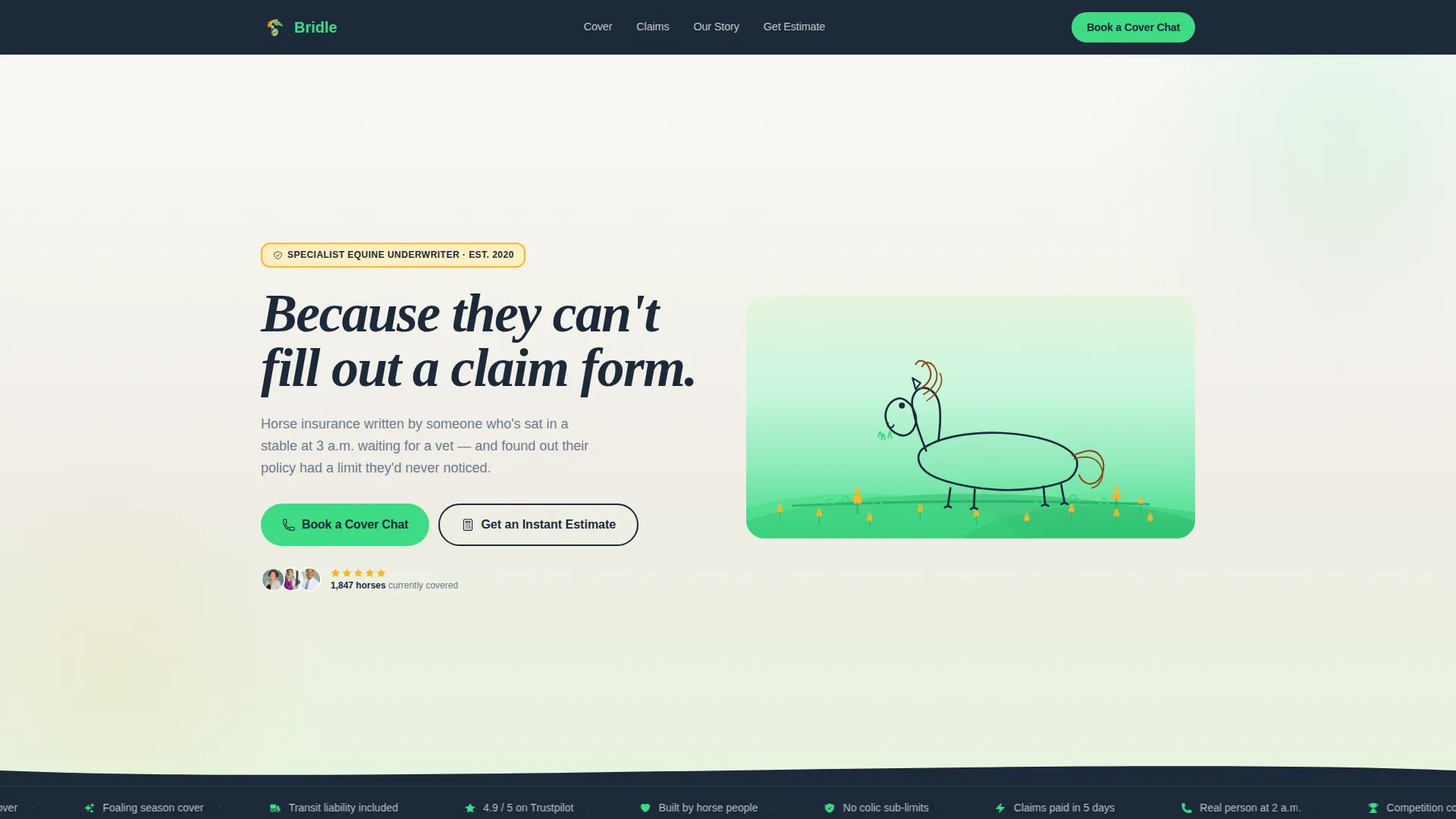
- An animated illustration header that draws itself in real time, paired with a headline that writes itself in sync
- A sticky mobile booking bar, an inline 15-minute slot scheduler, and a secondary instant-estimate path
Feature list
This section describes the core components built into the Bridle template.
Self-Drawing Animated Header
The header opens with a hand-drawn horse illustration that sketches itself into view as the page loads. Buttercups bloom in marigold, grass fills in electric clover green, and a parallax effect moves the mane gently. The headline appears in sync with the final drawn line, creating an entrance no photograph could replicate.
Origin Story Masonry Grid
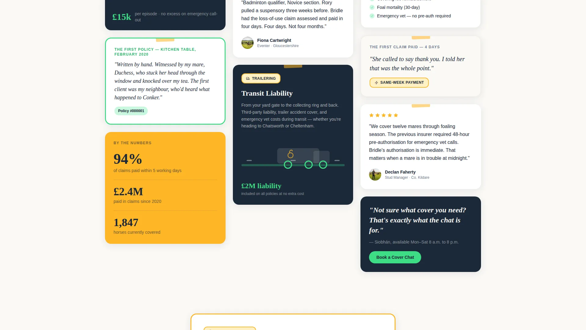
The page body is a masonry grid of cards that tells the provider's founding story in sequence. Short handwritten-style text blocks carry the narrative from the founding moment through the first policy, the first emergency call, and the first same-week claim paid. Product tiles appear between story cards, making cover categories feel personal rather than bureaucratic.
Inline Booking Scheduler
The primary call to action opens a lightweight inline scheduler directly on the page. Visitors choose a 15-minute phone slot and provide only the horse's name, breed, primary use via a dropdown, and a mobile number. The form is minimal by design to reduce friction before the first conversation.
Instant Estimate Secondary Path
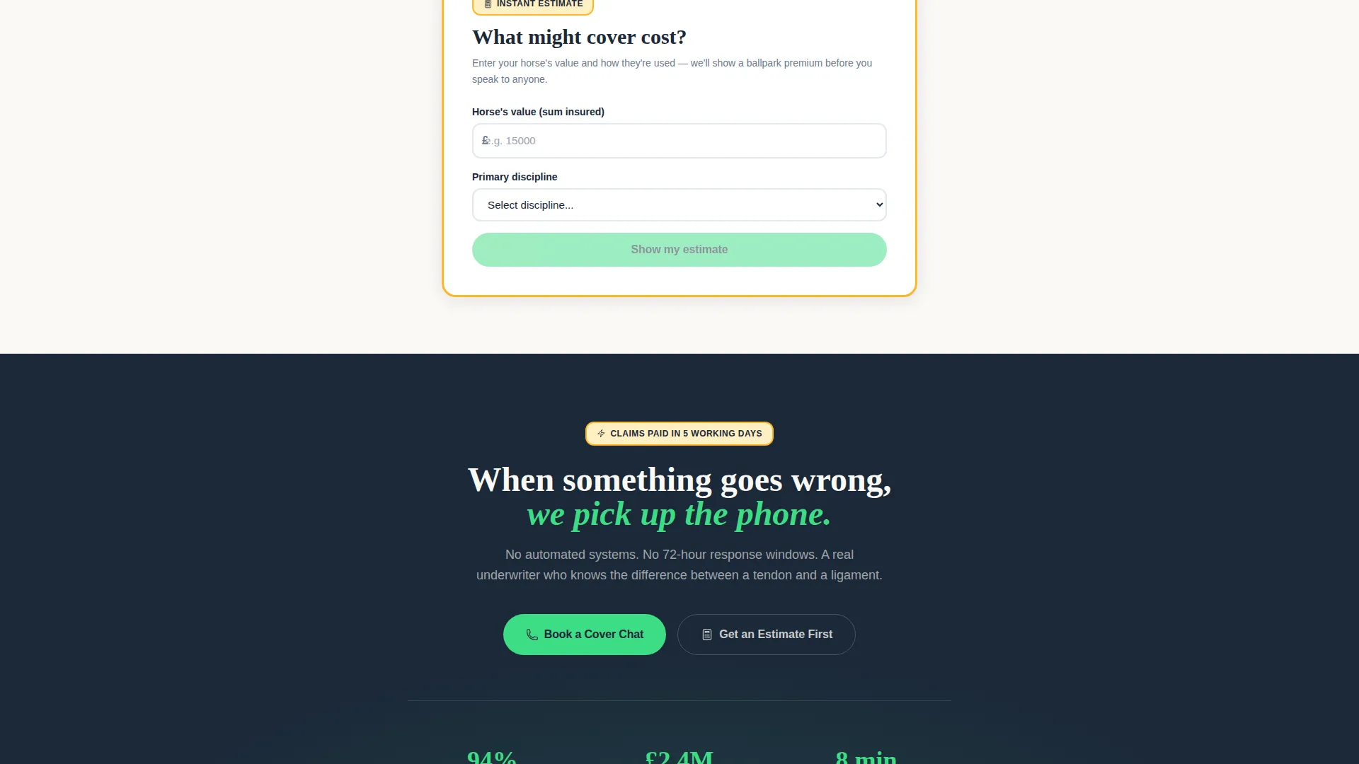
Visitors who want numbers before a call can use the secondary path. They enter a sum insured and discipline, and the page returns a ballpark premium. This secondary flow reduces hesitation for cautious visitors without removing the primary booking route.
Sticky Mobile Booking Bar
On mobile, a persistent booking bar sits at the bottom of the screen at all times. The call to action is always visible, no matter how far down the page a visitor scrolls. The bar reappears after every third masonry row on desktop as well.
Hand-Drawn Product Illustration Tiles
Every product category tile, covering areas such as colic surgery, loss of use, and transit liability, uses the same hand-drawn illustration style as the header. This visual consistency makes the product section feel like a natural continuation of the story rather than a shift into sales mode.
Page sections overview
| Section | Purpose |
|---|---|
| Animated Illustration Header | Opens with self-drawing horse art and a synchronised headline |
| Founder Origin Card | Establishes credibility through a real founding story |
| First Policy Card | Shows the first policy written on a kitchen table |
| Emergency Call Card | Demonstrates 24-hour responsiveness with a real example |
| Same-Week Claim Card | Builds payment trust with a concrete outcome story |
| Colic Surgery Tile | Presents surgical cover in illustrated, personal format |
| Loss of Use Tile | Explains loss-of-use cover with matching hand-drawn art |
| Transit Liability Tile | Covers trailering and transit risk in the same visual style |
| Book a Cover Chat call to action | Repeating booking prompt anchored after every third grid row |
| Inline Slot Scheduler | Lightweight 15-minute call booking form embedded on the page |
| Instant Estimate Path | Secondary ballpark premium tool for cautious visitors |
| Sticky Mobile Bar | Persistent bottom-bar booking prompt on mobile screens |
Design & branding system
The visual identity follows a nature-inspired theme executed through a dopamine pop colour system. The palette draws from a wildflower meadow photographed on oversaturated film: natural subjects rendered in unnatural vibrancy.
- Deep stable-door navy (#1B2838) anchors headers and footers; electric clover green (#3DDC84) fires every button and interactive toggle
- Hot marigold (#FFB627) highlights pull-quotes and trust badges; chalk-white (#FAF9F6) holds breathing room between cards so nothing competes
- Every visual element, from grid cards to product tiles, uses the same hand-drawn illustration style to keep the page cohesive and warm
Mobile & speed optimization
The template is structured to perform cleanly on mobile without sacrificing the visual richness of the masonry layout. The sticky booking bar ensures the primary call to action stays accessible on small screens throughout the entire scroll.
- The masonry grid reflows gracefully for narrower viewports so card content remains readable
- The inline scheduler and instant estimate path are both designed to work within the mobile layout without opening external windows
- The parallax animation on the header illustration is lightweight and does not interrupt the page load experience
How this template helps you convert
The page is built around a single conversion goal: getting a horse owner to book a 15-minute cover chat. Every design and content decision supports that goal without pressuring the visitor before they are ready.
- The origin story scroll builds genuine emotional trust before any product or price is introduced, so visitors arrive at the booking section already convinced the provider understands their world.
- The dual call-to-action path removes the binary choice between "book now" and "leave". Visitors who want a premium estimate get one immediately, which keeps them on the page and moves them closer to the main booking flow.
Other information about this template
This template is a strong fit for any equine insurance provider looking to stand out in a niche where most competitors use generic financial services layouts. The Bridle design language is deliberately warm, illustration-led, and storytelling-first.
- The template style is masonry and Pinterest-inspired, making it visually distinctive compared to standard single-column insurance pages
- The booking scheduler collects only four data points: horse name, breed, primary use, and owner mobile number, keeping the barrier to entry very low
- Primary use options in the dropdown cover competition, breeding, pleasure, and retirement, reflecting the real range of equine clients from event riders to retired cobs
Theme
Nature-Inspired
Creative direction
Origin Story
Color system
Dopamine Pop
Style
Masonry/Pinterest
Direction
Booking/Scheduling
Page Sections
Self-drawing Animated Header
Origin Story Masonry Grid
Inline 15-minute Booking Scheduler
Instant Premium Estimate Path
Sticky Mobile Booking Bar
Hand-drawn Product Illustration Tiles
Related questions
What type of business is this landing page designed for?
Can I edit the origin story cards to reflect my own founding history?
How does the inline booking scheduler work?
What makes this template different from a standard insurance page template?
What information does the booking form collect from visitors?