Elite Consulting Landing Page Template
Briefing is a gallery-and-detail landing page built for a veteran-owned consulting firm targeting mid-market CEOs, COOs, and private equity operators. The Neo-Retro design pairs deep obsidian black with worn brass gold. Each service is presented as a discrete case file. Visitors browse, click deeper, and are guided toward a meaningful engagement upgrade.
by Rocket studio
Quick summary
Briefing is a single-page consulting landing page that presents every service offering as a curated case file in a war-room gallery grid. The design uses an Obsidian and Gold color system with a Neo-Retro feel. The page opens with a provocative search prompt, guides visitors through an evidence-led browsing experience, and closes with a structured upgrade path.
Who this template is for
This template is built for founders and operators who lead serious organizations. It speaks directly to people who have already done hard things and need a firm that can match that standard.
- CEOs of companies with 50 to 500 employees who have outgrown their original operating playbook
- COOs carrying operational debt they struggle to name or quantify
- Private equity portfolio managers who need a turnaround team with verifiable discipline
What problem this template solves
Many consulting firms look the same online: stock photography, vague promises, and a single contact form. This template solves the trust gap between a firm's actual capability and how that capability is perceived by a skeptical mid-market buyer.
- Visitors often leave without understanding the full range of services on offer
- A single-service entry point rarely converts to a broader engagement without deliberate design
- Generic landing pages fail to communicate the precision and consequence that operators actually respect
What you get with this template
This template gives you a fully structured, single-page layout built around evidence-led browsing. Every element is purposeful and arranged to reflect the operational discipline the firm represents.
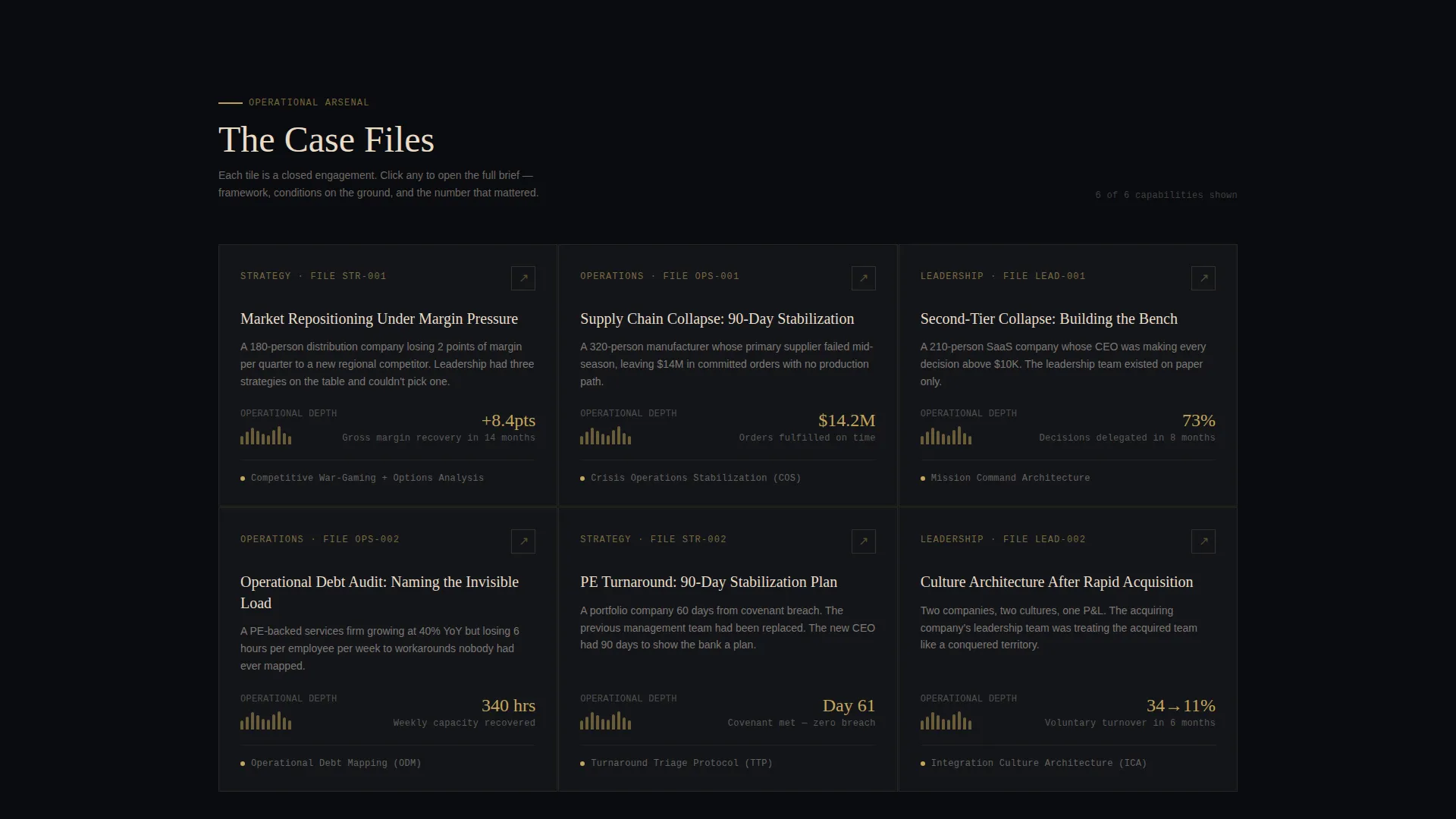
- A gallery grid of service cards, each expandable into a full detail panel with engagement story, framework, and outcome
- A header search box with a brass-gold underline, a ghost prompt, and three clickable category tabs
- A dual-call to action upgrade architecture with a primary path and a gated secondary download
Feature list
This template includes a carefully scoped set of functional components drawn directly from the source brief. Each one serves a clear role in the visitor's journey from first impression to upgrade decision.
Operational Search Header
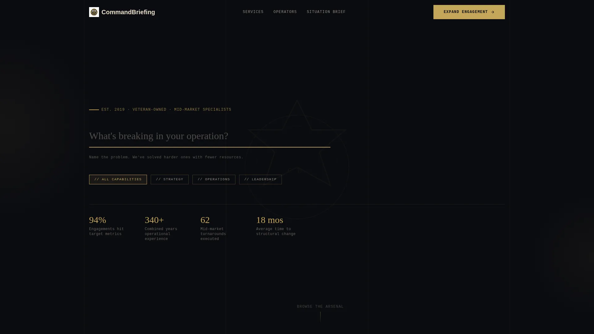
The page opens with a single input field set against obsidian black. The ghost prompt reads "What's breaking in your operation?" A brass-gold underline and a fading monogram crest watermark frame the question. Three brass-tagged category tabs, Strategy, Operations, and Leadership, sit below like labeled file drawers, each clickable.
Gallery Grid of Service Cards
Services are laid out as discrete artifacts in a war-room gallery grid. Each card functions like a case file. The scroll does not build a linear argument; it invites purposeful browsing. Visitors who arrived for one capability routinely discover several others they had not considered.
Expandable Detail Panels
Clicking any gallery card opens a full detail panel. The panel contains the engagement story, the framework applied, and the measurable outcome. This structure lets the firm show, not just tell. Each panel earns credibility before asking for anything in return.
Primary Upgrade Call to Action
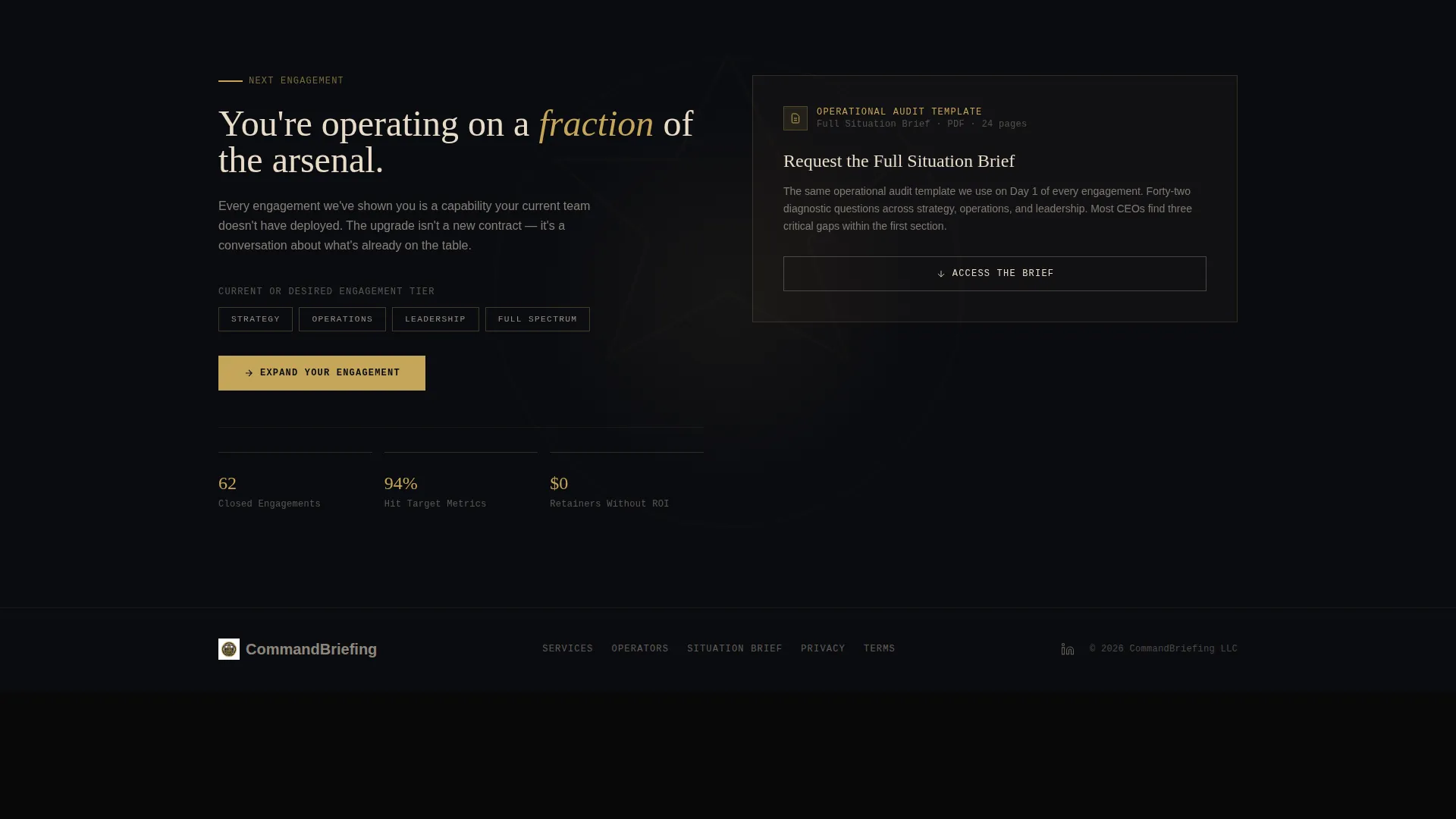
The primary call to action, "Expand Your Engagement," appears at the bottom of every detail panel. It is pre-filled with the visitor's current service tier, reducing friction for visitors arriving from an existing engagement. The upgrade is earned through accumulated evidence, not urgency.
Gated Operational Audit Download
A secondary path, "Request the Full Situation Brief," gates a downloadable operational audit template. Access requires an email address and a company-size qualifier. This creates a structured qualification step while delivering immediate value to serious prospects.
Neo-Retro Visual Identity System
The color system uses deep obsidian black for backgrounds, worn brass gold for interactive elements and accent lines, khaki parchment for body copy, and gunmetal gray for secondary text and dividers. The result feels like a leather-bound service record with gold-leaf embossing.
Page sections overview
| Section | Purpose |
|---|---|
| Search Header | Opens with the problem-framing input field and category tabs |
| Gallery Grid | Displays all service offerings as browsable case-file cards |
| Detail Panel | Expands a selected card with story, framework, and outcome |
| Primary call to action Block | Presents the "Expand Your Engagement" upgrade path |
| Gated Download Path | Gates the operational audit template behind qualification |
Design & branding system
The visual identity is Neo-Retro with a deliberate, worn-in quality. Every color choice carries a specific role, and nothing is decorative without purpose.
- Obsidian black (#0B0C10) dominates backgrounds and section breaks; brass gold (#C5A55A) marks every interactive element, accent line, and rank stripe
- Khaki parchment (#E8DCC8) carries body copy for legibility against dark backgrounds; gunmetal gray (#3D4148) holds secondary text and structural dividers
- A monogram crest watermark fades behind the search header, reinforcing the firm's identity without overpowering the central question
Mobile & speed optimization
The layout is designed to translate the gallery-and-detail experience cleanly across screen sizes. The browsing flow and card interactions are structured to remain functional and legible on smaller viewports.
- The gallery grid adapts to narrower screens without losing the case-file card structure or the detail panel logic
- Brass-gold interactive elements and parchment body copy maintain contrast and readability across device sizes
- The search header and category tabs are positioned to remain accessible and clear on mobile without horizontal scrolling
How this template helps you convert
The page is built around an upsell and upgrade conversion model. Every design and content decision is aimed at moving a visitor from a single-service mindset to a full-engagement decision.
- The gallery browsing structure ensures visitors discover capabilities beyond the one they originally sought, making a broader engagement feel like the obvious next step rather than a sales push.
- The pre-filled "Expand Your Engagement" call to action at the bottom of every detail panel reduces the friction of upgrading by meeting the visitor exactly where they already are.
- The gated operational audit download qualifies serious prospects with a company-size filter while giving them something genuinely useful before they commit to a conversation.
Other information about this template
This template was designed to serve a veteran-owned consulting firm operating in the mid-market space. The brief and its layout choices reflect a very specific client profile and a deliberate rejection of generic consulting aesthetics.
- The template style is Gallery and Detail, pairing a curated browsing experience with deep per-service content
- The header concept is a Search Box, chosen to place the visitor's problem at the center of the first interaction rather than the firm's credentials
- The creative direction is Curated Collection, treating each service offering as a discrete artifact with its own story and evidence
- The Neo-Retro theme and Obsidian and Gold color system are core to the visual identity and should be preserved when customizing
- This template is well suited to veteran-owned business contexts where operational credibility and earned authority need to be communicated without relying on conventional marketing language
Theme
Neo-Retro
Creative direction
Curated Collection
Color system
Sunset Gradient
Style
Gallery + Detail
Direction
Quiz/Assessment
Page Sections
Operational Search Header
Gallery Grid of Service Cards
Expandable Detail Panels
Pre-filled Upgrade Call to Action
Gated Operational Audit Download
Neo-retro Visual Identity System
Related questions
Who is this landing page template designed for?
Can I use this template for a firm with more than one service area?
How does the upgrade path work in this template?
What makes this template different from a standard consulting page?
Can I customize the colors and copy in this template?



