Street Food & Market Stall Professional Website Template
Brine is a gallery-and-detail landing page built for an agrarian fried chicken stand. It leads visitors through a sensory scrapbook header, a click-to-expand menu gallery with macro photography and origin stories, a farm sourcing narrative, and a tabbed order form covering both pickup and catering. The design uses a Fire and Earth color palette rooted in cast-iron craft and Southern food heritage.
by Rocket studio
Quick summary
Brine is a single-page, gallery-led landing page template designed for an artisanal fried chicken stand. It layers a found-object scrapbook header over a sensory menu gallery, a farm-to-table sourcing story, and a dual-path order form. The result is a restaurant web presence that feels as honest and hand-made as the food it sells.
Who this template is for
This template works for any fried chicken business that wants to sell online with personality. It fits roadside stands, market stalls, and neighborhood spots where the food carries a story worth telling.
- Local fried chicken stands and pop-up food vendors who need a fast, good-looking restaurant website
- Church catering coordinators and event planners who want to browse the menu and submit a headcount request in one place
- Food entrepreneurs creating a direct-to-consumer restaurant presence without a large web design budget
What problem this template solves
Most fast food and street food operators lose online orders because their website cannot match the energy of the stand itself. A plain, generic restaurant page fails to communicate the craft, the sourcing story, or the specific chicken cuts available that day. Visitors leave before they ever reach the order button.
- Disconnected design that does not reflect the brand voice or food identity
- No easy way for customers to choose cuts, build a box, or submit a catering request from the same page
- Missing sensory context that makes fried chicken irresistible before a person even arrives at the window
What you get with this template
You get a complete, ready-to-customize landing page that covers every stage of the customer journey. The template provides a clear visual hierarchy, rich food imagery placeholders, and two distinct conversion paths built into a single tabbed form.
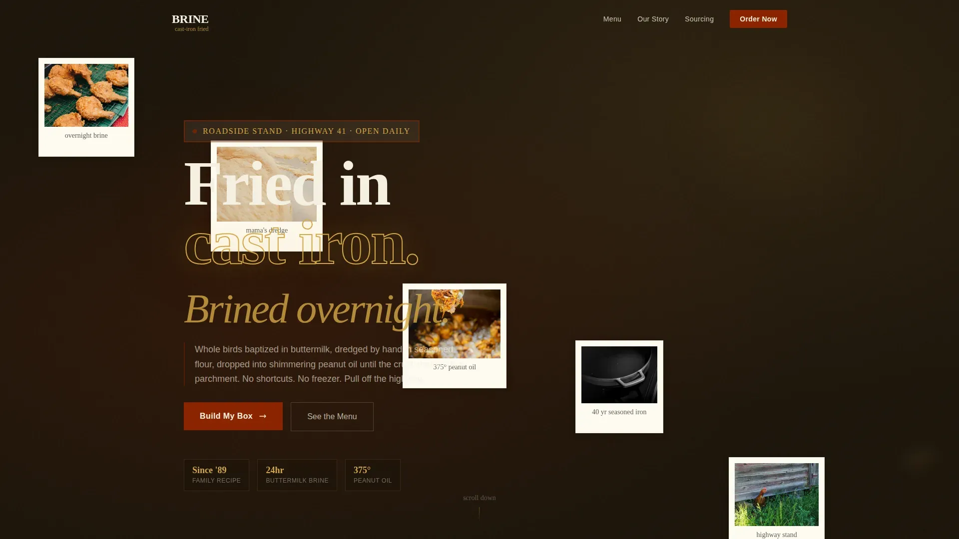
- A collage scrapbook hero section with layered Polaroid-style photo compositions, handwritten recipe card elements, and a stamped logo treatment
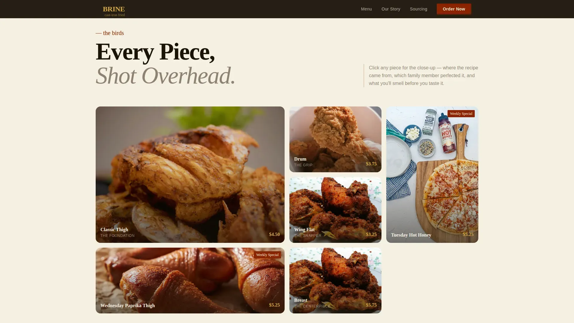
- A click-to-expand menu gallery where each fried chicken item opens a macro detail panel with a two-line origin story
- A tabbed dual-path order form with a piece-count builder for pickup and a headcount, date, and style-preference set of fields for catering
Feature list
This template is built around a small set of purposeful, high-impact features. Each one is designed to move visitors from browsing to ordering without friction.
Collage Scrapbook Hero
The header layers torn-edge Polaroid images, stained index card recipe fragments, a faded grandmother dredging chicken, and a stamped logo that looks burned into butcher paper. Nothing is aligned. The composition feels found rather than designed, which immediately communicates heritage and craft to anyone who lands on the page.
Macro Gallery with Slide-Open Detail Panel
Every fried chicken menu item appears in an overhead grid shot on wax paper. Clicking any piece opens a slide panel with a macro photograph close enough to see individual spice flecks in the crust. Each panel includes a two-line origin story connecting the dish to the family member who perfected the recipe.
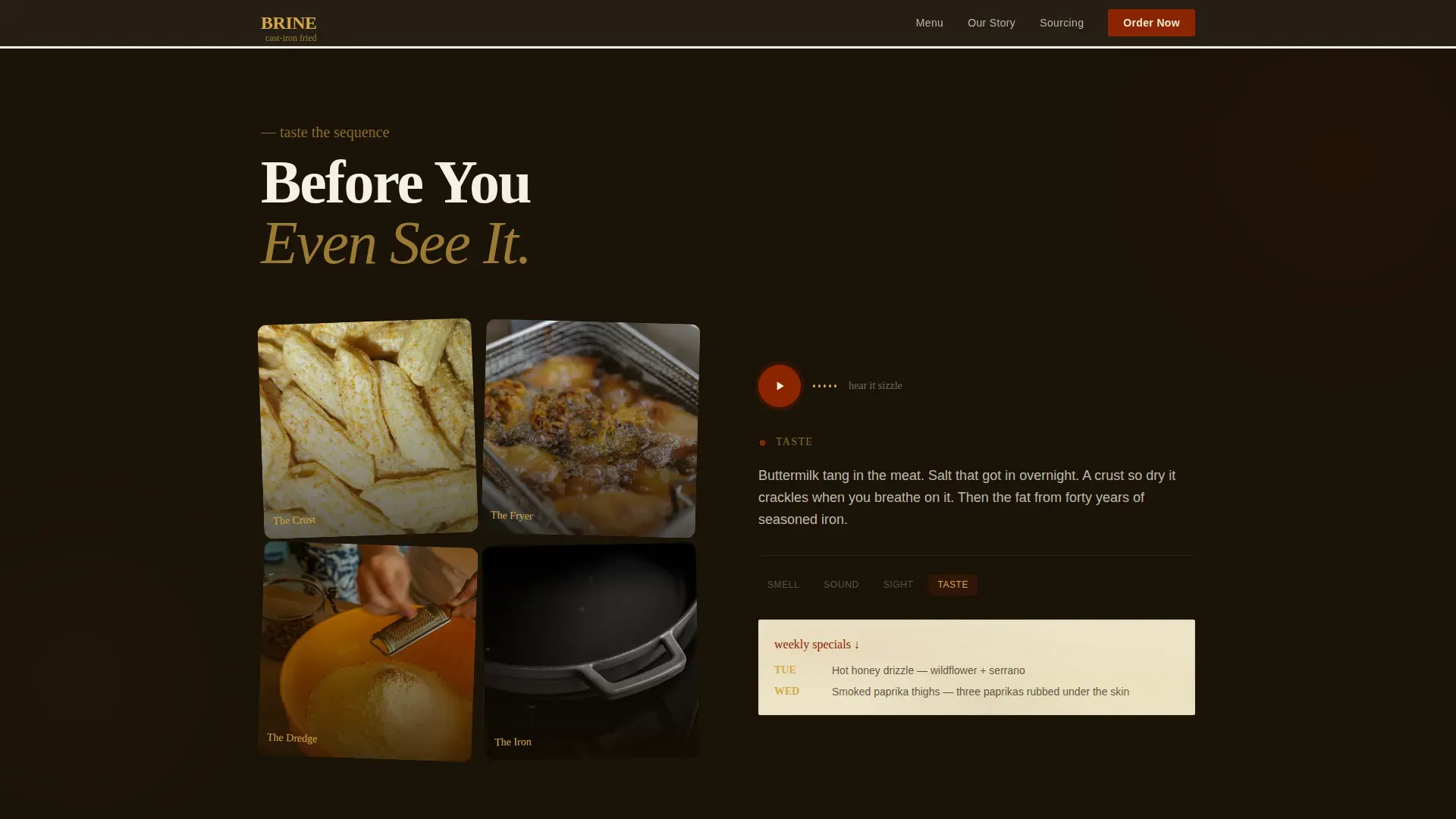
Sensory Arc Section Sequence
The page moves visitors through sight, sound, and smell in sequence. An overhead gallery handles sight. A looping audio snippet of sizzling oil handles sound. Aroma language so specific it triggers food memory handles the rest. This sensory design concept is built to make fried chicken irresistible before anyone places an order.
Dual-Path Tabbed Order Form
Two conversion paths share a single form area via tabs. The pickup path uses a time-slot selector and a piece-count builder for thighs, drums, wings, breast, and mixed boxes. The catering path provides a headcount field, a date picker, and a style toggle between Classic, Nashville Hot, and Lemon-Pepper. Primary calls to action read "Build My Box" and "Feed My People."
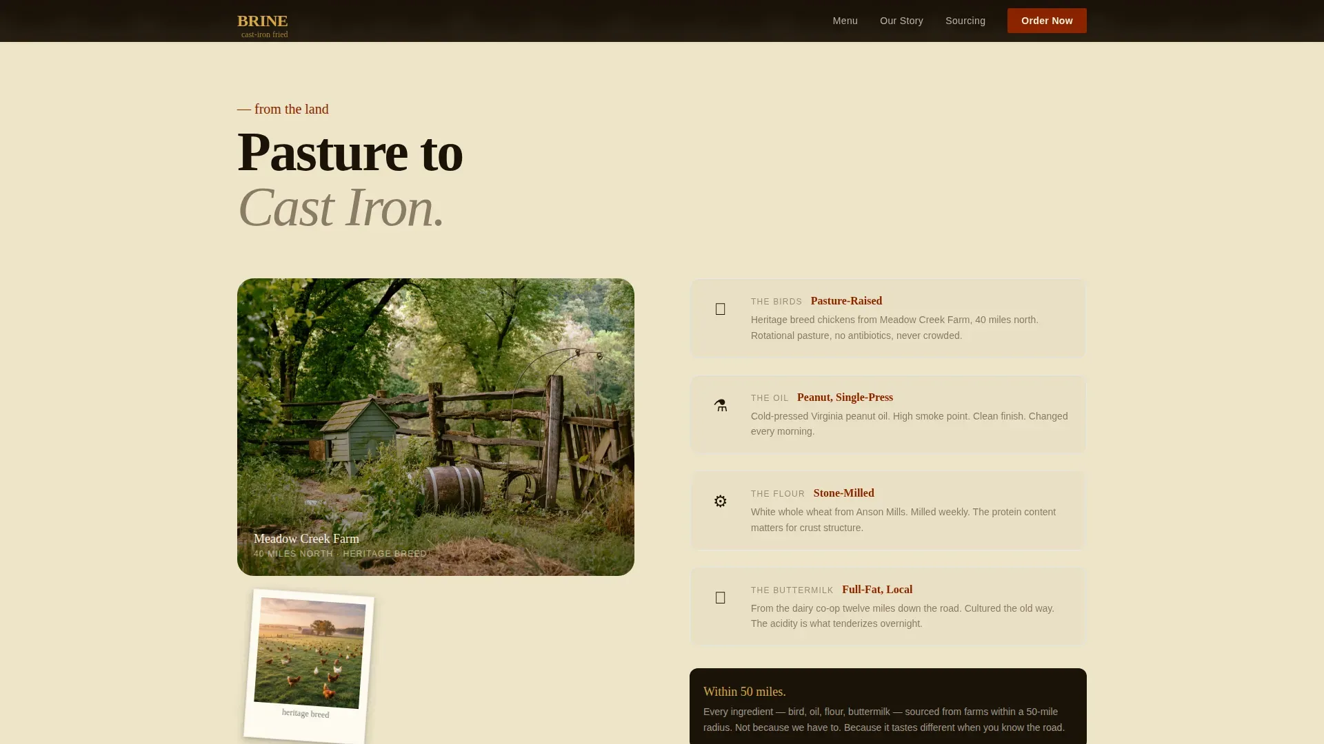
Farm Sourcing Story Section
The final content section connects every bird back to pasture and soil. Visual storytelling uses images of the farm and stand to build a farm-to-table narrative that supports trust. Sensory adjectives and origin details give customers good reason to choose this chicken over any fast food alternative.
Weekly Special and Social Proof Callouts
The template includes quote card slots for regular customers and callout blocks for weekly specials. Tuesday hot honey drizzle and Wednesday smoked paprika thighs are both built into the layout as rotating highlight examples. These details add life to the page and reward returning visitors.
Page sections overview
| Section | Purpose |
|---|---|
| Scrapbook Hero | Establish brand heritage and atmosphere |
| Menu Gallery Grid | Showcase every chicken cut overhead |
| Macro Detail Panel | Reveal texture and recipe origin story |
| Sensory Arc | Engage sight, sound, and aroma |
| Farm Sourcing Story | Build farm-to-table trust |
| Weekly Special Callouts | Highlight rotating chicken specials |
| Customer Quote Cards | Provide social proof from regulars |
| Tabbed Order Form | Handle pickup and catering conversion |
| Footer Arc Split | Share logo, tagline, and navigation links |
Design & branding system
The visual identity follows an Agrarian Root theme built around a Fire and Earth color system. The palette feels like a cast-iron skillet seasoned over decades: blackened, warm, and impossible to replicate.
- Colors: scorched iron black (#1A1208), deep clay red (#8B2500), sun-dried wheat (#D4A843), and crackled eggshell white (#F5F0E1) provide earthy, warm tones that evoke growth and heritage rather than generic fast food colours
- Typography: Fraunces display serif handles all headings and gives the brand a readable but characterful presence; DM Sans handles body copy with clean, simple clarity that fits the agrarian concept
- Illustrations and decorative elements: torn paper edges, grease-smudge textures, hand-stamp logo treatments, and index-card overlays add tactile personality across the design; designers can add, refine, or swap these illustration assets to match a specific chicken brand identity
Mobile & speed optimization
This template is built mobile-first, with construction crews ordering from truck cabs and church groups checking the menu between services in mind. Every interactive element is sized for thumb-friendly use.
- Large tap-friendly buttons on the order form let customers pick their chicken cuts and submit requests without pinching or zooming
- Images are sized and structured to perform well on mobile connections, keeping the page load experience smooth for phone users
- The piece-count builder and catering fields stack cleanly in a single column on small screens, so the full conversion path stays open and easy to access on any device
How this template helps you convert
A well-designed restaurant website can attract new customers and keep regulars coming back. This template is built around three conversion principles that work together to move visitors toward an order.
- Sensory-first design builds appetite before the form ever appears. By the time visitors reach the order section, the gallery, audio, and aroma language have already done the emotional work. Calls to action feel like a natural next step rather than a hard sell.
- Dual-path ordering removes the guesswork. Customers who want quick pickup choose their cuts and time slot in seconds. Event planners who need catering services choose their date, headcount, and chicken style without leaving the page. Simplified ordering like this is proven to improve customer experience and reduce drop-off.
- Trust signals are woven throughout. Origin stories for every dish, farm sourcing details, and quote cards from real regulars all work together. A restaurant page that provides honest information about its food and sourcing converts better than one that shows only a price list.
Other information about this template
This template sits at the intersection of agrarian food design and direct-to-consumer restaurant services. It is a good fit for any fried chicken business that wants a website which describes the food as clearly as a person standing at the counter would.
- The brine agrarian fried chicken stand landing page template is the specific design this page documents and is available to download and customize
- Designers and non-designers alike can search the template library, browse similar food and restaurant examples, and choose a starting point that fits their brand without creating everything from scratch
- Creating a fried chicken logo is easy with BrandCrowd, where you can customize logo colors, fonts, and layout; choosing the right colors for your fried chicken logo makes all the difference, and keeping your logo simple with three or fewer colors and clean fonts produces the most effective result
- A catchy fried chicken logo name that resonates with customers, paired with a simple layout, can convey elegance and sophistication; a stamped, burned-in logo treatment like the one in this template is one of many good ideas for standing out from standard fast food brand identities
- The template is free to explore in the marketplace; visitors can browse, check layout examples, and share ideas before committing to download
- Restaurant websites built on this template can provide easy navigation for customers to see the menu, place orders, access contact information, find the address, and stay informed about weekly specials
- Support resources and documentation are available to help users learn how to work with the template, refine the layout, and fit it to their own chicken stand or food business in any town or coastal market from a beach boardwalk stand to a rural highway lot
Theme
Agrarian Root
Creative direction
Taste & Aroma
Color system
Fire & Earth
Style
Gallery + Detail
Direction
Marketplace/Multi
Page Sections
Collage Scrapbook Hero Section
Macro Gallery with Slide-open Detail Panel
Sensory Arc Section Sequence
Dual-path Tabbed Order Form
Farm Sourcing Story Section
Weekly Specials and Quote Card Slots
Related questions
Can I use this template for a catering business rather than a walk-up stand?
Does this template work for other fried chicken restaurant concepts beyond the agrarian style?
How does the gallery section handle different menu items?
Is the order form suitable for both individual customers and large group orders?
What design assets are included in the template?



