Brownstone & Rowhouse Real Estate Specialist Booking Website Template
Brownstone is a gallery-and-detail landing page built for a firm that finds, acquires, and restores pre-war brownstones and rowhouses. It combines an immersive masonry photo gallery, a neighborhood search bar, and a two-step booking form to turn high-net-worth buyers, inherited-property owners, and returning diaspora professionals into booked consultations.
by Rocket studio
Quick summary
Brownstone is a single-page, full-width landing page for a pre-war brownstone and rowhouse acquisition and restoration firm. It opens with a parallax street photograph and an oversized neighborhood search bar, then walks visitors through a curated masonry gallery of past and current projects. Every section builds trust before asking for time, and the primary call to action books an in-person or video walk-through.
Who this template is for
This template is built for a real estate firm focused on finding, acquiring, and restoring pre-war brownstones and rowhouses in historically significant urban neighborhoods. It speaks directly to the firm's three core audiences and gives each one a clear path forward.
- High-net-worth buyers looking for parlor-floor ceilings, garden-level light, and original architectural detail
- Accidental landlords who inherited a two-family property they can no longer maintain
- Diaspora professionals returning to Brooklyn, Harlem, or similar neighborhoods with the capital to invest
What problem this template solves
Most real estate landing pages look the same: a grid of listings, a phone number, and a generic contact form. That approach fails completely when the product is irreplaceable pre-war architecture and the buyer expects a considered, taste-led experience.
- Visitors leave before trusting the firm because the design does not reflect the quality of the work
- Sellers and buyers cannot quickly self-identify their situation or find a relevant next step
- The firm's craft and restoration narrative gets buried under generic listing formats
What you get with this template
You get a richly art-directed, single-page layout that leads visitors through the firm's story, portfolio, and conversion flow without ever feeling pushy. Every section is ordered to build confidence before asking for a commitment.
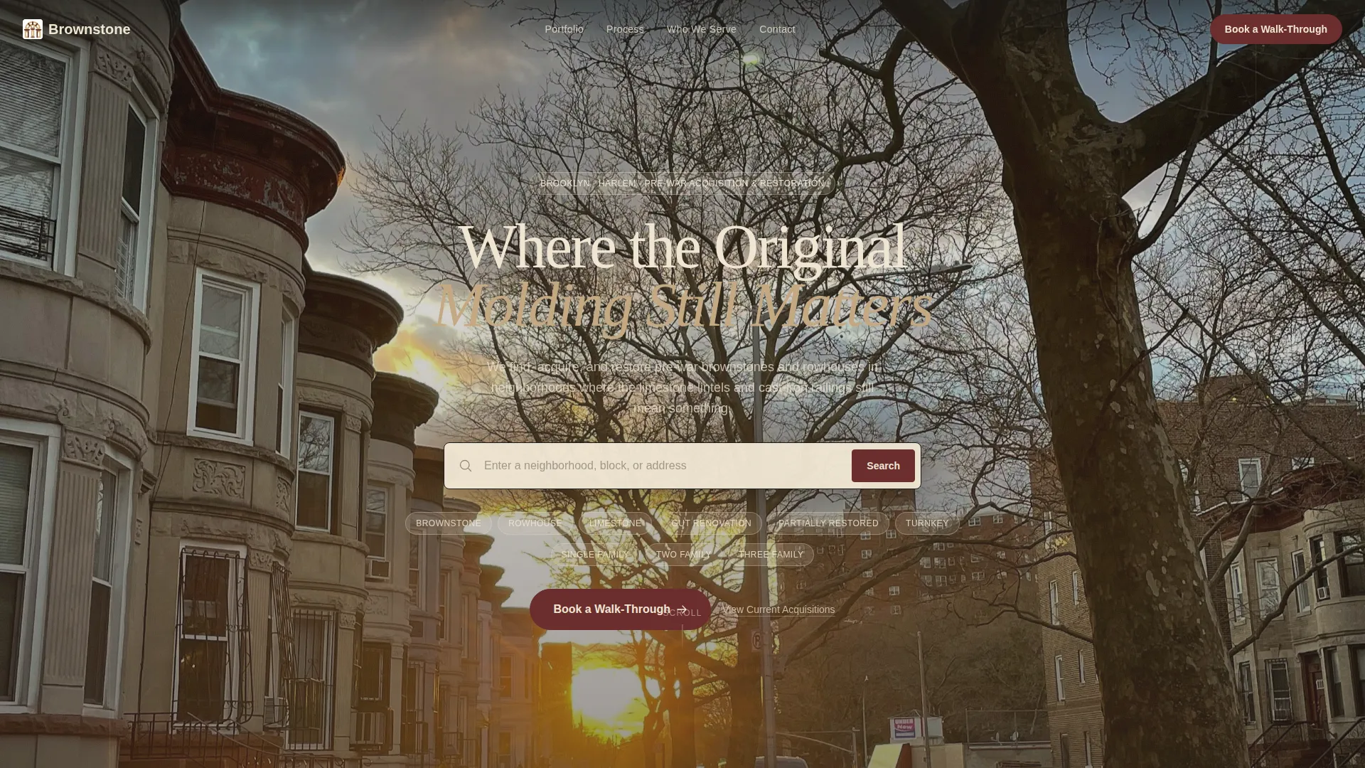
- A parallax header with a centered neighborhood search bar and three pill-shaped building filters
- A masonry gallery of acquisition and restoration projects, each expandable into a full detail view with before-and-after photography
- A two-step booking form and a secondary email-capture path for investors not yet ready to call
Feature list
This section describes the core built-in components that come with the Brownstone landing page template.
Parallax Header with Neighborhood Search
The header displays a full-width golden-hour street photograph with a subtle parallax scroll effect. Centered over the image is an oversized warm-cream search field with wrought-iron-black border and placeholder text reading "Enter a neighborhood, block, or address." Three pill-shaped filters sit below it for building type, condition, and unit count.
Masonry Gallery with Expandable Detail View
The main gallery arranges project thumbnails in a masonry grid. Each photograph is art-directed with shallow depth of field to highlight architectural details such as carved newel posts, original pocket doors, and restored tin ceilings. Clicking any thumbnail opens a full detail view with before-and-after photography, an acquisition narrative, neighborhood context, and financial structure.
Escalating Project Scroll
Projects are ordered intentionally from single-family parlor-floor restorations to two-family conversions to full-block assemblages. This sequencing builds the visitor's sense of the firm's capability as they scroll, creating growing confidence in the firm's scale and taste.
Two-Step Booking Form
The primary call-to-action button labeled "Book a Walk-Through" opens a two-step form. Step one presents three illustrated cards so the visitor selects their situation: buying, selling, or seeking guidance. Step two reveals a scheduler for the next available in-person or video consultation.
Persistent Booking Bar
After the second gallery section, a persistent bottom bar carries the "Book a Walk-Through" call to action across the rest of the scroll. This keeps the conversion path visible without interrupting the browsing experience.
Secondary Email Capture
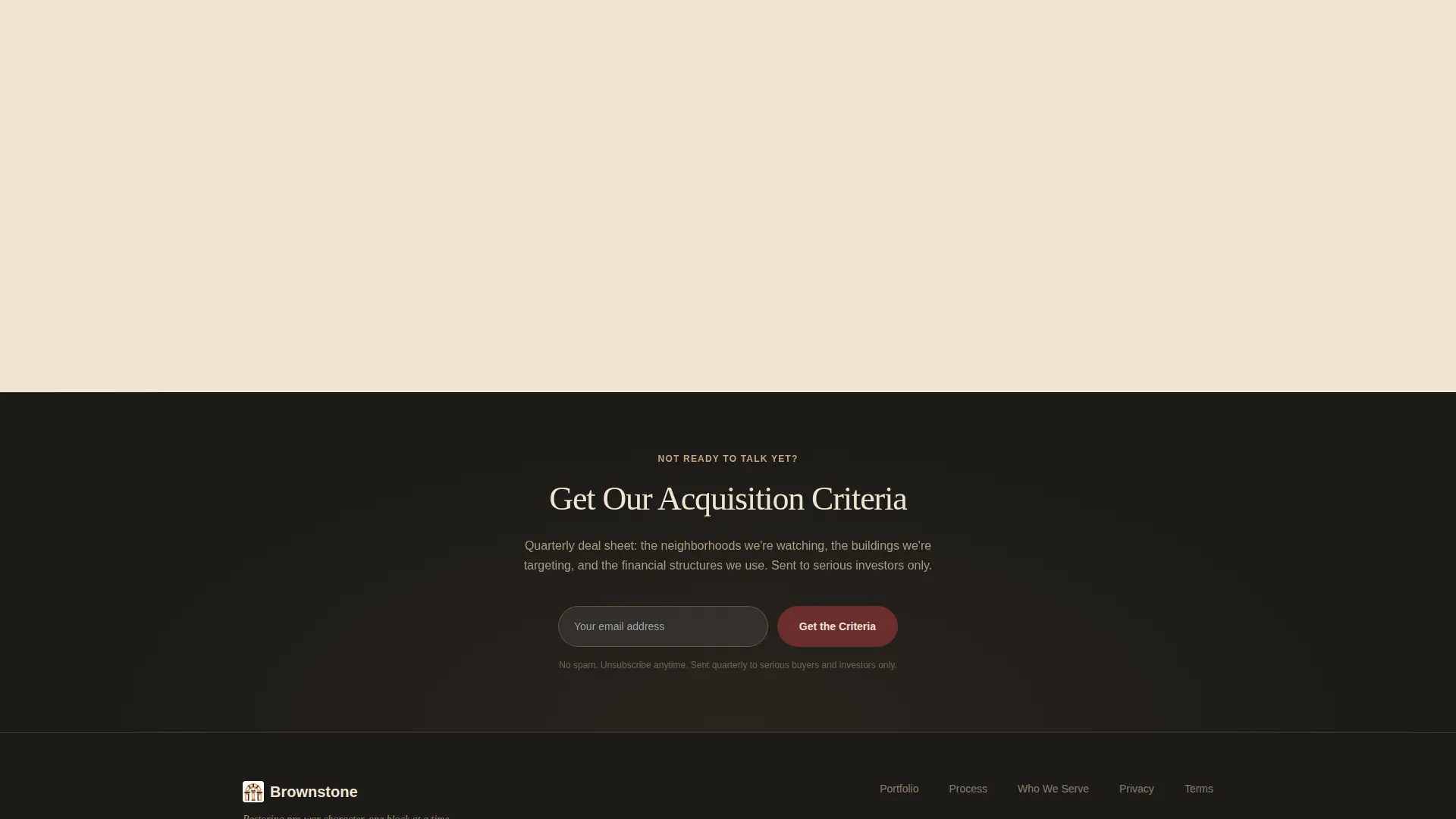
A second conversion path titled "Get Our Acquisition Criteria" captures email addresses from investors who are researching but not yet ready to speak. This feeds a quarterly deal sheet and keeps the firm in front of future clients.
Page sections overview
| Section | Purpose |
|---|---|
| Parallax Header | Sets tone and enables neighborhood search |
| Pill Filter Bar | Filters by building type, condition, unit count |
| Primary call to action Block | First "Book a Walk-Through" placement |
| Masonry Gallery (Current) | Showcases active and recent acquisitions |
| Site-Visit Text Block | Adds narrative context between gallery rows |
| Expanded Detail View | Shows full project story and photography |
| Second Gallery Section | Escalates project scale and ambition |
| Persistent Booking Bar | Keeps booking call to action visible after scroll |
| Acquisition Criteria Capture | Secondary email opt-in for deal sheet |
Design & branding system
The visual identity follows an Atelier Studio theme built on a Warm Stone color system. Every color choice references the physical materials of the buildings this firm restores, giving the page an immediate sense of authenticity.
- Core palette: brownstone façade tan (#C4A882), aged mortar cream (#F0E6D3), wrought-iron black (#1C1A17), and restored-mahogany accent (#6B2D2D) used on hover states and call-to-action elements
- Typography is restrained serif, appearing on mortar-cream backgrounds between gallery sections to evoke handwritten site-visit notes
- Photography direction uses shallow depth of field and golden-hour light to highlight original architectural details rather than full-room staging
Mobile & speed optimization
The full-width immersive layout is designed to translate cleanly to smaller screens without losing the visual weight that makes it persuasive. Core interaction patterns remain accessible on touch devices.
- The masonry gallery reflows to a single-column stack on mobile, keeping thumbnail quality and tap-to-expand behavior intact
- The oversized search field and pill filters resize gracefully so neighborhood browsing remains comfortable on a phone screen
- The persistent booking bar anchors to the bottom of the viewport on all screen sizes, keeping the primary call to action always within reach
How this template helps you convert
The page is built around a deliberate show-before-ask philosophy. Visitors see finished work, read project narratives, and develop trust in the firm's craft before any form appears.
- The escalating project scroll moves visitors from curiosity to conviction by revealing progressively more ambitious restorations, so that by the time the booking form appears, the firm's capability is already proven.
- The two-step booking form reduces friction by letting visitors self-identify their situation first, which means the scheduled consultation starts with shared context rather than a cold introduction.
- The secondary email-capture path keeps hesitant investors inside the firm's orbit, turning browsers into warm leads through the quarterly acquisition criteria deal sheet.
Other information about this template
This template is a strong fit for boutique real estate firms operating in neighborhoods where pre-war architecture carries cultural and financial significance. It is designed as a gallery-and-detail landing page, not a multi-listing search platform.
- The detail view layout can support mixed media including photography sets and written narratives for each individual project
- The mortar-cream text block sections between galleries are designed to carry short, voice-driven copy that reads like field notes rather than marketing language
- The template's single-page structure keeps all conversion paths on one scroll without requiring a visitor to navigate away

Theme
Dark Immersive
Creative direction
Before/After Reveal
Color system
Cloud Canvas
Style
Full-Width Immersive
Direction
Direct Sales
Page Sections
Parallax Header with Neighborhood Search
Masonry Gallery with Expandable Detail View
Escalating Project Scroll
Two-step Booking Form
Persistent Booking Bar
Secondary Email Capture Path
Related questions
Who is this landing page template designed for?
Can the gallery show both current and past projects?
How does the two-step booking form work?
What is the secondary email capture path for?
Can the color palette be customized?



