Fast No-Code Agency Landing Page Template
The Shippit no code agency bento grid landing page template is built for no-code agencies that ship fast and need to prove it. A scroll-jacked hero assembles a live no-code canvas, while a bento grid gallery curates past builds, KPI metrics, and client proof. The result is a sleek, conversion-focused landing page that earns the discovery call before the visitor reaches the form.
by Rocket studio
Quick summary
This is a single-page bento grid landing page designed for no-code development agencies. It combines a scroll-jacked hero sequence with a curated bento gallery of real project proof, a clear stack showcase, client testimonials, and a three-step progressive contact form. The design runs on a Tech Glass aesthetic with an iridescent color system that keeps every bento cell visually striking and organized.
Who this template is for
This landing page is built for agencies and studio teams that build full-stack apps, internal tools, and client portals without writing traditional code. It speaks directly to the audience that ships fast and needs a page that proves it.
- No-code agencies and freelance studio teams presenting services to B2B buyers
- Designers and developers who want a high-impact bento grid layout without building from scratch
- Marketing teams at tech agencies who need to launch or update pages quickly without relying on engineers
What problem this template solves
Most agency websites bury the proof. Visitors land on a page full of vague claims, slow-loading videos, and walls of copy that fail to connect with busy founders or ops leads. The bento grid design solves this by presenting evidence first and copy second.
- Visitors leave before they trust the agency, because proof is scattered across multiple pages
- A weak layout fails to display KPIs, timelines, and client logos in a clear, scannable way
- Generic agency pages lack the modern, interactive feel that B2B decision-makers expect
What you get with this template
You get a fully structured, single-page bento grid landing page with distinct sections, a high-density gallery of build examples, and a progressive multi-step form. Every bento cell is designed to display a different type of proof without overwhelming the user.
- A scroll-jacked hero with five animated scroll steps that assembles a no-code canvas in real time
- A bento gallery section with varied bento cell sizes for KPI metrics, client logos, use case snippets, and interactive app previews
- A three-step progressive disclosure form with selectable build-type cards, company detail fields, and a brief or video link input
Feature list
This bento grid landing page template includes the following built-in features. Each one is drawn directly from the template brief.
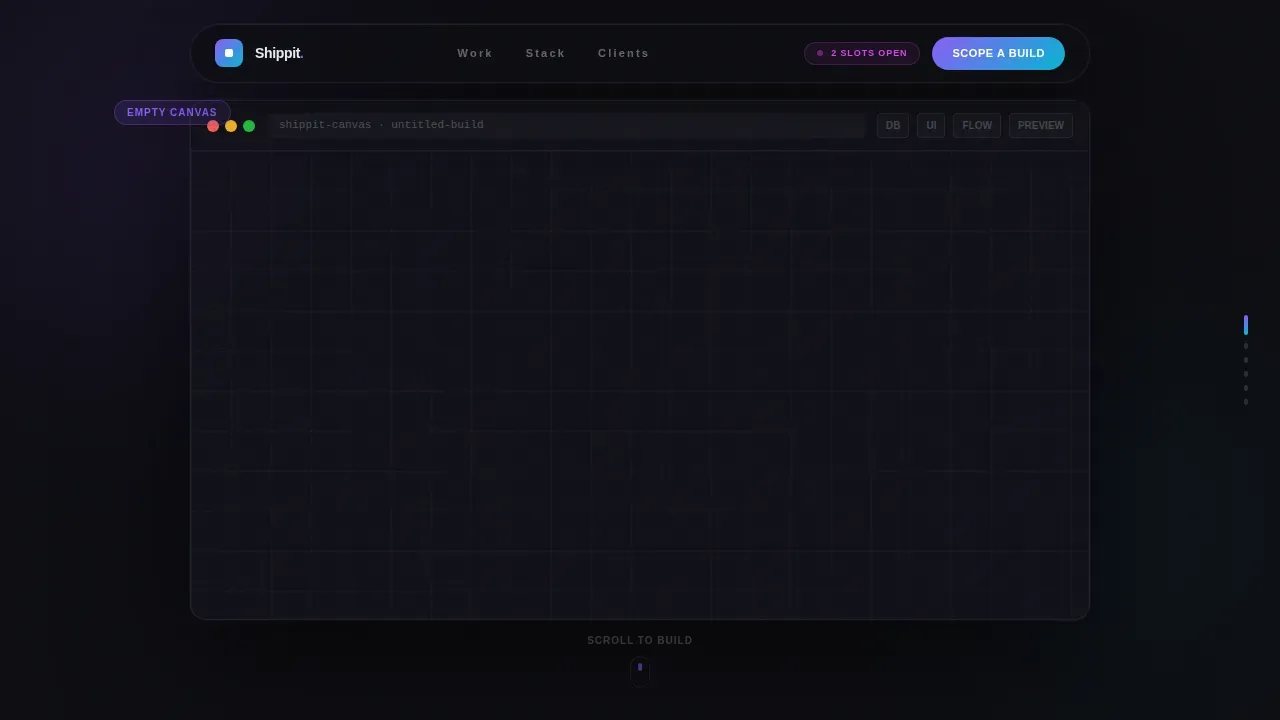
Scroll-Jacked Hero Canvas
The hero section locks the viewport and guides the user through five scroll steps. Each step reveals a new layer of a no-code interface: an empty canvas, a database schema, snapping user interface components, animated workflow arrows, and a live app preview. The sequence ends with the headline "We Build What You Sketch" appearing over the completed build. This immersive opening gives every visitor an immediate sense of what the agency creates.
Bento Gallery with Staggered Reveals
The bento grid gallery is the heart of the landing page. Each bento cell varies in size, functioning like a curated collection of framed exhibits. Some bento cells hold scrollable app previews, others display single KPI metrics, and others show client logos with one-line use cases. Cells reveal with staggered fade-and-rise animations as the visitor scrolls, creating a gallery-walk rhythm. The bento grid layout alternates between completed projects, capability statements, testimonials, and metrics to keep the story moving.
Three-Step Progressive Contact Form
The primary call-to-action is a full-width bento cell at the bottom of the page containing a three-step form. Step one presents four selectable cards for build type. Step two asks for company name and monthly active user range. Step three captures name, email, and an optional video or brief link. This progressive disclosure reduces friction and guides buyers naturally toward a scoped discovery call.
Iridescent Bento Grid Design System
Every bento cell carries a one-pixel border that catches an iridescent violet-to-cyan gradient on hover. The bento grid design uses deep obsidian backgrounds, frosted glass card surfaces at 60 percent opacity with backdrop blur, and a holographic pink accent for notification badges. This Tech Glass aesthetic gives the bento grid layout a modern, premium feel that matches the agency's positioning without relying on stock imagery.
Stack and Capabilities Section
A dedicated bento section displays the agency's tool stack with capability statements. Each tool gets its own bento cell with an icon and a short description of what it enables. This section gives visitors the clarity they need to understand what the agency actually builds with, and why it matters for their project.
Secondary Conversion Path
A secondary bento cell offers visitors a gated "Download Our Build Playbook" option. This captures email and company size from buyers who are not yet ready to book a call. It acts as a lower-commitment entry point, expanding the audience the landing page can convert across different stages of the buying journey.
Page sections overview
| Section | Purpose |
|---|---|
| Scroll-Jacked Hero | Assembles a no-code canvas across five scroll steps, ending with the core headline |
| Bento Gallery | Curated exhibition of past builds, KPIs, client logos, and interactive app previews |
| Stack and Capabilities | Tool icons with capability statements for each platform in the agency's stack |
| Social Proof | Client testimonials with company, role, and specific project outcomes |
| Progressive Contact Form | Three-step "Scope a Build Together" form spanning the full page width |
| Secondary Download call to action | Gated playbook offer capturing email and company size for mid-funnel visitors |
| Footer | Single-row linear footer with navigation links |
Design & branding system
The branding is built around a Tech Glass aesthetic with an AI Iridescent color system. Every visual element in the bento grid design serves a purpose: frosted surfaces signal clarity, iridescent gradients signal motion and life, and the obsidian background keeps focus on the content inside each bento cell.
- Color set: deep obsidian (#0D0D12) background, frosted glass white (#E8EAF0) at 60 percent opacity for bento card surfaces, iridescent violet (#8B5CF6) shifting to electric cyan (#06B6D4) on hover states and accent borders, holographic pink (#D946EF) for badges and active indicators
- Typography: Plus Jakarta Sans for bold headings, DM Sans for body copy; both clean and modern with strong legibility across bento grid layouts
- Icons and elements use stylized recreations of real no-code tool interfaces rendered in the iridescent palette; no stock imagery is used anywhere on the page
Mobile & speed optimization
The bento grid layout is designed desktop-first to serve B2B decision-makers on laptops, and it responds cleanly across all device sizes. The bento grid rearranges across three breakpoints, with tiles stacking in a logical order that preserves the gallery rhythm. Animation uses GPU-accelerated transforms only, keeping loading smooth even with high interactivity.
- Bento grid tiles restack automatically at three breakpoints, preserving the proof-then-possibility rhythm on every device
- Animations rely on GPU-accelerated transforms to support smooth loading of GSAP ScrollTrigger sequences and staggered bento reveals
- Native CSS smooth scroll handles page-level scrolling, keeping the experience consistent without adding unnecessary script weight
How this template helps you convert
The bento grid landing page is structured to move visitors from curiosity to confidence to action. Every design decision, from the scroll-jacked hero to the final form bento cell, is built around earning the click before asking for it.
- The scroll-jacked hero demonstrates the agency's craft in the first five scroll-lengths, so visitors understand the value before reading a single line of copy. The bento gallery then presents real project examples as evidence, building trust through specifics like timelines and KPI metrics rather than generic claims.
- The three-step progressive form reduces friction by breaking the inquiry into small, easy steps. Selectable cards replace open text fields in step one, lowering the effort required to start. The secondary playbook download gives mid-funnel visitors a free, low-commitment way to engage, capturing leads across multiple traffic source types and audience readiness levels.
Other information about this template
This template is part of a broader category of bento grid landing page templates designed for agencies and studio teams in the no-code space. It draws inspiration from the popularity of bento box-style layouts in modern product and SaaS pages, where the bento grid is recognized as one of the most effective ways to present complex services with simplicity and clarity.
- The bento grid format is modeled after the classic Japanese bento box, where varied compartments of different sizes organize content in a visually appealing, user-friendly way without visual clutter
- The Shipixen bento grid template approach allows agencies to quickly swap out text and icons for new clients while maintaining a high-end tech aesthetic, making this template style easy to adapt across studio projects
- The Bento Grid Maker plugin in Figma allows designers to set up customizable grids with ease, and this template's structure is compatible with that kind of design-to-build workflow
- Bento grids are a strategic tool poised to play a significant role in future design frameworks, and this template is built to stand at that intersection of creativity and conversion
- Conversion rates on bento grid landing pages vary by traffic source, offer type, and audience readiness; the secondary playbook call to action is included specifically to capture value from visitors who are not yet ready to book a call
- Bento grid templates are used by marketing teams in tech companies to quickly launch campaigns or update websites without relying on developers, making this template a practical asset beyond its initial agency use case


Theme
Tech Glass
Creative direction
Gallery Walk
Color system
AI Iridescent
Style
Bento Grid
Direction
Partnership/B2B
Page Sections
Scroll-jacked Hero with Five Steps
Bento Gallery with Proof-first Rhythm
Three-step Progressive Contact Form
Iridescent Bento Grid Design System
Stack and Capabilities Bento Section
Secondary Gated Playbook Download
Related questions
What kind of agency is this landing page template designed for?
Can I customize the bento grid cells for my own projects and clients?
How does the three-step form work on this landing page?
Does the bento grid layout work on mobile devices?
Is there a lower-commitment option for visitors not ready to book a call?


