SaaS Builders Community Reviews Website Template
The Builders Family First SaaS Community landing page template is an editorial-style, single-page layout built for free Discord communities. It uses a warm Forest Trust color system, a magazine-style testimonial mosaic, and a live-proof bar to turn solo SaaS founders into community members. The primary call to action links straight to Discord with zero friction.
by Rocket studio
Quick summary
This landing page template is purpose-built for a free SaaS builders Discord community. It combines an editorial magazine aesthetic with real social proof, a typewriter hero headline, and a scroll-driven testimonial mosaic. The page has a single clear goal: move a solo founder from reading to joining, without a form between them and the community.
Who this template is for
This template speaks directly to community builders who want landing pages that feel lived-in rather than corporate. It fits teams and individuals who are running free communities and need a page that earns trust before it asks for anything.
- Solo SaaS founders and indie hackers who run free Discord communities and need a landing page that proves the community is already alive
- Developer-founders and agency owners pivoting to product who want to connect with a peer group and need a low-friction entry point
- Community managers and builders who want landing page examples that lead with warmth, candor, and real member voices instead of polished marketing copy
What problem this template solves
Most community landing pages feel like a signup form wearing a costume. They list features, drop a few generic quotes, and ask for an email before they have earned it. Founders who are already burnt out and skeptical scroll past those pages without a second thought. This template solves that trust gap directly.
- It proves the community is active right now, using a live member count, a last-message timestamp, and real Discord thread screenshots instead of stock imagery
- It leads with warmth and candor so potential users feel the culture before they click, removing the hesitation that kills conversions on typical product landing pages
- It sequences trust carefully: the page earns the primary click before it introduces a secondary email capture path, so the community and the checklist resource each land at the right moment
What you get with this template
You get a fully structured single-page layout with clearly defined sections, ready to customize and publish. Every section serves a specific role in moving a visitor toward the community or the free checklist resource.
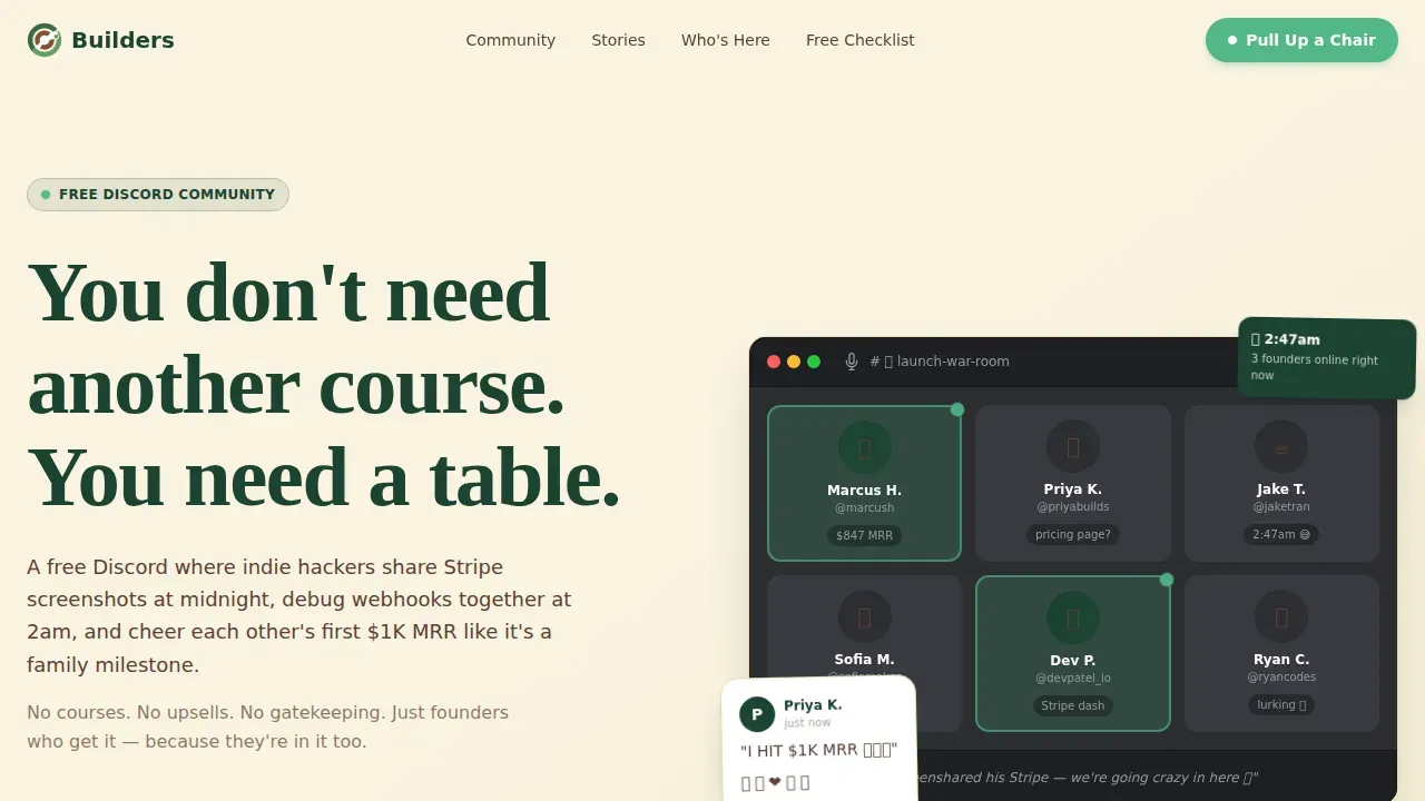
- A hero section with a typewriter headline, a candid team photo treatment, and a live proof bar that shows real community activity at a glance
- A scroll-driven testimonial mosaic with magazine-style pull-quote layouts, Discord thread screenshot placeholders, and staggered reveal animations
- A resource hub section with a primary call to action button linking to Discord and a secondary email capture path for the free SaaS Builder's First 90 Days checklist
Feature list
This landing page template ships with a focused set of features designed to capture attention, build trust, and convert visitors into community members.
Typewriter Hero Headline with Team Photo Header
The hero section opens with a cinematic photo treatment that layers a Discord voice channel screenshot with a candid virtual meetup photo. The main headline types in like a chat message, giving the page an immediate sense of a living, breathing community rather than a static product landing pitch. This hero image treatment sets the editorial tone for everything below it.
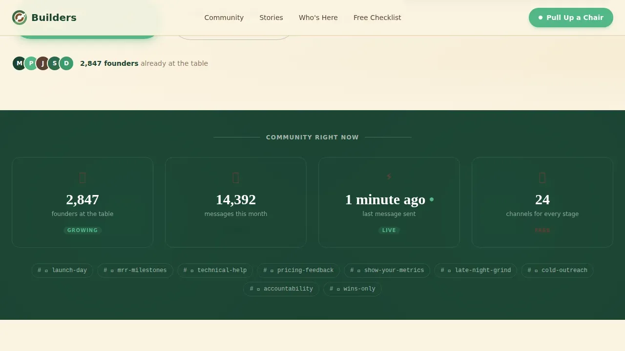
Live Proof Bar
A dedicated bar just below the hero section displays a live member count, a last-message-sent timestamp, and active channel indicators. This section gives potential customers a real-time signal that the community exists and is moving right now. It is one of the most important social proof tools on the page because it removes the fear of joining an empty room.
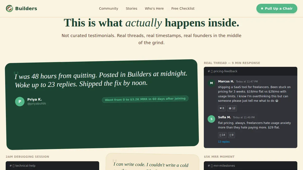
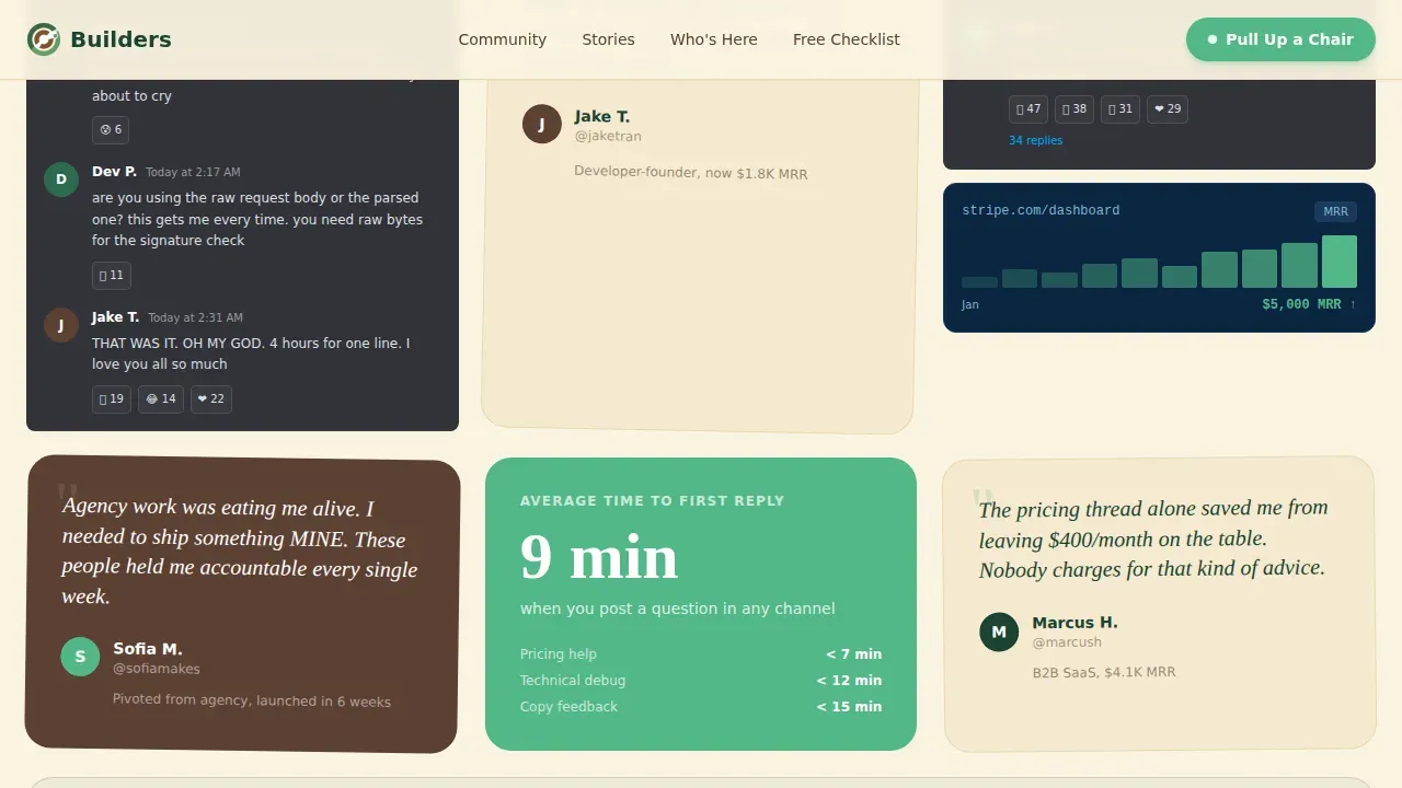
Scroll-Driven Testimonial Mosaic
The testimonial mosaic is the heart of the page. It lays out real member quotes as pull-quotes in a magazine-style spread, surrounded by Discord thread screenshot placeholders. The mosaic grows denser as users scroll, giving visitors the feeling of eavesdropping on genuine conversations. Customer testimonials are arranged so the strongest proof compounds as you read deeper into the page.
Who's at the Table Section
Three founder archetypes are introduced with candid portrait placeholders: the indie hacker, the developer-founder, and the agency owner pivoting to product. This section helps potential users self-identify quickly. It reassures them that people at different stages of the SaaS journey are already at the table and finding value.
Resource Hub with Dual Call to Action
The resource hub section sits after the testimonial mosaic, when trust is fully earned. The primary call to action button, styled in new-growth green, links directly to the Discord invite with no email gate. The secondary path offers the free First 90 Days checklist with a clean email capture form, giving the page two ways to capture leads without forcing either on visitors too early.
Editorial Typography and Forest Trust Color System
The template uses Fraunces for headlines and DM Sans for body text, pairing a warm serif editorial feel with clean, readable body copy. The Forest Trust palette places cream as the dominant background, evergreen for navigation and headlines, bark brown for body text, and new-growth green on call to action buttons and badges. The overall design feels like a cabin where serious work happens between good conversations.
Page sections overview
| Section | Purpose |
|---|---|
| Hero with Photo | Opens with a candid team photo, typewriter headline, and immediate emotional tone |
| Live Proof Bar | Shows real-time member count and last-message timestamp to confirm the community is active |
| Testimonial Mosaic | Builds trust through magazine-style pull-quotes and Discord thread screenshot placeholders |
| Who's at the Table | Introduces three founder archetypes so potential users can self-identify |
| Resource Hub and call to action | Delivers the primary Discord link and secondary email capture for the free checklist |
| Footer | Single-row linear footer with navigation links and minimal closing information |
Design & branding system
The overall design follows a Family First editorial theme that feels warm, sturdy, and deliberately unpolished. The visual identity is built to make a founder feel like they have pulled up a chair at a kitchen table, not landed on a SaaS marketing page.
- The Forest Trust color system uses hearthlight cream (#FAF3E0) as the page background, deep evergreen (#1B4332) for headlines and the navigation bar, bark brown (#5C4033) for all body text, and new-growth green (#52B788) for call to action buttons, badges, and highlights
- Typography pairs Fraunces (a warm editorial serif) for headlines and display text with DM Sans (a clean, modern sans-serif) for body copy, giving every section strong visual hierarchy without sacrificing readability
- The page uses real photos and candid screenshot placeholders rather than high quality images from stock libraries, keeping the site feeling authentic and lived-in throughout
Mobile & speed optimization
The template is built mobile-first, reflecting the reality that founders are most likely to discover the community on their phone late at night. Every section reflows cleanly for smaller screens without losing the editorial warmth of the desktop layout.
- The hero section, live proof bar, testimonial mosaic, and resource hub all stack vertically on mobile with comfortable reading width and touch-friendly call to action buttons
- Animations including the typewriter headline effect, the staggered mosaic card reveals, and the live counter use a medium animation weight, keeping the page engaging without becoming slow or distracting on lower-end devices
- Static sections use server-rendered components for fast initial load, while interactive elements like the live counter and email capture form use client-side rendering only where needed
How this template helps you convert
This landing page template is built around one principle: earn the click before you ask for anything. Every design decision and section sequence exists to move a hesitant, burnt-out founder closer to joining without pressure.
- The hero section and live proof bar work together to establish credibility in the first few seconds, giving visitors a clear signal that the community is real, active, and worth their time before they scroll further
- The testimonial mosaic compounds trust with each scroll step, layering real member voices and Discord thread screenshots until the page feels less like a sales pitch and more like a window into a community that already works
- The resource hub converts interest into action with two paths: the frictionless primary call to action links straight to Discord, while the secondary email capture path offers a concrete free resource for founders who want something tangible before they commit
Other information about this template
This template is one of the more distinctive landing page examples in the Community and Nonprofit category. It is worth understanding how it fits into the broader ecosystem of templates and use cases.
- The builders family first saas community landing page template is designed specifically for free community landing pages, not for paid membership sites, online stores, or enterprise saas platforms requiring transparent pricing sections
- This is a product landing page in structure, but it behaves more like an editorial feature article in tone. It is not a classic example of a minimal SaaS landing page with a single headline and a button. It is a longer, scroll-rewarding page built for communities where culture is the product
- The template supports meta tags and page-level title customization so your site can be found via search engines without additional configuration overhead
- It works well as a standalone page linked from paid campaigns, social bios, and community referral links. It is not intended to replace a multi-page website or sit alongside other pages in a larger site navigation
- The page is not a website builder tool itself. It is a ready-made landing page template you drop into your preferred platform. It gives users fast editing capability by providing clear section slots and placeholder content
- Small businesses and professional services running community-adjacent programs will find the warm editorial style and soft colors adaptable. The template is not locked to SaaS. Any company running a free peer community can use it
- Potential clients browsing this template should note that the email capture form, live counter, and pop ups for the checklist offer are included as interactive components. These tools are part of the page's strategy to capture leads without interrupting the main conversion flow
- Upcoming events or community calls can be added as supplementary content blocks. The structured layout makes it easy to insert new sections without disrupting the overall design
- The navigation bar is minimal by design, keeping users focused on the page content rather than sending them away to other pages before they have converted
- Custom icons and engaging visuals in the mosaic section can be swapped out quickly, making the template adaptable for platform offers in adjacent niches such as freelancer communities, job seekers groups, or founder networks at different stages
- SaaS companies of all sizes, from bootstrapped solo founders to small teams, will find the clean layout and warm tone a strong fit. It is equally useful for potential users who are pre-revenue and for founders who already have traction and want to grow their peer network
- The page is easily accessible on all screen sizes due to its mobile-first responsive design, giving visitors a consistent experience whether they arrive from a direct link, a referral, or a paid campaign
- Platform aims in this template are clear: prove the community is alive, surface the value proposition honestly, and make joining feel like walking through an open door rather than filling out a form
Theme
Family First
Creative direction
Testimonial Mosaic
Color system
Forest Trust
Direction
Content/Resource
Page Sections
Typewriter Hero with Live Proof Bar
Scroll-driven Testimonial Mosaic
Founder Archetype Section
Dual-path Resource Hub
Editorial Forest Trust Design System
Modular Section Layout for Fast Editing
Related questions
Can I use this template for a paid community instead of a free one?
Does the template include the live member count component out of the box?
Is this template only useful for SaaS communities?
How does the secondary email capture work?
Can I add or remove sections without breaking the design?


