Restaurant Contractor Landing Page Template
Buildout is a split-screen landing page template built for restaurant general contractors. It pairs a map-based header with a Problem→Solution Arc layout, moving prospects from doubt to confidence before a single form appears. The Corporate Precision design uses charcoal, gunmetal, and amber to feel intentional and industrial. Every section is structured to earn the consultation click.
by Rocket studio
Quick summary
Buildout is a 50/50 split-screen landing page template for restaurant general contractors. An interactive map header anchors credibility immediately. A scrolling Problem→Solution Arc walks restaurateurs through every construction nightmare and resolves each one with a specific process. Two strategically placed calls to action guide qualified visitors toward a project consultation page.
Who this template is for
This template is built for construction businesses that specialize in restaurant buildouts. It speaks directly to clients who already understand the complexity of commercial kitchen construction and need a contractor who can prove competence before a first meeting.
- Restaurant general contractors handling new builds, gut renovations, and tenant improvement projects
- Contractors serving hospitality groups, franchise operators, and multi-location restaurateurs
- Construction firms that want to move prospects to a consultation page rather than a contact form
What problem this template solves
Most construction websites look identical. They list services, show a gallery, and add a phone number. That approach fails when the buyer is a restaurateur on a tight timeline who has already survived one bad contractor. This template solves the credibility gap head-on.
- Prospects arrive skeptical of permit delays, ghosted contractors, and failed inspections
- Generic construction pages cannot show specialty knowledge fast enough to hold attention
- Restaurant clients need proof of process before they will schedule a conversation
What you get with this template
You get a fully structured single-page layout designed around one goal: moving a qualified restaurant client from doubt to a consultation click. Every section plays a defined role in that sequence.
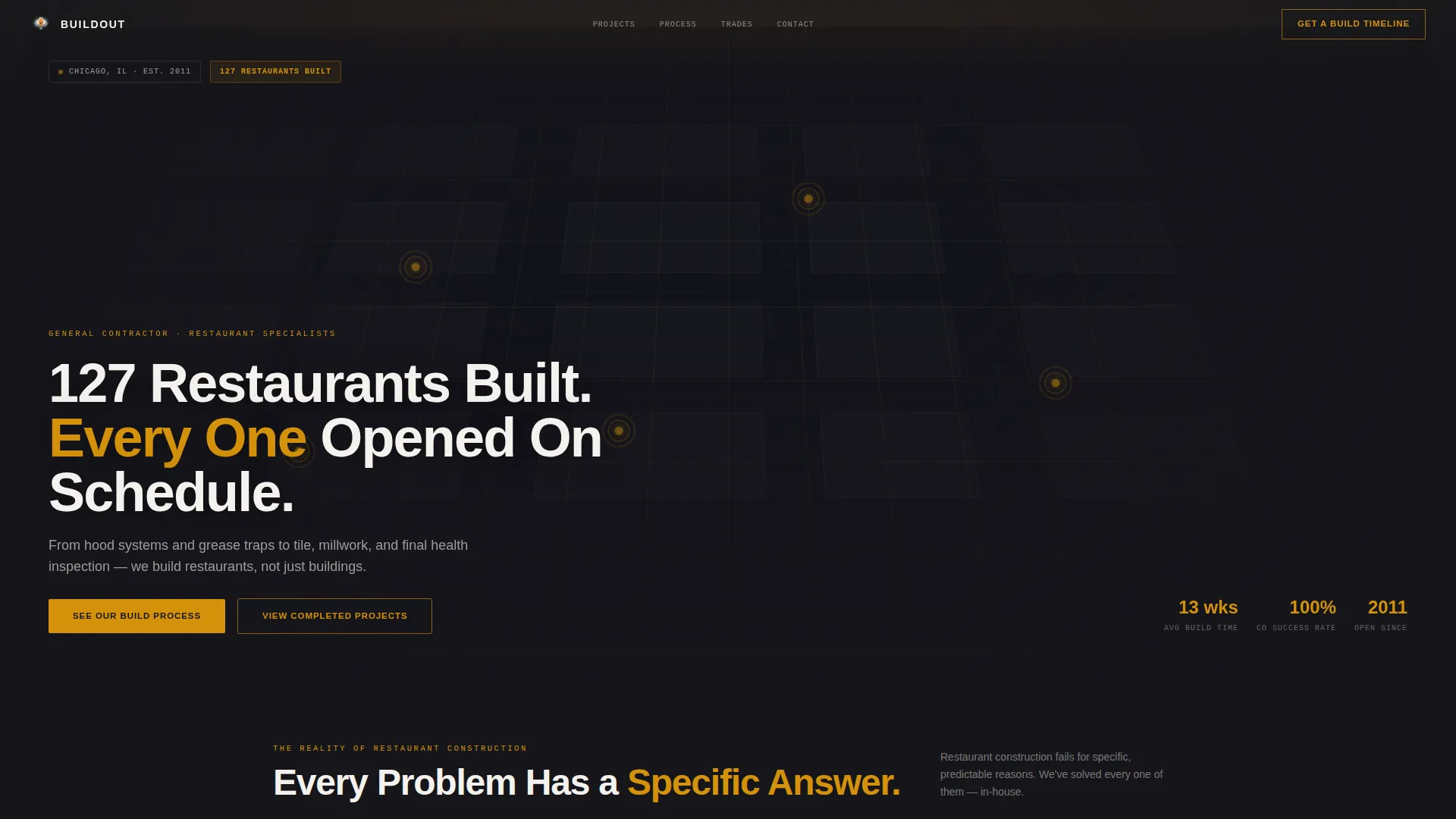
- A map-based header with interactive project pins, project cards, and a bold proof headline
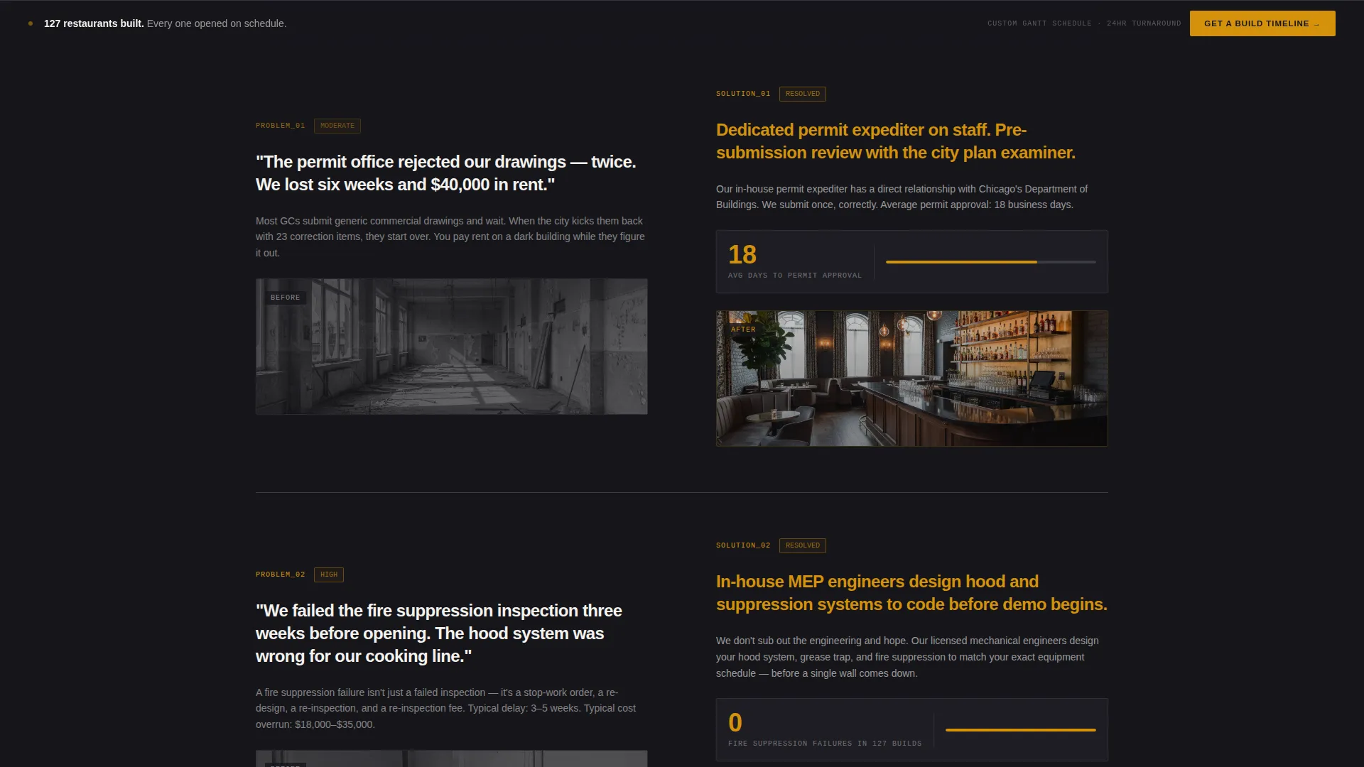
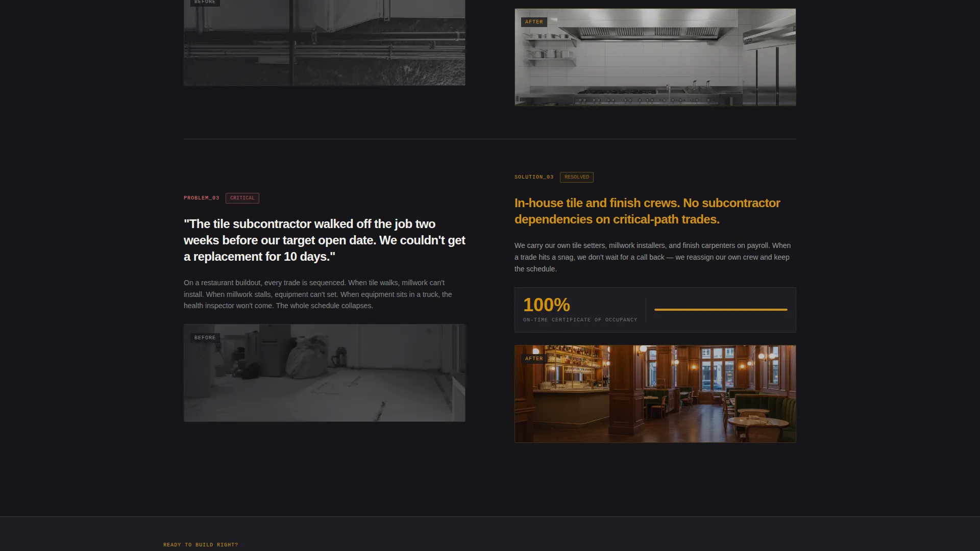
- A scrolling Problem→Solution Arc with alternating demolition and finished-interior photography
- A primary call-to-action that evolves from ghost button to solid amber, plus a sticky secondary bar
Feature list
This template delivers six purpose-built components that work together as a complete restaurant contractor landing page.
Interactive Map Header
A dark, stylized city map fills the header. Amber markers pulse at completed restaurant buildout locations. Hovering a pin opens a project card showing the restaurant name, square footage, and build timeline in weeks. The slightly tilted, near-isometric camera angle gives the map architectural depth. A headline fades in over the map, anchoring the page with a specific proof statement.
Split-Screen Problem→Solution Layout
The 50/50 split-screen layout runs the full page. The left panel presents construction problems in the restaurateur's own language: permit delays, failed fire suppression reviews, contractors who disappear after demo. The right panel answers each problem with a named process: a dedicated permit expediter, in-house mechanical, electrical, and plumbing engineers, weekly owner walk-throughs, and a guaranteed certificate of occupancy timeline. Each scroll step raises the stakes before resolving them.
Escalating Proof Sequence
The Problem→Solution Arc is structured to escalate. Early scroll steps address cosmetic frustrations. Later steps build to six-figure code violations and inspection failures. Photography alternates between raw demolition shots and finished interiors, always at the same split-screen angle, always proving the same transformation. By the third pair, the visitor has absorbed enough evidence to trust the next step.
Progressive Call-to-Action System
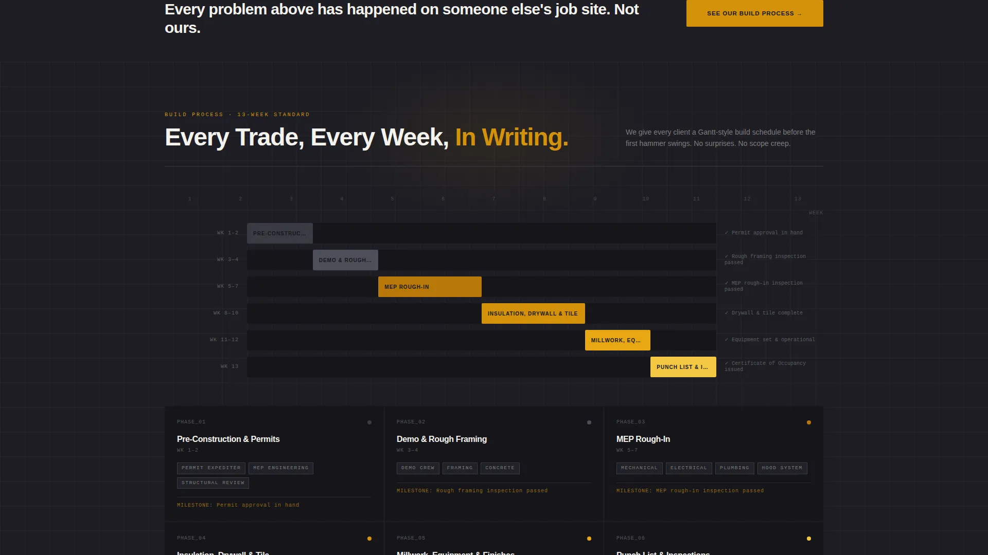
The primary call to action, "See Our Build Process," appears first as a ghost button over the map header. After the third Problem→Solution pair, it solidifies into a full amber button. A secondary call to action, "Get a Build Timeline," floats as a sticky bar after the page midpoint. No forms appear on this page. Every click routes to a dedicated consultation page.
Consultation-Ready Click-Through Flow
This template is designed as a click-through landing page. Visitors are not asked to fill out a form here. Instead, the page builds enough trust through specific project evidence that prospects arrive on the consultation page already confident. The consultation page handles project type selection, square footage range, and target open date.
Corporate Precision Visual System
The charcoal and amber color system runs throughout the layout. Deep charcoal dominates backgrounds and body text. Warm amber marks every interactive element and progress indicator. Gunmetal separates sections. Drywall white opens up content panels so photography has room to breathe. The result feels industrial and intentional without sacrificing readability.
Page sections overview
| Section | Purpose |
|---|---|
| Map Header | Anchor credibility with interactive project pins and a proof headline |
| Ghost call to action Button | Introduce the primary action early without pressure |
| Problem Panel One | Open with cosmetic and scheduling frustrations in the client's language |
| Solution Panel One | Respond with a named process and specific contractor commitment |
| Problem Panel Two | Escalate to permit delays and inspection failures |
| Solution Panel Two | Resolve with in-house engineers and a dedicated permit expediter |
| Problem Panel Three | Peak stakes: six-figure code violations and contractor abandonment |
| Solution Panel Three | Close the arc with a guaranteed certificate of occupancy timeline |
| Solid Amber call to action | Convert trust into a click after the full proof sequence |
| Sticky Timeline Bar | Keep the secondary "Get a Build Timeline" offer visible after midpoint |
Design & branding system
The Corporate Precision theme uses a four-color palette built to feel like a construction site at early morning: heavy, warm, and purposeful. Every color has a structural role in the layout.
- Charcoal (#1E1E24) and gunmetal (#3A3A44) handle all backgrounds and section dividers, keeping the page grounded and focused
- Warm amber (#D4920B) is reserved for interactive elements, progress indicators, and the primary call-to-action button, so the eye always knows where to go
- Drywall white (#F4F2ED) opens content panels so split-screen photography has clean breathing room against the dark structure
Mobile & speed optimization
The split-screen layout is built to translate cleanly across screen sizes. On smaller viewports, the 50/50 panels stack vertically so both the problem and solution copy remain fully readable without horizontal scrolling.
- The sticky secondary call-to-action bar is designed to remain visible and tappable on mobile without blocking content
- Photography panels are structured to display at a consistent crop and angle across breakpoints, preserving the transformation contrast
How this template helps you convert
This landing page is engineered to move a skeptical restaurant client toward a consultation click, not a cold form submission. The layout earns trust incrementally before asking for anything.
- The interactive map header delivers immediate geographic proof. Real project pins with real timelines disarm skepticism before the visitor reads a single line of body copy.
- The escalating Problem→Solution Arc mirrors exactly what restaurant clients fear most. By resolving each concern with a specific named process, the template positions the contractor as a specialist, not a generalist, across three compounding proof moments.
- The progressive call-to-action system converts passively. The ghost button invites early interest. The solid amber button closes after full proof exposure. The sticky bar keeps a low-commitment secondary offer always reachable.
Other information about this template
This template is built specifically for the restaurant construction niche and is not a general contractor template adapted for hospitality. Every structural decision reflects the buying psychology of multi-location restaurateurs and franchise operators.
- The consultation click-through flow is designed for clients selecting between a new build, a lease renovation, or a franchise rollout
- The template supports photography that alternates between raw demolition and finished interiors, reinforcing the before-and-after transformation at every scroll step
- Franchise operators needing consistent buildouts across multiple floor plans will find the template language and structure directly relevant to their approval process
- The page works best when paired with a dedicated consultation page that handles project scoping details
Theme
Corporate Precision
Creative direction
Problem→Solution Arc
Color system
Charcoal & Amber
Style
Split Screen (50/50)
Direction
Click-Through
Page Sections
Interactive Map Header with Project Pins
50/50 Split-screen Layout
Escalating Problem→solution Arc
Progressive Call-to-action System
Click-through Consultation Flow
Corporate Precision Color System
Related questions
Is this a single-page landing page or a multi-page website?
What type of photography works best with this split-screen layout?
Does this template include a contact or inquiry form?
Who is this template written to attract?
Can this template work for a general contractor who also does non-restaurant projects?



