Construction Operations Consultancy Landing Page
Buildout is a construction operations consultancy landing page built for mid-size general contractors tired of winning bids and losing margin. It leads with hard metrics, walks prospects through a transparent diagnostic process, and delivers side-by-side comparison tables that make inefficiency impossible to ignore. The primary call to action drives operations audit requests directly.
by Rocket studio
Quick summary
Buildout is a single-page landing page designed for a construction operations consultancy. It opens with a bold metrics wall, moves into a transparent engagement model, and anchors everything around a side-by-side comparison table. The page is built to convert mid-size general contractors into audit inquiries through honest data and a clearly structured B2B conversion flow.
Who this template is for
This template is built for construction operations consultants who work with mid-size general contractors. It speaks directly to firms running project backlogs between $5 million and $50 million that keep winning work but struggle to protect their margins. If your practice fixes the operational gap between the field and the bottom line, this page was built for your pitch.
- Construction operations consultants targeting mid-size general contractor clients
- Niche professional services firms that sell process improvement and operational accountability
- B2B service providers who need a high-trust, data-forward landing page to open senior conversations
What problem this template solves
Most construction consultancy websites look like every other professional services page: a headline, a stock photo, and a vague list of offerings. That approach does not work when your buyer is a superintendent or a company owner who has already heard every pitch. This template solves the credibility gap by replacing promises with proof and process.
- General contractors need to see real before-and-after data, not marketing language, to trust a new operational partner
- Consultants lose deals because their web presence does not reflect the rigor of their actual methodology
- The comparison table format forces an honest reckoning with operational dysfunction, making the consultant's value impossible to miss
What you get with this template
This template delivers a complete single-page layout structured around transparency and conversion. Every section serves a specific role in moving a skeptical B2B buyer from initial interest to audit request. The layout is dense with purpose and clean in execution.
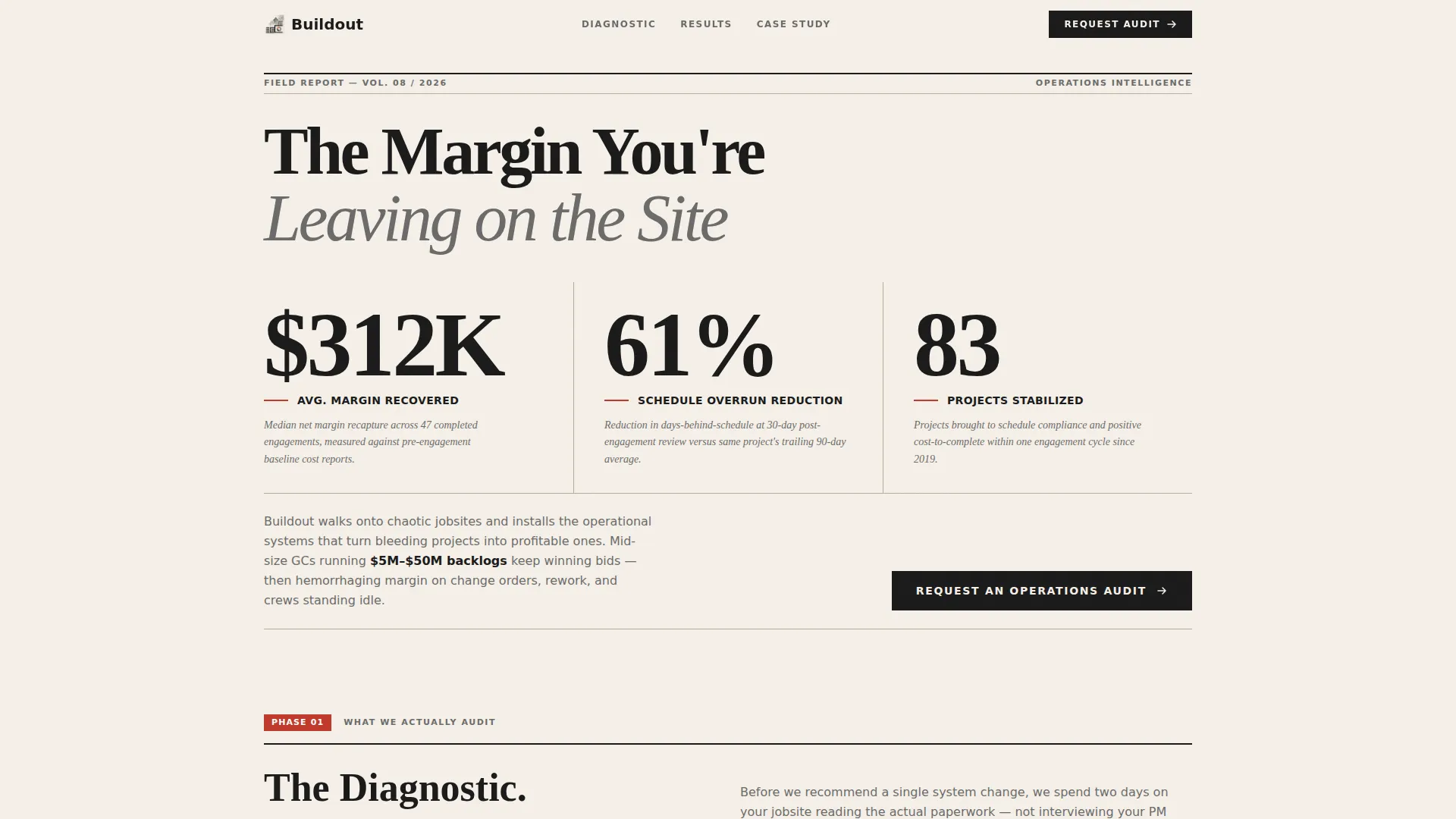
- A Stats/Metrics header wall with three oversized performance figures and italic methodology annotations
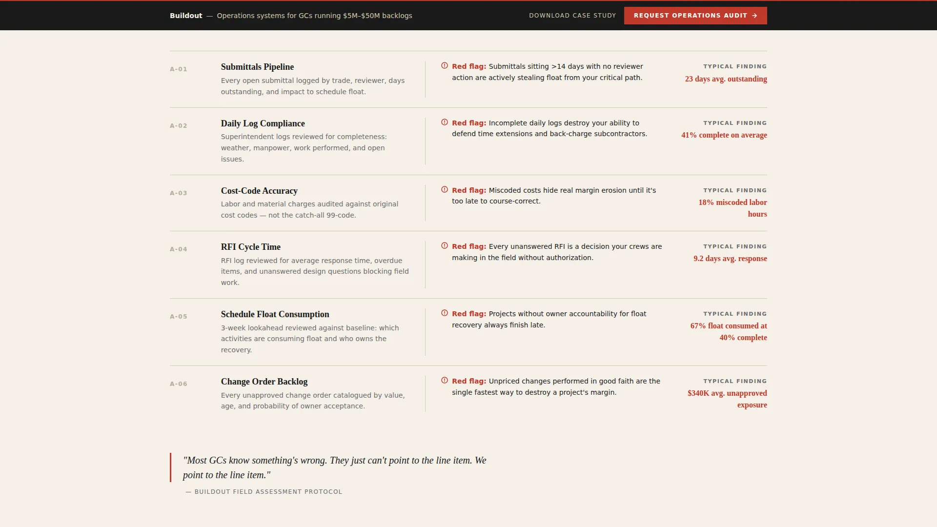
- A full diagnostic section covering submittals pipeline, daily log compliance, and cost-code accuracy audits
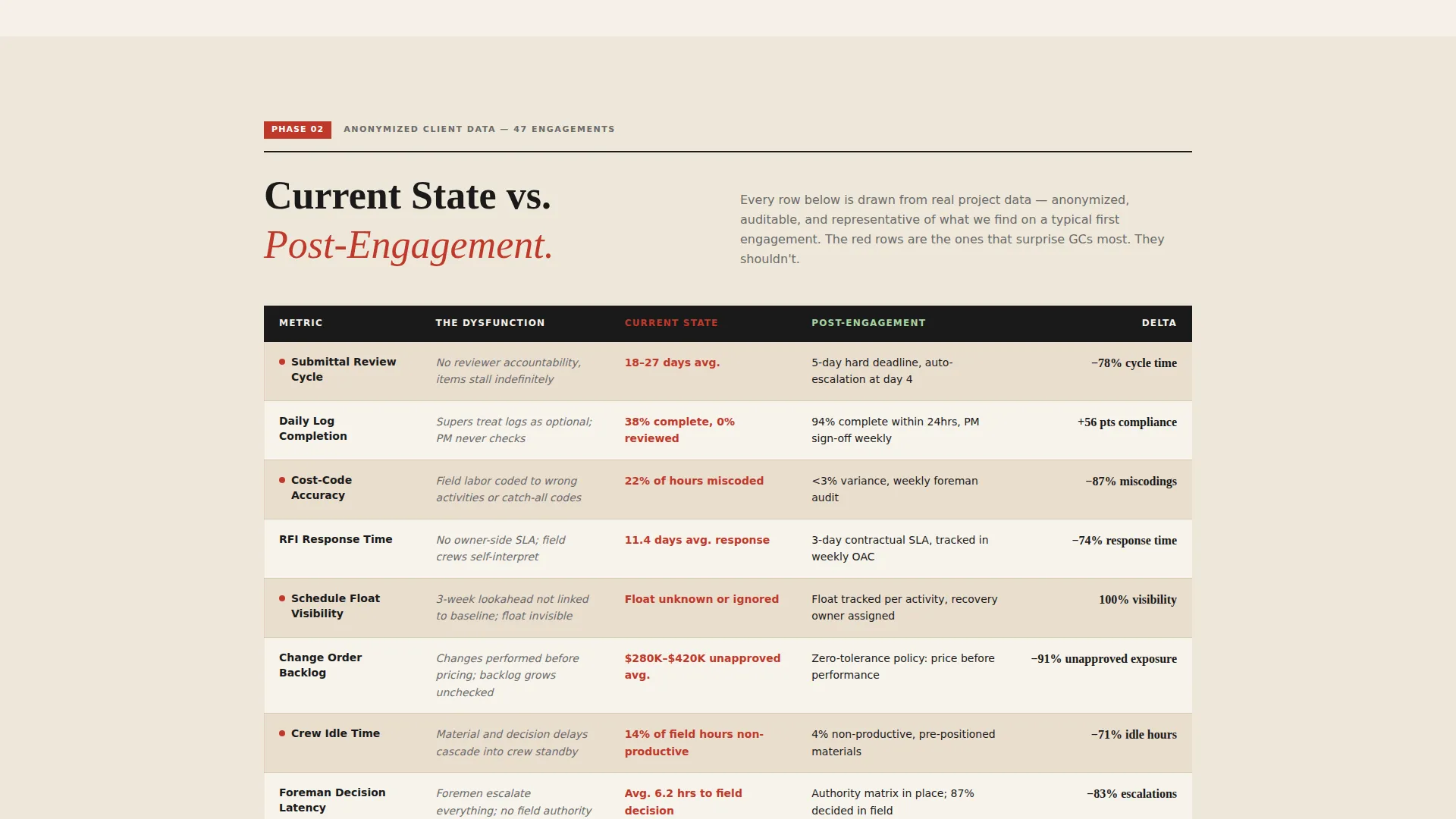
- A side-by-side comparison table with eight to ten rows of Current State versus Post-Engagement operational metrics
- A primary conversion form capturing company name, revenue range, active project count, and free-text pain point
- A secondary conversion path offering a gated PDF case study behind an email capture
- A persistent bottom bar anchoring the primary call to action throughout the scroll
Feature list
This template is built around a small set of high-impact components. Each one earns its place on the page.
Oversized Stats Header Wall
Three editorial-style metric figures dominate the top of the page. Each number is set in a bold condensed serif at display scale, separated by thin horizontal rules. A single italic annotation below each figure explains the methodology behind the result, no vague claims, just auditable outputs styled like a front-page headline.
Side-by-Side Comparison Table
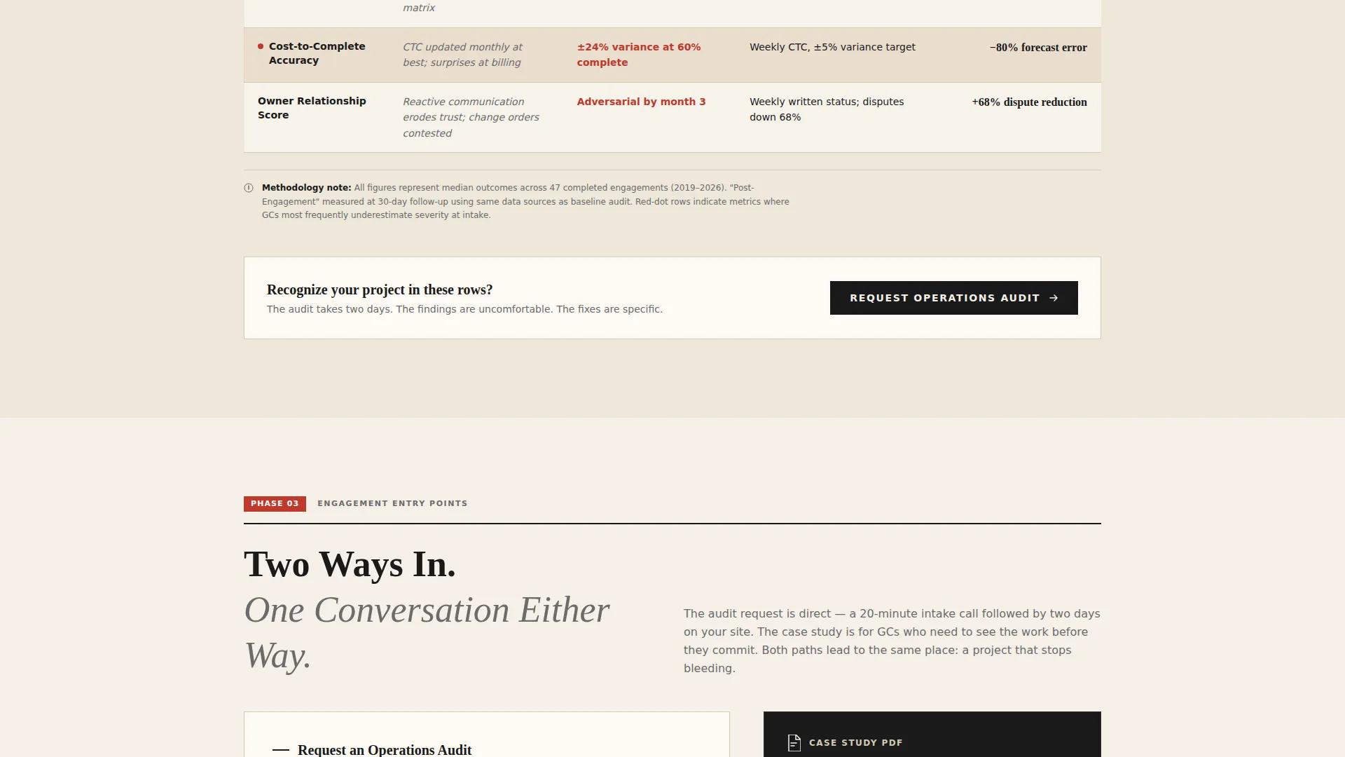
The core conversion engine of the page. Eight to ten operational metrics are laid out in two columns: Current State and Post-Engagement. Each row names a specific dysfunction and its specific fix, populated with real anonymized client data. The format creates an uncomfortable and clarifying reading experience that generic service pages cannot replicate.
Transparent Diagnostic Section
Before the comparison table, the page walks through exactly what the consultancy audits: submittals pipeline health, daily log compliance rates, and cost-code accuracy. This section functions like a long-form magazine feature, methodical and credible, showing prospects the process before asking for their commitment.
Dual Conversion Path Layout
The page runs two conversion paths in parallel. The primary path leads to an operations audit request form with four structured fields. The secondary path offers a downloadable PDF case study gated behind email only, giving cautious prospects a low-commitment entry point before a direct conversation begins.
Persistent call to action Bottom Bar
The call to action does not disappear as the visitor scrolls. A fixed bottom bar keeps the "Request an Operations Audit" prompt visible throughout the entire page. This design choice removes friction for buyers who are ready to act before they reach the end of the scroll.
Page sections overview
| Section | Purpose |
|---|---|
| Stats Metrics Header | Establishes credibility instantly with three auditable performance figures |
| Diagnostic Phase Block | Reveals exactly what the consultancy audits before engagement begins |
| Comparison Table | Contrasts Current State versus Post-Engagement across eight to ten metrics |
| Primary Audit Form | Captures company name, revenue range, active projects, and top pain point |
| PDF Case Study Gate | Offers a lower-commitment entry point for cautious prospects via email capture |
| Persistent call to action Bar | Keeps the audit request visible and accessible throughout the full scroll |
Design & branding system
The visual identity follows an Editorial Magazine theme built on an Ink and Paper color system. The palette recalls a well-worn project binder left open on a superintendent's desk: authoritative, analog, and resistant to vague claims. Typography is driven by a bold condensed serif for display figures and a structured hierarchy that separates data from annotation.
- Deep editorial black (#1A1A1A) for headlines and data labels; warm newsprint (#F5F0E8) as the dominant background tone
- Red-pen markup (#C0392B) for critical metrics, callout annotations, and key performance figures
- Pencil-lead gray (#6B6B6B) for body copy and secondary labels, with italic styling reserved for methodology annotations
Mobile & speed optimization
The layout is structured for clean rendering across screen sizes. The Editorial Magazine visual approach uses a restrained color system and type-led hierarchy, both of which translate well to smaller viewports without losing the authoritative tone the design depends on.
- The comparison table is designed to remain readable on mobile with appropriately scaled columns and row labels
- The persistent bottom call to action bar is positioned to stay usable on touch screens without obscuring primary content
- The stats header wall scales its oversized figures to remain impactful at tablet and phone widths
How this template helps you convert
The page converts by doing what most consultancy websites refuse to do: showing the work. Every section is engineered to reduce skepticism and reward the kind of buyer who needs evidence before they will pick up the phone.
- The metrics wall opens the page with specific, annotated results that filter out disinterested visitors and immediately engage the right buyer profile.
- The transparent diagnostic section and comparison table create a scroll experience that mirrors reading an industry exposé, building conviction row by row before the audit form appears.
- The dual conversion path captures both the ready buyer through the direct audit form and the cautious researcher through the gated PDF case study, maximizing the number of qualified leads the page produces.
Other information about this template
This template is part of the Buildout collection, a set of construction industry landing page designs built for niche professional services positioning. The Buildout name reflects the template series' focus on operational depth and field-level credibility rather than generic agency aesthetics.
- The template style is a Comparison Table layout, one of the most effective formats for B2B professional services that need to demonstrate measurable transformation
- The creative direction is Transparent Process, meaning the page reveals methodology rather than concealing it behind a sales pitch
- The header concept is Stats/Metrics, a format borrowed from editorial journalism to give data the visual authority it deserves
- The landing page direction is Partnership and B2B conversion, prioritizing long-cycle trust-building over immediate transactional pressure
- This template suits any construction operations consultant, project controls advisor, or field systems specialist targeting established general contractor firms
Theme
Editorial Magazine
Creative direction
Transparent Process
Color system
Ink & Paper
Style
Comparison Table
Direction
Partnership/B2B
Page Sections
Oversized Editorial Stats Header
Current Versus. Post-engagement Table
Transparent Diagnostic Walkthrough
Dual-path Lead Capture
Persistent Bottom Call to Action Bar
Related questions
Who is the primary audience for this landing page template?
What does the comparison table section include?
Can this template capture leads in two different ways?
What does the persistent bottom bar do?
Does this template include actual client data in the comparison table?



