AI Builders Community Landing Page Template
Buildspace is a modular card grid landing page built for a paid AI builders community. It combines a Community Mosaic hero, transparent budget breakdown, and tiered contribution cards to turn curious visitors into paying members. The design blends a notebook aesthetic with terminal-window energy, making accountability and radical transparency the core of every section.
by Rocket studio
Quick summary
Buildspace is a single-page, card grid landing page for a paid AI builders community. It opens with a living Community Mosaic hero and walks visitors through the community thesis, a bento card grid, a cap-table budget breakdown, and tiered contribution cards. Every section earns trust before the persistent "Fund a Builder" bar asks for commitment.
Who this template is for
This template is built for founders, developers, and community organizers who need a landing page that converts genuine curiosity into paid membership. It works best when transparency and peer accountability are the product's core value.
- Solo founders and indie hackers who have outgrown tutorial content and want to ship real AI products
- Corporate developers running side projects and non-technical founders comfortable calling application programming interfaces (APIs)
- Community builders in the AI and tech education space who want a fundraising and membership page in one
What problem this template solves
Most community landing pages bury the value proposition behind vague promises. For an AI builders community, that gap is costly. Visitors want to know exactly what they are paying for and who else is in the room before they commit.
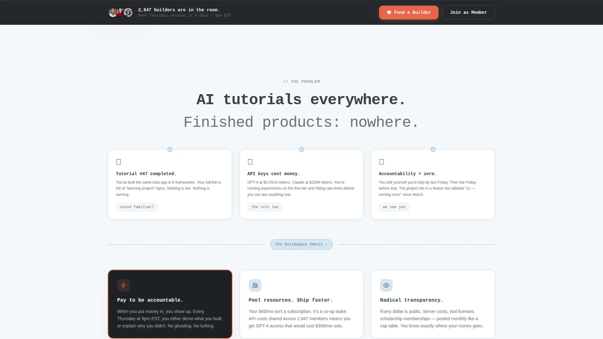
- Tutorials are everywhere, but finished products are rare, this template frames that tension directly on the page
- Contribution tiers with no cost breakdown erode trust before the ask even lands
- A single-path conversion flow loses visitors who want to join but are not ready to donate
What you get with this template
You get a complete, ready-to-customize landing page that handles community storytelling, social proof, budget transparency, and conversion in one scrollable flow. Every section is a self-contained card module that can be updated without restructuring the layout.
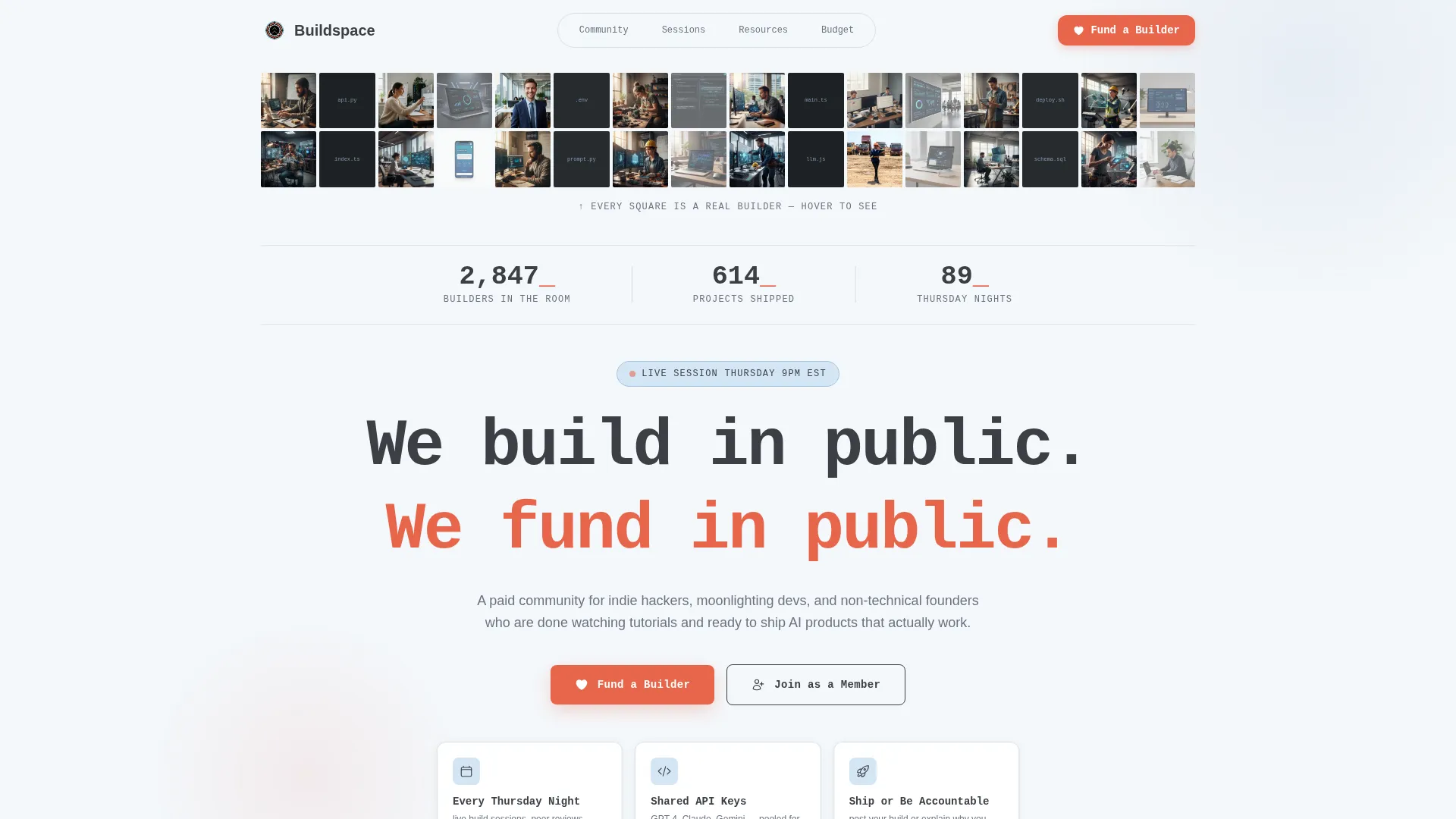
- Community Mosaic hero with a live member counter, projects-shipped counter, and monospaced headline
- Bento card grid including member spotlight, weekly build challenge, resource library, and live session replay cards
- Cap-table style budget transparency section plus three tiered contribution cards with exact cost breakdowns
Feature list
This template delivers six purposeful components. Each one is designed to move a visitor from skeptical observer to active participant.
Community Mosaic Hero Grid
The hero assembles member avatars, project screenshots, and code snippet thumbnails into a composite image that resolves into the community logo. A live counter ticks upward showing real member count and total projects shipped, paired with a monospaced "We build in public. We fund in public." headline.
Staggered Problem and Thesis Cards
Bold statement cards animate into view like sticky notes being pinned to a board. They present the problem ("tutorials everywhere, products nowhere") and then reveal the community thesis: builders learn fastest when they pay to be accountable to each other.
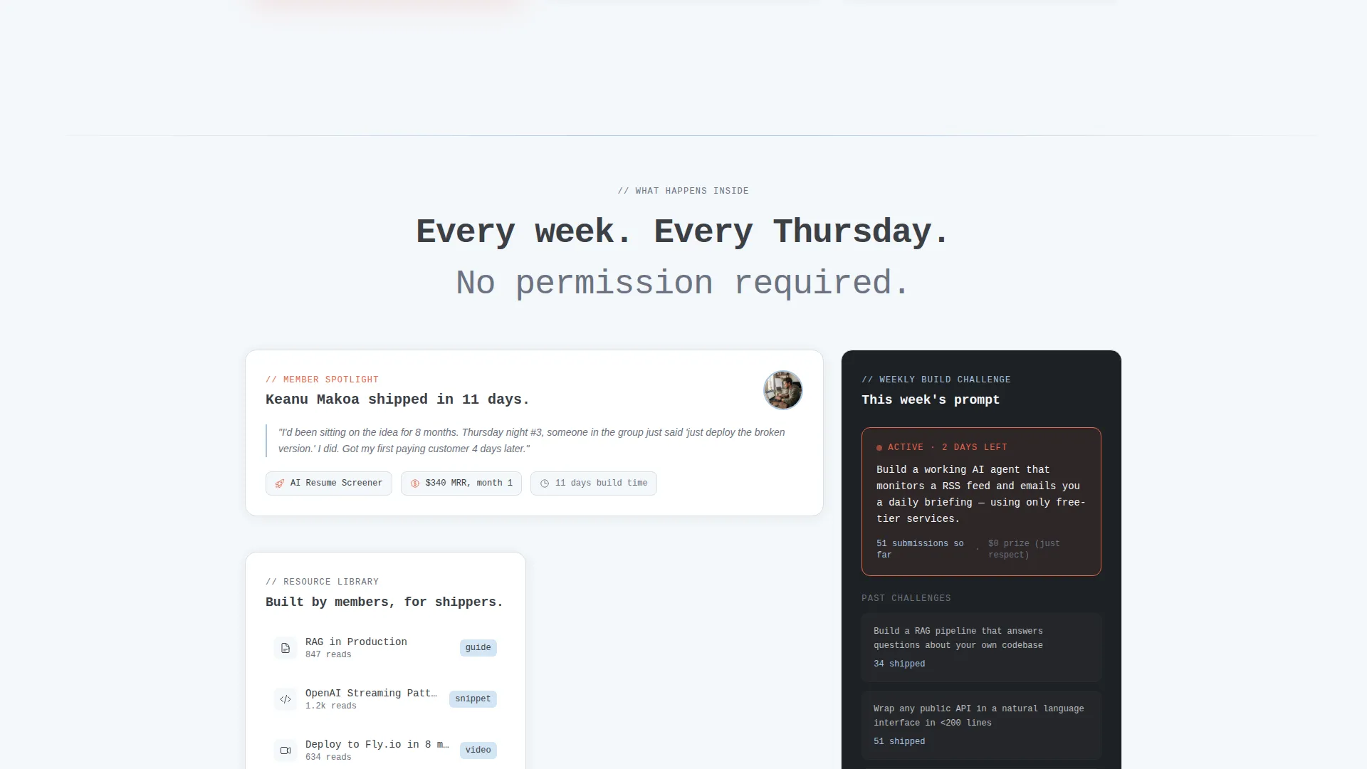
Asymmetric Bento Card Grid
Four card types form the grid: a member spotlight card, a weekly build challenge card, a resource library card, and a live session replay card. Cards stagger in on scroll, creating a rhythm that mirrors the energy of a crowded co-working table.
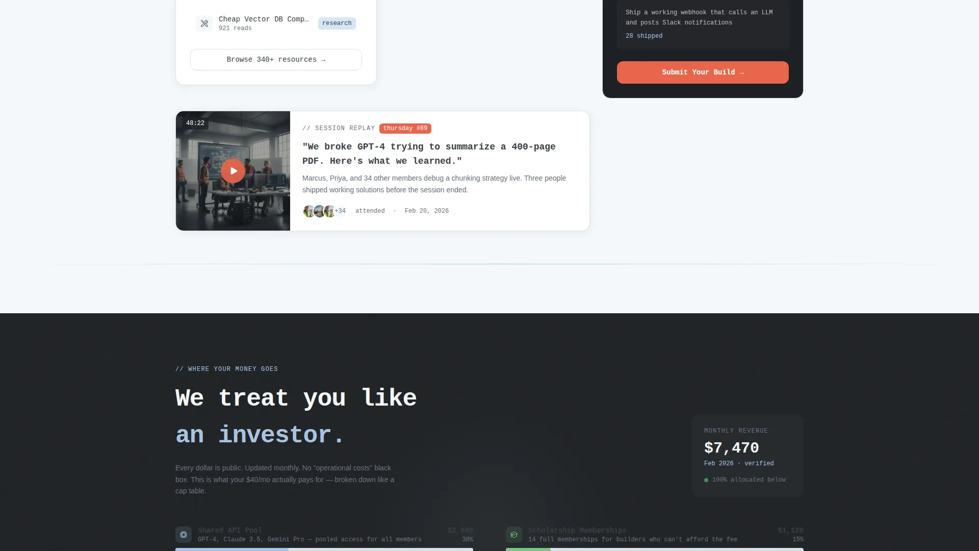
Budget Transparency Breakdown
A cap-table style card treats supporters like investors reading a summary of fund allocation. Server costs, scholarship memberships, and tool licenses are each itemized with no abstraction, building the trust required before the primary call to action appears.
Tiered Contribution Cards
Three membership tiers are displayed as cards: $15 per month "Keep the Lights On," $40 per month "Sponsor a Seat," and $100 per month "Back a Build." Each card lists exactly what the contribution covers so every decision feels informed.
Persistent "Fund a Builder" Bottom Bar
After the budget transparency section, a sticky bottom bar appears with the primary call to action. A secondary path lets visitors "Join as a Member" directly, collapsing the donation into a membership fee so every supporter becomes a participant.
Page sections overview
| Section | Purpose |
|---|---|
| Hero Mosaic Grid | Opens with collective identity and live social proof counters |
| Problem Thesis Cards | Frames the tutorial-to-product gap and community belief system |
| Bento Card Grid | Showcases member activity, resources, and live session replays |
| Budget Transparency Card | Itemizes fund allocation to earn trust before the ask |
| Contribution Tier Cards | Presents three clear membership tiers with exact cost details |
| Persistent Bottom Bar | Keeps the primary call to action visible after trust is established |
| Footer | Single-row linear pattern with community links and secondary navigation |
Design & branding system
The visual identity follows an Educational Guide theme. The palette feels like a freshly opened notebook sitting next to a terminal window, approachable enough to sketch in, serious enough to ship from.
- Cloud Canvas color system: vapor white (#F4F7FA) backgrounds, graphite pencil (#3B3F45) for body text and card borders, chalk blue (#A8C4E0) on dividers and hover states, and signal coral (#E8654A) reserved for calls to action and contribution tier highlights
- JetBrains Mono for headlines and code-style display text; DM Sans for body copy, keeping technical credibility alongside readable prose
- Card borders, section dividers, and hover states are consistent across the grid, so the layout feels cohesive even when card content varies
Mobile & speed optimization
The template is built desktop-first with a strong mobile experience, recognizing that community pages are frequently browsed on phones. Static sections use server components while animations and live counters run on client components, keeping the interactive feel without slowing the initial load.
- Card grid reflows cleanly for smaller screens without losing the asymmetric bento rhythm
- Staggered card reveals and counter tick-up animations are scoped to client components, keeping static content fast to render
- The persistent bottom bar adapts to mobile viewport heights so the call to action remains visible without obscuring content
How this template helps you convert
The page is structured as a Vision and Mission arc. Every section earns a little more trust before asking for money or a membership commitment. The result is a conversion flow that feels earned rather than forced.
- The Community Mosaic and live counters establish credibility immediately, showing real activity before a single word of copy is read
- The budget transparency card removes the single biggest objection to paid community membership by showing exactly where every dollar goes
- The persistent bottom bar and dual-path conversion (donate or join) mean no visitor leaves without a clear, low-friction next step
Other information about this template
This template is categorized under Community and Nonprofit with a subcategory focus on AI builders communities. It is suited for any paid community platform in the creator economy or AI education space that wants to lead with accountability rather than hype.
- The landing page direction is Donation and Fundraising, making it equally useful for independent community fundraisers and membership-first organizations
- Localization defaults are set for English, US dollars, and US date format
- Animation intensity is high: mosaic assembly, sticky-note card pinning, counter tick-up, and hover states are all included in the template spec
- The card grid (modular) template style means individual card modules can be updated or reordered without restructuring the full layout
Theme
Educational Guide
Creative direction
Vision & Mission
Color system
Cloud Canvas
Style
Card Grid (Modular)
Direction
Donation/Fundraising
Page Sections
Community Mosaic Hero with Live Counters
Staggered Problem and Thesis Cards
Asymmetric Bento Card Grid
Budget Transparency Breakdown Card
Tiered Contribution Cards with Cost Detail
Persistent Dual-path Conversion Bar
Related questions
Who is this landing page template designed for?
Can I update the contribution tier amounts and descriptions?
Does the template support both donation and membership conversion paths?
What animations are included in this template?
Is this template suitable for a community that is just starting out?


