Bold Brutalist Fitness Agency Landing Page Template
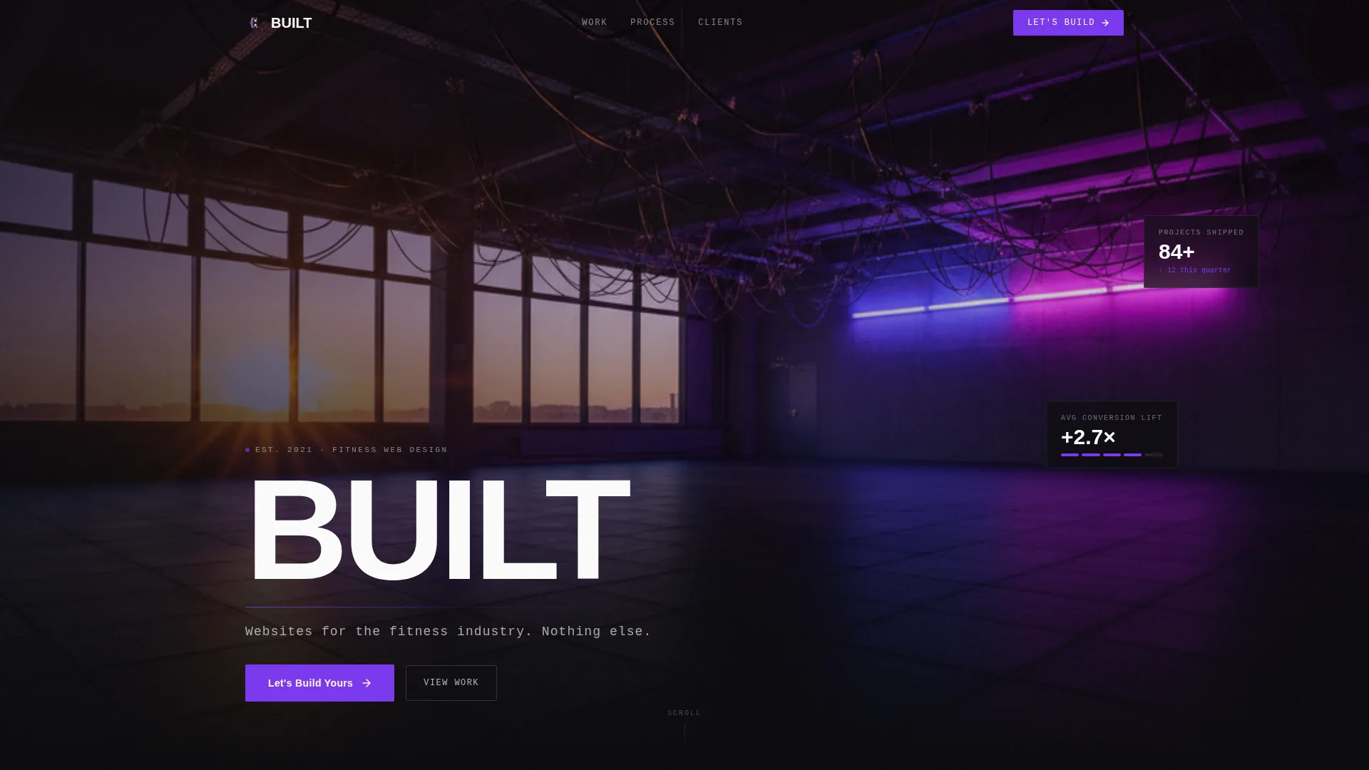
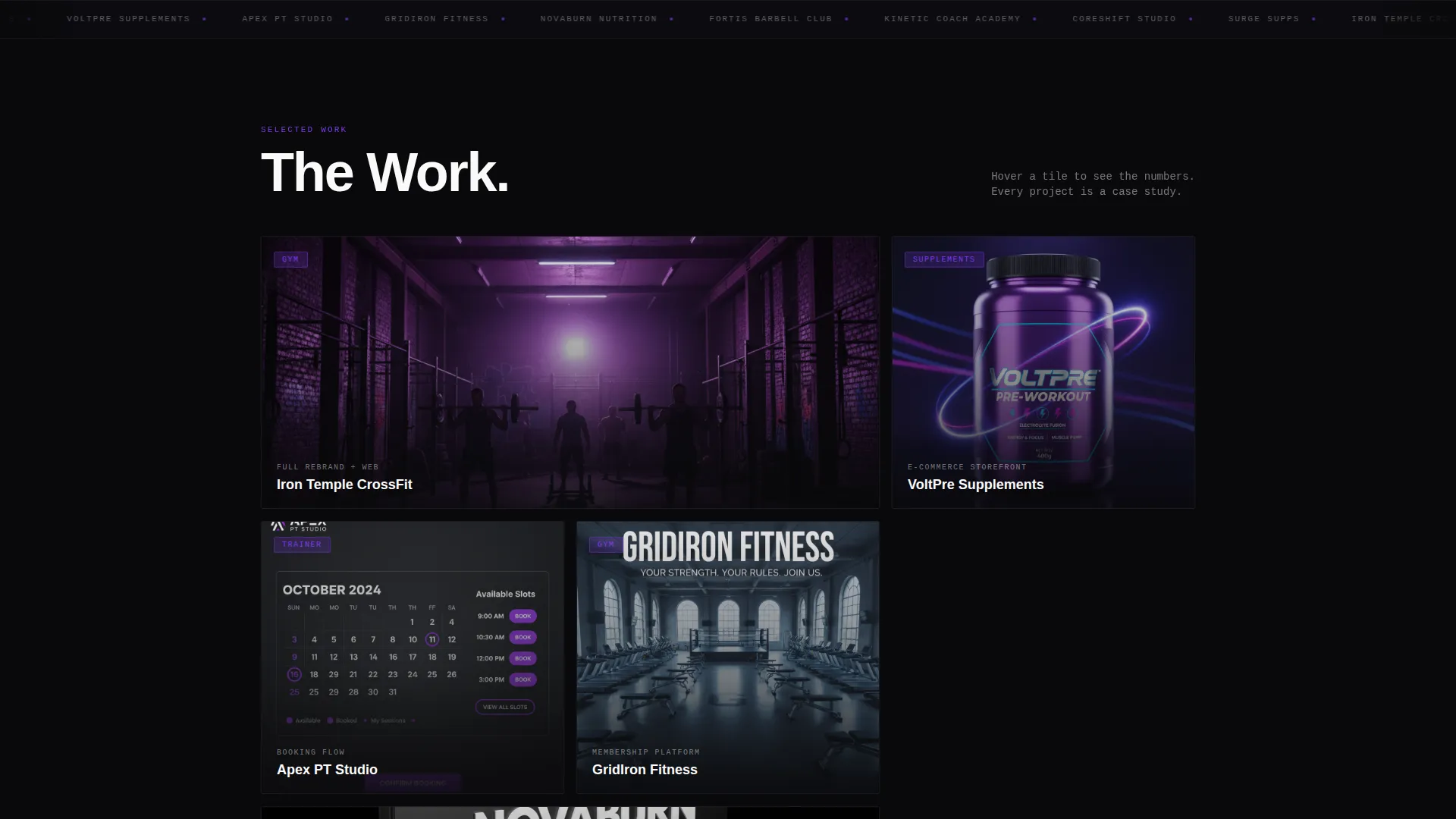
Built is a bold brutalist bento grid landing page template for fitness web design agencies. It combines a full-bleed neon gym header, a gallery-walk project showcase, and a dual-path B2B conversion section. Designed for agencies that serve gyms, trainers, and supplement brands, it turns your portfolio into a high-impact sales tool.
by Rocket studio
Quick summary
Built is a single-page bento grid template for fitness-focused web design agencies. It opens with a full-bleed gym photo header, moves through a gallery-style project showcase, and closes with a dual-path lead capture section. The Void and Violet color system and bold brutalist typography make the work speak before a word is read.
Who this template is for
This template is purpose-built for design agencies that work exclusively in the fitness space. If your clients are gym owners, personal trainers, or supplement brands, this page was made for your studio.
- Boutique gym owners and CrossFit box operators who need a rebrand after moving locations
- Online coaches scaling their business beyond social media and direct messages
- Supplement startups that need a storefront built to convert browsers into buyers
What problem this template solves
Generic agency portfolio templates dilute your positioning. When your niche is fitness, a generic look signals that you do not fully understand the industry. This template solves that by making your agency feel like a product of the same world your clients live in.
- Fitness prospects struggle to trust agencies that show mixed-industry work alongside sports brands
- Standard portfolio layouts bury the actual work behind long case-study text and slow scrolls
- Most templates offer only one lead path, cutting off prospects who are not ready to commit
What you get with this template
You get a focused, single-page layout that functions as both a portfolio and a lead generation tool. Every section earns its place, and nothing exists as decoration.
- A full-bleed photo header with a bold typographic overlay and a mono subline
- A bento grid showcase section with variable tile sizes and hover-reveal project metrics
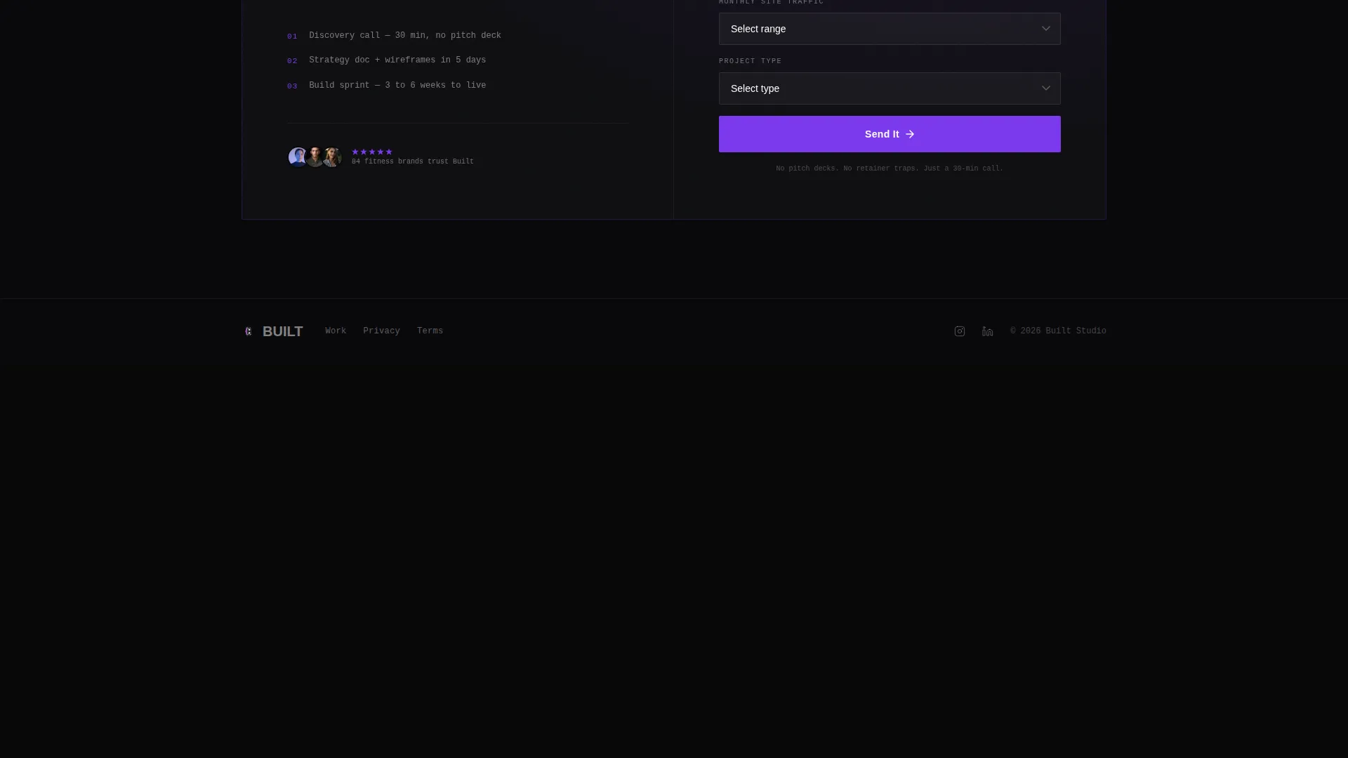
- A dual-path conversion section with a contact form and a gated PDF download option
Feature list
This template delivers a tight set of features drawn directly from the design brief. Each one serves the agency's goal of converting portfolio visitors into project inquiries.
Full-Bleed Gym Photo Header
The header uses a single desaturated gym floor photograph with a violet wash bleeding from the far wall. One word in 200-pixel knockout white type reads "BUILT", followed by a mono subline underneath. The combination sets the visual tone immediately.
Bento Grid Project Gallery
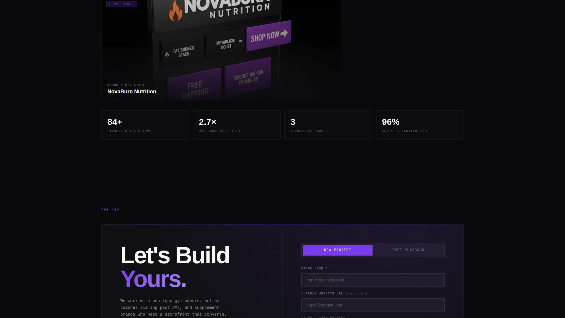
The core of the page is a multi-tile bento grid where each tile is a standalone project showcase. Tiles vary between two-column spans and square formats. Hover states reveal project metrics such as conversion rate, load time, and session duration.
Hover-Reveal Project Metrics
Individual gallery tiles expand on hover to surface real performance data from featured projects. This transforms each tile from a visual sample into a lightweight case study. Metrics appear without breaking the gallery rhythm.
Partnership-Focused Contact Form
The largest bento tile at the grid bottom contains the primary call to action: "Let's Build Yours." The form collects brand name, current website URL (optional), monthly traffic range, and a project-type dropdown covering new build, redesign, and ongoing retainer.
Gated PDF Lead Magnet Path
A secondary lead capture option sits alongside the main form. It offers a downloadable fitness web playbook in exchange for an email address and business type. This captures prospects who are researching before committing.
Bold Brutalist Typography System
Headlines are set massive and unkerned, slammed to grid edges. The type treatment is designed to feel like chalk on a barbell plate. The combination of scale, weight, and raw placement gives the agency an immediate identity signal.
Page sections overview
| Section | Purpose |
|---|---|
| Full-Bleed Header | Establish visual identity and agency name |
| Bento Grid Gallery | Showcase client project work |
| Hover Metric Tiles | Surface project performance data |
| Primary Contact Form | Capture qualified project inquiries |
| PDF Lead Magnet | Convert research-stage visitors |
Design & branding system
The visual identity runs on the Void and Violet color system. Every color choice was made to feel like a UV light cutting through a pitch-dark warehouse gym.
- Core palette: absolute void black (#09090B), deep muscle purple (#7C3AED), bruised violet (#4C1D95), and bare fluorescent white (#FAFAFA) for type and dividers
- Violet activates in borders, hover states, and call-to-action surfaces throughout the grid
- Typography is bold brutalist with massive, unkerned white type set flush to grid edges
Mobile & speed optimization
The bento grid structure is designed to reflow cleanly across screen sizes. Tile sizing and hover interactions are adapted for touch environments without losing the gallery feel.
- Variable tile spans collapse to single-column stacks on smaller screens
- Images are tightly cropped to focus on the most impactful visual area at any viewport
- The layout prioritizes visible, high-contrast content blocks that load and render without layout shift
How this template helps you convert
The page is structured as a deliberate selling sequence. It shows the work first, then it makes the ask.
- The gallery section does the persuasion work by presenting real project examples with visible performance metrics, so prospects arrive at the form already convinced.
- The dual-path conversion section serves two buyer stages at once: the ready-to-talk prospect fills out the project form, while the research-stage lead downloads the playbook and enters a lighter funnel.
Other information about this template
This template is part of the Built collection, designed for agencies operating in a specific vertical rather than general creative markets. It is particularly well-suited for studios positioning themselves as fitness industry specialists.
- The template style is a bento grid layout, which gives the page a structured but visually dynamic feel compared to standard portfolio scroll formats
- The bold brutalist theme and Void and Violet palette are designed to feel native to the fitness world, not borrowed from a generic design trend
- The creative direction follows a Gallery Walk approach, meaning every tile is treated like an exhibition piece rather than a thumbnail
- The landing page direction is Partnership and B2B, meaning the structure prioritizes lead quality over lead volume
- Page type is a single-page landing page with a linear section flow from header to form
Theme
Bold Brutalist
Creative direction
Gallery Walk
Color system
Void & Violet
Style
Bento Grid
Direction
Partnership/B2B
Page Sections
Full-bleed Photo Header
Bento Grid Project Gallery
Hover-reveal Metrics on Tiles
Dual-path Lead Capture Section
Bold Brutalist Typography System
Related questions
Can I customize the bento grid tile layout?
What kind of projects can I feature in the gallery tiles?
Does the contact form support both lead types?
Is this template only suitable for fitness agencies?



