Proven Illness Insurance Landing Page Template
Shield is a single-column landing page template built for critical illness insurance products targeting newlywed couples. The page design follows a Corporate Precision style, using actuarial data sections, a freemium risk report form, and a calm, authoritative visual identity to guide visitors from financial awareness toward a personalized insurance conversation. It is specific, data-driven, and built to convert.
by Rocket studio
Quick summary
Shield is a focused insurance landing page template designed for newlywed critical illness insurance. It uses a data-anxiety editorial flow to move visitors from statistics to action. The page design pairs deep teal with clinical white and catalyst coral accents, presenting each section like a page from an actuarial report. The result is an intuitive, trust-building experience built to generate leads without overwhelming users.
Who this template is for
This template is perfect for insurance businesses, independent insurance advisors, and marketers launching critical illness insurance products aimed at newly married couples. It is also a strong fit for designers building landing page experiences for finance-adjacent clients who need clarity and conversion in equal measure.
- Insurance agencies and InsurTech businesses targeting dual-income newlywed couples
- Designers and marketers who need an intuitive, ready-to-deploy insurance landing page
- Financial planners and wedding-adjacent advisors looking to support clients with specific health and income protection guidance
What problem this template solves
Newly married couples co-sign leases, open joint accounts, and merge finances within weeks of the wedding. Yet most have no critical illness coverage. A generic insurance landing page fails here because it lacks the specific emotional and financial framing this audience needs to act. This template solves that gap.
- It replaces vague insurance copy with data-driven sections that show couples the real financial exposure of a critical illness diagnosis
- It creates trust through transparency, presenting coverage tiers as clean data tables rather than sales cards
- It removes hassle from the lead generation process by asking only two form fields before delivering a personalized risk report
What you get with this template
You get a complete, single-column insurance landing page built around a freemium lead model. Every element on the page works toward one goal: move visitors from awareness to a personalized risk report request, then offer a clear path to a full quote. The structure guides visitors naturally from data to decision without friction.
- A five-section page layout including hero, diagnosis data, financial exposure, coverage tiers, and a two-field lead form
- Scroll-reveal animations on data sections, count-up bar charts, and staggered number reveals for an engaging page design
- A secondary conversion path for high-intent visitors who are ready to sign up and get a joint quote in four minutes
Feature list
The Shield template includes a focused set of features drawn directly from its InsurTech brief. Each feature serves the insurance landing page conversion goal without unnecessary complexity.
Giant Flush-Left Headline Hero
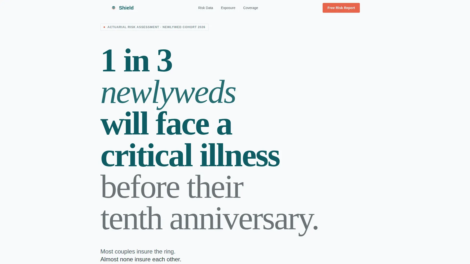
The hero section opens with an enormous display statistic set flush-left in Fraunces serif type. The headline reads like a fact, not a tagline. White space carries the design weight, letting the number land before anything else competes for attention. No images, no illustration, just the data and a single subhead in warm graphite.
Actuarial Data Section Flow
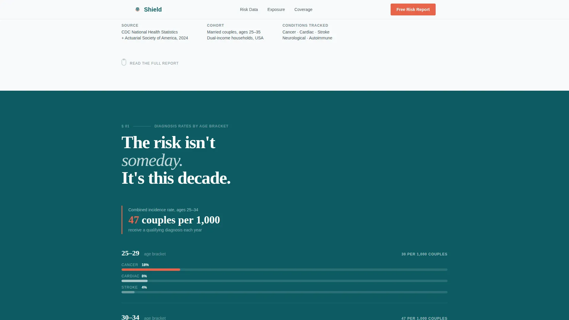
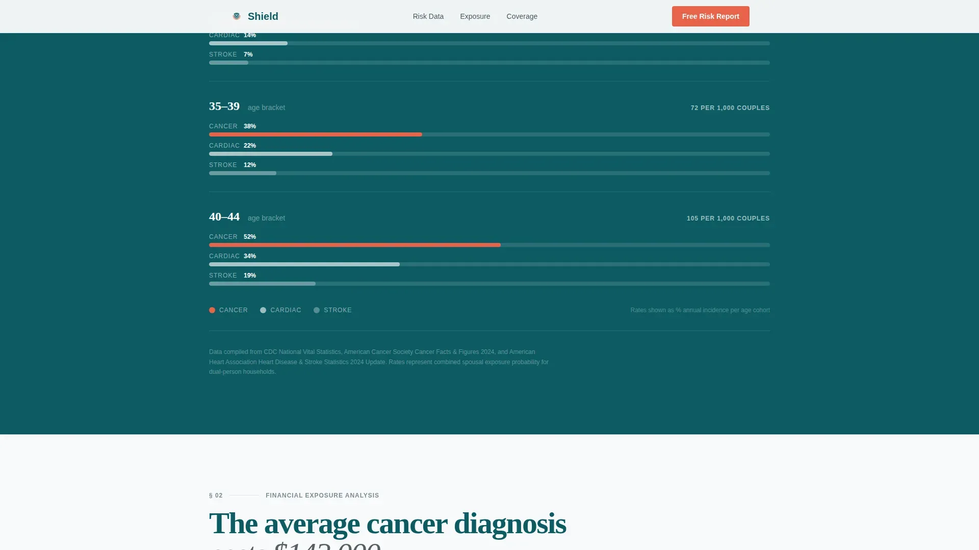
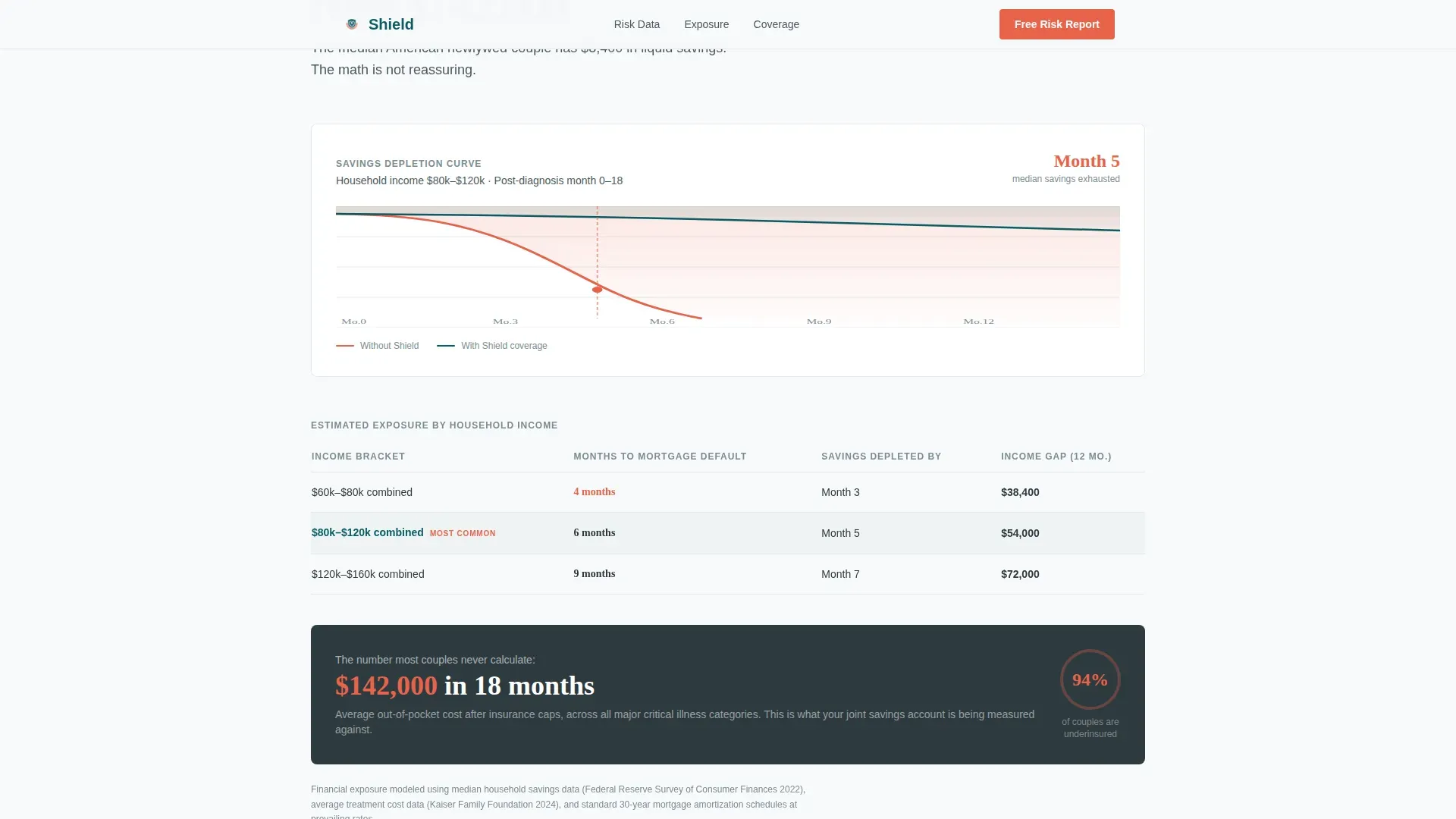
Three sequential data sections unfold like pages from an industry report. Section one presents diagnosis rates by age bracket with minimal bar charts. Section two shows mortgage default timelines and savings depletion curves. Each scroll stacks another number onto the financial case, building urgency through data rather than fear-based copy.
Two-Field Freemium Lead Form
The lead capture form asks for two inputs only: combined household income bracket and age of the younger spouse. Submitting the form generates a personalized one-page PDF risk report. Keeping forms this short is essential for insurance landing page conversion, minimal essential details at the first stage dramatically reduce drop-off.
Coverage Tier Data Tables
Insurance products are presented as clean data tables on a deep teal background. This page design choice signals precision and security rather than a sales pitch. Visitors can learn exact coverage tiers without decoding marketing language, which supports trust and clarity in the decision process.
Anchor call to action with Secondary Quote Path
The primary call-to-action, "Get Your Free Couple's Risk Report," appears after the second data section and anchors to the bottom of every subsequent section. A secondary path below the report preview reads "Ready now? Get a joint quote in 4 minutes," capturing high-intent visitors who are ready to act immediately.
Scroll-Reveal Animations and Number Reveals
Data sections use scroll-reveal entry animations, bar chart count-up sequences, and staggered number reveals. These elements keep users engaged as they move through the page, creating a sense of a living report rather than a static insurance brochure.
Page sections overview
| Section | Purpose |
|---|---|
| Hero Headline | Opens with a large flush-left statistic to establish financial stakes immediately |
| Diagnosis Rates | Age-bracket bar charts presenting critical illness data in a clinical, credible format |
| Financial Exposure | Mortgage default timelines and savings depletion curves showing real household risk |
| Coverage Tiers | Clean data tables introducing the insurance product as a direct financial intervention |
| Free Report Form | Two-field lead capture form delivering a personalized PDF risk report on submission |
| Footer | Horizontal flow footer pattern closing the page with brand and navigation elements |
Design & branding system
The page design follows a Corporate Precision visual identity, built to feel like a hospital billing statement redesigned by a Swiss typographer. Sterile enough to trust, warm enough to act on. The Teal Catalyst color system carries all the credibility signals this insurance landing page needs.
- Deep institutional teal (#0D5C63) anchors data-heavy sections; clinical white (#F7F9FA) provides breathing room between statistical blocks
- Warm graphite (#2E3A3F) is used for body text that reads like a financial brief; catalyst coral (#E8634A) is reserved for calls-to-action and the most alarming data points
- Fraunces display serif handles headlines and statistics while DM Sans covers body copy and data labels, creating a precise typographic hierarchy
Mobile & speed optimization
More than 60% of searches occur on mobile devices, and many newlyweds will first encounter this insurance landing page on their phones. The template is built with full mobile support alongside its desktop-first layout. A mobile-first design ensures a seamless experience across all screen sizes.
- Responsive design ensures all elements resize smoothly across phones, tablets, and desktops; buttons are sized for easy thumb-tapping without zooming
- Forms on mobile are quick and easy to fill out, two fields only, reducing friction and keeping the conversion process painless on any device
- Clear navigation and scroll pacing keep users oriented as they move through the data sections, supporting usability on smaller screens
How this template helps you convert
Every insurance landing page needs a specific strategy to turn visitors into leads. Shield is built around a give-first model, it delivers real value before asking for any commitment. The page design, data flow, and form structure all work together to support conversion at each scroll point.
- The freemium PDF report gives before it asks: visitors receive a personalized financial exposure document in exchange for two data points, creating reciprocity and trust signals that increase form completion rates
- Social proof is built into the page through embedded actuarial statistics and space for testimonials from other young couples, helping potential customers feel confident that the data reflects real health and finance risk
- The anchored call-to-action and secondary quote path ensure that both early-stage browsers and high-intent visitors have a clear next step, every section on the page supports conversion without forcing a single path
Other information about this template
The Shield newlywed critical illness insurance landing page template is a specialized web page built for a very specific insurance niche. It is designed for businesses that need inspiration from successful insurance landing page examples without starting from scratch. Using a pre-designed template like this accelerates the design process and saves time for both designers and marketers.
- The template files are organized so teams can easily find, adjust, and manage elements across the page design without hassle
- Designers can use the layout as inspiration and match their client's brand colors, adjust typography, or test different headline variations through simple A/B testing
- The page is built to support paid ads traffic as a dedicated post-click landing page, making it a practical tool for insurance marketers running search or social ads campaigns
- Trust signals including space for security badges, reviews, and testimonials are woven into the page design to build credibility with visitors who arrive skeptical
- The clear value proposition, a free personalized risk report before any quote commitment, gives insurance businesses a unique way to create leads and stand out from competitors offering generic insurance products
- Premiums for critical illness insurance are lower when couples are young and healthy, and this template frames that value proposition clearly so visitors understand why acting now matters
Theme
Corporate Precision
Creative direction
Industry Report
Color system
Teal Catalyst
Style
Single Column Flow
Direction
Freemium/Trial
Page Sections
Giant Flush-left Headline Hero
Actuarial Data Section Flow
Two-field Freemium Lead Form
Coverage Tier Data Tables
Anchored Call to Action with Secondary Quote Path
Scroll-reveal and Count-up Animations
Related questions
Who is this landing page template designed for?
Can I adjust the data sections and coverage tiers?
Does the template support a freemium lead model?
How does the page build trust with visitors?
Is this template suitable for running paid ads traffic?



