Intensity CrossFit Landing Page Template
Grind is a bold fitness landing page template built for youth-founded studios that sell on energy and authenticity. It features layered scroll sections, before/after reveal sliders, a floating checkout bar, and an embedded single-step purchase flow. The obsidian-and-gold visual system makes every call to action feel earned, not forced.
by Rocket studio
Quick summary
Grind is a single-page fitness landing page template designed for independent, youth-founded gyms that compete on culture, not budget. It pairs a dark obsidian-to-gold gradient palette with cascading overlapping sections, three interactive before/after sliders, and a pinned direct-sales checkout bar. Every layout decision moves the visitor toward one confident action: claiming their first week.
Who this template is for
This template is built for scrappy, founder-led fitness studios that want a page as intense as their programming. It speaks directly to the people running early morning sessions in converted spaces and the clients who want to join them.
- Independent gym owners who founded their studio out of a genuine need, not a business plan
- Youth-led fitness brands targeting college students, young professionals, and former athletes
- Studio operators who sell on community and transparency, and need a page that proves it fast
What problem this template solves
Most gym landing pages look like corporate brochures. They bury the price, hide the personality, and make visitors scroll through stock photography before reaching a single useful fact. Grind fixes that directly.
- Visitors arrive skeptical about cost and commitment, so the template shows proof before it asks for money
- Pricing transparency is a feature, not an afterthought, with a dedicated before/after price reveal
- The checkout is embedded on the page so the visitor never has to leave to complete a purchase
What you get with this template
You get a fully structured fitness landing page with every section pre-built and ready to customize. The layout is opinionated by design, so you spend time on your content, not your containers.
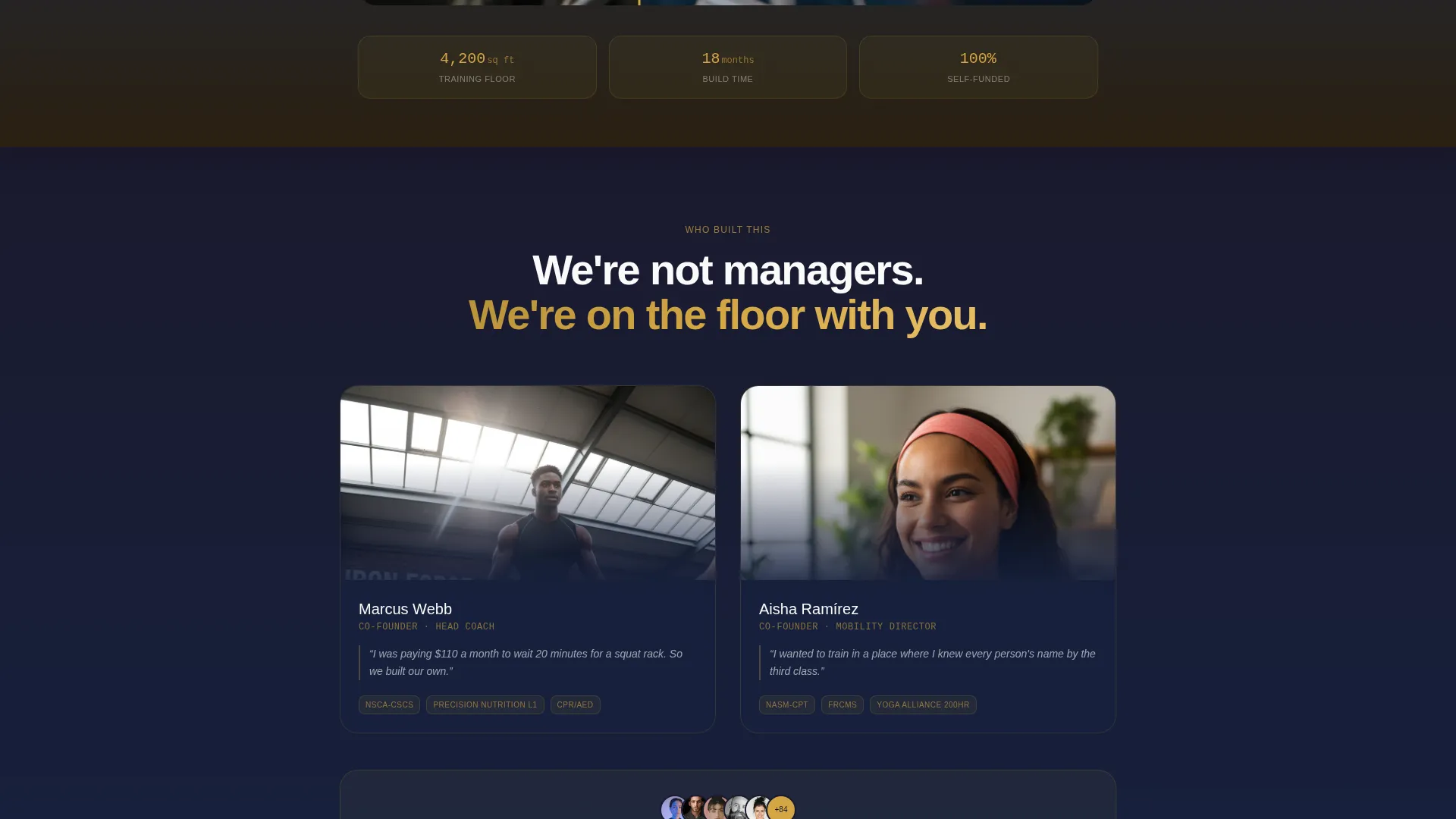
- A layered scroll layout where each section overlaps the previous by forty pixels, creating visual momentum
- Three draggable before/after reveal sliders covering space, member transformation, and pricing
- A floating sales bar with an embedded single-step checkout, a class-time selector, and a secondary gifting link
Feature list
This template ships with purpose-built components that do specific jobs. Each one is grounded in the brief and designed to reduce friction between curiosity and conversion.
Overlapping Cascading Scroll Layout
Each section slides up over the previous one by forty pixels. This stacked, layered structure creates physical depth as the visitor scrolls, mimicking the momentum of a workout set rather than a standard page flow.
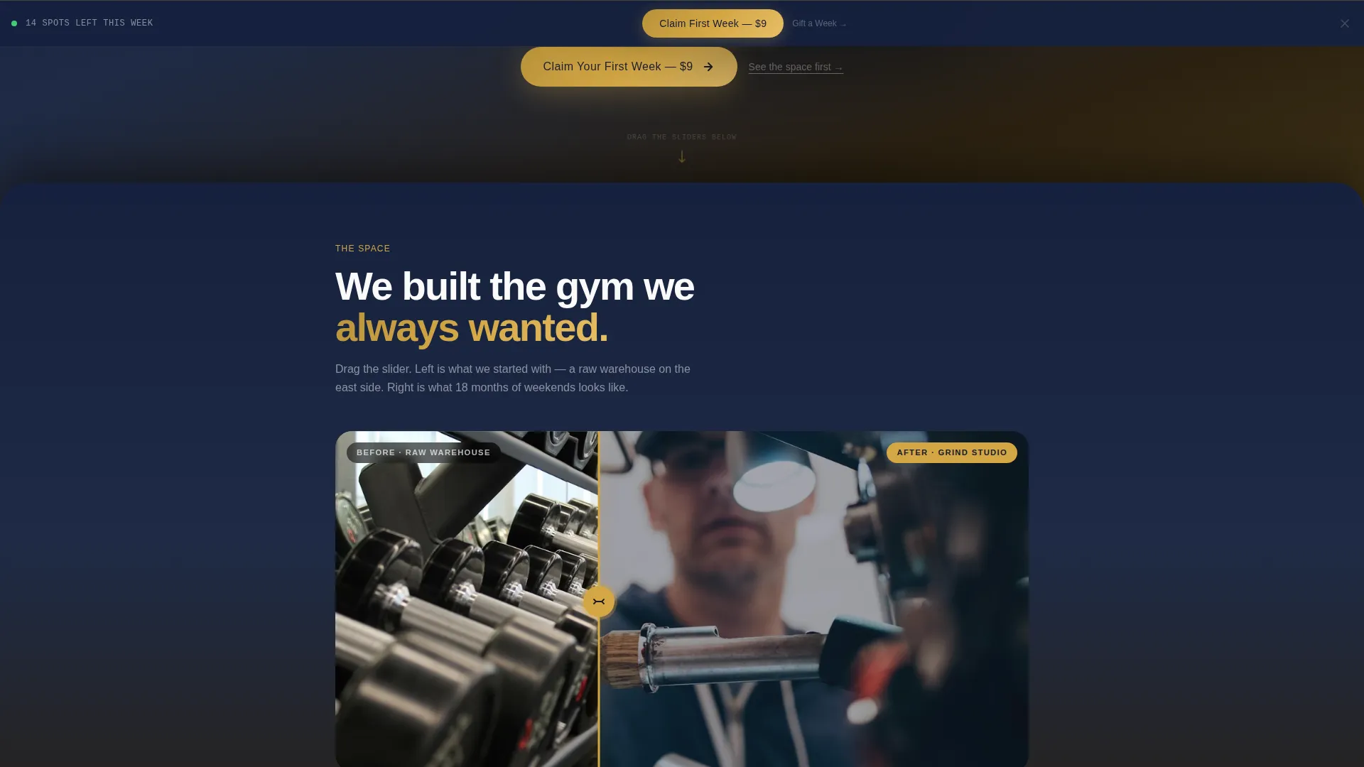
Three Before/After Reveal Sliders
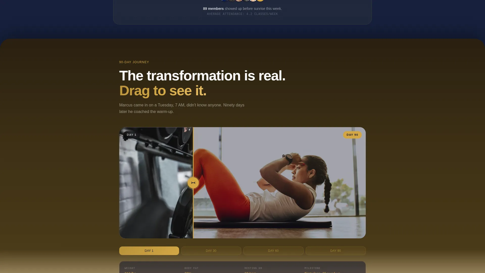
The template includes three draggable sliders. The first contrasts the raw warehouse space against the finished studio. The second shows a member's ninety-day physical journey. The third places a blurred commercial gym contract next to the studio's single transparent price card.
Floating Pinned Sales Bar
After the header scrolls out of view, a sticky bar locks to the bottom of the screen. It carries the primary call to action in gold on obsidian and stays visible throughout the entire scroll journey.
Embedded Single-Step Checkout
The purchase flow lives directly on the page. It collects a first name, a phone number, and a class-time selection showing real availability for the next seven days. No redirect, no extra tab, no friction.
Device Mockup Header Section
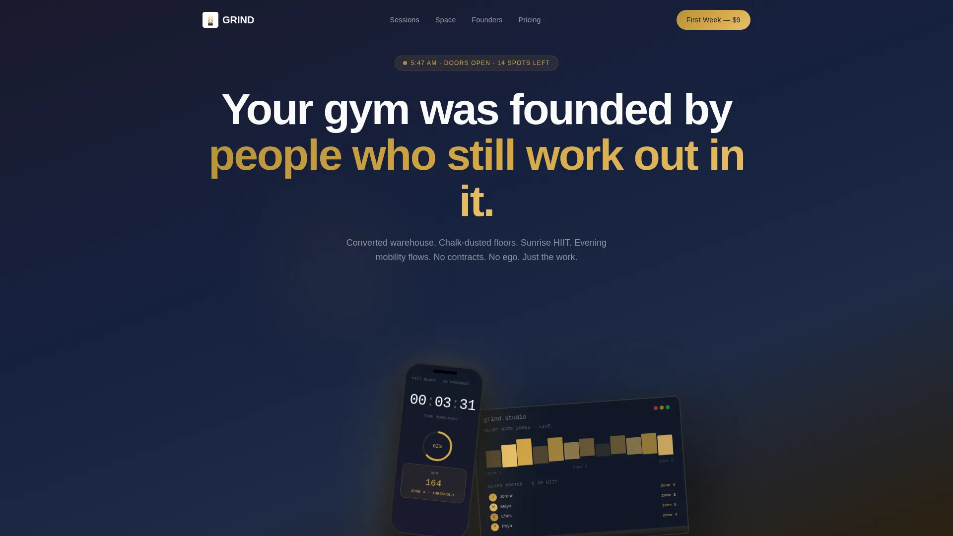
The header layers an iPhone and a laptop at offset angles over a gradient background. The device screens show a live-state booking interface: a countdown timer, a heart rate zone chart, and a class roster with avatar circles, all communicating that this studio is active and full.
Secondary Gift Purchase Path
Beneath the main call to action, a plain text link offers a "Gift a Week to a Friend" option. This secondary path adds a referral-friendly purchase route without competing visually with the primary conversion goal.
Page sections overview
| Section | Purpose |
|---|---|
| Floating Device Header | Establish credibility and energy with an active booking app mockup |
| Primary Headline Block | Anchor the brand voice with a single condensed-type statement |
| Space Reveal Slider | Show the warehouse-to-studio transformation with a draggable compare view |
| Member Journey Slider | Display a ninety-day physical transformation draggable from day one to day ninety |
| Pricing Reveal Slider | Contrast opaque commercial contracts with the studio's transparent single price |
| Pinned Checkout Bar | Persist the primary call to action and embedded purchase form throughout the scroll |
| Gift Link Row | Offer a secondary referral purchase path beneath the main action |
Design & branding system
The visual identity is built around a soft gradient theme using an obsidian and gold color system. The palette moves from near-black at the top of the page to a warm cream at the bottom, with gold reserved for high-stakes moments only.
- Base colors: deep charcoal (#1A1A2E) and brushed obsidian (#16213E) form all dark panel backgrounds
- Accent and action colors: warm champagne gold (#D4A745) appears exclusively on prices, call-to-action buttons, and transformation metrics; sunrise blush (#F5E6CC) handles gradient transition zones
- Typography: clean white (#FAFAFA) on dark panels, flipping to obsidian on light sections; headlines use condensed sans-serif for punch; overlapping cards cast soft shadows to build perceived depth
Mobile & speed optimization
The overlapping layout and layered card system are structured to stay readable and usable on smaller screens. The floating checkout bar is especially important on mobile, where it keeps the conversion path visible without requiring a scroll back to the top.
- Offset device mockups and rotated containers are sized so they do not crowd mobile viewports
- The embedded checkout form uses three minimal fields, keeping the input burden low on touch screens
- Gradient transitions and shadow depth are applied in a way that works across screen sizes without heavy visual clutter
How this template helps you convert
This template earns the click before it asks for it. The page is sequenced so every interaction builds trust before a purchase decision appears.
- The three before/after sliders put the visitor in an active role. By the time they reach the checkout, they have already dragged through the space reveal, the member transformation, and the pricing comparison. Engagement precedes the ask.
- The pinned floating bar keeps the call to action present without being intrusive. Gold on obsidian gives it visual authority, and the $9 entry price removes the financial objection before it forms.
- The embedded single-step checkout removes the most common drop-off point: the redirect. The visitor selects a class time, enters two fields, and completes the purchase without leaving the page.
Other information about this template
This template was designed with a specific energy in mind. It is not a generic gym page. Every structural and visual decision reflects the source brief's founding story and audience.
- The cascading forty-pixel overlap between sections is intentional, creating a scroll experience that feels earned, like progressive reps in a set
- The "Gift a Week to a Friend" secondary link supports peer referrals, which align naturally with the college-student and young-professional audience
- The template is categorized under Retail and E-Commerce with a Youth-Founded Business subcategory, making it relevant for founders who are also the product
- Color usage is strict: gold appears only on prices, calls to action, and metrics, never as decoration, so every gold element carries transactional weight
- The page style draws from a soft gradient theme and a before/after reveal creative direction, both of which align with the physical and visual transformation narrative at the core of the brand
Theme
Soft Gradient
Creative direction
Before/After Reveal
Color system
Dopamine Pop
Style
Bento Grid
Direction
Marketplace/Multi
Page Sections
Overlapping Cascading Scroll Layout
Three Draggable Before/after Sliders
Floating Pinned Sales Bar
Embedded Single-step Checkout
Device Mockup Header Section
Secondary Gift Purchase Path
Related questions
Can I change the $9 intro offer price shown in the template?
Does the embedded checkout form connect to a booking system automatically?
Can I use this template if my fitness studio has more than one location?
Are the before/after sliders interactive out of the box?
Can I replace the device mockup header with a different hero style?



