Artisan Small Animal Supplement Landing Page Template
Burrow is a hero-dominant landing page template built for small-batch rabbit and small animal health supplement brands. A custom botanical illustration fills the viewport, a single persimmon call-to-action button guides every visitor toward a product quiz, and a Japanese Zen color system keeps the entire page warm, unhurried, and rooted in ingredient trust.
by Rocket studio
Quick summary
Burrow is a single-page, click-through landing page template for rabbit and small animal health supplement brands. The design leads with a full-viewport hand-drawn illustration, channels sensory storytelling through ingredient-focused sections, and funnels every scroll toward one action: a persimmon "Find Their Blend" button that connects visitors to a product quiz.
Who this template is for
This template is made for small-batch supplement makers who serve devoted small-animal owners. It suits founders who want their page to feel handcrafted, transparent, and quietly authoritative rather than loud or sales-heavy.
- Artisan supplement brands serving house rabbits, guinea pigs, and chinchillas
- Small pet wellness creators who lead with ingredient storytelling and community trust
- Independent sellers who want a single click-through goal and no on-page cart or form
What problem this template solves
Generic product pages fail small-animal supplement brands. They push too hard, explain too little, and feel nothing like the careful, seasonal care these animals actually need. Devoted pet owners sense that mismatch immediately and leave.
- Visitors land on pages that feel corporate, not craft-made, and they lose trust before reading a single ingredient
- There is no clear single action to take, so interested buyers drift away without converting
- Ingredient quality gets buried in bullet points instead of being felt through the page experience
What you get with this template
You get a fully structured hero-dominant landing page built around sensory appeal and a single conversion path. Every section is designed to earn trust slowly and guide the visitor toward the product quiz without pressure.
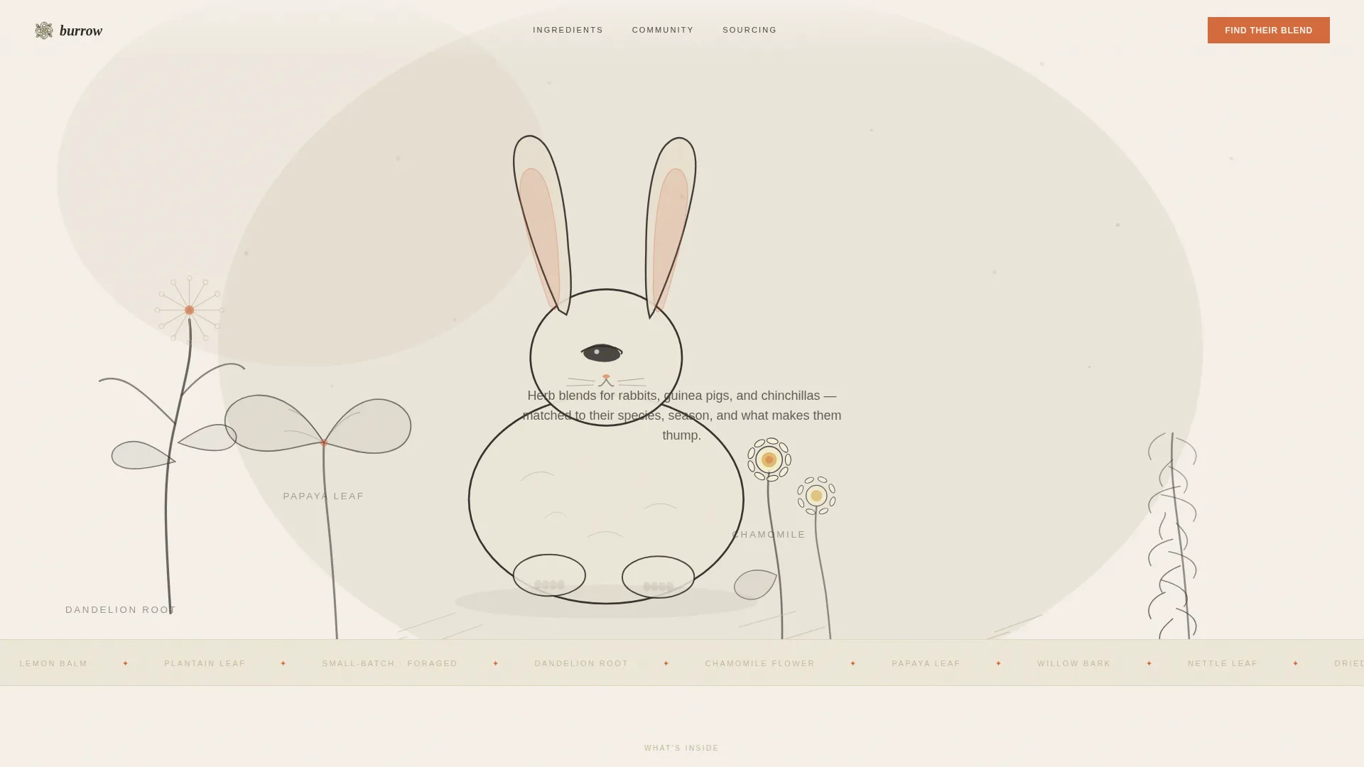
- A custom-illustration hero filling ninety percent of the viewport, with headline and call-to-action button embedded inside the scene
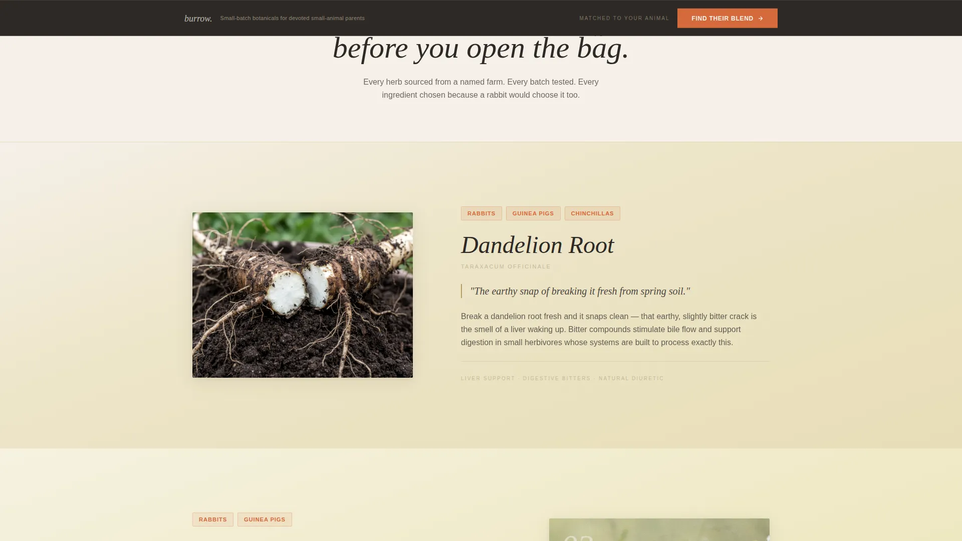
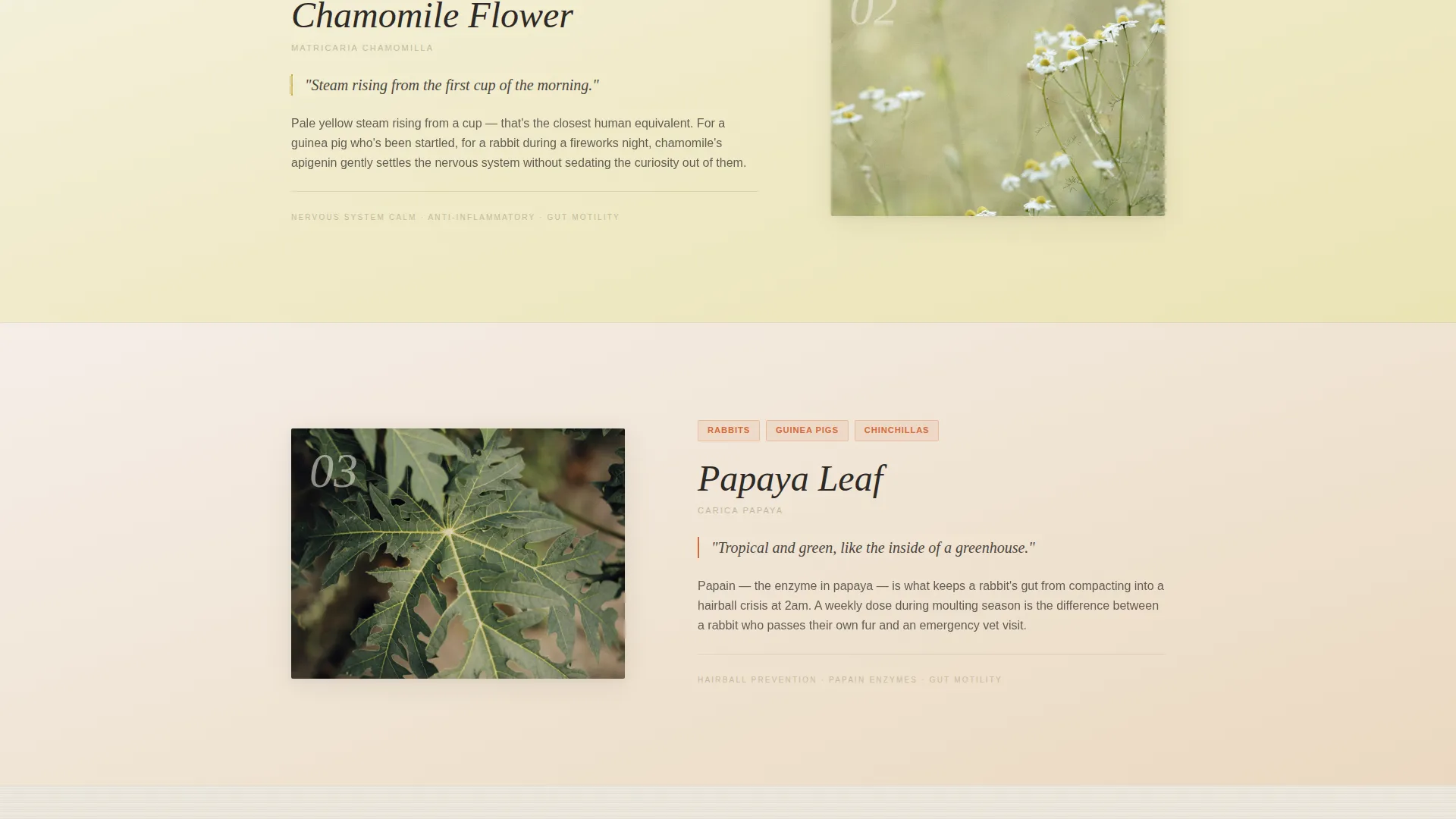
- Ingredient feature sections with individual texture backgrounds and sensory-focused copy areas for botanicals like chamomile, dandelion root, and willow bark
- A community photo mosaic, a sticky call-to-action bar, and a sourcing story section, all styled within the Japanese Zen color system
Feature list
A paragraph overview of the feature set: Burrow packages a carefully sequenced set of design features that build trust section by section. Each feature serves the click-through goal without cluttering the page or pulling attention away from the botanical story.
Full-Viewport Botanical Illustration Header
The hero section fills ninety percent of the viewport with a hand-drawn, softly textured scene. A lop-eared rabbit rests among oversized chamomile flowers, papaya leaf, dandelion root, and willow bark. The headline "What They'd Forage If They Could" appears letterpressed into the illustration itself.
Sensory Ingredient Sections
Each key botanical gets its own scroll section with a distinct background texture. A pale yellow chamomile wash, an earthy kraft paper sourcing panel, and a smooth ceramic ingredient panel each create a different sensory register. Visitors accumulate trust through feeling, not just reading.
Sticky Call-to-Action Bar
After the visitor passes the second scroll position, a soft sticky bar appears carrying the persimmon "Find Their Blend" button. This keeps the conversion path visible throughout the page without interrupting the reading experience.
Community Photo Mosaic
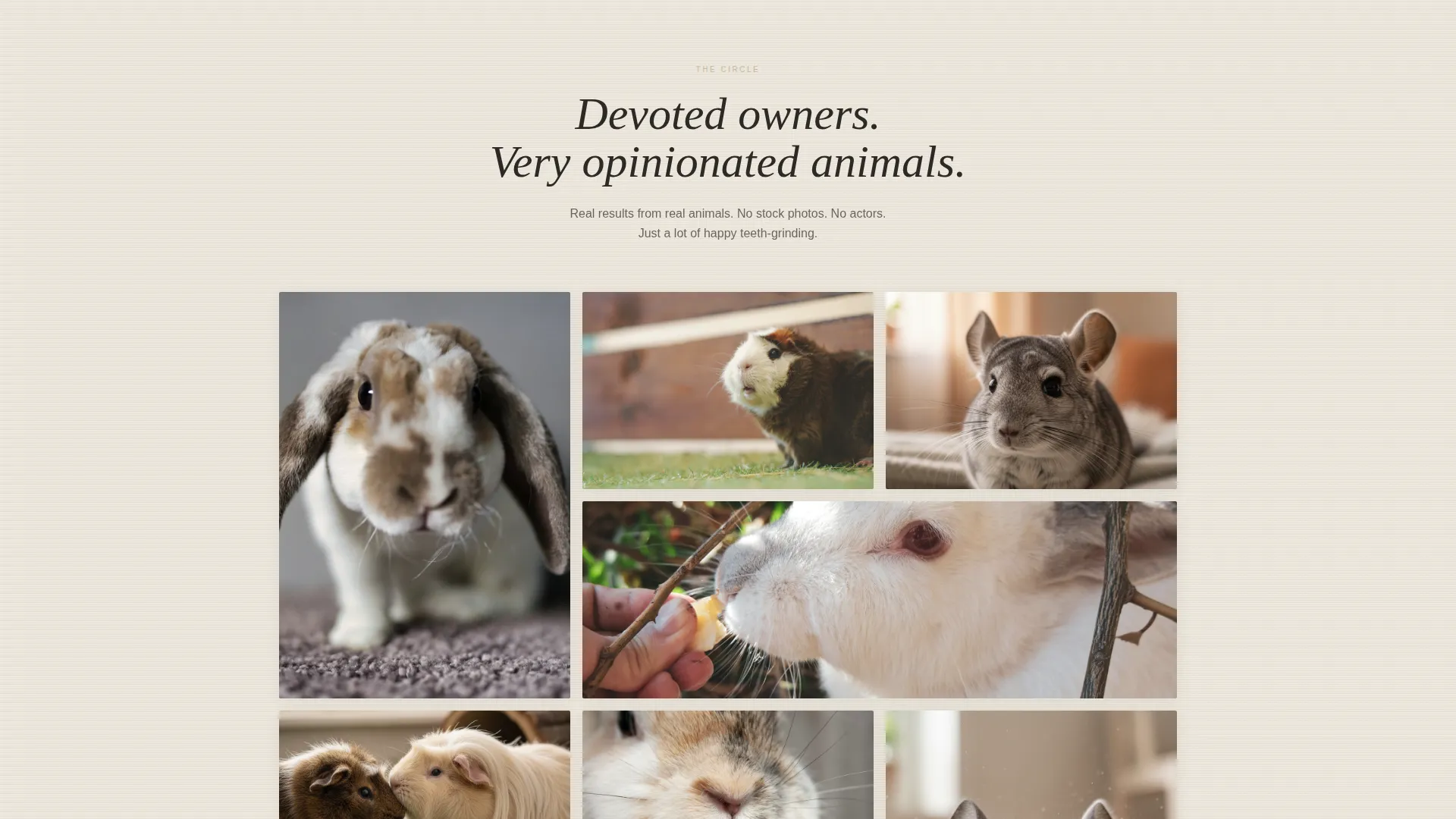
A scrolling mosaic of real customer-style photos shows rabbits mid-flop, guinea pigs popcorning, and chinchillas dust-bathing. Each image is captioned with a first name and breed. The section signals a living community rather than a transactional product page.
Japanese Zen Color and Texture System
The entire page runs on four values: washi paper cream, tatami straw, sumi ink charcoal, and persimmon accent. Backgrounds stay in the cream-to-straw range. Persimmon appears only on buttons and ingredient callouts. Generous whitespace separates every element cleanly.
Single-Action Click-Through Flow
There is no cart, no form, and no competing call to action on this page. Every section is positioned to move the visitor toward one persimmon button that leads to a species, age, and health-concern quiz. The page earns the click rather than demanding it.
Page sections overview
| Section | Purpose |
|---|---|
| Hero Illustration | Establish brand feeling and place the first call-to-action button inside the scene |
| Dandelion Root Feature | Isolate one ingredient with earthy sensory copy and a kraft paper texture background |
| Chamomile Feature | Carry a pale yellow wash across the section to evoke warmth and calm |
| Ingredient Panel | Present botanical transparency on a smooth ceramic-style background |
| Sourcing Story | Share the small-batch, foraged-herb origin narrative in a rough kraft setting |
| Community Mosaic | Display customer pet photos with first names and breeds to build belonging |
| Sticky Action Bar | Float the persimmon button after the second scroll for continuous conversion access |
Design & branding system
The visual system is built on a Japanese Zen palette that feels handmade and unhurried. Every color, texture, and spacing choice reinforces the sense that this supplement line was made slowly and with intention.
- Four-value palette: washi paper cream (#F5F0E8) and tatami straw (#C4B99A) for all backgrounds, sumi ink charcoal (#2D2926) for body text, and persimmon (#D46A3C) reserved exclusively for buttons and ingredient callouts
- Texture layering: linen weave behind testimonial areas, smooth ceramic behind ingredient panels, and rough kraft paper behind the sourcing story, each shifting the sensory register without breaking visual coherence
- Generous whitespace and visible brushstroke illustration style keep the page breathing like a zen garden, never crowded or rushed
Mobile & speed optimization
The hero-dominant layout is structured to translate cleanly to smaller screens. The single call-to-action path means there is very little interface complexity to manage across breakpoints.
- The full-viewport illustration scales and crops to maintain the rabbit-and-botanicals focal point on mobile without losing the headline placement
- The sticky call-to-action bar is designed for thumb-reach placement, keeping the persimmon button accessible as a visitor scrolls on a phone
- Texture backgrounds are applied as lightweight visual layers so they contribute atmosphere without creating heavy load conditions
How this template helps you convert
The page earns conversion through trust accumulation rather than pressure tactics. Every layout decision is made to move a cautious, devoted small-animal owner gently toward one action.
- The hero illustration sets emotional resonance immediately, so the visitor feels understood before reading a single product claim, and the embedded call-to-action button captures early intent
- Ingredient sections build layered credibility with each scroll, and the sticky bar ensures the persimmon "Find Their Blend" button is always one tap away once interest is established
- The community photo mosaic closes the trust gap by showing real animals and real owners, making the visitor feel they are joining an existing circle of care rather than taking a risk on a new product
Other information about this template
Burrow was designed with a very specific kind of small-animal owner in mind. The template reflects that specificity in every detail, from the half-closed eye on the illustrated rabbit to the texture shift between sections.
- The template supports a quiz-led conversion model: the page itself holds no product catalog, no pricing grid, and no checkout flow
- The Community Hearth theme surfaces most visibly in the photo mosaic, where first names and breed captions create intimacy rather than social proof in the traditional marketing sense
- The Sensory Appeal creative direction means copy areas across the template are intentionally short and evocative rather than long and informational
- The hero-dominant layout (90/10 ratio) means the illustration carries the brand weight, while the remaining ten percent of the page handles ingredient context and community signal
- This template is well suited to Framer, Webflow, or similar visual-builder environments where custom illustration assets and texture layers can be imported and applied without code
Theme
Community Hearth
Creative direction
Sensory Appeal
Color system
Japanese Zen
Style
Hero-Dominant (90/10)
Direction
Click-Through
Page Sections
Full-viewport Botanical Illustration Hero
Sensory Ingredient Scroll Sections
Sticky Persimmon Call-to-action Bar
Community Pet Photo Mosaic
Japanese Zen Four-value Palette
Single-goal Click-through Architecture
Related questions
What kind of product is this template designed for?
Does this template include a shopping cart or checkout flow?
How is the call-to-action button handled across the page?
Can I adapt this template for a brand that sells supplements for more than one small animal species?
Can the hero illustration be replaced with brand photography?