Journal Editor Profile Landing Page Template
Byline is a full-width immersive landing page template built for journal editors who want their profile to carry real weight. It pairs a manifesto-style scroll structure with a stark Monochrome Steel palette and a giant centered headline, turning an editor's convictions about scholarly publishing into a compelling, trust-building resource page.
by Rocket studio
Quick summary
Byline is a single-page template designed for academic journal editors. It opens with a massive typographic statement on pure black, then unfolds as a scrolling manifesto, each section a belief about scholarly publishing, backed by a concrete editorial example. The page builds authority through argument, not biography, and guides visitors toward submission guidelines and archive browsing.
Who this template is for
This template is built for journal editors who want their profile to do serious intellectual work. It suits anyone whose credibility comes from editorial judgment, not personal branding.
- Journal editors presenting their standards and philosophy to prospective authors
- Academic institutions or research programs hosting an editor's public-facing profile
- Early-career and established researchers evaluating whether a journal is the right home for their work
What problem this template solves
Most academic profile pages bury the editor's actual thinking under a list of credentials. Prospective authors leave without understanding what the journal values or how to write for it. Byline solves this by making the editorial philosophy the content itself.
- Researchers struggle to find clear signals about a journal's standards before submitting
- Editors have no structured way to communicate craft principles and rejection philosophy publicly
- Institutional librarians and tenure-track faculty need a credible, readable resource to justify a journal's value
What you get with this template
You get a carefully structured single-page layout that reads like a printed editorial manifesto. Every section is purposeful and ordered to build conviction as the visitor scrolls.
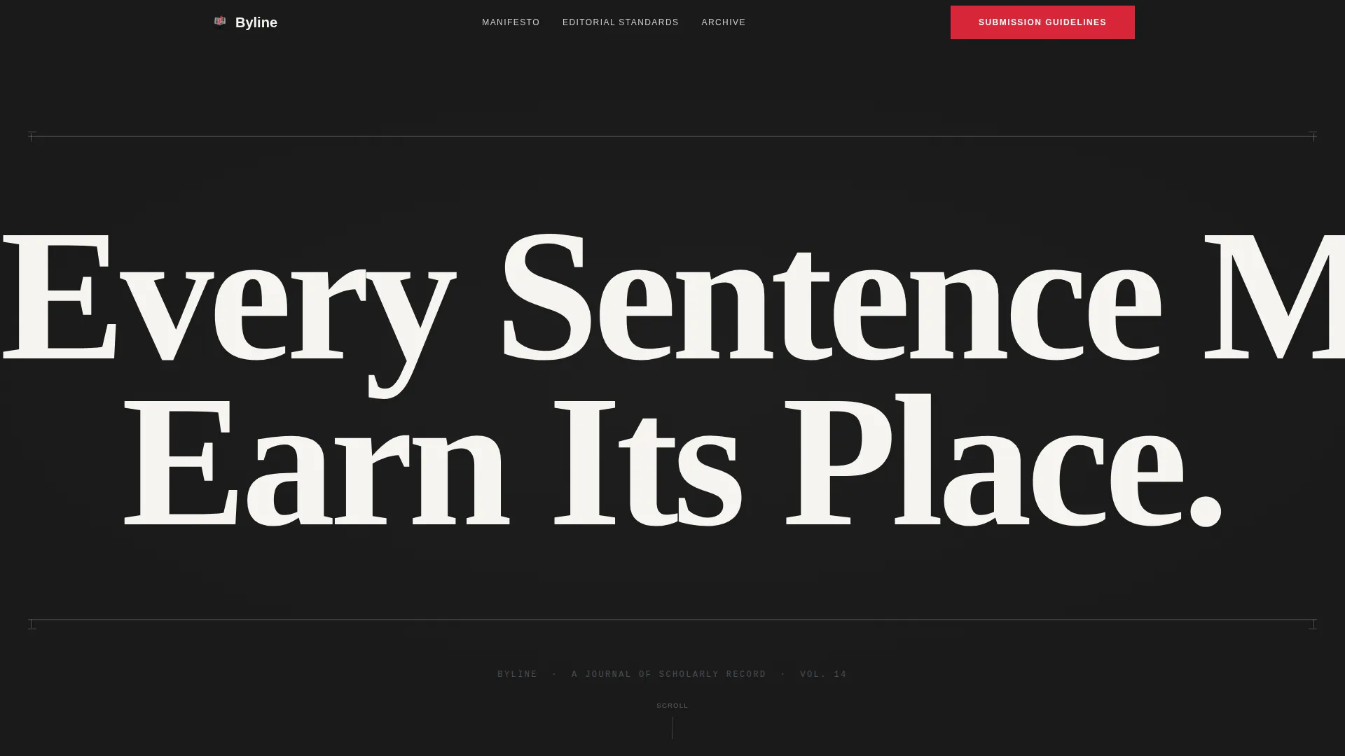
- A giant centered headline section in white type on pure black, framed by silver trim rules
- A scrolling manifesto body with belief-driven sections, each backed by a real editorial example
- A primary call-to-action linking to a downloadable submission guidelines PDF, plus a secondary archive browsing path
Feature list
This template ships with a set of carefully considered layout and content features, each derived directly from its editorial brief.
Giant Headline Centered Header
The header sets the entire tone. One typographic statement in a sharp serif typeface, set at massive scale against pure black. No portrait, no tagline, no decoration. Thin silver rules above and below act as trim marks, signaling that this page operates at print-level precision.
Manifesto Scroll Structure
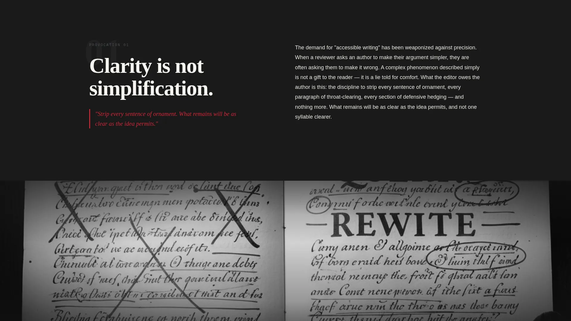
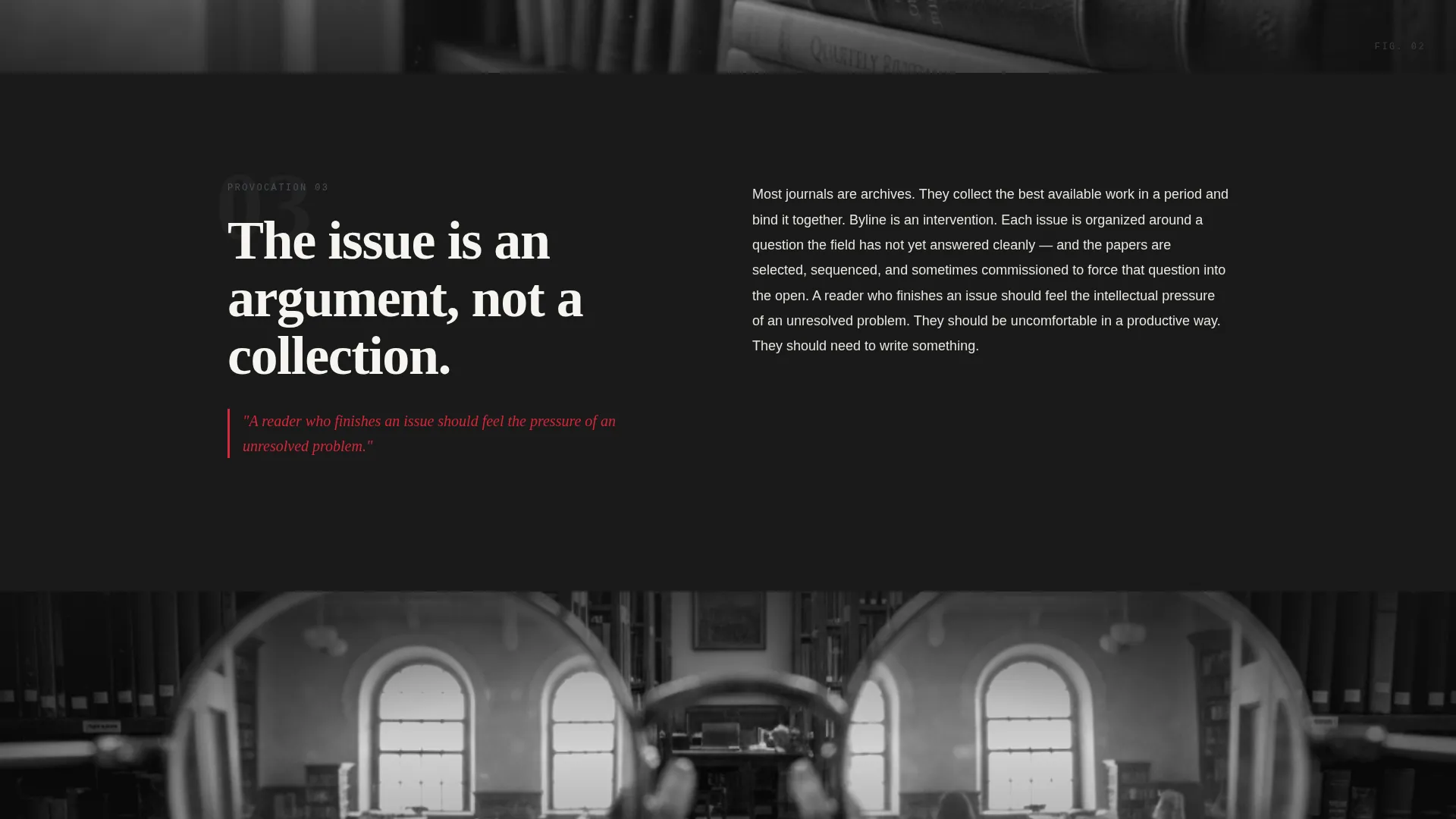
Each content section leads with a provocation, a single declarative belief about scholarly publishing. That belief is then unpacked with one concrete editorial example, such as a reshaped abstract or an anonymized reviewer letter. The scroll escalates in conviction from craft principles to field-shaping philosophy.
Full-Bleed Section Dividers
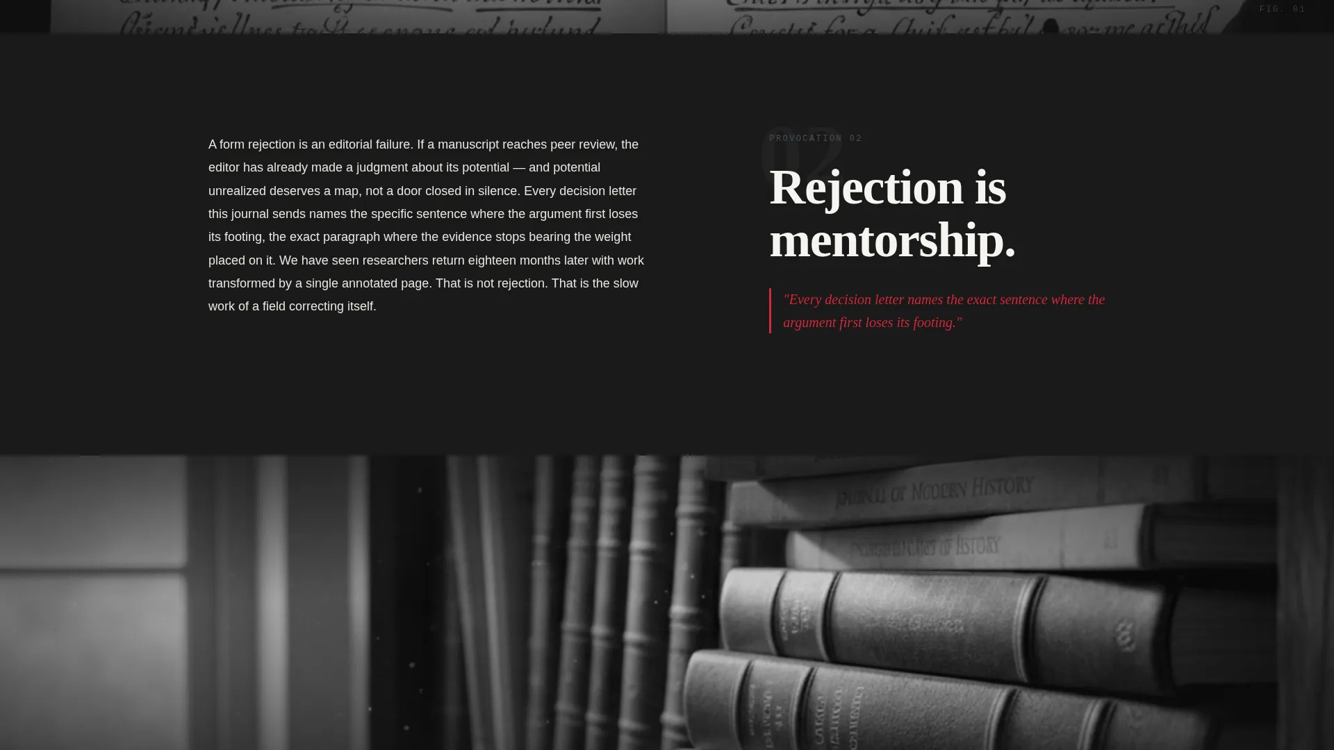
Between each manifesto section, a full-bleed grayscale photograph punctuates the scroll. Images follow a Lens and Frame visual motif: manuscripts seen through reading glasses, galley proofs on a lightbox, shelves of bound volumes receding into selective focus. The photographs reinforce the editorial atmosphere without distracting from the text.
Before-and-After Editorial Examples
The template includes a structured before-and-after component for displaying an abstract or passage the editor reshaped. This makes the editor's standards visible and teachable, turning the page into a genuine resource rather than a credential list.
Primary and Secondary Conversion Paths
The primary call-to-action directs visitors to read the submission guidelines, formatted as a downloadable PDF that doubles as a statement of editorial standards. A secondary path invites visitors to browse a filterable grid of past journal issues. There is no contact form on this page.
Proof-Mark Red Accent System
Interactive elements and pull-quotes use a single reserved accent color: bright proof-mark red (#D72638). Every other surface stays within the Monochrome Steel palette. The red functions like a correction mark on a manuscript page, drawing the eye exactly where action is required.
Page sections overview
| Section | Purpose |
|---|---|
| Giant Headline Header | Opens the page with the editor's core philosophy as a single typographic statement |
| First Manifesto Section | States the first editorial belief and unpacks it with a concrete example |
| Full-Bleed Divider | Provides an atmospheric visual pause between manifesto sections |
| Second Manifesto Section | Escalates the argument with a second belief and supporting editorial evidence |
| Before-and-After Example | Shows the editor's craft through a reshaped abstract or passage |
| Third Manifesto Section | Advances the philosophy toward field-level conviction |
| Anonymized Reviewer Letter | Illustrates the "rejection is mentorship" principle with a real example |
| Full-Bleed Divider | Reinforces the Lens and Frame visual motif mid-scroll |
| Archive Browse Path | Offers a filterable grid of past issues as a secondary discovery path |
| Submission Guidelines call to action | Directs visitors to the downloadable PDF as the primary conversion event |
Design & branding system
The visual identity is built on a Monochrome Steel color system that feels like a steel letterpress plate: industrial, precise, and authoritative. Every surface is either shadow or reflection, with one deliberate exception.
- Core palette: deep editorial black (#1A1A1A), gunmetal gray (#4A4F57), cold silver (#C8CDD3), and proof-mark red (#D72638) reserved exclusively for interactive elements and pull-quotes
- Typography: a sharp serif typeface used at extreme scale in the header, scaling down through body sections with clear typographic hierarchy
- Visual motif: the Lens and Frame theme runs through every full-bleed photograph, framing editorial materials through optical devices to reinforce the idea of focused, deliberate reading
Mobile & speed optimization
The full-width immersive layout is structured to translate cleanly across screen sizes. Large typographic elements and full-bleed images are the core building blocks, which scale predictably on smaller viewports.
- The giant headline section is designed to reflow gracefully so the typographic impact holds on mobile screens
- Full-bleed photograph dividers maintain their atmospheric quality at reduced widths without requiring additional assets
- The filterable archive grid is laid out to collapse into a readable single-column format on smaller devices
How this template helps you convert
This template treats trust-building as the conversion mechanism. There is no form, no sign-up wall, and no pitch. The page earns commitment by giving the editor's thinking away freely.
- The manifesto structure qualifies visitors naturally: a researcher who reads through the scroll already understands the journal's standards and is far more likely to submit work that fits.
- The submission guidelines PDF functions as both a resource and a conversion event, because a researcher who downloads and reads them fully is already engaged in the submission process.
Other information about this template
Byline sits within the Personal and Resume category, specifically the Academic and Research Profile subcategory. It is designed for the Journal Editor Profile niche and carries an intersection match score that reflects a precise alignment between editorial identity and content-led profile pages.
- The template style is Full-Width Immersive, meaning the layout uses the full browser width at every section with no contained columns breaking the visual field
- The creative direction is Manifesto, a format borrowed from print editorial traditions where argument and example replace biography and credential lists
- The Lens and Frame theme and the Monochrome Steel color system are paired design decisions that work together to produce the feeling of picking up a freshly printed journal issue
- This template is suitable for use on platforms that support custom HTML and CSS landing page builds, or as a design reference for page builders that handle full-width section layouts
Theme
Lens & Frame
Creative direction
Manifesto
Color system
Monochrome Steel
Style
Full-Width Immersive
Direction
Content/Resource
Page Sections
Giant Centered Typographic Header
Manifesto Scroll with Editorial Examples
Full-bleed Grayscale Dividers
Before-and-after Abstract Component
Proof-mark Red Accent System
Dual Conversion Path Layout
Related questions
Is this template suitable for a first-time journal editor?
Does the page include a contact form or submission inbox?
Can the proof-mark red accent color be customized?
Who is the intended audience for a page built with this template?
How does the before-and-after editorial example component work?



