PR & Communications Agency Professional Website Template
Byline is a tech PR agency landing page template built for crisis strategists and former journalists who place founders in the press and protect them from negative coverage. It uses a zigzag layout, an Ink and Paper color system, and a proof-first scroll flow designed to earn the click to a capabilities deck before asking for anything in return.
by Rocket studio
Quick summary
Byline is a single-page PR agency template built around transparent process storytelling. It pairs candid descriptions of real PR steps with visible artifacts, pitch emails, coverage trackers, embargo calendars, to build trust through proof rather than promises. The result is a page that feels authoritative and earned, guiding high-intent visitors toward one clear click.
Who this template is for
This template is built for PR agencies and communications firms that work with technical founders and public companies. It speaks directly to buyers who have seen vague agency pitches before and need something more credible.
- Tech PR agencies serving Series B startups or developer-tool companies
- Crisis communications teams who respond to press leaks and negative coverage
- Comms directors at public companies who need a rapid-response partner
What problem this template solves
Most PR agency pages lead with credentials nobody can verify. Byline flips that by showing the work before asking for anything. It addresses the core trust gap between a buyer who needs a media partner and a page that has not yet earned that confidence.
- Generic PR pages make vague "relationships" claims with no supporting evidence
- Founders and comms directors need to vet an agency fast, not fill out a form and wait
- No visible process means no credibility, especially for high-stakes product launches
What you get with this template
You get a fully structured, single-page landing page designed to convert skeptical, high-intent visitors into capabilities-deck requests. Every section has a defined role in that journey.
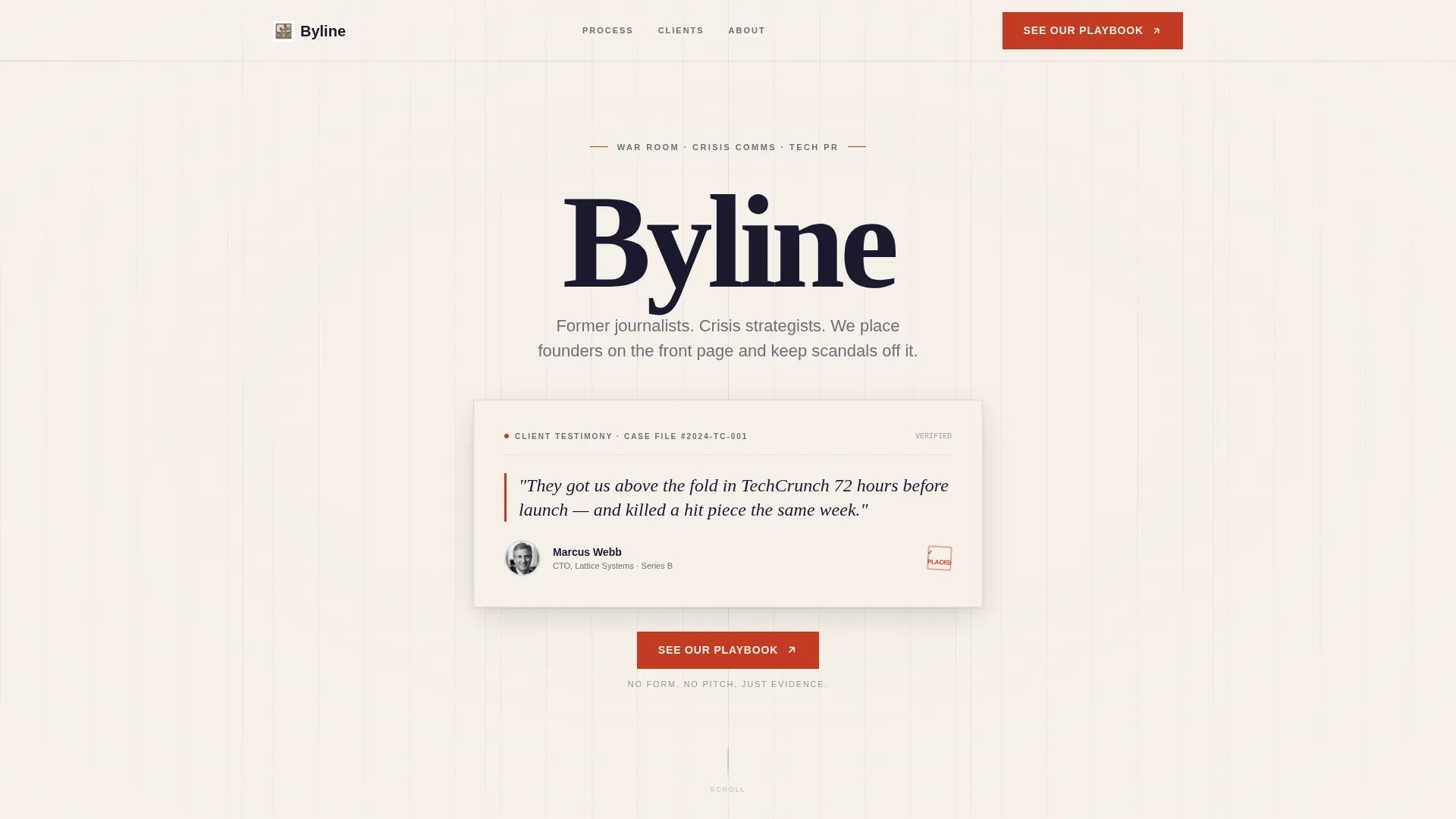
- A testimonial header styled as a legal affidavit, with a pull quote, founder name, company, and headshot
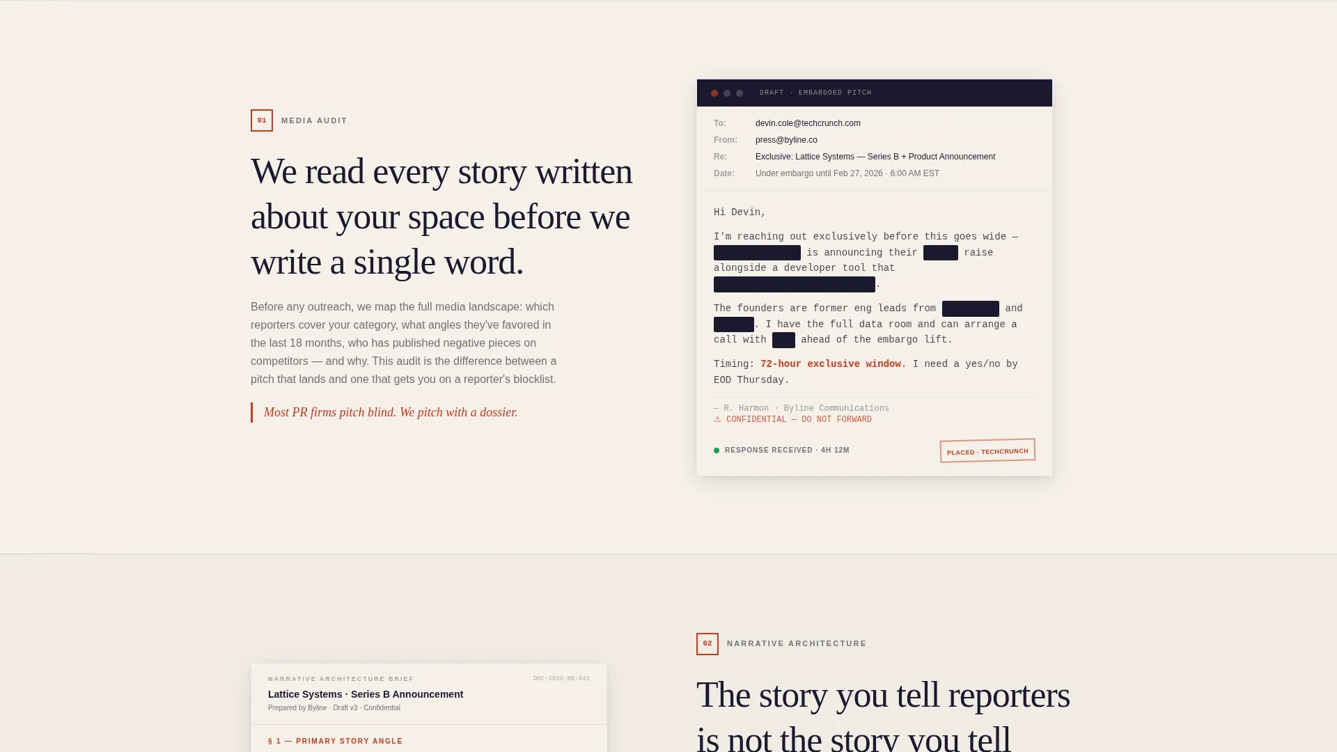
- Alternating zigzag sections pairing process descriptions with real PR artifacts on each side
- Redline red call-to-action buttons repeating at every major scroll milestone
Feature list
This template includes several purpose-built components that work together to build a credible, conversion-focused page.
Affidavit-Style Testimonial Header
The header is a cream card with a drop shadow, typeset to resemble a legal affidavit. It displays a two-line quote from a named CTO, the founder's full name and company, and a small monochrome headshot. A faint newspaper-column texture scrolls slowly behind the card for added newsroom atmosphere.
Zigzag Process Reveal Layout
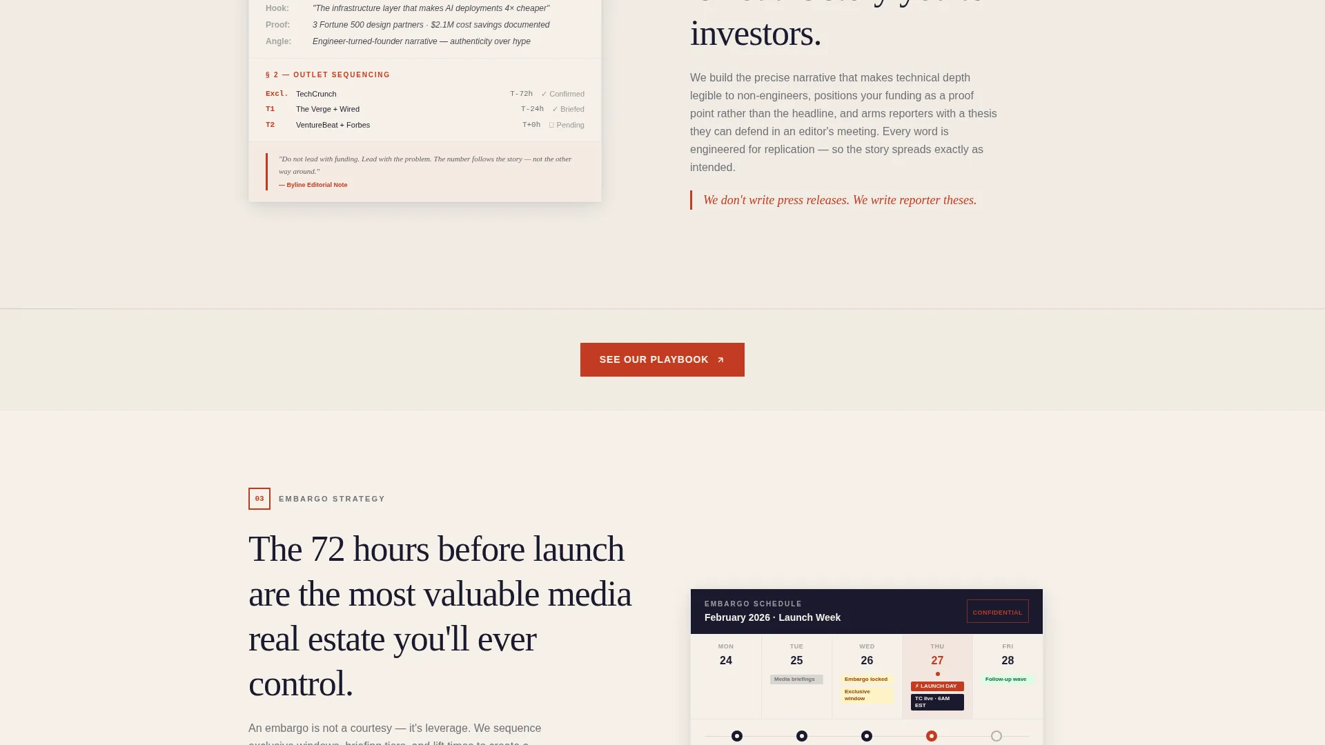
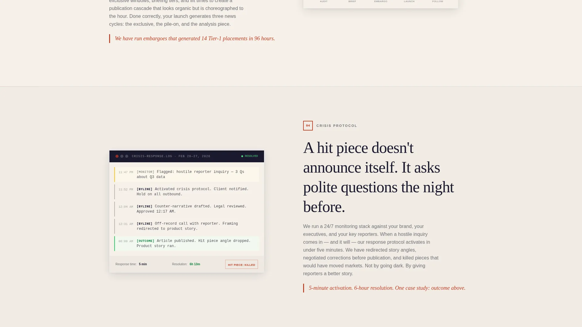
Each alternating section peels back one layer of how PR coverage actually happens. The left block describes a step such as a media audit, narrative architecture, or embargo strategy. The right block shows a corresponding real artifact, like a redacted pitch email or a coverage tracker screenshot. This pairing builds trust through visible evidence at every scroll point.
Redline Red Call-to-Action System
The primary call-to-action button, labeled "See Our Playbook," appears first beneath the testimonial card and repeats at the close of every zigzag pair. Buttons are anchored in redline red (#C23B22), ensuring the eye lands on the action point at each natural pause in the scroll.
Ink and Paper Color System
The palette uses deep briefcase black (#1A1A2E), warm parchment (#F5F0E8), redline red (#C23B22), and steel-nib gray (#6E7078). Parchment dominates open space, black frames section breaks, and red appears only on interactive accents and pull quotes. The result feels like a freshly printed broadsheet, authoritative and tactile.
No-Form Click-Through Architecture
This page carries no contact form. The single conversion action drives visitors to a gated PDF capabilities deck where email capture happens off-page. Every element before that click, including quotes, artifacts, and timelines, is designed to earn the action rather than interrupt it.
Page sections overview
| Section | Purpose |
|---|---|
| Testimonial Header Card | Opens with a named CTO quote styled as a legal affidavit to establish instant credibility |
| First call to action Block | Prompts the first "See Our Playbook" click directly beneath the header card |
| Media Audit Section | Describes the audit step on the left and shows a real coverage tracker artifact on the right |
| Narrative Architecture Section | Explains story framing on the left, paired with a sample pitch structure artifact on the right |
| Embargo Strategy Section | Covers embargo planning on the left alongside a redacted embargo calendar artifact |
| Reporter Outreach Section | Details outreach methodology on the left with a redacted pitch email artifact on the right |
| Crisis Protocol Section | Presents rapid-response process on the left with a crisis timeline artifact on the right |
| Closing call to action Block | Delivers the final "See Our Playbook" button to close the proof-building scroll |
Design & branding system
The design language draws from legal documents and printed broadsheets. Every color choice, typographic decision, and layout rule exists to communicate precision and authority without shouting.
- Deep briefcase black (#1A1A2E) frames section breaks like editorial column rules
- Warm parchment (#F5F0E8) fills open space to give the page a tactile, printed quality
- Redline red (#C23B22) appears only on buttons, pull quotes, and process-step markers so it always signals importance
Mobile & speed optimization
The zigzag layout and artifact panels are structured to restack gracefully on smaller screens. The single-column mobile view preserves the left-to-right proof reveal as a top-to-bottom narrative instead.
- Artifact panels stack below their paired process descriptions on mobile
- The testimonial header card maintains its cream card treatment and drop shadow at all viewport sizes
- Redline red call-to-action buttons remain full-width and thumb-friendly on small screens
How this template helps you convert
This template is engineered around one conversion goal: getting the visitor to click "See Our Playbook" with confidence. Every design and copy decision supports that moment.
- Proof comes before the ask. Quotes, artifacts, and real timelines build the case across the scroll so the visitor already trusts the agency before the final button appears.
- The single call-to-action, repeated at every zigzag pair, removes decision fatigue and keeps the exit path clear without adding form friction.
- The no-form architecture means the page never interrupts the persuasion flow. Email capture happens after the click, once interest is already established.
Other information about this template
This template is built specifically for the PR and corporate communications space, where credibility is the product. A few additional details worth noting:
- The template style follows an editorial magazine aesthetic paired with a split-screen layout philosophy, making it well suited for agencies that want a premium, publication-grade feel
- The creative direction is Transparent Process, meaning every visual and copy element is designed to reveal methodology rather than obscure it
- The header concept centers on a data and evidence storytelling approach, using real artifacts as visual proof points rather than decorative imagery
- The page type is a click-through landing page, not a lead-generation form page, so conversion metrics should be tracked at the capabilities deck stage
- The intersection context positions this template within the Corporate Communications niche, making it relevant for both boutique PR firms and in-house communications teams at growth-stage tech companies
Theme
Editorial Magazine
Creative direction
Testimonial Mosaic
Color system
Plum Executive
Style
Split Screen (50/50)
Direction
Lead Generation
Page Sections
Affidavit-style Testimonial Header
Zigzag Proof-reveal Layout
Redline Red Call to Action System
Ink and Paper Color System
No-form Click-through Architecture
Related questions
Can I use this template without changing the copy structure?
Does this template include a contact form?
Is the testimonial header card easy to update?
Who is this template best suited for?
Can I change where the call to action button points?



