Bold Brutalist Freelance Writer Landing Page Template
Byline is a bold, brutalist freelance writer landing page template built for copywriters who want their work to do the talking. A masonry trophy-wall layout, a viewport-filling headline, and a clear click-through path toward a booking page make this template as confrontational and persuasive as the writing it showcases.
by Rocket studio
Quick summary
Byline is a single-page freelance writer landing page template built on a Bold Brutalist visual theme. It uses a masonry grid to display published work, awards, and readership stats in a gallery-style layout. A fixed call-to-action button, a full-width banner, and a closing call to action line drive visitors toward one clear action: booking an inquiry session.
Who this template is for
This template is built for freelance writers who compete at a high level and want their portfolio to reflect that. It suits writers whose work carries measurable proof, publication credits, award shortlists, and audience numbers that speak for themselves.
- Freelance copywriters and content strategists with a strong editorial track record
- Independent brand writers who serve startup founders, magazine editors, and creative agencies
- Experienced wordsmiths ready to replace a generic portfolio site with something that commands attention
What problem this template solves
Most freelance writer portfolio pages feel safe and forgettable. They list services, drop a few logos, and wait. Byline solves the problem of a portfolio that fails to build conviction fast enough to convert a cold visitor into an inquiry.
- Visitors cannot immediately feel the writer's tier from a standard list-based layout
- Award credits, readership stats, and publication names get buried instead of showcased
- There is no clear, repeated path to a booking or inquiry action on most portfolio pages
What you get with this template
You get a complete, ready-to-customize single-page layout designed to position a freelance writer as a first-choice hire. Every section is purposeful, and the visual weight is calibrated to impress without feeling cluttered.
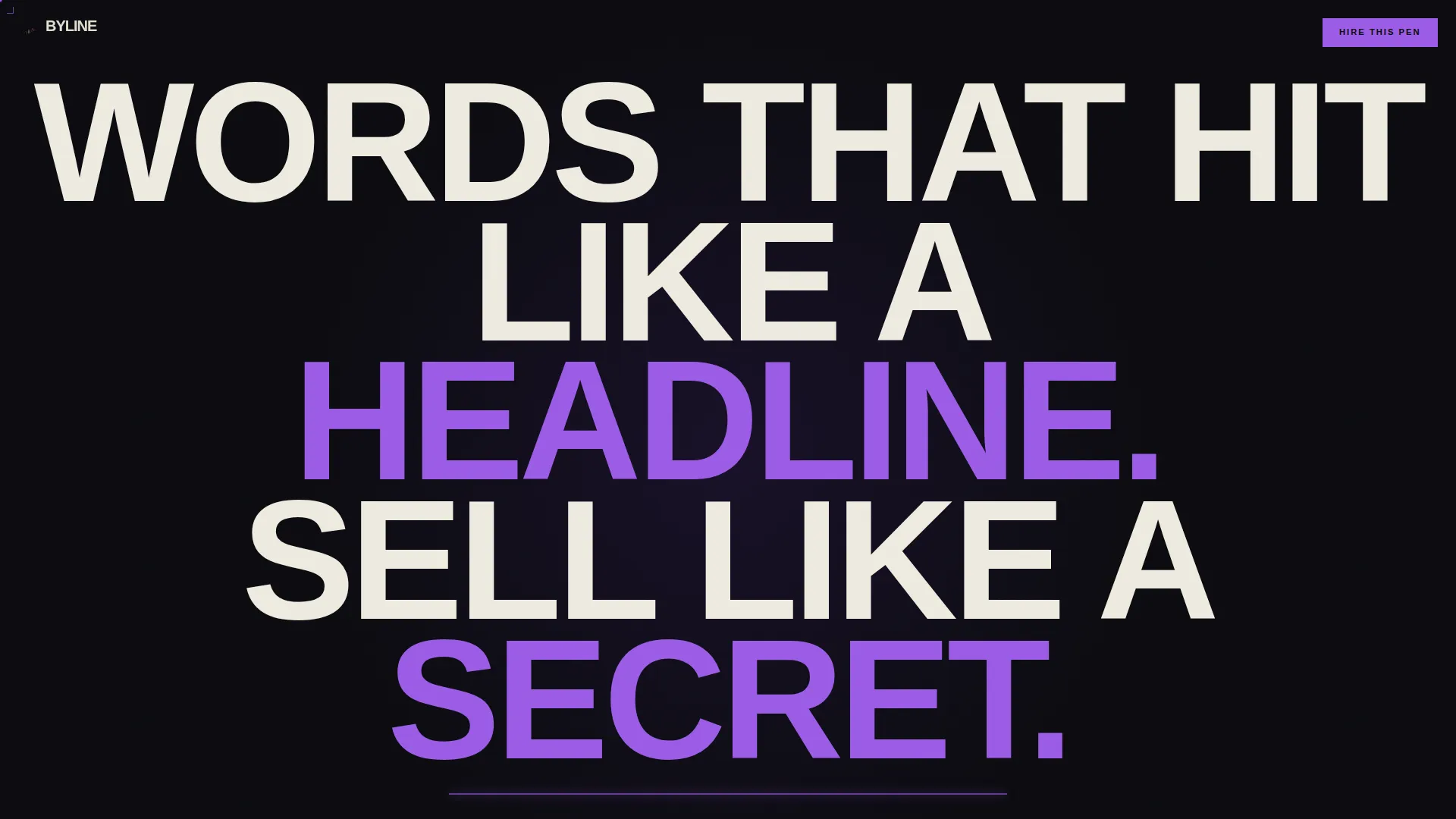
- A viewport-filling header with a centered giant headline and a stat-backed subline
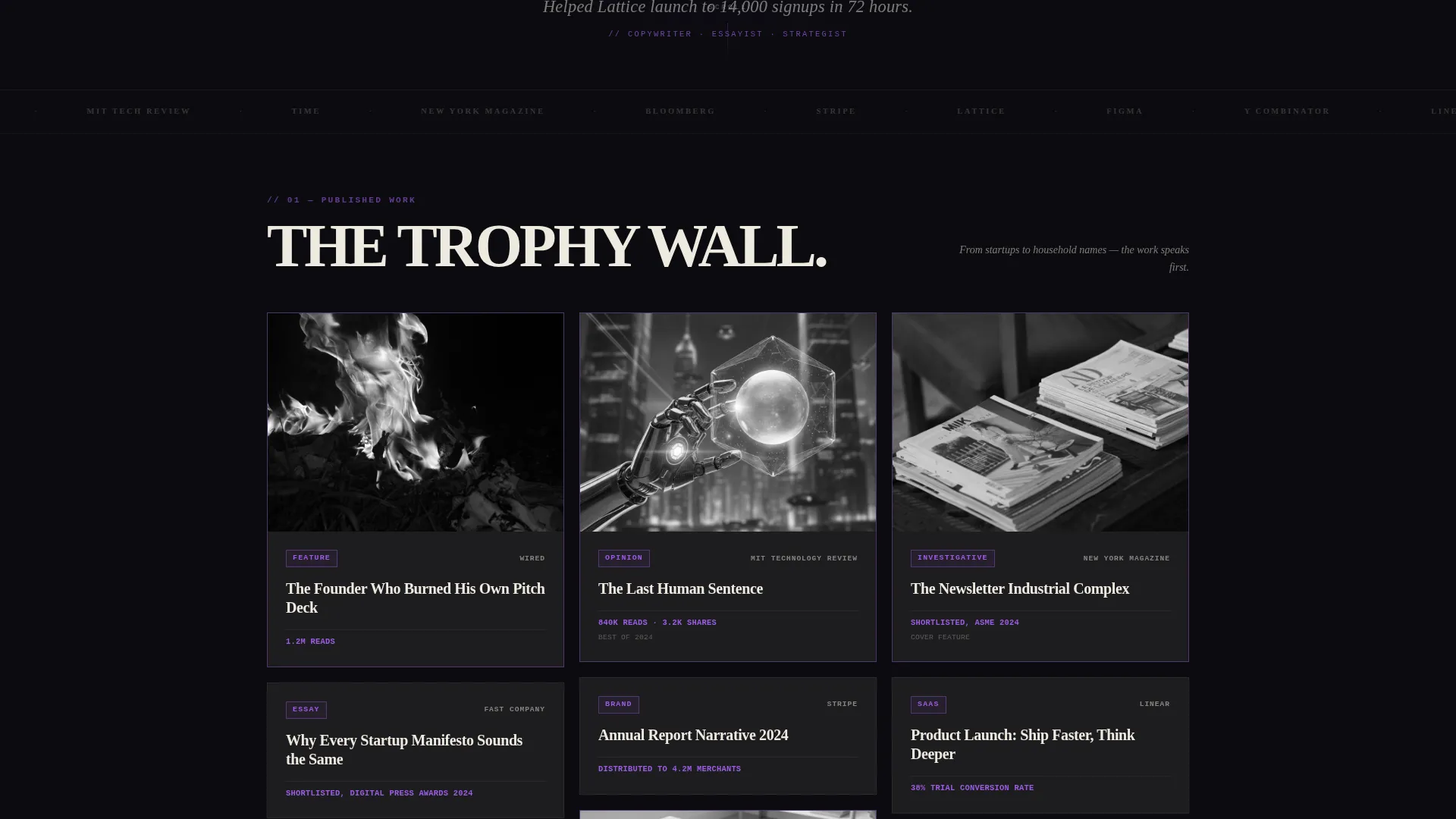
- A staggered masonry grid of work cards, each displaying a publication logo, article headline, and a single proof point such as a readership number or award credit
- Three strategically placed calls-to-action that guide visitors toward an external booking or inquiry page
Feature list
A breakdown of the core components built into the Byline template.
Viewport-Filling Giant Headline
The header uses all-caps type sized to fill the screen edge to edge. The letterforms are large enough to crop at the screen edges, creating an immediate visual impact with no image or illustration required. A violet underline and a lowercase italic subline anchor the opening statement.
Trophy-Wall Masonry Grid
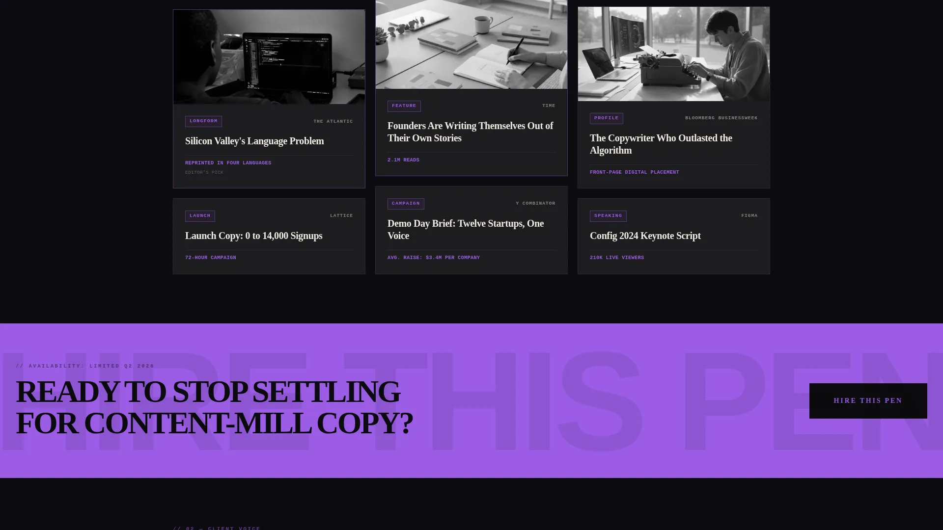
Work cards are arranged in a staggered, Pinterest-style masonry layout. Each card holds a publication logo, an article headline, and one proof point: a readership figure, an award shortlist credit, or a reprint note. Cards escalate in prestige as the visitor scrolls, building a cumulative case for the writer's caliber.
Three-Point Click-Through call to action System
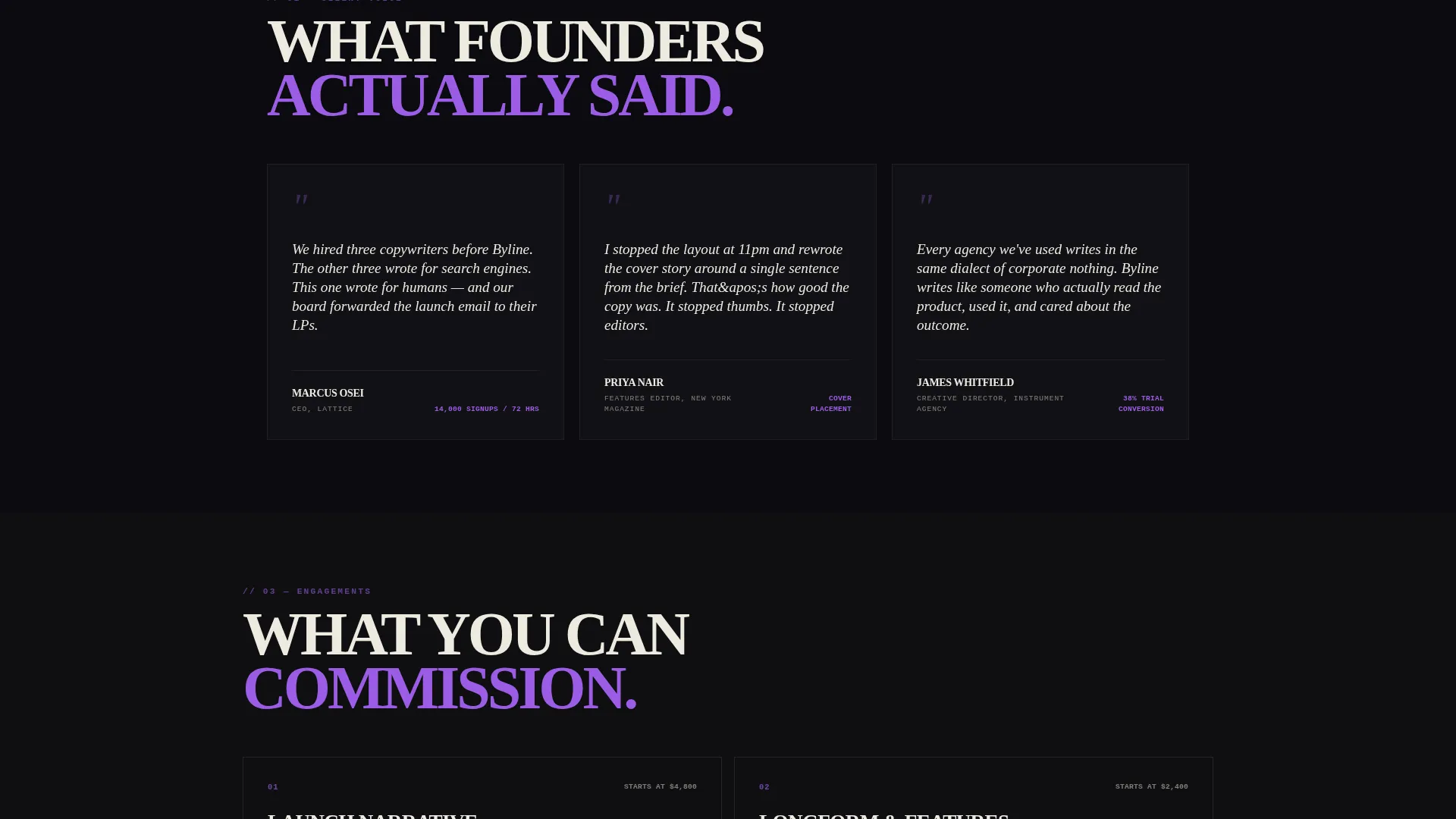
The primary call-to-action, labeled "Hire This Pen," appears in three places. It starts as a fixed violet button in the top-right corner, reappears as a full-width brutalist banner after the masonry grid, and closes the page after a final positioning line. All three instances link to an external inquiry page with no on-page form.
Void and Violet Color System
The palette pairs abyssal black (#0B0B0F) as the dominant background with deep ultraviolet (#3D1F72) on borders, tags, and interactive elements. Electric orchid (#9B5DE5) activates on accents and hover states. Stark bone white (#EDEADF) carries pull-quotes and body text.
Bold Brutalist Typography
Headlines use heavy, uppercase slabs of Helvetica or Monument Extended. No decorative typefaces, no softening details. The typographic hierarchy is blunt and intentional, ensuring every level of text lands with appropriate weight.
Featured Card Differentiation
Select masonry cards receive violet border treatment to mark them as featured pieces. Others remain raw black-on-white. This visual hierarchy lets the writer signal which works carry the most weight without adding extra copy.
Page sections overview
| Section | Purpose |
|---|---|
| Giant Headline Header | Opens with bold, viewport-filling copy and a proof-backed subline |
| Fixed call to action Button | Keeps the booking action visible as visitors scroll |
| Masonry Work Grid | Displays published work, stats, and awards as a scrollable trophy wall |
| Full-Width call to action Banner | Reinforces the booking call-to-action after the work grid |
| Closing call to action Line | Ends the page with a final positioning statement and booking link |
Design & branding system
The Void and Violet system is built around confrontational contrast. Black dominates every background surface. Violet and orchid create sharp boundary lines and reactive hover states. Bone white carries the text with enough weight to feel typeset, not typed.
- Typography uses Helvetica or Monument Extended in heavy uppercase for headlines, with no decorative embellishment
- Violet borders and orchid hover states act like exposed structural elements, functional and visible rather than decorative
- The overall aesthetic echoes a neon sign against raw concrete: high contrast, literary in tone, and impossible to scroll past without pausing
Mobile & speed optimization
The template layout is structured to translate the brutalist density of the masonry grid into a readable single-column flow on smaller screens. The fixed call to action button remains accessible throughout the scroll experience on mobile devices.
- Masonry cards reflow into a stacked single-column layout on narrow viewports
- Large typographic headlines scale proportionally so the impact of the header carries across screen sizes
- The fixed violet call to action button stays positioned without obscuring key content on mobile
How this template helps you convert
Byline earns the click rather than demanding it. The layout is built to stack evidence continuously until the visitor's only remaining question is whether the writer has availability.
- The trophy-wall grid escalates from smaller publications to major names as the visitor scrolls, building undeniable proof of tier before the full-width call to action banner appears
- The fixed "Hire This Pen" button stays in view throughout the scroll, removing friction at any moment the visitor feels ready to act
- The closing line, "Your next piece deserves better than a content mill," reframes the inquiry as a quality decision rather than a price comparison, making the click feel like the obvious next step
Other information about this template
Byline is categorized under Portfolio and Agency templates, specifically within the Freelancer and Consultant subcategory. It is purpose-built for the freelance writer niche and carries a strong intersection match for writers who operate at an editorial or brand-strategy level.
- The template style is Masonry and Pinterest, meaning cards sit at varying heights to create a gallery rhythm as you scroll
- The click-through landing page direction means no inquiry form sits on the page itself; the call to action links out to a tool such as Calendly or Typeform where the visitor completes a three-field form covering project type, deadline, and budget range
- The creative direction is Award and Recognition, meaning the grid is designed to function as a trophy wall rather than a simple portfolio list
- The header concept is Giant Headline Centered, a single massive statement with no supporting imagery, relying entirely on typographic force
Theme
Bold Brutalist
Creative direction
Award & Recognition
Color system
Void & Violet
Style
Masonry/Pinterest
Direction
Click-Through
Page Sections
Viewport-filling Giant Headline Header
Trophy-wall Masonry Grid
Three-point Call to Action System
Void and Violet Color System
Featured Card Differentiation
Bold Brutalist Typography
Related questions
Does this template include an on-page inquiry form?
Can I use this template if I do not have award credits yet?
What does the three-point call to action system mean in practice?
Is the masonry grid suitable for writers who work across multiple subject areas?
How is the header section structured visually?



