Content Writer Portfolio Specialist Portfolio Website Template
Byline is a dark, immersive one-page portfolio landing page built for freelance content writers. It opens with an interactive Before/After Slider that physically reveals your editing craft, then cascades into a masonry wall of published work and results. A pinned inquiry form with a project-type selector makes it easy for ready clients to reach out fast.
by Rocket studio
Quick summary
Byline is a single-page portfolio landing page for content writers who need to prove their craft before a client even scrolls to the form. The Before/After Slider opens the page with a dramatic transformation moment, a masonry tile wall stacks social proof in a visual crescendo, and a pinned inquiry bar keeps the conversion path always within reach.
Who this template is for
This template is built for working writers who win clients on credibility, not just promises. If your best argument is a published piece with a measurable result, this layout lets that argument lead.
- Freelance content writers pitching startup founders who need fast turnarounds
- Independent writers targeting content directors at software-as-a-service companies who need a reliable, deadline-safe hire
- Agency-side writers available for mid-campaign backfill work with creative leads
What problem this template solves
Most writer portfolio pages bury the best work behind a navigation menu and a generic "about me" paragraph. Clients who are busy and skeptical leave before they find a reason to stay.
- Slow proof delivery makes potential clients lose confidence before reaching the inquiry form
- Generic portfolio layouts fail to communicate measurable writing outcomes like traffic lifts or award recognition
- No clear conversion path means interested visitors leave without leaving contact details
What you get with this template
This template gives you a fully structured, dark-themed one-page portfolio layout ready to receive your published work, result metrics, and inquiry details. Every section serves a distinct persuasion role.
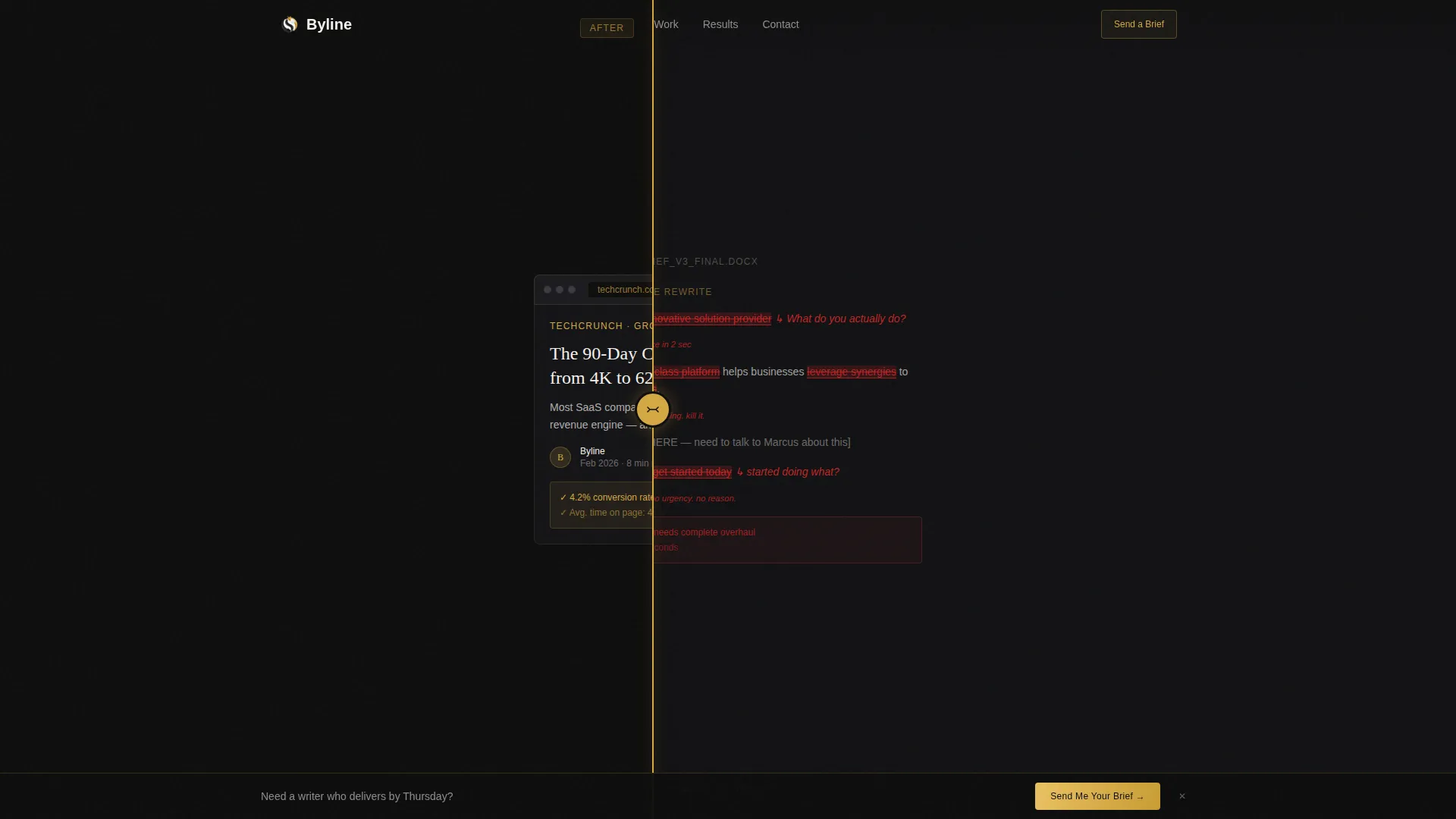
- A full-viewport Before/After Slider header with draggable interaction and a post-interaction headline reveal
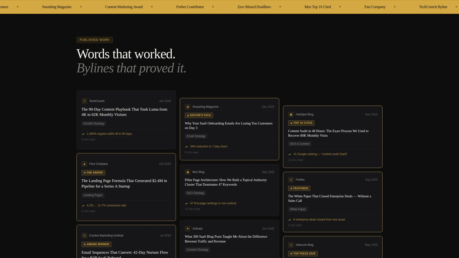
- A staggered masonry tile wall designed to display publication logos, result metrics, award badges, and client testimonials in escalating proof order
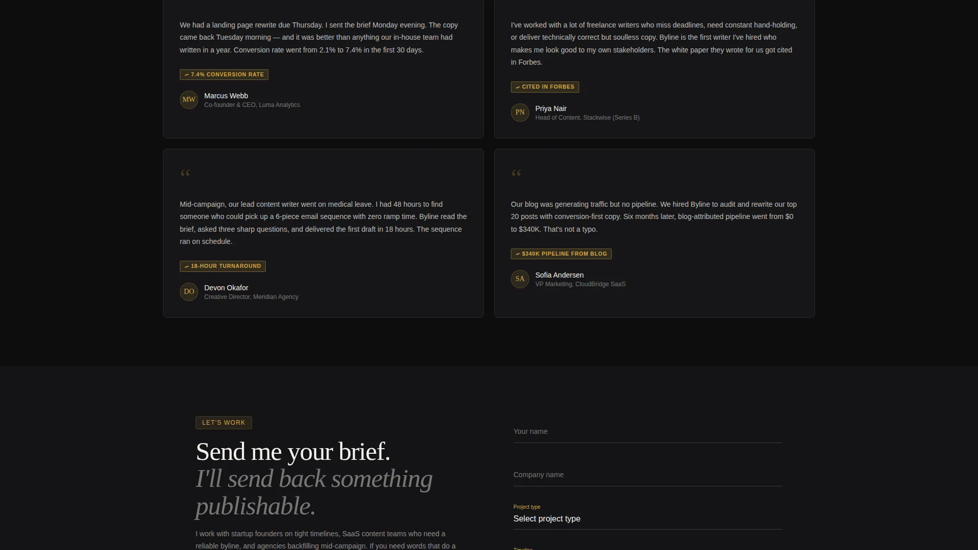
- A bottom-pinned call-to-action bar plus a full inquiry section with name, company, project type selector, timeline dropdown, and optional file upload
Feature list
This template is built around five focused components, each designed to move a skeptical client from "interesting" to "I need to reach out."
Interactive Before/After Slider Header
The header fills the full viewport with a split view. The left side shows a raw client brief with visible red-line edits and placeholder copy. The right side shows the polished, published result with a live URL bar and social share counts highlighted in goldenrod. The visitor drags the divider themselves, making the transformation feel personal and tangible. A headline fades in after the first drag: "This is what I do to words."
Staggered Masonry Tile Wall
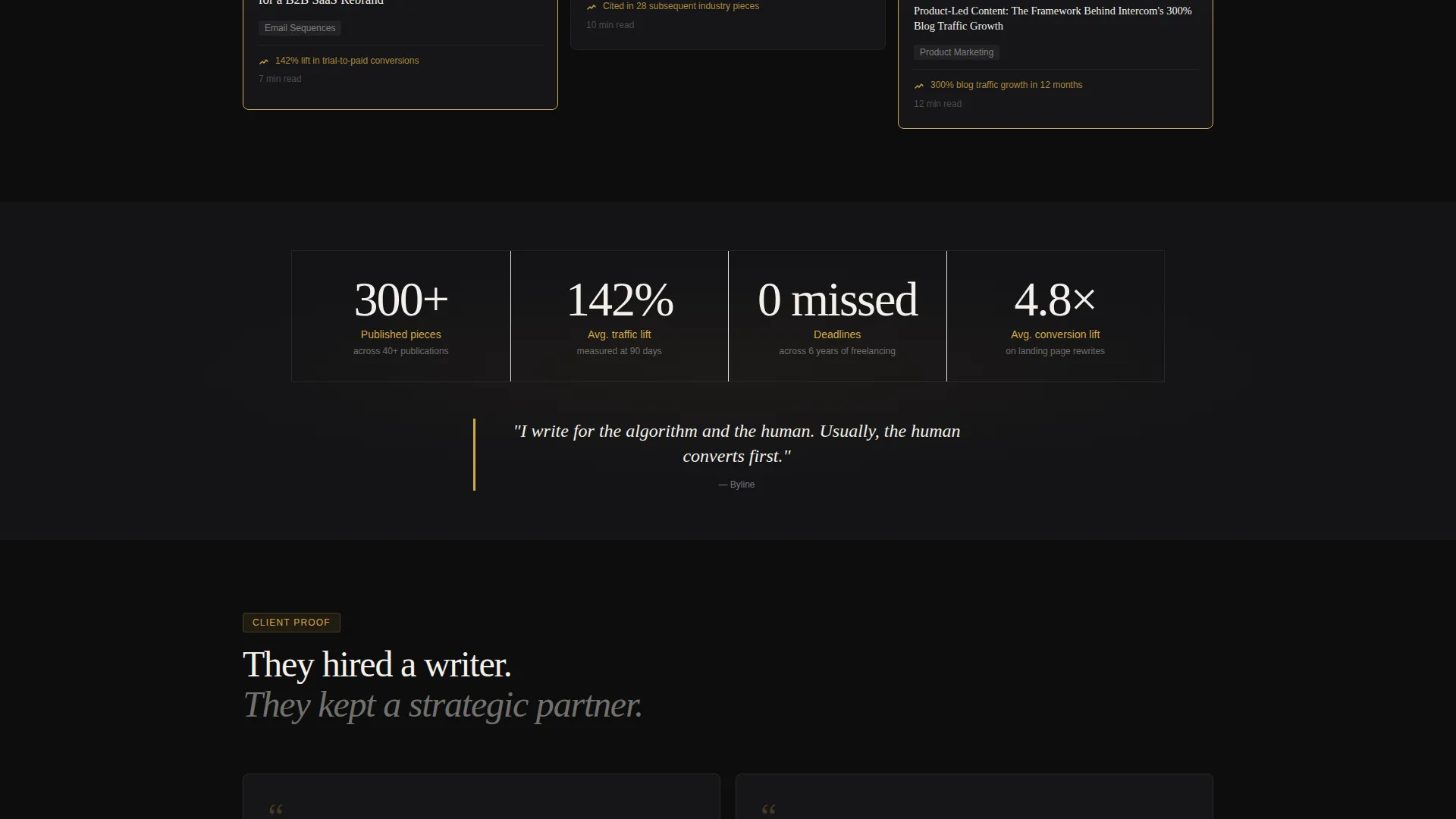
The portfolio section uses a Pinterest-style masonry grid with tiles cascading in staggered columns as the visitor scrolls. Each tile shows a publication logo, article headline, and a one-line result metric. Tiles carrying awards or top-ten rankings display a faint goldenrod border that pulses once on scroll-entry, creating a visual rhythm that escalates from solid bylines to editor's picks to client testimonials.
Pinned Lead Generation Bar
After the first scroll interaction, a slim call-to-action bar pins itself to the bottom of the viewport. It stays visible throughout the rest of the page, giving returning visitors a frictionless way to reach the inquiry section at any point in their scroll journey.
Structured Inquiry Form
The base of the page holds a full inquiry section with clearly labeled fields. A project type selector covers blog posts, landing pages, email sequences, white papers, and other work types. A rough timeline dropdown lets prospects self-qualify. An optional file upload field lets serious clients attach an existing brief or style guide before hitting send.
Rate Card Secondary Conversion Path
Below the inquiry form, a secondary text link offers a downloadable rate card. This gives prospects who are not ready to commit a low-friction next step, keeping the conversation warm without requiring them to fill out the full form.
Page sections overview
| Section | Purpose |
|---|---|
| Before/After Slider | Opens the page with a draggable transformation reveal |
| Post-Interaction Headline | Fades in after first slider drag to anchor the writer's value |
| Masonry Portfolio Wall | Stacks published work, metrics, and awards in escalating proof order |
| Award Badge Tiles | Highlights recognized pieces with a pulsing goldenrod border |
| Client Testimonial Cards | Closes the proof wall with named humans and real titles |
| Pinned call to action Bar | Keeps the inquiry entry point visible after the first scroll |
| Inquiry Form Section | Collects project details, timeline, and optional brief upload |
| Rate Card Download Link | Offers a secondary, low-commitment conversion path |
Design & branding system
The visual identity follows a Dark Immersive theme built on the Cloud Canvas color palette. The result feels like a leather-bound manuscript opened under a single desk lamp: warm in the right places, dark everywhere else, with negative space doing real work.
- Core palette: deep inkwell black (#0D0D0D) for backgrounds, soft graphite (#2A2A2E) for card surfaces, cloud-paper white (#F4F1EC) for body text, and muted goldenrod (#D4A843) reserved for award badges, hover states, and pull-quote borders
- Typography and layout evoke a dense, well-used Moleskine notebook: sharp, margin-full, and purposeful
- Goldenrod accent usage is intentionally restrained, appearing only on high-signal elements to preserve its visual weight throughout the scroll
Mobile & speed optimization
The layout is structured to remain clear and navigable on smaller screens. The masonry grid, slider header, and pinned bar are each designed with viewport-aware behavior in mind.
- The Before/After Slider adapts to touch input, allowing mobile visitors to swipe the divider rather than drag it with a cursor
- The masonry tile grid reflows for narrow viewports so publication cards and result metrics stay legible without horizontal scrolling
- The pinned call-to-action bar remains fixed at the bottom on mobile, giving thumb-accessible entry to the inquiry section at any scroll depth
How this template helps you convert
Every structural decision in this template is sequenced to reduce skepticism before asking for anything. Proof comes first; the form comes last.
- The Before/After Slider front-loads tangible transformation evidence in the first five seconds, so the visitor's first action is experiencing your work rather than reading about it.
- The masonry wall builds a progressive case through published results, award recognition, and named client testimonials, creating a crescendo of credibility that makes the inquiry form feel like the natural next step rather than a sales push.
- The pinned call-to-action bar and secondary rate card download give two distinct conversion paths, capturing both the ready client and the almost-ready prospect in one layout.
Other information about this template
This template is part of the Portfolio and Agency category, under the Content Writer Portfolio subcategory. It is specifically designed for the one-page portfolio niche, where a single well-sequenced scroll replaces a multi-page site.
- The template style is Masonry/Pinterest, making it well suited for writers with a high volume of published clips to display
- The Dark Immersive theme and Cloud Canvas color system are coordinated design decisions, not independent style options
- The Award and Recognition creative direction means the layout is intentionally structured to foreground accolades, publication logos, and outcome metrics rather than general descriptions of services
- The lead generation landing page direction prioritizes form completion and rate card downloads as the two primary conversion outcomes
Theme
Dark Immersive
Creative direction
Award & Recognition
Color system
Cloud Canvas
Style
Masonry/Pinterest
Direction
Lead Generation
Page Sections
Draggable Before/after Slider Header
Staggered Masonry Portfolio Grid
Escalating Social Proof Sequence
Pinned Call-to-action Bar
Full Inquiry Form with Project Details
Related questions
Can I use this template if I only have a few published pieces?
What content goes inside the Before/After Slider?
Is the inquiry form ready to receive submissions out of the box?
Can I replace the goldenrod accent with my own brand color?
Who is the rate card download link designed for?



