Journalist Portfolio Portfolio Website Template
Byline is a dark, immersive journalist portfolio landing page built around a masonry case study grid. It presents each piece of journalism not as a clip but as a layered narrative with sourcing context, editorial decisions, and documented impact. The template targets managing editors, fellowship committees, and journalism educators who need to evaluate craft at depth.
by Rocket studio
Quick summary
Byline is a single-page journalist portfolio landing page with a masonry grid layout. Each card opens into a three-act immersive overlay covering the assignment, reporting process, and aftermath. The visual identity uses deep editorial black and tarnished gold. The page is built to earn trust through demonstrated craft before presenting a download call to action.
Who this template is for
This template is designed for working journalists who need to present their body of work as a portfolio of process, not just a list of published links. It suits professionals whose work spans multiple beats and whose audiences evaluate methodology as much as output.
- Investigative and long-form journalists building a hiring or fellowship application
- Staff and freelance reporters presenting cross-beat narrative range to editors or committees
- Journalism educators and professors who want a real-world portfolio model to show students
What problem this template solves
Most journalist portfolio pages reduce complex reporting work to a headline and a link. That format fails when the audience is a managing editor evaluating judgment, a fellowship committee weighing range, or a professor teaching craft. Byline solves the depth problem by turning each entry into a structured case study.
- Clips-only portfolios hide sourcing decisions, ethical calls, and measurable impact
- Generic portfolio layouts give no visual hierarchy between a quick brief and a cross-border investigation
- Standard grids offer no mechanism for escalating reader engagement card by card
What you get with this template
You get a fully designed, single-page journalist portfolio landing page with a masonry card layout, an immersive overlay story structure, and a complete visual system built around the Obsidian and Gold color palette. Every section is pre-structured to guide a visitor from curiosity to a download action.
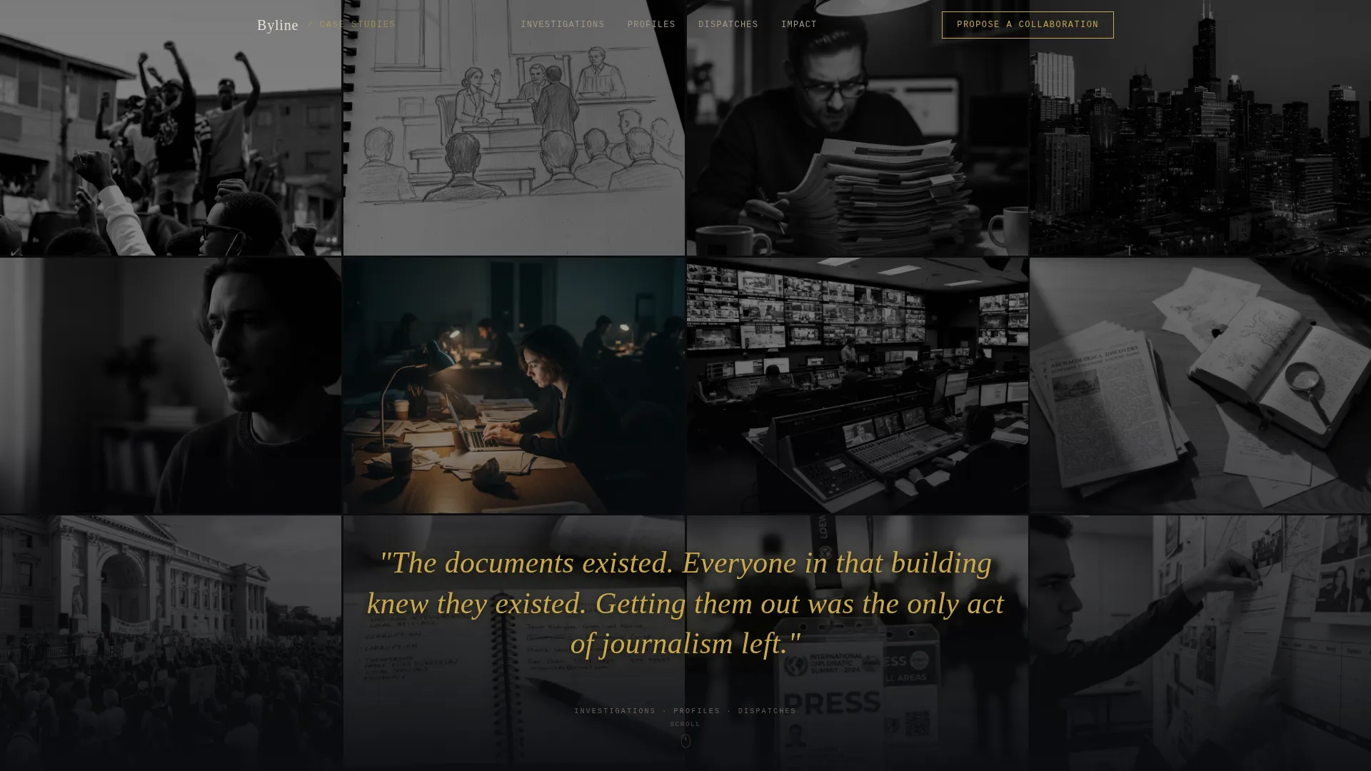
- A full-viewport Photo Grid Mosaic header with parallax drift and a gold serif typewriter headline
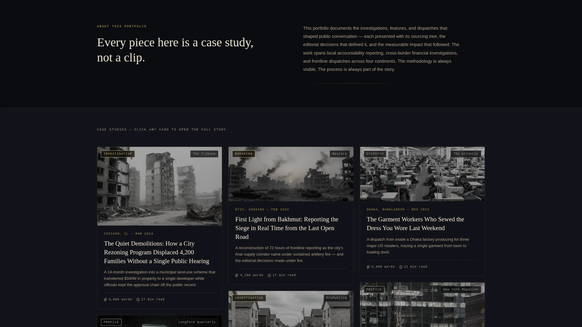
- Masonry case study cards staggered by beat, each with gold beat tags, word count, and publication name
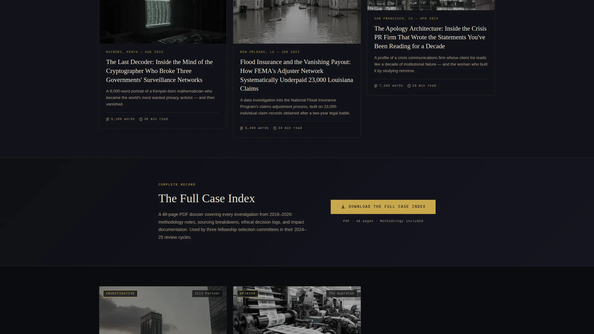
- A primary "Download the Full Case Index" call to action placed after the sixth card, plus a fixed secondary email capture in the top navigation
Feature list
This section walks through the core built-in features that make Byline work as a journalist case study portfolio landing page.
Photo Grid Mosaic Header
The header fills the full viewport with a collage of field photographs, redacted documents, and interview stills. All images are desaturated to near-monochrome except one centered image that retains its original color. On scroll, tiles shift with a subtle parallax drift. A gold serif sentence types itself across the mosaic after the first scroll tick, displaying the journalist's most-cited line.
Three-Act Immersive Card Overlay
Each masonry card expands into a full overlay when clicked. The overlay is structured in three acts: the tip or original assignment, the reporting process including sourcing trees and ethical decisions, and the aftermath covering publication impact, legal response, policy change, and awards. Clicking a card does not navigate away from the page.
Beat-Staggered Masonry Grid
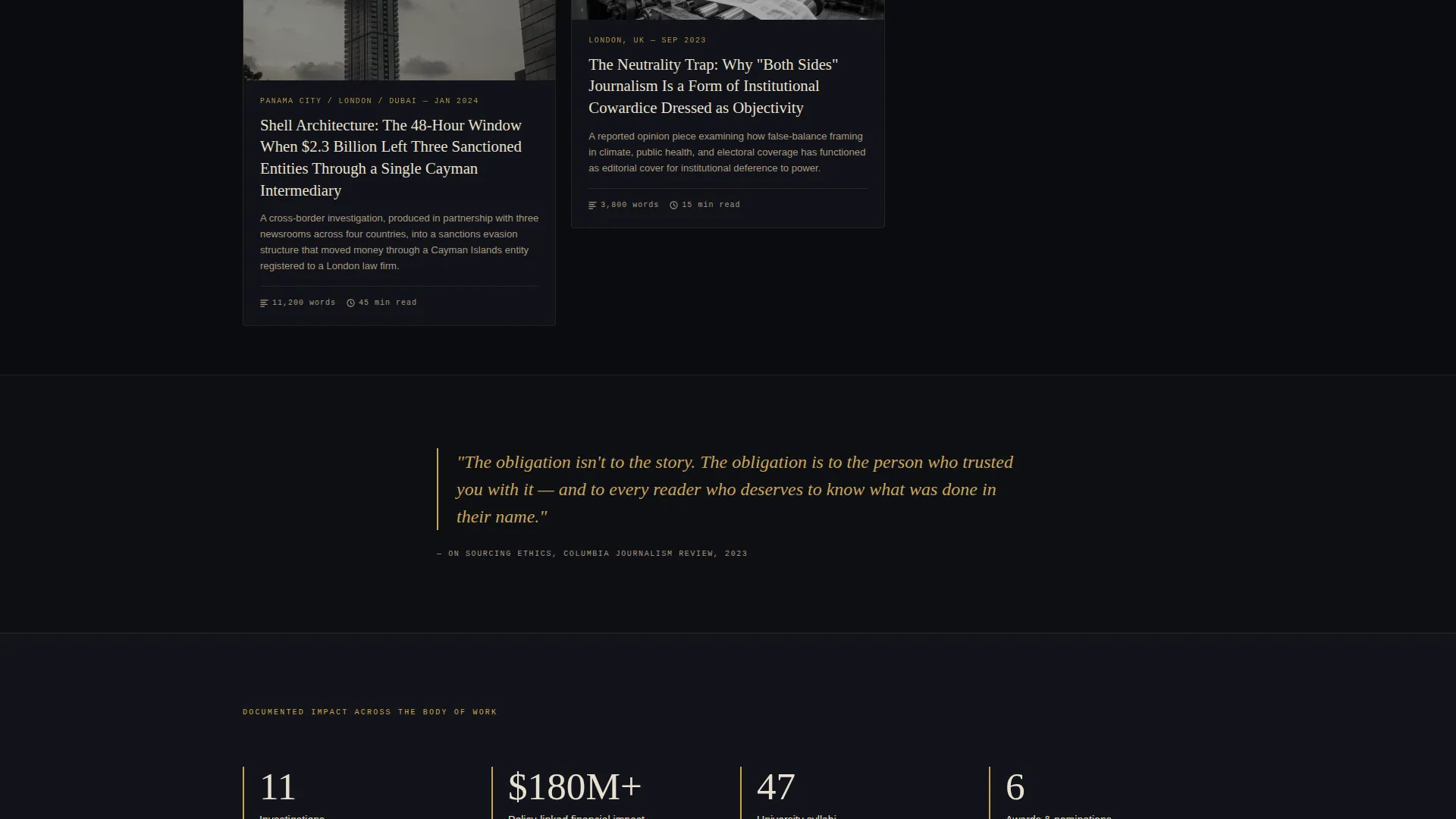
Cards are arranged in a masonry layout and staggered by journalism beat: investigative, profile, breaking, and opinion. The sequencing is intentional, with each card presenting a progressively harder story than the last. This escalation moves the reader from local accountability work toward cross-border investigations, building credibility as the page scrolls.
Gold Accent Tagging System
Every card carries a small gold tag showing the beat category, word count, and publication name. Datelines and byline accents also use tarnished gold, applied sparingly so the accent retains its visual weight. Thin gold ruled lines separate cards, reinforcing the broadsheet editorial aesthetic without crowding the layout.
Dual Conversion Pathway
The primary call to action is a "Download the Full Case Index" button in gold on obsidian, inserted after the sixth card. A secondary path sits fixed in the top navigation as a "Propose a Collaboration" prompt with a single email field and an optional message box. Both paths are designed to appear only after the visitor has engaged with enough content to act with intent.
Page sections overview
| Section | Purpose |
|---|---|
| Photo Grid Mosaic | Full-viewport header with parallax and typewriter headline |
| Typewriter Gold Headline | Reveals journalist's most-cited line on first scroll |
| Beat-Staggered Grid | Masonry card wall organized by journalism beat |
| Investigative Cards | Deep-dive case studies for accountability reporting |
| Profile and Feature Cards | Narrative range entries for long-form work |
| Card Expand Overlay | Three-act immersive story behind each piece |
| Mid-Grid call to action Block | Download prompt placed after the sixth card |
| Fixed Nav Capture | Persistent collaboration email field in top navigation |
Design & branding system
The visual identity follows a Dark Immersive theme built on an Obsidian and Gold color system. The palette is designed to feel editorial and atmospheric rather than corporate, evoking the back room of a foreign correspondents' club with brass fixtures and lamp-lit mahogany.
- Core colors: deep editorial black (#0B0C10) as the primary background, warm newsprint charcoal (#1A1A2E) for section shifts, tarnished gold (#C9A84C) for pull quotes, hover states, datelines, and ruled lines, and muted parchment (#E8E0D0) for body text
- The background is not flat black; it shifts subtly between sections like chapters in a long-form piece, giving depth without visual noise
- Gold is applied sparingly and with intention, used only for accents, tags, and key typographic moments so it retains its editorial weight throughout the page
Mobile & speed optimization
The masonry layout adapts to narrower screens while preserving the card-based reading experience. The three-act overlay is designed to work as a full-screen modal on mobile, keeping the sourcing breakdown readable without horizontal scrolling.
- Cards reflow to a single or two-column stack on smaller viewports, maintaining beat staggering in the new arrangement
- The fixed top navigation email capture collapses cleanly on mobile so it does not block content at smaller screen sizes
- The Photo Grid Mosaic header scales to viewport height on mobile, with parallax drift adjusted to suit touch-scroll behavior
How this template helps you convert
Byline earns its conversion by proving craft before asking anything of the visitor. The page is structured so that trust is built through content depth, and the call to action arrives only after the visitor has already engaged with multiple sourcing breakdowns.
- The escalating card sequence moves visitors from accessible local reporting stories to complex cross-border investigations, increasing perceived credibility with each card and making the dossier download feel like a natural extension of what they have already read.
- The mid-grid placement of the "Download the Full Case Index" call to action at card six ensures the visitor has seen enough range and process detail to value the complete record, reducing friction by making the download feel earned rather than gated.
- The fixed "Propose a Collaboration" email capture in the navigation stays visible throughout the session, offering editors, producers, and researchers a low-commitment contact path at any moment without interrupting the reading experience.
Other information about this template
Byline is built specifically for the journalist portfolio niche and reflects the professional expectations of that audience. It is not a general creative portfolio template adapted for journalism use.
- The template style is Masonry and Pinterest grid layout, suited for portfolios with varied card heights and mixed media types
- The theme is Dark Immersive, which distinguishes it visually from lighter editorial or magazine-style portfolio templates
- The creative direction follows a Case Study Narrative model, meaning the structure prioritizes reported process and documented outcomes over visual presentation alone
- The landing page direction is Content and Resource, meaning the primary conversion goal is a document download rather than a contact form or booking flow
- The header concept is a Photo Grid Mosaic, a component type that works well for journalists with a body of field photography, document imagery, or archival visual material
Theme
Dark Immersive
Creative direction
Case Study Narrative
Color system
Obsidian & Gold
Style
Masonry/Pinterest
Direction
Content/Resource
Page Sections
Photo Grid Mosaic Header
Three-act Card Overlay
Beat-staggered Masonry Grid
Gold Accent Tagging System
Dual Conversion Pathway Design
Related questions
Who is this landing page template designed for?
What happens when a visitor clicks a portfolio card?
Where does the primary call to action appear on the page?
How does the masonry grid handle multiple journalism beats?
What does the fixed navigation include?



