Sports Marketing & Agency Advanced Portfolio Website Template
Byline is a sports PR agency landing page template built for press offices that turn athletes into headline names. It combines an editorial Ink & Paper visual identity with layered, overlapping panels, a scrapbook-style header, and athlete case study cards. The primary call to action invites agents and rosters to start a conversation, not sign a contract.
by Rocket studio
Quick summary
Byline is a single-page template for sports PR agencies. It opens with a collage header that feels pulled from a war-room corkboard, moves through stacked athlete spotlights, and closes every scroll with a low-friction inquiry form. The design communicates editorial authority before a single word is read.
Who this template is for
This template is built for PR professionals who represent athletes and need a digital presence that matches the weight of their work. It speaks directly to the people making calls at 2 a.m. when a story breaks.
- Sports PR agencies managing multiple athlete rosters
- Independent agents seeking coverage for mid-career footballers or Olympic hopefuls
- Press offices that want inbound inquiries without giving away strategy upfront
What problem this template solves
Most agency pages either look like a corporate brochure or a generic portfolio. Neither earns trust from agents who guard their clients carefully. Byline solves the credibility gap before a conversation even starts.
- It establishes editorial authority through visual design alone
- It presents results in a format agents already respect: headlines, metrics, and before-and-after proof
- It invites inquiry without forcing a commitment, which is essential for clients who value discretion
What you get with this template
You get a fully structured, single-page layout built around the sports PR agency use case. Every section has a defined role, from the collage header to the fixed inquiry bar that appears at the bottom from midpage onward.
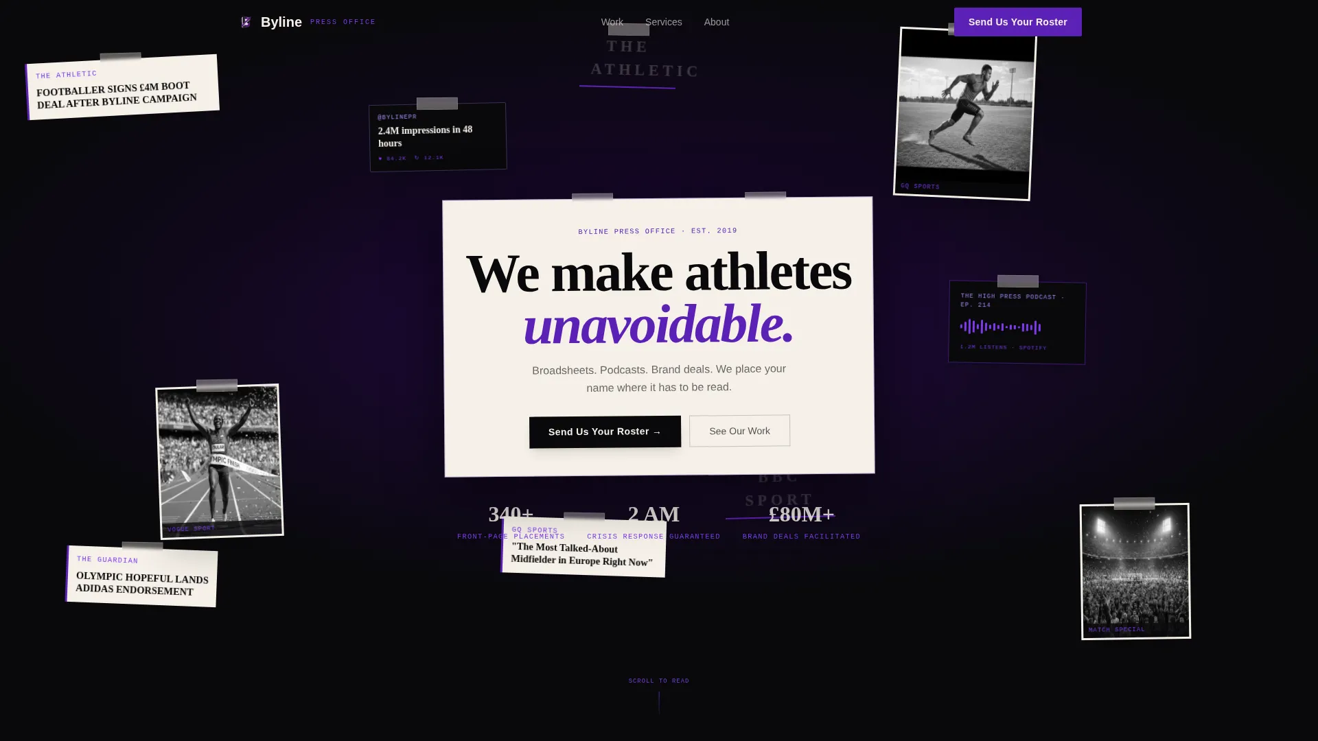
- A scrapbook-style collage header with parallax scroll behavior on overlapping clippings
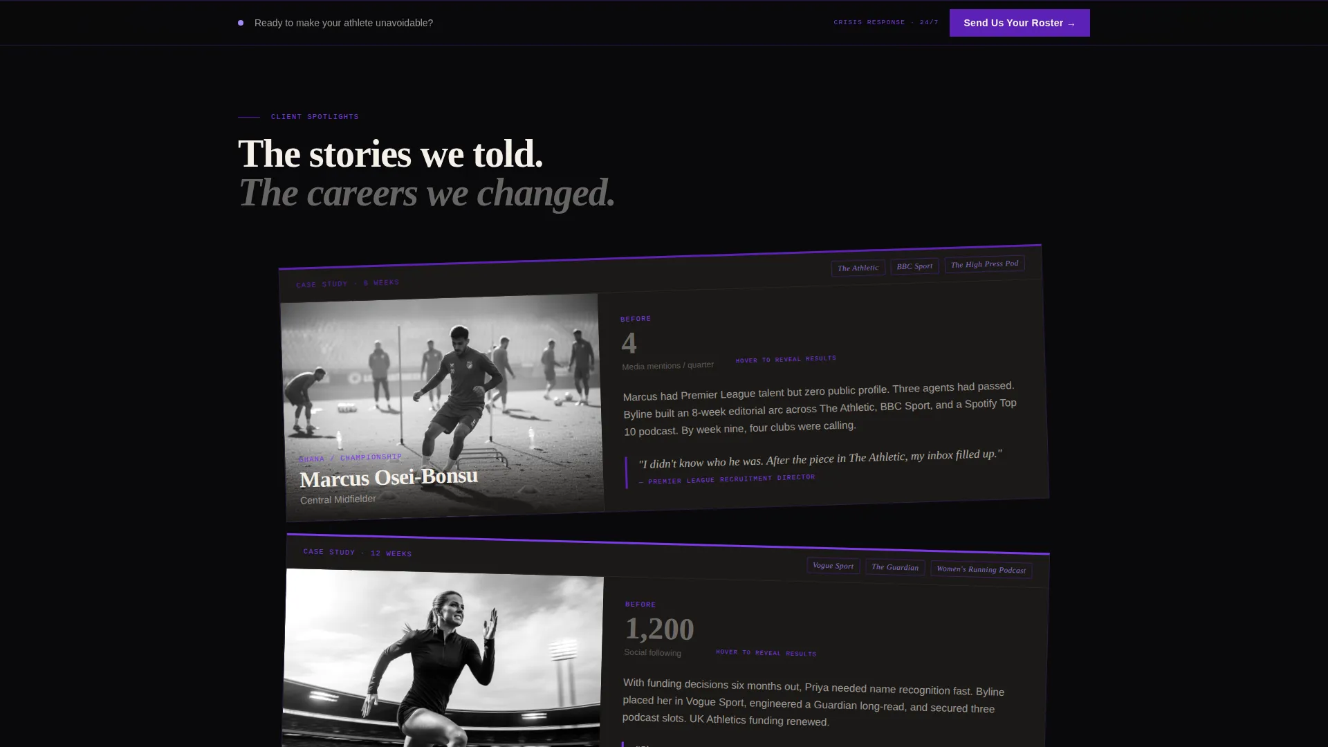
- Stacked athlete spotlight cards with before and after metrics, tilted two degrees off-axis for editorial feel
- A partnership inquiry form with a dropdown for representation status and a free-text field for narrative context
Feature list
This section covers the core built-in capabilities of the Byline template as described in the brief.
Collage Header with Parallax Layers
The header is assembled like a war-room corkboard. Torn clippings, magazine covers, podcast waveform strips, and social screenshots overlap at slight angles. On scroll, the layers shift at different speeds, creating depth and movement without animation libraries.
Overlapping Athlete Spotlight Cards
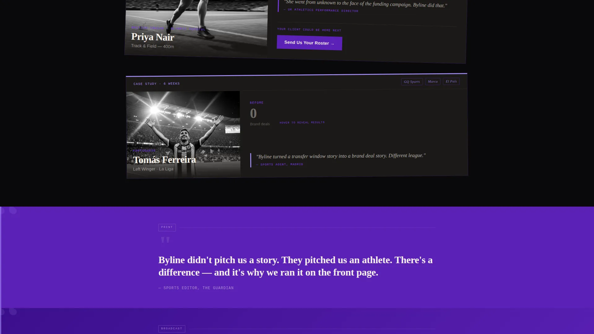
Each spotlight card is tilted two degrees off-axis and stacked in editorial sequence. Cards open with the athlete's name in heavy serif, show a before-metric, and reveal the after-metric on hover. The pacing deliberately compresses from card to card, letting results make the argument.
Pull-Quote Accent Strips
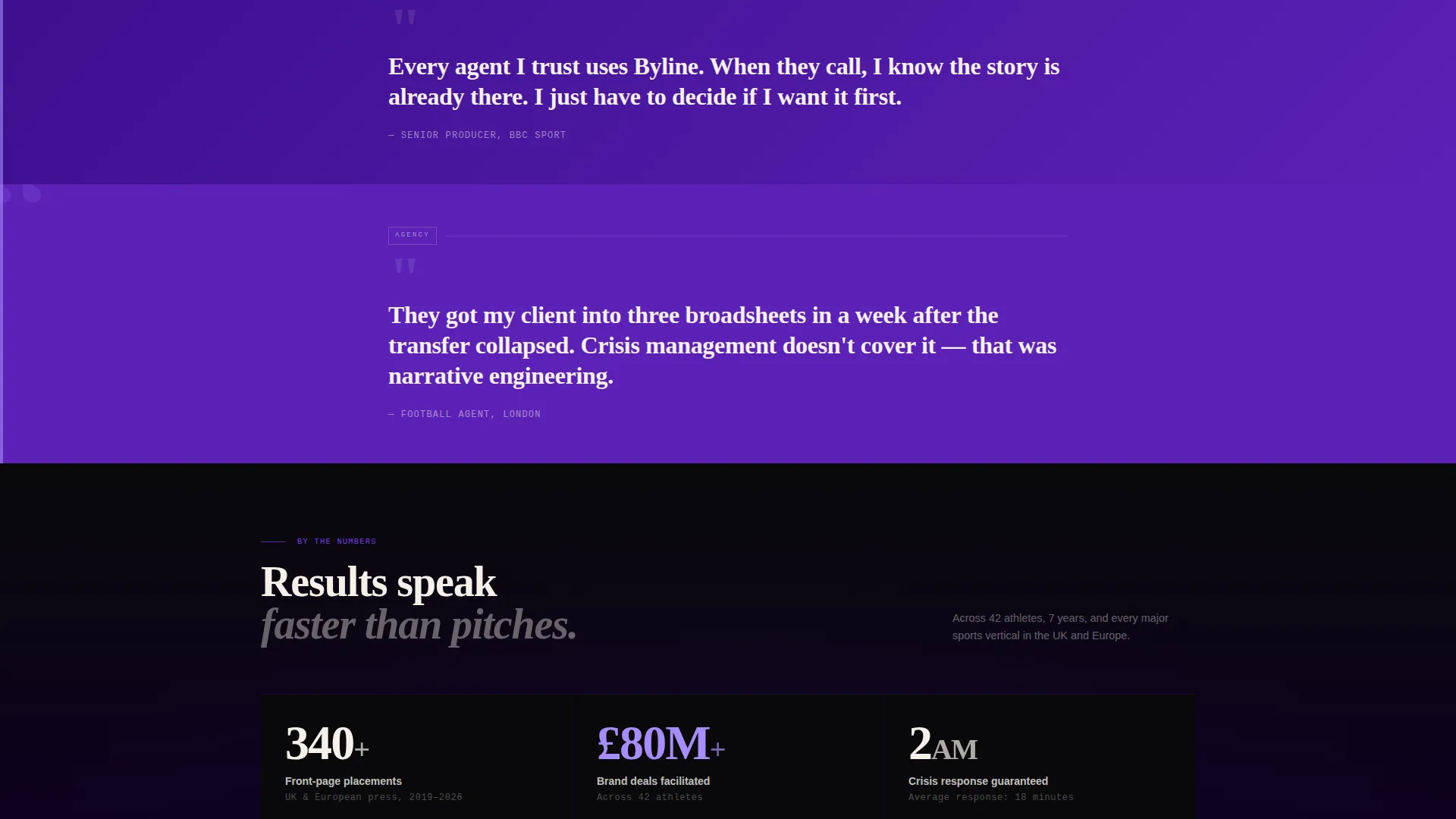
Between athlete spotlights, pull-quotes from editors and agents float on violet accent strips. These strips act as credibility breaks, separating the case studies and reinforcing the agency's media relationships without requiring named testimonials.
Partnership Inquiry Form
The form asks for agency or athlete name, a representation status dropdown (self-managed, agency-represented, or in transition), and a free-text field labeled "What story isn't being told?" No pricing is displayed. The form is built to open a conversation, not close a sale.
Fixed Bottom call to action Bar
From midpage onward, a slim bottom bar carries the primary call to action: "Send Us Your Roster." It appears first after the second spotlight card and stays fixed as the visitor scrolls, keeping the conversion path visible without interrupting the editorial flow.
Void & Violet Color System
The palette uses absolute black for card backgrounds, newsprint cream for body text, deep violet for borders and accent stripes, and sharp highlight lilac reserved for hover states and pull-quote marks. Every color decision reinforces the Ink & Paper editorial identity.
Page sections overview
| Section | Purpose |
|---|---|
| Collage header wall | Establishes editorial credibility and visual identity on first impression |
| Hero typed headline | Delivers the agency's core positioning on cream card stock |
| Athlete spotlight cards | Presents case studies with before and after performance metrics |
| Pull-quote accent strips | Adds third-party credibility between case study panels |
| Partnership inquiry form | Captures qualified leads with low-friction, narrative-first fields |
| Fixed bottom call to action bar | Keeps the primary call to action visible throughout the scroll |
Design & branding system
The Ink & Paper theme treats the page like a freshly printed broadsheet. Black dominates as stacked card backgrounds, cream carries body text across column-width panels, and violet bleeds through borders and dateline accents.
- Typefaces follow an editorial hierarchy: heavy serif for athlete names, clean body weight for metrics and copy
- The lilac highlight (#A78BFA) is reserved for hover states and pull-quote marks, keeping it meaningful rather than decorative
- Layered panels separate at slight tilts and overlaps, giving the layout physical texture without relying on imagery alone
Mobile & speed optimization
The overlapping, layered layout is designed to translate across screen sizes. Stacked cards and collage layers reflow naturally into a vertical reading sequence on smaller screens.
- Parallax behavior and card tilts are scoped to desktop viewports to maintain clarity on mobile
- The fixed bottom call to action bar remains functional at all breakpoints, so the inquiry path is never buried
- Typography scales are set to preserve the editorial hierarchy from desktop down to compact phone screens
How this template helps you convert
Byline is structured to move a skeptical agent from curiosity to inquiry without pressure. Every design and copy decision reduces friction for someone who values discretion above all.
- The collage header creates an immediate impression of media saturation, making the agency feel already embedded in the press landscape before any claim is made.
- The athlete spotlight sequence compresses from full backstory to pure numbers, demonstrating results in a format agents trust more than sales copy.
- The inquiry form's free-text field, "What story isn't being told?", invites a real conversation rather than a package selection, which lowers the barrier for first contact.
Other information about this template
Byline is categorized under Portfolio & Agency, specifically within the Sports Marketing and Agency subcategory. It is designed as a sports PR agency landing page and sits within the broader niche of athlete brand management and media relations work.
- The template style is Overlap/Layered, meaning panels and cards are deliberately stacked rather than arranged in a flat grid
- The creative direction follows a Creator Spotlight model, where individual athlete results drive the narrative arc of the page
- The header concept is Collage/Scrapbook, inspired by editorial war-room boards rather than polished studio photography
- The landing page direction targets Partnership and Business-to-Business inquiries, not direct consumer sales
Theme
Ink & Paper
Creative direction
Creator Spotlight
Color system
Void & Violet
Style
Overlap/Layered
Direction
Partnership/B2B
Page Sections
Collage Header with Parallax Scroll
Tilted Athlete Spotlight Cards
Violet Pull-quote Accent Strips
Narrative-first Inquiry Form
Fixed Bottom Call to Action Bar
Ink & Paper Editorial Palette
Related questions
Who is the Byline template designed for?
Does the template include a contact or inquiry form?
Can I use this template if I represent a single athlete rather than a full roster?
What does the fixed bottom call to action bar do?
Is Byline suitable for agencies that handle crisis communications?



