Fitness Landing Page Template for Veteran-Owned Gyms
Cadence is a single-page landing page built for a veteran-owned fitness studio. It combines a masonry card grid, a typewriter headline, a device mockup header, and a five-question program-finder quiz. The result is a high-energy, trust-building page that speaks directly to servicemembers, first responders, and driven suburban athletes who want more than a generic gym experience.
by Rocket studio
Quick summary
Cadence is a bold, Neo-Retro landing page template built for a veteran-owned fitness studio. It pairs a dramatic device mockup header with a masonry content grid and a built-in quiz that delivers personalized program recommendations. The design system channels military discipline through a stencil-influenced typeface, deep olive drab backgrounds, and high-voltage tangerine call-to-action elements.
Who this template is for
This template is built for fitness professionals who serve a community with real standards. It fits studios where the story behind the programming matters as much as the programming itself.
- Veteran-owned gym operators marketing to recently separated servicemembers and first responder crews
- Fitness coaches who want their landing page to reflect discipline, specificity, and earned trust
- Studio owners tired of generic templates that flatten their brand into a franchise feel
What problem this template solves
Most fitness landing pages treat every visitor the same. They lead with stock photography and a single "sign up now" button. That approach fails completely when your audience has served, sacrificed, and learned to distrust anything that feels watered down.
- Generic gym pages cannot communicate military culture, coach credentials, or community proof in a single scroll
- First responders and veterans need specificity, not broad lifestyle messaging, before they commit to a trial
- Studios with rich, varied content, such as coach bios, transformation stories, and program overviews, have no structure to present it all without overwhelming visitors
What you get with this template
You get a complete single-page layout that earns trust through visual variety and targeted interactivity. Every section has a clear job, and no two cards look the same.
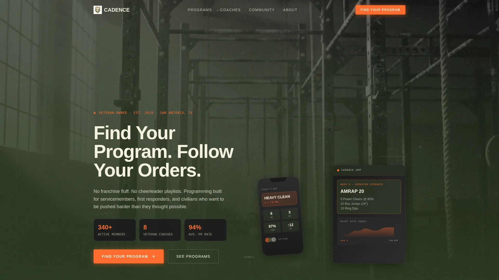
- A device mockup header with a typewriter headline, desaturated background photo, and in-screen training app preview
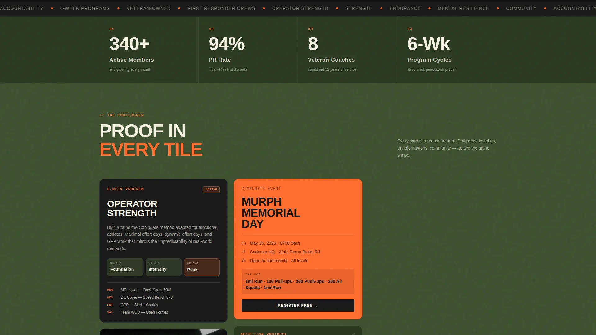
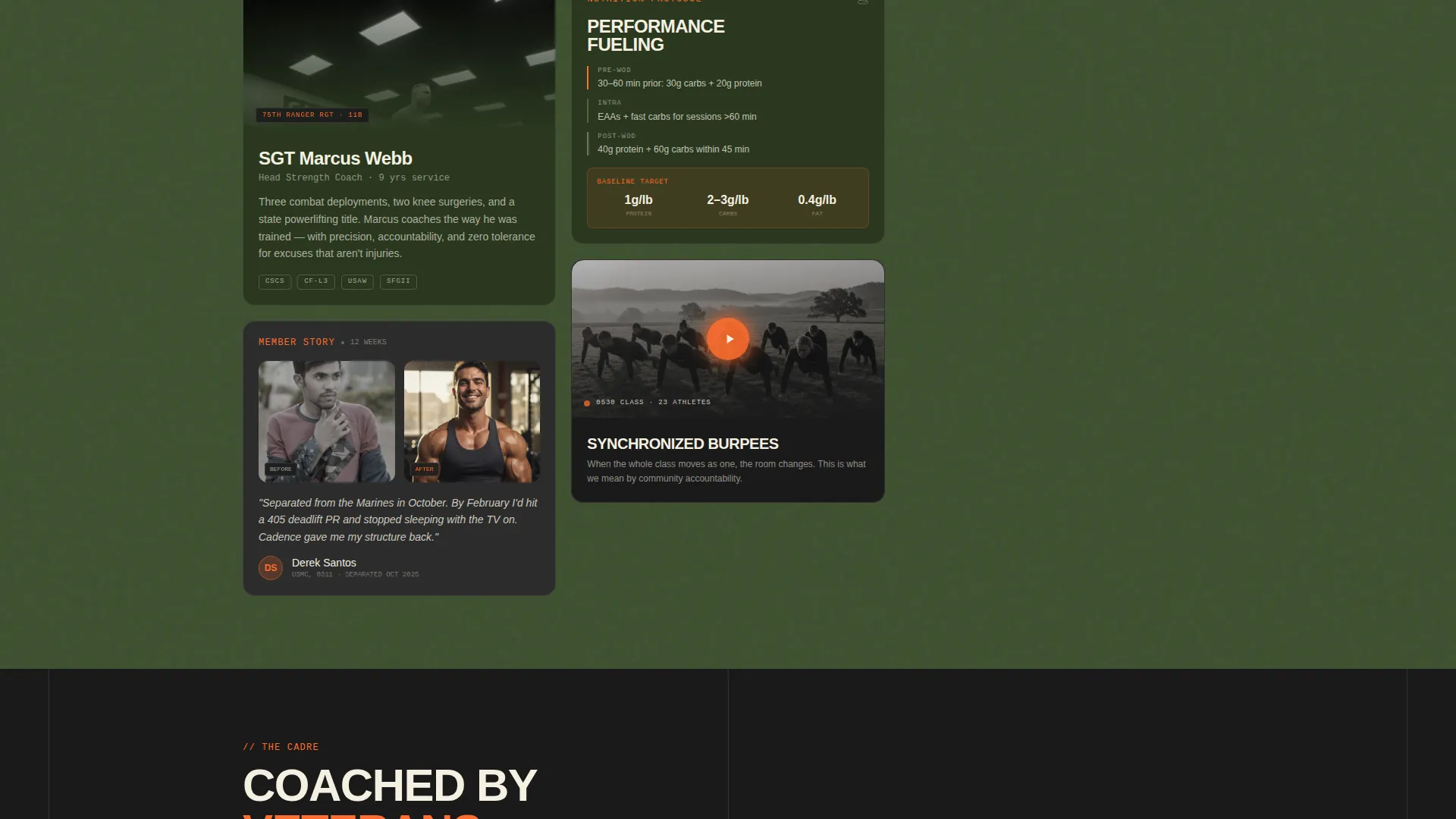
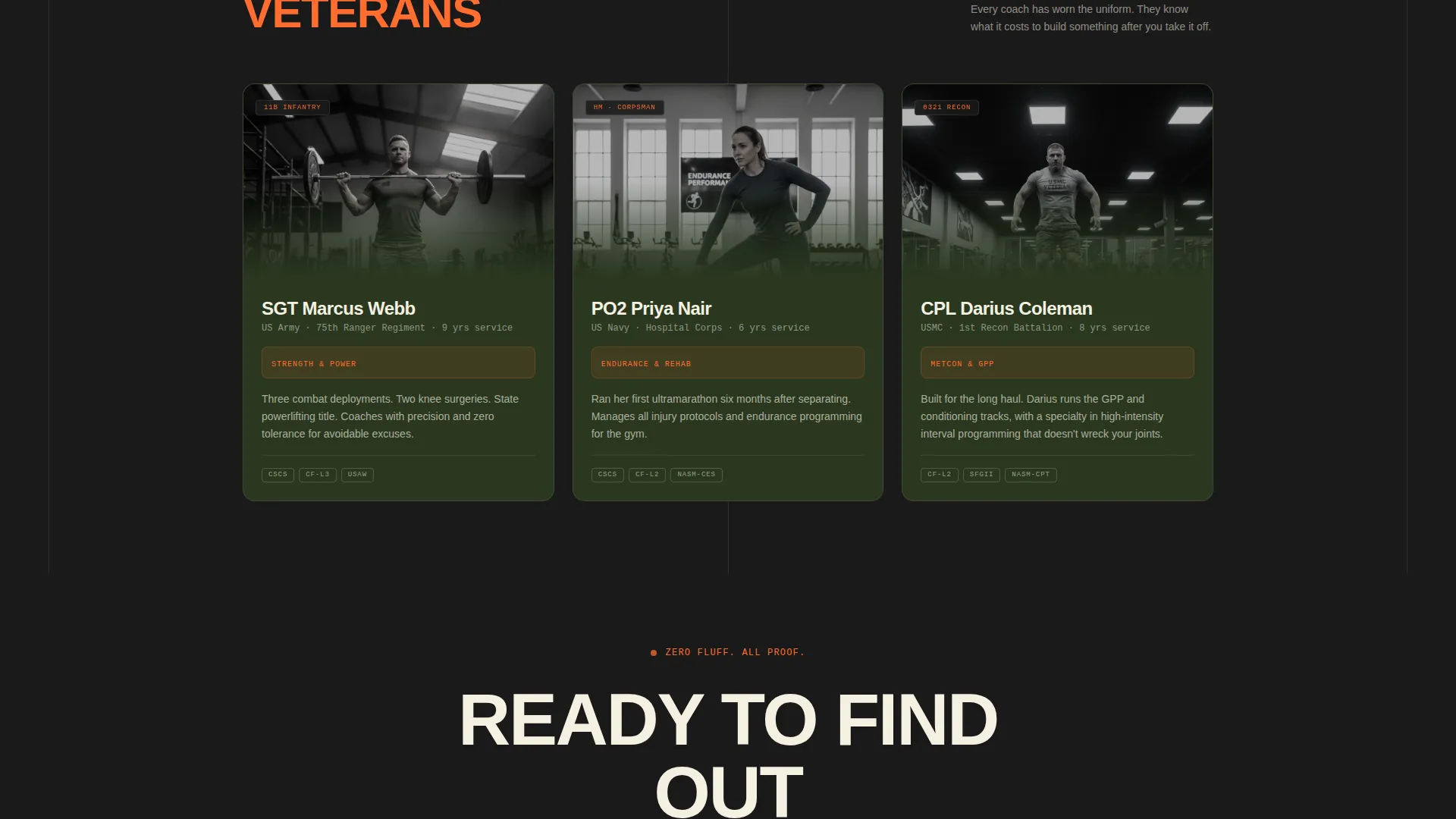
- A masonry card grid displaying coach bios, program summaries, transformation stories, a looping class video, nutrition snippets, and event flyers
- A five-question assessment quiz that ends with a personalized program recommendation, a sample week preview, and a free trial class call-to-action
Feature list
This section walks through the core built-in components that make Cadence work.
Typewriter Headline Animation
The header headline renders letter by letter, mimicking a field dispatch. This single animation sets tone immediately and signals that this page is intentional, not templated.
Device Mockup Header
A phone and tablet float at a slight angle, screens showing a custom training app card labeled "WEEK 6 OPERATOR STRENGTH" alongside a tangerine heart-rate zone chart. Behind the devices, a desaturated photo of chalk dust, pull-up bars, and dog tags fills the frame.
Masonry Content Grid
Below the fold, cards tile out in a Pinterest-style masonry layout. Cards vary in height, saturation, and content type. Some are olive-heavy, some carry tangerine borders. The grid grows denser and more persuasive as visitors scroll deeper.
Five-Question Program Finder Quiz
The sticky tangerine button at the bottom of the viewport launches an in-page assessment. Visitors answer five questions covering training frequency, military or first responder status, primary goal, injury history, and preferred session time.
Personalized Program Recommendation
Quiz results surface a matched coach profile with name and photo, a sample week of programming, and a secondary call-to-action: "Claim Your Free Trial Class." A calendar picker opens directly from that button.
Varied Card Content Types
The masonry grid supports six distinct card formats: a six-week program overview, a coach bio with service branch and military occupational specialty, a member transformation with before-and-after layout, a looping burpee class video, a nutrition protocol snippet, and a community event flyer.
Page sections overview
| Section | Purpose |
|---|---|
| Device Mockup Header | Anchors brand identity with in-screen app preview and typewriter headline |
| Masonry Content Grid | Tiles coach bios, transformations, video, programs, and event cards |
| Quiz Entry Button | Sticky viewport call-to-action that launches the five-question assessment |
| Quiz Assessment Flow | Collects five visitor inputs to generate a program match |
| Program Recommendation | Displays matched coach, sample week, and free trial class booking button |
| Trial Class Booking | Opens a calendar picker for first-class scheduling |
Design & branding system
The visual identity runs on a Neo-Retro theme that feels like a vintage recruiting poster reprinted on fresh stock. Every color and type choice is deliberate.
- Deep olive drab (#3D4F2F) dominates the background, grounding the page in a military-adjacent palette
- High-voltage tangerine (#FF6D2E) drives every call-to-action button and hover state, creating unmissable action cues
- Chalky off-white (#F5F0E1) surfaces card backgrounds and body text, while blackout charcoal (#1A1A1A) anchors headlines set in a condensed, stencil-influenced typeface
Mobile & speed optimization
The layout is designed to perform on the devices your audience actually uses. The masonry grid and quiz flow are both structured for smaller screens.
- The device mockup header adapts so the phone and tablet visuals remain legible and proportional on mobile viewports
- The masonry grid reflows cards at narrow widths, preserving visual variety without horizontal overflow
- The sticky quiz button remains pinned to the bottom of the viewport on mobile, keeping the primary call-to-action always within thumb reach
How this template helps you convert
Cadence converts by earning trust before asking for commitment. The page is built around specificity, proof, and a low-stakes first step.
- The masonry grid layers proof progressively: coach credentials, member transformations, class footage, and community events all accumulate as the visitor scrolls, building confidence before any ask is made.
- The five-question quiz replaces a generic sign-up form with a personal prescription. Visitors feel seen rather than sold to, and the program recommendation gives them a concrete reason to book the free trial class.
Other information about this template
Cadence is a single-page landing page, not a multi-page website. All content lives within one scroll path, which keeps the visitor focused and the narrative tight.
- The template is built under the Curated Collection creative direction, meaning every card in the masonry grid is treated as a distinct artifact rather than a repeated module
- The intersection context for this template aligns with veteran-owned business storefronts, making it a strong fit for studio operators who want their page to reflect ownership pride and community roots
- The quiz call-to-action copy ("Find Your Program. Follow Your Orders.") is pre-written in stencil caps style and is fully editable to match your studio's voice and program naming conventions
Theme
Neo-Retro
Creative direction
Curated Collection
Color system
Sunset Gradient
Style
Gallery + Detail
Direction
Quiz/Assessment
Page Sections
Typewriter Headline Animation
Device Mockup Header with Training App Preview
Masonry Card Grid
Five-question Program Finder Quiz
Personalized Program Recommendation Screen
Sticky Viewport Call-to-action Button
Related questions
Can I edit the quiz questions to match my studio's programs?
Does the masonry grid support video content?
How does the program recommendation screen work?
Can I use this template if my studio is not veteran-owned?
Can I connect the free trial booking button to my own scheduling tool?



