Veteran-Owned Beauty Brand Landing Page Template
Cadence is a bold, neo-retro landing page template built for a veteran-owned beauty brand. It pairs editorial card-grid product displays with a story-driven scroll experience, an ink-and-parchment color palette, and a click-optimized layout that routes every visitor straight to checkout with zero friction.
by Rocket studio
Quick summary
Cadence is a single-page, modular card-grid landing page designed for a veteran-owned beauty brand. It blends 1940s editorial aesthetics with a sharp, modern shopping flow. Each product card tells a story, the color palette commands attention without shouting, and every design decision points the visitor toward a confident, frictionless purchase.
Who this template is for
This template is built for founders and brand teams who need their landing page to do serious storytelling work while still driving sales. It suits brands where identity and product are inseparable.
- Veteran-owned beauty brands launching a flagship or limited-edition product drop
- Small beauty businesses whose audience values heritage, discipline, and clean formulas
- Brand builders who want editorial depth without sacrificing a clean checkout flow
What problem this template solves
Most beauty landing pages look beautiful but feel empty. They show the product without telling the story, and they lose the visitor before the first scroll is complete. This template solves the gap between inspiration and action.
- Visitors leave before converting because the page does not give them a reason to stay
- Product grids feel generic and disconnected from the brand's values and community
- The path from product discovery to purchase has too many steps and too much friction
What you get with this template
You get a fully structured, single-page layout that moves visitors from brand story to purchase in one confident scroll. Every section is intentional and every component is prompt-backed.
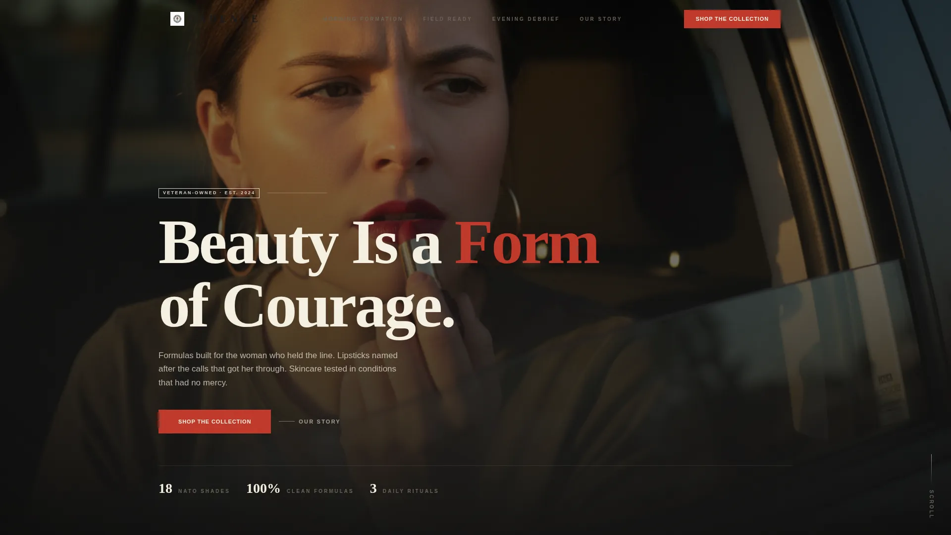
- A cinematic lifestyle header with condensed serif typography and a commanding brand statement
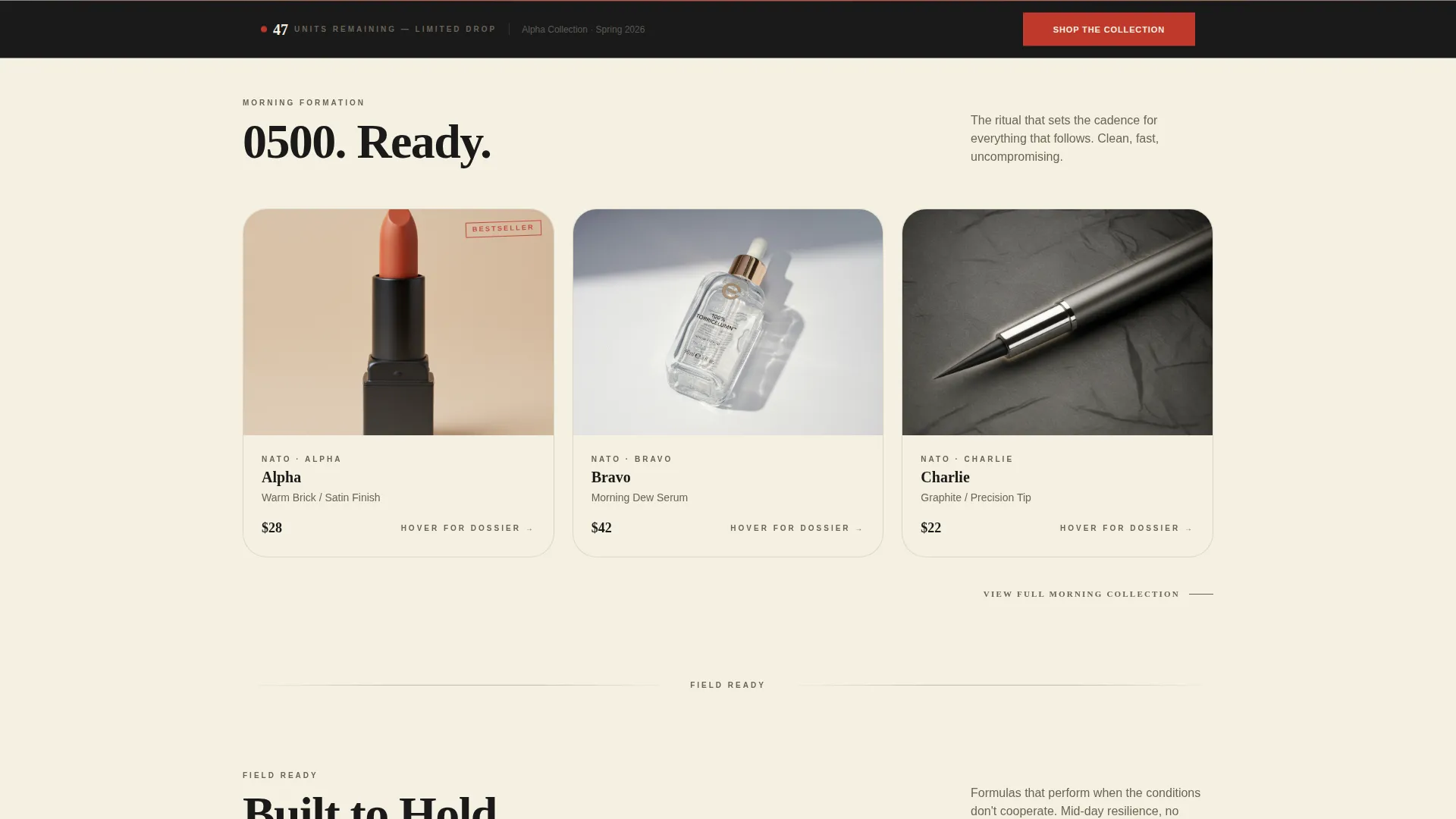
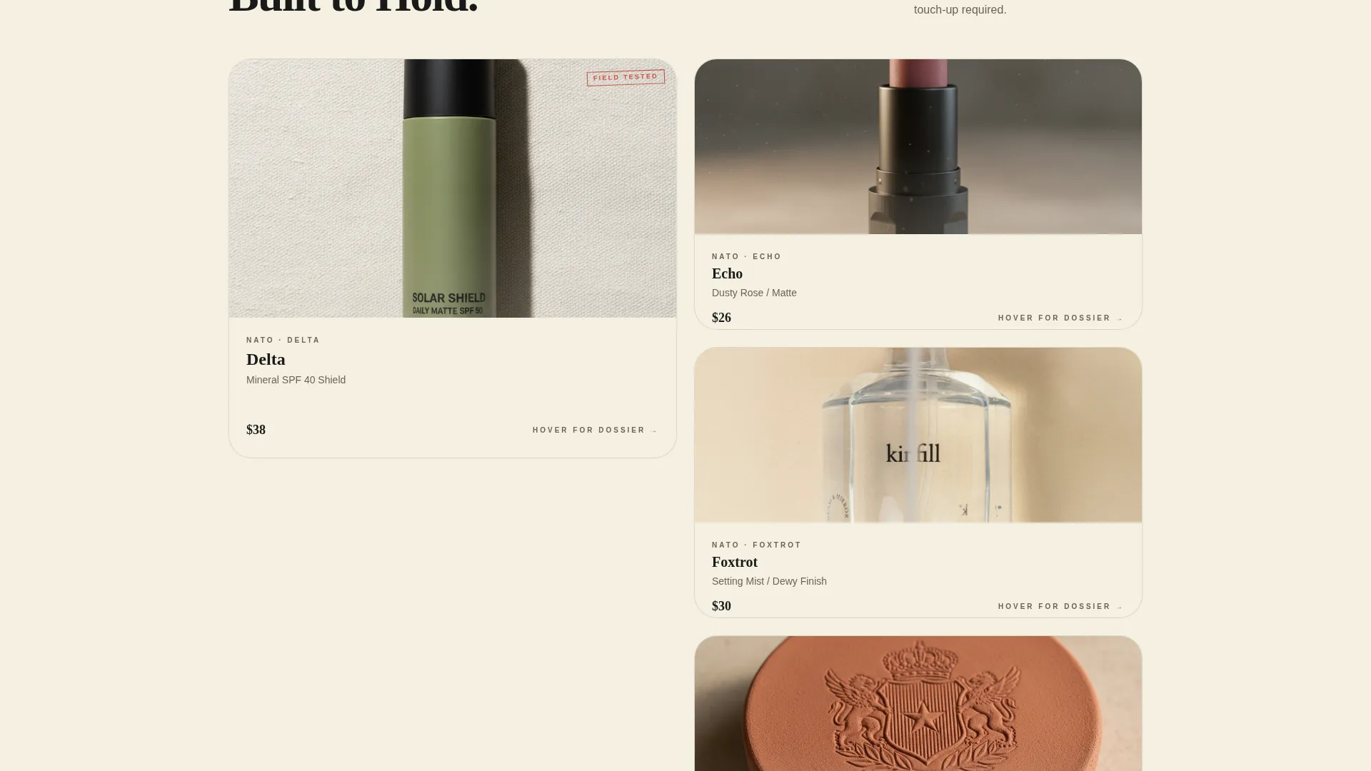
- A modular, ritual-grouped product card grid with hover-flip dossier cards and "Add to Kit" buttons
- A sticky bottom bar with a primary call-to-action and a real-time limited-edition unit counter
Feature list
This template delivers a focused set of components, each designed to serve the brand story and the buyer's journey simultaneously.
Lifestyle Header with Editorial Framing
The header is designed as a full-bleed, Kodachrome-style lifestyle shot. A condensed serif headline, "Beauty Is a Form of Courage," enters from the bottom of the frame. The composition places the product at center frame with golden-hour light, setting an immediate emotional tone.
Modular Card Grid with Ritual Grouping
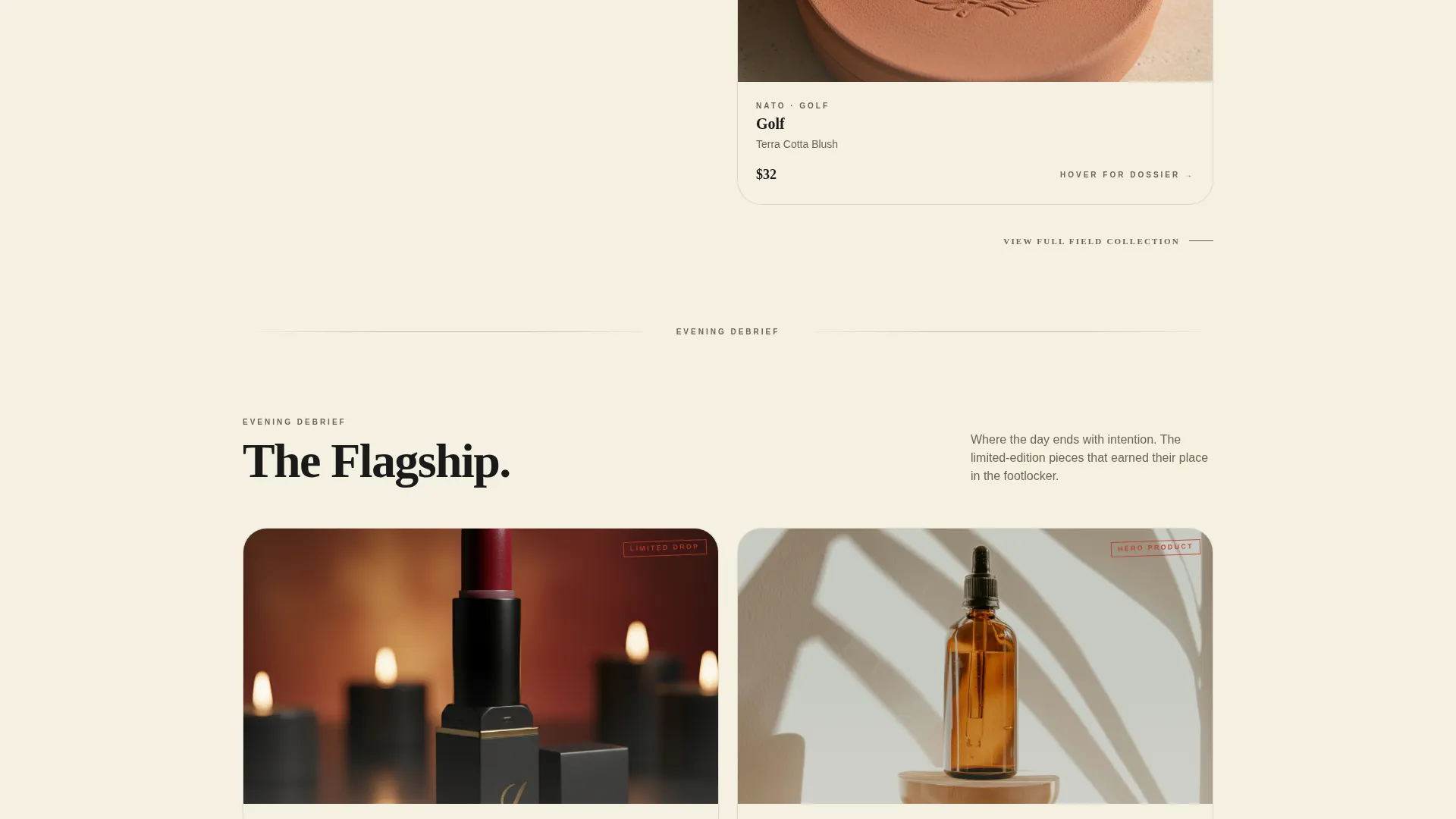
Products are organized into three ritual-based collection groups: Morning Formation, Field Ready, and Evening Debrief. This structure turns a standard product grid into a narrative arc. The pace of the grid accelerates as the visitor scrolls, with cards growing larger and bolder toward the flagship collection.
Hover-Flip Product Dossier Cards
Each product card flips on hover to reveal a second face. The reverse side shows ingredient information, a shade story, and a one-line origin note tied to the product's name. This keeps the grid scannable while rewarding engaged visitors with richer detail.
Sticky Bottom Bar with Unit Counter
After the second scroll fold, a sticky bottom bar appears. It carries the "Shop the Collection" call-to-action alongside a real-time counter showing remaining units in the limited-edition drop. This creates urgency without relying on pop-ups or interruptions.
Officer's Red Call-to-Action System
Every "Add to Kit" button uses officer's red (#C0392B) as its exclusive accent color. Buttons route directly to the Shopify product page with the variant pre-selected, removing every step between product discovery and checkout initiation.
Neo-Retro Ink and Paper Visual Identity
The full template is built on a four-color palette: matte black ink, foxed parchment cream, typewriter ribbon blue-black, and officer's red. Typography uses condensed serif faces. Together, these choices create a visual identity that feels like a vintage document that has already earned its place in history.
Page sections overview
| Section | Purpose |
|---|---|
| Lifestyle Hero Header | Opens with cinematic brand statement and editorial imagery |
| Morning Formation Grid | Showcases ritual-grouped daytime product cards |
| Field Ready Grid | Presents midday and on-the-go product dossiers |
| Evening Debrief Grid | Anchors the scroll with flagship collection cards |
| Sticky Bottom Bar | Delivers persistent call to action and limited-edition unit counter |
Design & branding system
The design system is grounded in a neo-retro aesthetic that feels earned rather than borrowed. Every color, typeface, and layout decision connects back to the brand's military heritage and beauty confidence.
- Four-color ink-and-paper palette: matte black (#1A1A1A), foxed parchment cream (#F5F0E1), typewriter ribbon blue-black (#2C3E50), and officer's red (#C0392B)
- Condensed serif typography that enters scenes rather than simply appearing, reinforcing the editorial, vintage-document feel
- Officer's red is used exclusively for buttons, badges, and limited-edition callouts, keeping its visual authority intact throughout the page
Mobile & speed optimization
The modular card grid is built to reflow cleanly on smaller screens. Ritual-grouped sections stack vertically while preserving their narrative sequence, so the story reads correctly on any device.
- Cards maintain their hover-flip interaction pattern in a touch-friendly format on mobile
- The sticky bottom bar remains visible and functional on mobile viewports, keeping the primary call-to-action accessible at all times
- The layout avoids heavy decorative layers, relying on color and typography rather than complex image stacks to carry the visual identity
How this template helps you convert
This template is engineered around one goal: turning genuine product admiration into a click with no unnecessary steps in between.
- The ritual-grouped grid builds desire progressively. Visitors do not browse randomly. They move through a curated editorial sequence that earns their attention before asking for their click.
- The hover-flip dossier cards answer ingredient and story questions in place, reducing the need to leave the page for more information before deciding to buy.
- The sticky bar with a unit counter applies visible, honest urgency. The "Shop the Collection" button stays within reach from the second scroll fold through to the bottom of the page.
Other information about this template
This template is purpose-built for the intersection of veteran-owned retail and beauty commerce. It suits brands that need a landing page to function as both a brand statement and a direct sales tool.
- The template is structured for a Shopify-connected product flow, with buttons pre-configured to route to variant-specific product pages
- The gallery-plus-detail template style means every card serves double duty: it attracts attention in the grid view and delivers depth on hover
- The neo-retro theme and ink-and-paper color system are designed to feel distinctive on a market dominated by minimalist white-space beauty pages
- The limited-edition drop mechanic built into the sticky bar makes this template especially effective for timed product launches and seasonal collections
Theme
Neo-Retro
Creative direction
Curated Collection
Color system
Sunset Gradient
Style
Gallery + Detail
Direction
Quiz/Assessment
Page Sections
Cinematic Lifestyle Hero Header
Ritual-grouped Modular Card Grid
Hover-flip Product Dossier Cards
Sticky Bottom Bar with Unit Counter
Officer's Red Call to Action Button System
Neo-retro Ink and Paper Identity System
Related questions
Can I use this template for a product drop with limited inventory?
How are the product cards organized in the grid?
Does the card flip interaction work on mobile devices?
Is this template suitable for brands that sell both skincare and makeup?
Can I adapt the color palette and typography to my own brand?



