Music School Marketing Portfolio & Case Study Website Template
Cadence is a single-page comparison landing page built for a neighborhood music school that provides emergency enrichment programming. It targets school districts, after-school coordinators, and corporate campus managers. The layout pairs an instructor showcase with side-by-side comparison tables, guiding B2B visitors toward a coverage plan request or a downloadable program guide.
by Rocket studio
Quick summary
Cadence is a single-page landing page designed for a music school offering rapid-deployment enrichment programming. It combines a bold manifesto header, a team showcase, and side-by-side comparison tables to convert institutional partners. The primary call to action drives coverage plan requests. A secondary path offers a gated program guide for stakeholders who need internal approval before committing.
Who this template is for
This template is built for music educators and enrichment program operators who serve institutional clients rather than individual students. It speaks directly to the decision-makers who hold budgets and schedules, not to parents browsing lessons for their children.
- School district administrators looking to fill enrichment gaps during snow days, holiday weeks, or schedule disruptions
- After-school program coordinators managing unstructured time between 3 and 6 PM
- Corporate campus managers who want lunchtime wellness programming that staff will actually attend
What problem this template solves
Institutions regularly face gaps in their enrichment calendar. Canceled field trips, unexpected closures, and unplanned free periods leave coordinators scrambling with no ready solution. A generic music school website does not speak to that urgency or prove that a provider can mobilize quickly.
- No existing template addresses the "emergency coverage" framing that B2B enrichment buyers need to see
- Standard music school pages bury logistics under student-facing content, losing institutional decision-makers fast
- Comparison formats that show "no coverage" versus "covered outcomes" are rarely available in ready-to-use templates
What you get with this template
The template delivers a fully structured, single-column landing page built around one clear conversion goal. Every section is ordered to build trust and lower the commitment barrier for busy administrators.
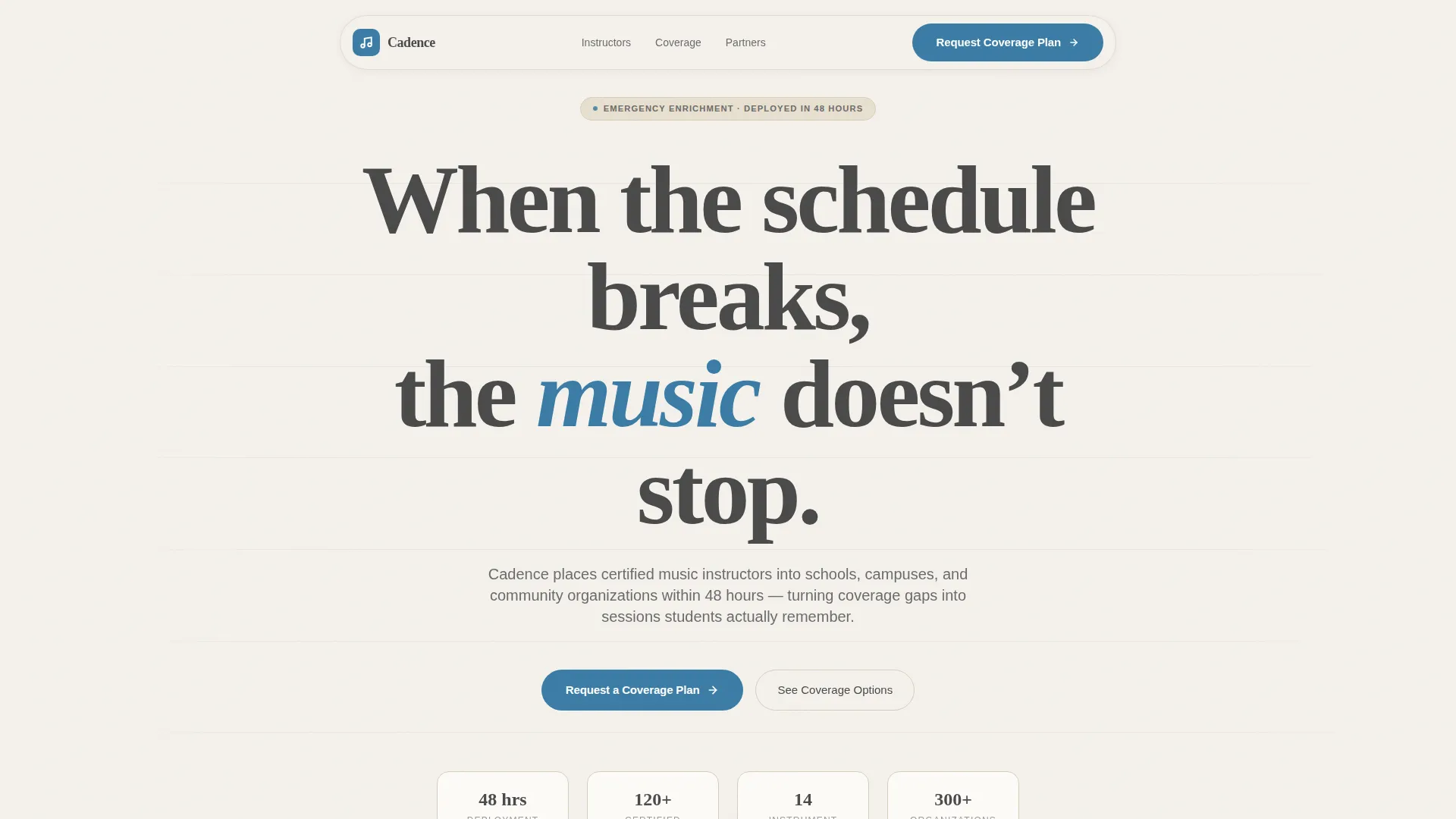
- A manifesto-style header with bold serif typography and a single accent color on the key word
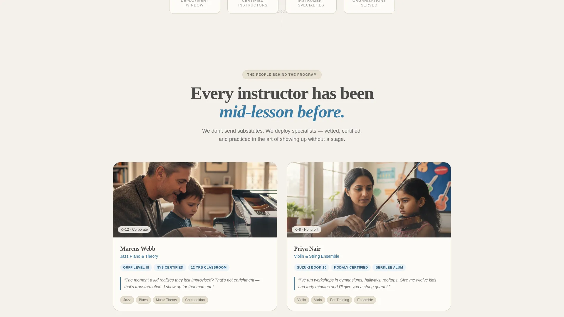
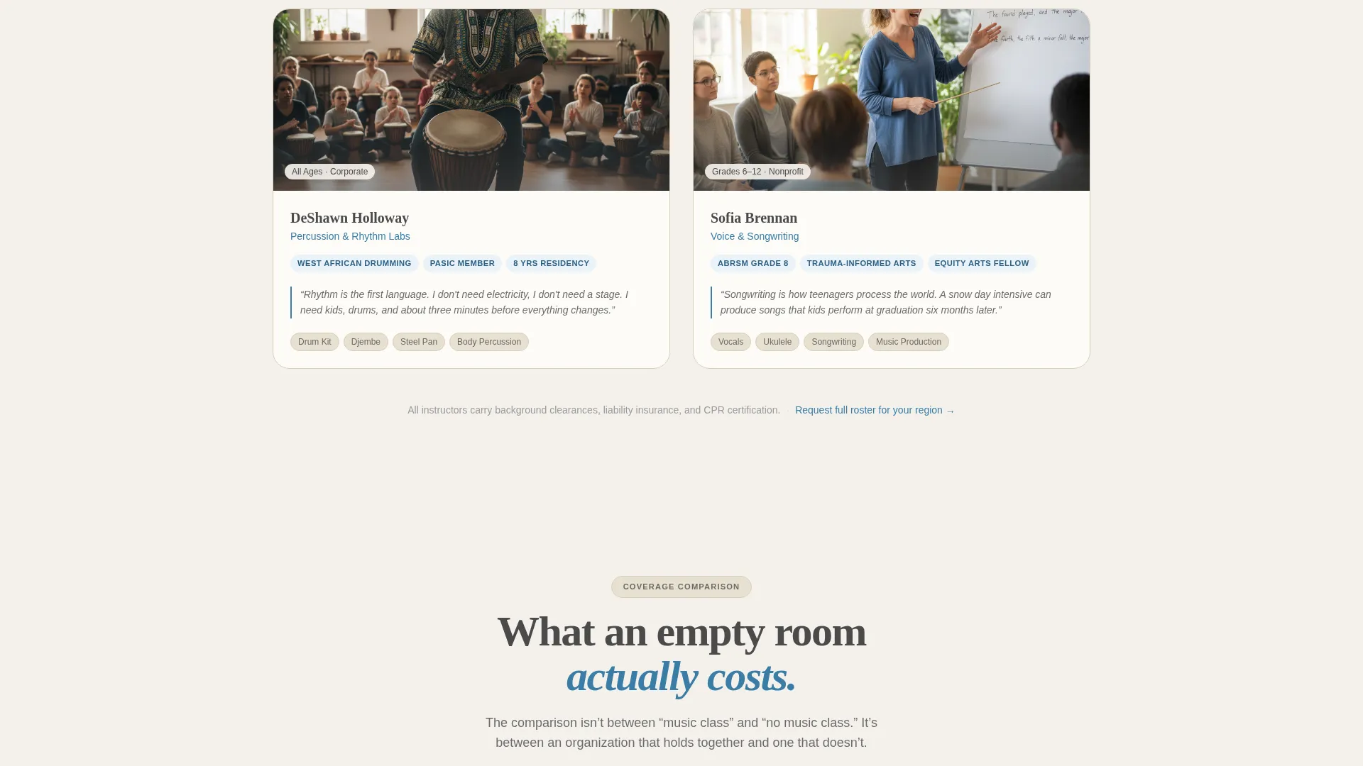
- An instructor showcase section with mid-lesson photography slots, credential fields, and personal teaching quotes
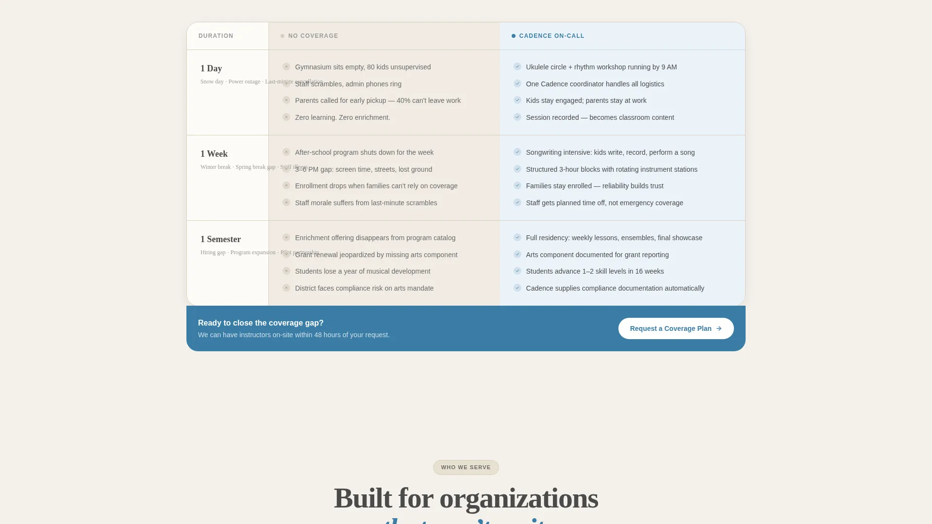
- Side-by-side comparison tables contrasting unmanaged gaps against Cadence On-Call outcomes, scaled across one day, one week, and one semester
- A dual-conversion footer with a primary "Request a Coverage Plan" form and a secondary "Download the Program Guide" gated PDF path
Feature list
This template is organized around the promise that music programming can be deployed within 48 hours. Each built-in section earns that claim by showing the people, the proof, and the path to booking.
Manifesto Header Block
The header opens with a large serif quote on a cream background. The phrase "When the schedule breaks, the music doesn't stop." anchors the page. A single supporting line confirms the 48-hour deployment promise. The word "music" carries the tuning-fork blue accent as the only color interruption, making the statement visually unforgettable without any image competition.
Instructor Showcase Section
Each instructor card is designed to hold a mid-lesson photograph paired with instrument specialties, certifications, and a direct quote about why they teach. This section builds personal credibility before the page asks for any commitment. Visitors meet the people behind the program before they read the logistics.
Side-by-Side Comparison Tables
The comparison tables are the logical core of the page. Each row contrasts a "No Coverage" scenario with a "Cadence On-Call" outcome. The stakes escalate across three time horizons: one day, one week, and one semester. Tuning-fork blue highlights key outcome cells so the contrast lands immediately.
Dual-Path Conversion Footer
Two calls to action anchor the page footer. The primary button reads "Request a Coverage Plan" and opens a short form collecting organization type, number of locations, and typical gap duration. The secondary option offers a downloadable program guide for stakeholders who need board approval before signing.
Cloud Canvas Color System
The palette uses soft chalk white, pencil graphite, worn music-sheet cream, and tuning-fork blue as a single accent. Every color choice reinforces the Educational Guide theme without borrowing from consumer music branding. The result feels like a well-used practice room rather than a polished retail storefront.
Educational Guide Typography System
The type system uses large-format bold serif for headlines and tight kerning that echoes engraved letterhead. Body copy sits in readable graphite on cream fields. The typographic scale is wide enough to read from across a room, reinforcing the idea that the words themselves carry the visual weight.
Page sections overview
| Section | Purpose |
|---|---|
| Manifesto Header | Establish tone and urgency |
| Deployment Promise Line | Confirm 48-hour availability |
| Instructor Showcase | Build trust through real people |
| Comparison Tables | Prove logistics with outcome contrast |
| Coverage Plan Form | Capture primary B2B leads |
| Program Guide Download | Support stakeholders needing approval |
Design & branding system
The visual identity follows an Educational Guide theme. Every design decision points back to the lived experience of a working practice room, not a polished brand campaign.
- Color system: soft chalk white (#F4F1EC), pencil graphite (#4A4A4A), worn music-sheet cream (#E8E0D0), and tuning-fork blue (#3A7CA5) reserved for calls to action and table highlights
- Typography: large bold serif headlines with tight kerning for the header; readable body type in graphite for instructor cards and table content
- Texture references: fingerprints on ivory keys, rosin dust on wood floors, afternoon light on a dog-eared practice book
Mobile & speed optimization
The single-column layout keeps the reading flow intact on smaller screens. Comparison tables and instructor cards are the most layout-intensive elements, and both are structured to reflow cleanly without horizontal scrolling.
- Single-column flow ensures that manifesto text, instructor cards, and comparison tables stack naturally on mobile viewports
- Table highlight colors and bold serif type remain legible at reduced sizes without requiring separate mobile styles
- The dual-path footer is designed so both conversion options remain reachable without excessive scrolling on any device
How this template helps you convert
Every section is sequenced to reduce hesitation and build enough confidence for a B2B buyer to take the next step. The page does not ask for commitment before earning it.
- The manifesto header filters visitors immediately, confirming within seconds that this page speaks to institutional gaps rather than individual lessons, so only the right audience reads on.
- The instructor showcase humanizes the service before the comparison tables introduce the logistics, making the program feel real and accountable before any data appears.
- The dual-path footer removes the all-or-nothing barrier: visitors who are ready commit via the coverage plan form, while those who need internal sign-off leave with the program guide and a reason to return.
Other information about this template
This template is a strong fit for music school marketing campaigns where the audience is institutional rather than consumer-facing. It is particularly relevant for emergency enrichment contexts where a coordinator needs to show a board or administrator exactly what they are buying before making a call.
- The comparison table format is adaptable to different program types beyond music, including arts, wellness, and movement enrichment
- The gated PDF path supports longer B2B sales cycles where a single page visit rarely closes the deal
- The template style follows a single-column flow, which keeps the narrative linear and reduces decision fatigue for busy administrators reading on limited time
- Organizations considering this template include school districts exploring after-school enrichment contracts, corporate wellness coordinators, and nonprofit program managers
Theme
Corporate Precision
Creative direction
Expert Panel
Color system
Charcoal & Amber
Style
Single Column Flow
Direction
Lead Generation
Page Sections
Manifesto Header Block
Instructor Showcase Section
Side-by-side Comparison Tables
Dual-path Conversion Footer
Cloud Canvas Color System
Educational Guide Typography System
Related questions
Who is the intended audience for this landing page?
What does the comparison table section actually show?
What information does the coverage plan form collect?
Can I use this template if my music school does not offer emergency deployments?
Is this template suitable for a corporate wellness program pitch?



