Road Cycling Coaching Landing Page Template
Cadence is a high-performance road cycling coaching landing page built for serious cyclists and their coaches. It uses a bento grid layout, a futuristic neon visual identity, and a scroll-driven narrative that moves visitors from struggle to breakthrough. Every tile and call-to-action funnels toward one goal: getting the rider to select a coaching plan.
by Rocket studio
Quick summary
Cadence is a single-page coaching template built for road cycling services. It uses a bento grid structure, a carbon fiber color system, and a scroll-driven story arc that mirrors an athlete's journey from plateau to peak performance. The layout is built to earn a click, not collect a form submission.
Who this template is for
This template is designed for road cycling coaches and training services that need a focused, high-converting landing page. It suits coaches who work with data-driven athletes and want their page to reflect that seriousness.
- Cycling coaches targeting age-group racers chasing category upgrades
- Training services serving century riders, returning collegiate athletes, and performance-focused hobbyists
- Coaching brands that want a page built around results, watts, and race outcomes
What problem this template solves
Most coaching landing pages look like generic fitness websites. They rely on stock photography, vague promises, and long forms that kill momentum before a visitor even decides they are interested. Cadence solves the specific problem of a coaching page that fails to speak the athlete's language.
- Visitors leave because the page does not show real proof of progress
- Generic layouts do not reflect the technical, data-led world of road cycling
- Forms placed too early interrupt intent before trust is established
What you get with this template
You get a complete, single-page layout built around a bento grid structure and a clear narrative arc. The design, copy structure, and call-to-action placement are all pre-built and ready to customize for your coaching service.
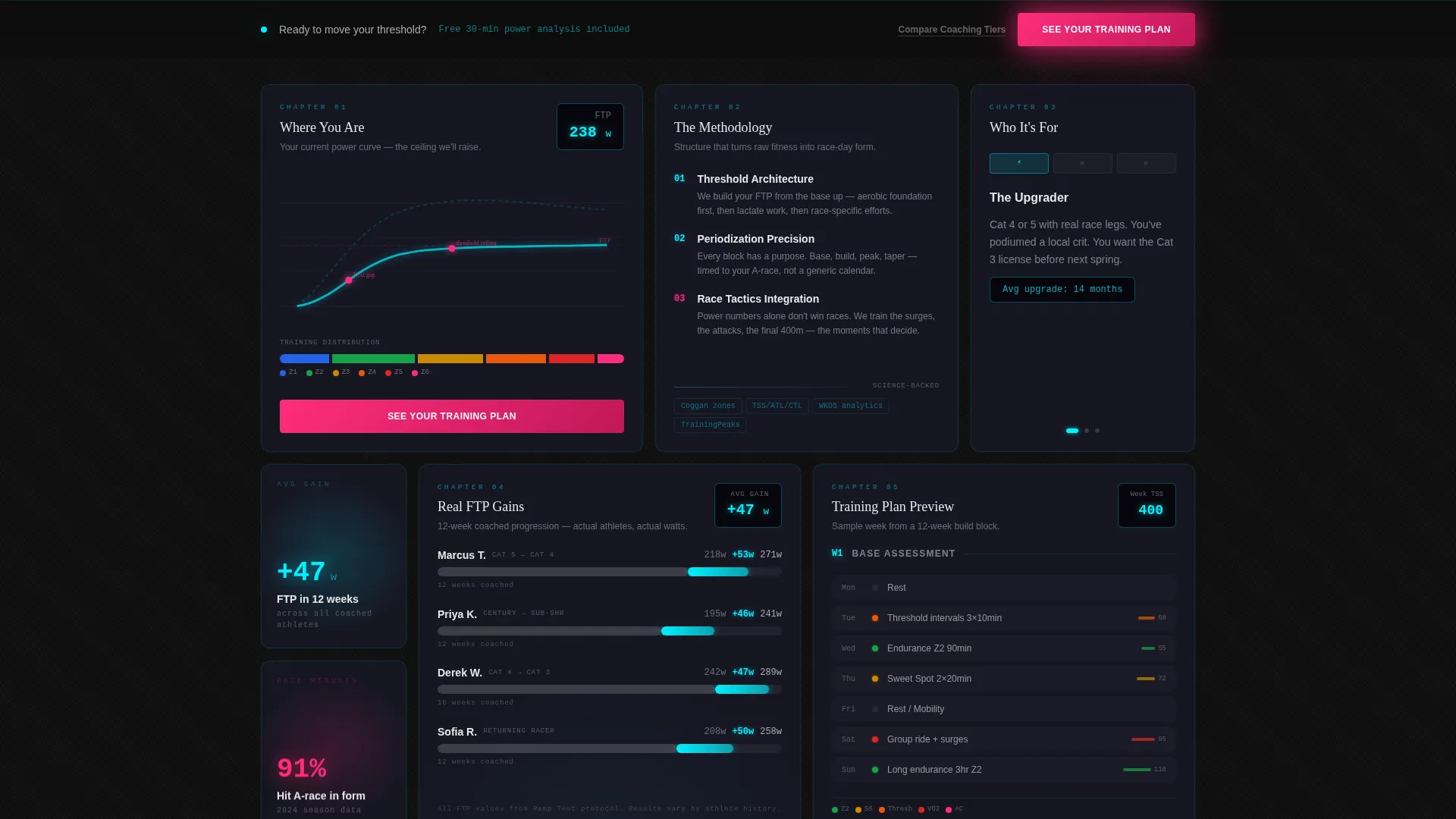
- A bento grid landing page with narrative tiles that move from "Where You Are" through methodology, training previews, FTP progressions, and a testimonial
- A persistent bottom-bar call-to-action that activates after the third scroll, keeping the primary action visible throughout
- A futuristic neon visual identity using the Carbon Fiber color system, pre-styled with deep blacks, woven graphite, electric blue, and magenta accents
Feature list
This template is built around prompt-defined capabilities. Every feature below comes directly from the design brief.
Bento Grid Story Arc
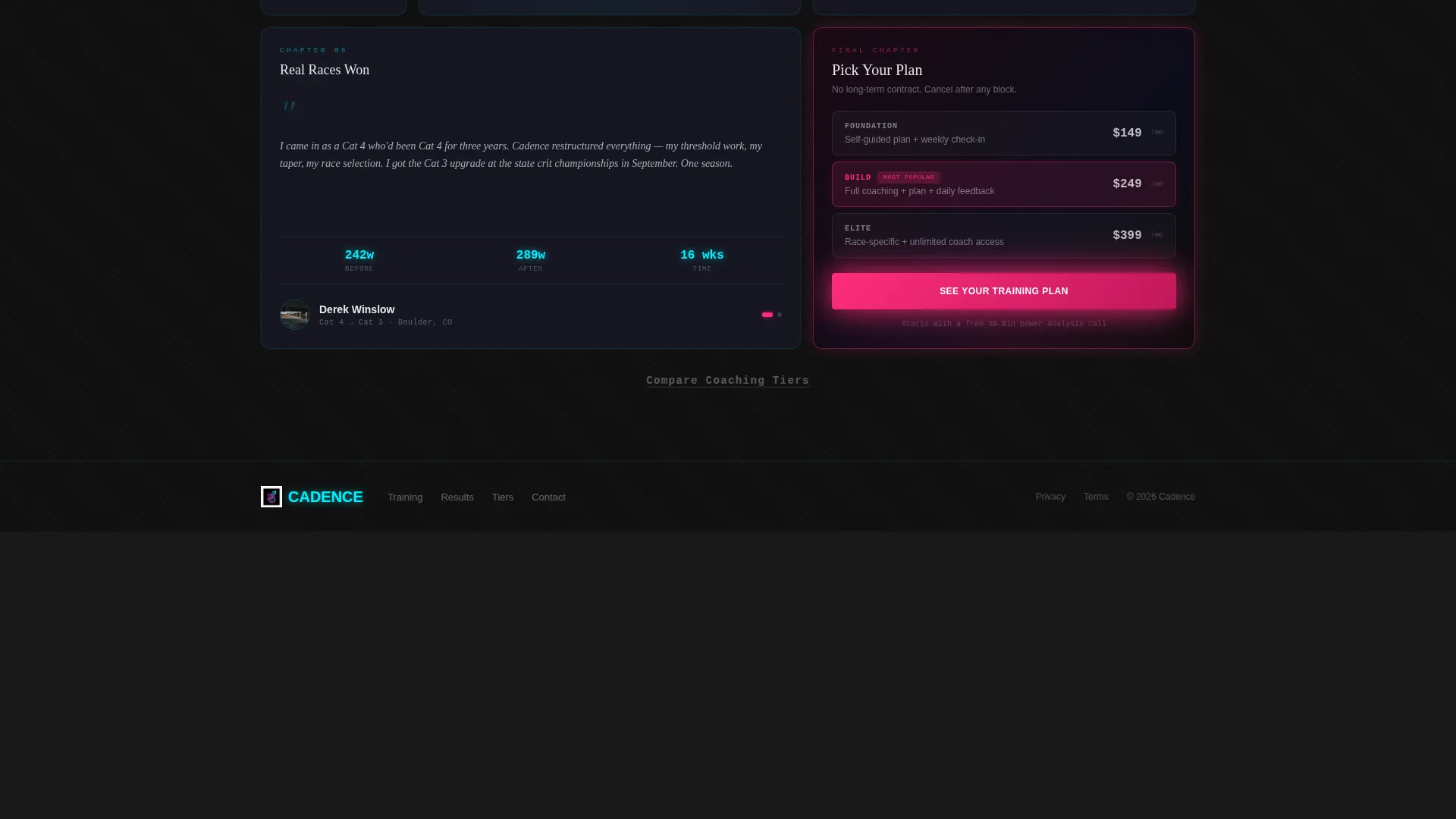
Each tile in the grid represents a chapter in the athlete's journey. The layout moves from a muted power curve showing visible weaknesses to a testimonial from a real Cat 4 racer who upgraded to Cat 3 in a single season. The progression is structural, not decorative.
Scroll-Driven Neon Intensity
The neon accents in the grid grow more luminous as the visitor scrolls deeper. This mirrors the athlete's own transformation from stagnation into form, making the visual behavior reinforce the coaching message without a single word.
Macro Close-Up Hero Header
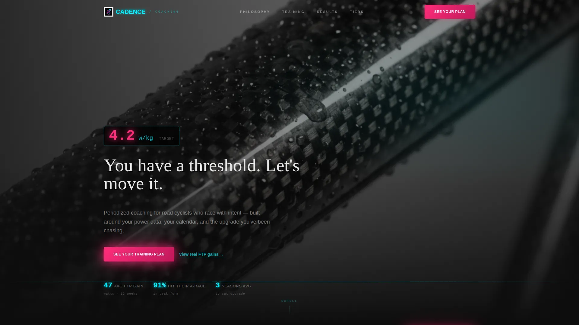
The header features an extreme-detail shot of a carbon fiber top tube with condensation droplets catching neon-blue light. A glowing magenta power number and a typewriter-style headline set the tone immediately: precise, technical, and personal.
Persistent Bottom-Bar Call-to-Action
After the third scroll, a fixed bottom bar keeps the primary call-to-action, "See Your Training Plan," in view at all times. The visitor never has to scroll back up to act. Intent captured, momentum preserved.
Single-Destination Click Architecture
There is no form on this page. Every tile and interaction point funnels toward one destination: the coaching plan selector on the next page. A secondary text link, "Compare Coaching Tiers," appears beneath the final testimonial for visitors who need one more comparison before committing.
Real Athlete FTP Progression Tile
One dedicated bento tile displays actual functional threshold power progressions over twelve weeks. Showing real watts gained builds the kind of trust that marketing copy alone cannot achieve.
Page sections overview
| Section | Purpose |
|---|---|
| Hero Header | Establishes tone with macro carbon fiber image and glowing power metric |
| Where You Are | Shows a muted power curve with visible weaknesses to open the journey |
| Coaching Methodology | Explains the training approach that drives improvement |
| Training Plan Preview | Gives visitors a structured look at what a plan contains |
| FTP Progression Tile | Displays real twelve-week functional threshold power gains |
| Testimonial Tile | Builds trust with a Cat 4 to Cat 3 upgrade story |
| Persistent Bottom Bar | Keeps the primary call-to-action visible after third scroll |
Design & branding system
The visual identity is built around a Futuristic Neon theme expressed through a Carbon Fiber color system. The palette is designed to feel like reading a head unit in the dark on a pre-dawn ride.
- Core colors: deep carbon black (#0D0D0D), woven graphite (#1A1A2E), electric chainring blue (#00F0FF), and power-zone magenta (#FF2D7B) used for calls-to-action, data highlights, and hover states
- Typography and layout follow a single-column flow with the bento grid as the primary content structure, keeping visual hierarchy clean and fast to scan
- No stock photography; the visual language relies on close-up equipment details, glowing metrics, and data-driven tile design to communicate precision and credibility
Mobile & speed optimization
The single-column flow and bento grid structure adapt naturally to smaller screens. The layout is designed to remain legible and navigable without horizontal scrolling or cramped tiles.
- The persistent bottom bar remains accessible on mobile, keeping the primary call-to-action reachable with a thumb
- The single-destination click architecture reduces page complexity, which supports a lean, focused experience on any screen size
How this template helps you convert
Cadence earns the click by presenting proof before the ask. The page structure is deliberate: build trust through data, then present the action at the moment intent peaks.
- Real athlete data, a twelve-week FTP progression tile and a category upgrade testimonial, builds credibility before any call-to-action appears above the fold
- The single-destination architecture removes decision fatigue by pointing every tile toward one next step, with the persistent bottom bar ensuring the action is always one tap away
Other information about this template
This template sits inside the Sports and Recreation category, specifically within the Road Cycling niche. It is well-suited for road cycling academy and training services looking for a focused, modern landing page.
- The creative direction follows a Launch Energy approach, designed to create urgency and forward momentum from the first scroll
- The header concept is a Scroll-Triggered Video style, meaning the visual experience is designed to respond to user movement down the page
- The landing page direction is oriented toward booking and scheduling, funneling visitors toward a plan selection rather than a passive content browse
- Template style is Single Column Flow with the bento grid as the primary layout device, making it straightforward to customize tile content, colors, and calls-to-action

Theme
Futuristic Neon
Creative direction
Launch Energy
Color system
Carbon Fiber
Style
Single Column Flow
Direction
Booking/Scheduling
Page Sections
Bento Grid Story Arc Layout
Scroll-driven Neon Intensity
Macro Close-up Hero Header
Persistent Bottom-bar Call-to-action
Real Athlete FTP Progression Tile
Single-destination Click Architecture
Related questions
Can I customize the tile content and athlete data shown in the grid?
Do I need to add a form to this template?
Is this template suited for coaching services outside road cycling?
Can I change the color system to match my existing brand?
What is the purpose of the Compare Coaching Tiers link?