Luxe Music School Franchise Landing Page Template
Cadence is a luxe minimal landing page template built for music school franchises. It combines a cinematic layered layout with an interactive instrument quiz, student transformation reveals, and dual conversion paths for both new students and franchise investors. The obsidian and gold visual identity gives every section the quiet drama of a private recital.
by Rocket studio
Quick summary
Cadence is a single-page landing page template designed for premium music school franchises. It leads with a split-layer header showcasing a bundle deal, moves through emotionally compelling student transformation reveals, and closes with a five-question interactive assessment that personalizes lesson recommendations. Two distinct conversion paths serve prospective students and franchise investors side by side.
Who this template is for
This template speaks to two very different audiences at once, and it handles both with clarity and confidence. Whether you are marketing piano lessons to curious parents or pitching a proven education brand to investors, the layout gives each audience exactly what they need.
- Parents researching beginner lessons for young children aged six and up
- Working adults who want to learn guitar, piano, or another instrument before a milestone birthday
- Multi-unit franchise investors evaluating premium education brands for their next territory
What problem this template solves
Most music school landing pages either look too casual to earn a premium price point or too corporate to feel warm. Cadence closes that gap. It presents a franchise brand that feels intimate and world-class at the same time, while making it easy for very different visitors to find their own reason to act.
- Parents and adult learners can not immediately tell which program fits their schedule, experience level, or goals
- Franchise investors land on student-facing pages with no clear path to ownership information
- Generic school pages fail to communicate the transformation a student actually experiences
What you get with this template
The template delivers a complete, production-ready landing page layout with distinct visual layers, interactive components, and two independent lead-capture flows built in. Every section is purpose-built from the brief and ready to adapt to your brand content.
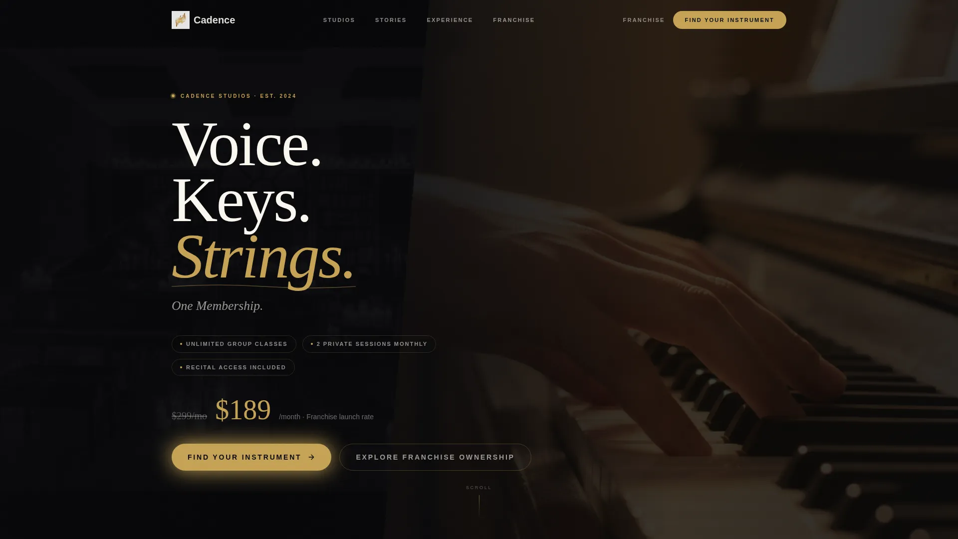
- A cinematic split-composition header with a bundle pricing reveal and struck-through original pricing
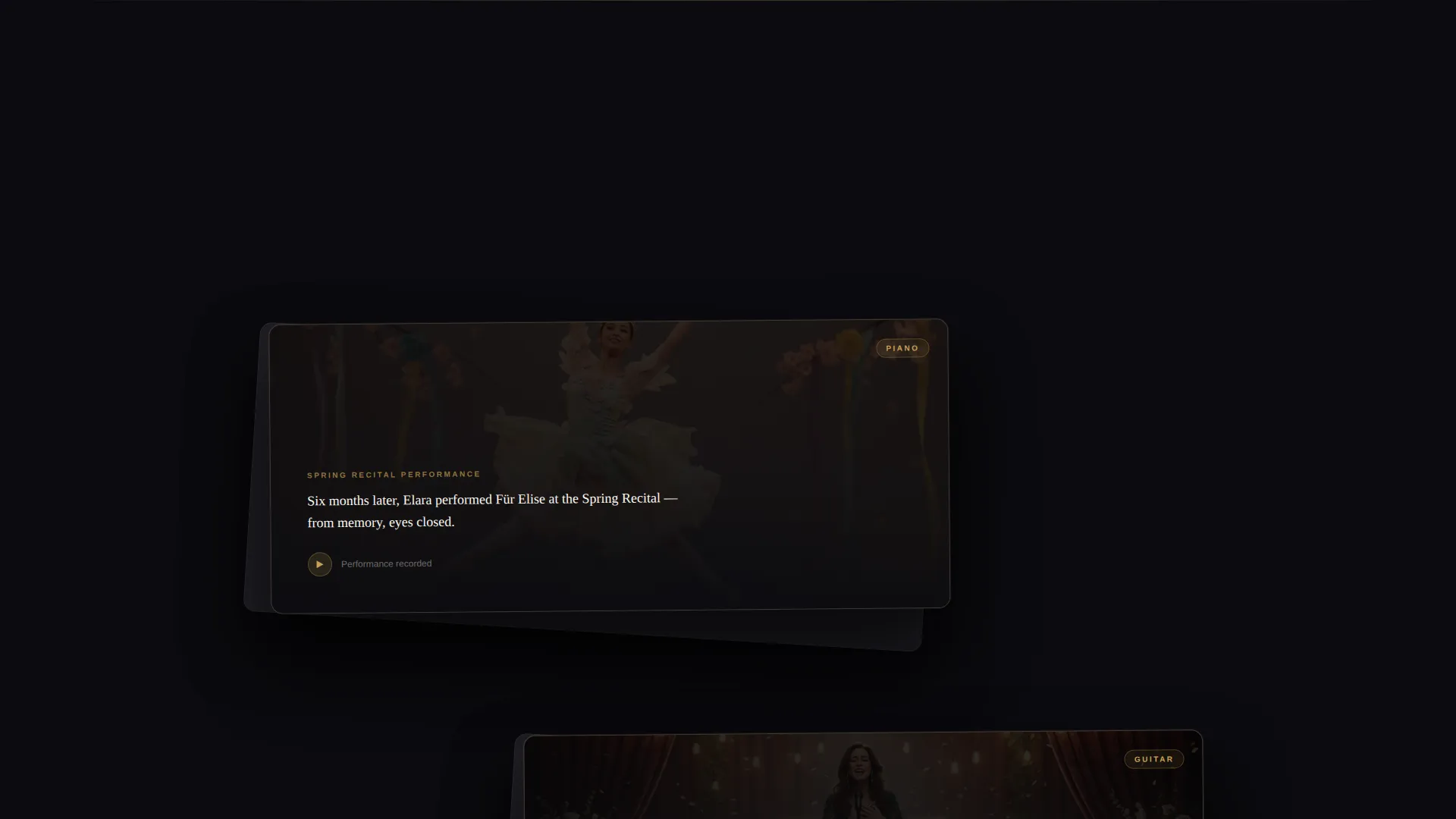
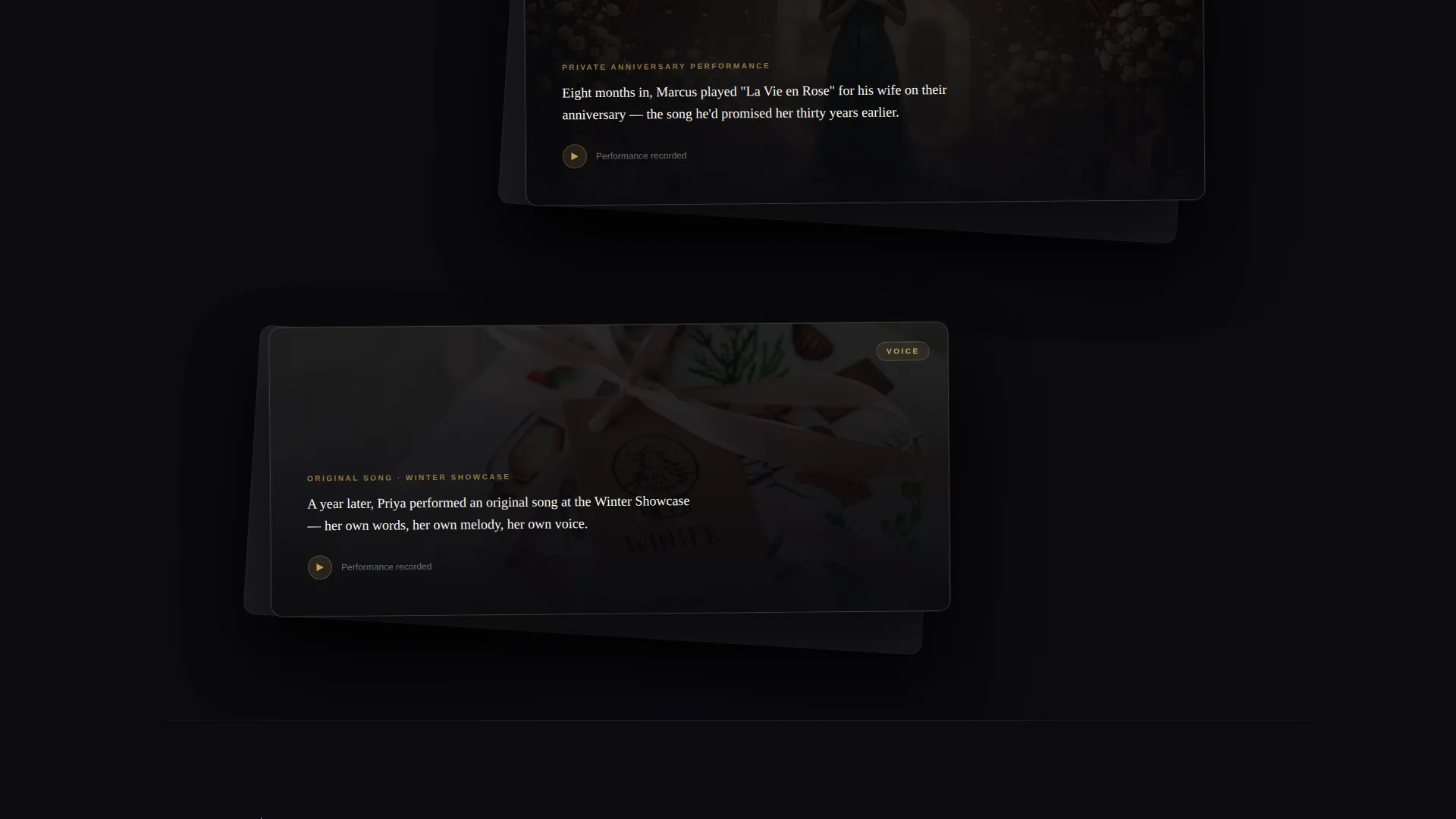
- A scrollable before-and-after student transformation section with layered card stacks and video clip placeholders
- A five-question interactive instrument quiz delivered in a gold-bordered modal overlay
Feature list
This template is built around a small number of high-impact components. Each one earns its place by serving a real conversion or storytelling purpose.
Cinematic Split-Layer Header
The header splits into two overlapping visual layers. The left layer shows a blurred, muted studio interior. The right layer, offset and overlapping by roughly one-third, reveals a golden-lit close-up of hands on piano keys mid-chord. Thin-serif typography at enormous scale floats above both layers, and the bundle pricing replaces the struck-through standard rate in warm gold.
Scrollable Student Transformation Reveals
Three to four layered card stacks scroll in sequence, each telling a student story across two cards. The back card holds a short first-person quote from the student's first day. The front card, offset and overlapping, carries a video clip of that same student performing months later. Cards peel apart on scroll to reveal depth, mirroring the theme of uncovering hidden ability.
Interactive Instrument Assessment Modal
A gold-bordered modal overlay launches from the primary call-to-action button. It walks the visitor through five questions: musical experience level, age range, genre preference, schedule availability, and learning goal. The results screen delivers a personalized studio recommendation and pre-filled lesson bundle, with a direct booking button ready to go.
Dual Conversion Path Layout
Two lead paths coexist without competing. The primary path drives prospective students toward the instrument quiz and a spot reservation. The secondary path, positioned beneath the header, routes franchise investors to a short form requesting territory interest and investment range. Both paths stay visible without cluttering the page.
Obsidian and Gold Visual System
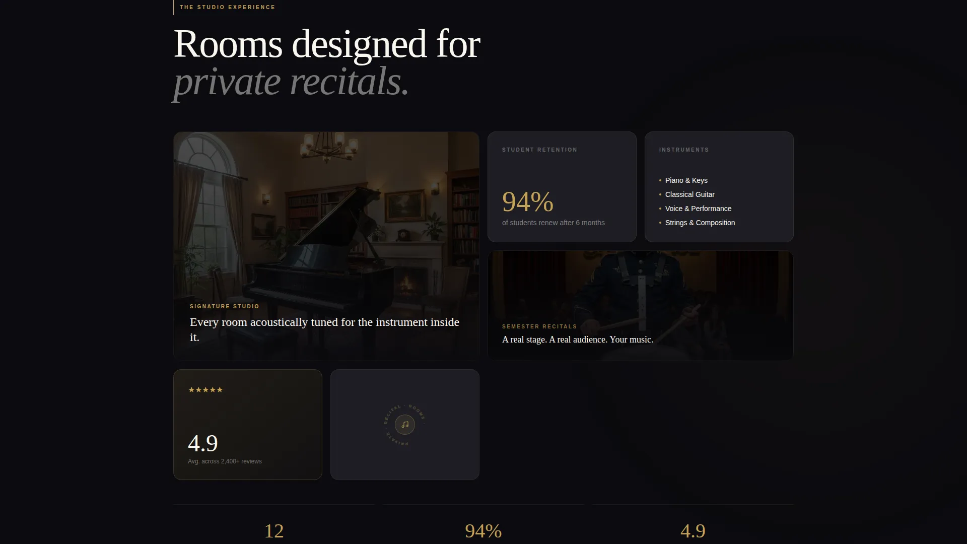
Every surface in the template uses the four-tone color palette defined in the brief. Deep obsidian black dominates the background. Warm antiqued gold marks accents, interactive highlights, and pricing callouts. Soft ivory handles body text and breathing space. A muted charcoal tone creates floating card surfaces that layer above the black background.
Page sections overview
| Section | Purpose |
|---|---|
| Split Header Layer | Introduces the bundle deal with cinematic overlapping visuals and pricing reveal |
| Bundle Pricing Block | Displays struck-through standard rate and franchise launch price in gold |
| Student Story Reveals | Scrollable before-and-after card stacks showing real student transformations |
| Instrument Quiz Modal | Five-question interactive assessment with personalized lesson recommendation |
| Spot Reservation Flow | Converts quiz results into a pre-filled booking action |
| Franchise Investor Path | Secondary lead form for territory interest and investment range |
Design & branding system
The visual identity follows a Luxe Minimal direction. Every design decision reinforces the feeling of a premium, intimate space, the kind you find in a candlelit recital room rather than a chain music store.
- Obsidian black (#0B0B0F) as the dominant background, charcoal (#1E1E24) for floating card surfaces, ivory (#FAF7F0) for readable body text
- Warm antiqued gold (#C5A255) for all accents, pricing callouts, interactive highlights, and modal borders
- Thin serif typography at large display scale for headlines, paired with fine-weight body copy that keeps the page feeling open and uncluttered
Mobile & speed optimization
The layered overlap layout is designed to translate cleanly across screen sizes. Card stacks, modal overlays, and split-composition elements are all structured to reflow logically on smaller viewports without losing the depth effect that defines the template.
- Layered card components are structured to stack vertically on mobile while preserving the offset overlap visual
- The gold-bordered modal overlay is sized and positioned to remain fully usable on phone-width screens
- Video clip placeholders in the transformation section are contained within their card bounds on all screen sizes
How this template helps you convert
The template is built around a clear conversion architecture. Every section leads the visitor one step closer to taking action, whether that action is booking a first lesson or exploring a franchise opportunity.
- The header bundle deal with a visible price comparison creates immediate perceived value, giving the visitor a clear reason to keep reading before they scroll past the first section.
- The student transformation reveals build emotional proof over three to four scroll steps, moving the visitor from interest to genuine belief that the school delivers on its promise.
- The instrument quiz personalizes the offer so the final booking button does not feel generic. The visitor arrives at the reservation step with their own recommended program already in front of them.
Other information about this template
Cadence is a franchise-focused music school landing page template built for operators who need to speak to two audiences without diluting either message. A few additional details worth noting before you build:
- The template is designed as a single-page layout with section-led scroll flow, not a multi-page site
- The investor lead form and the student quiz are independent conversion paths and can each be connected to your own preferred form destination
- The before-and-after card reveal effect is driven by scroll interaction and works with static image or video content dropped into the placeholders
- This template fits naturally within the Franchise Business subcategory under Retail and Commerce, and it adapts well to any premium education brand that values intimate, experience-first presentation
Theme
Neo-Retro
Creative direction
Comparison Journey
Color system
Ink & Paper
Style
Overlap/Layered
Direction
Click-Through
Page Sections
Cinematic Split-layer Header
Scrollable Student Transformation Reveals
Interactive Instrument Assessment Modal
Dual Conversion Path Layout
Obsidian and Gold Visual System
Related questions
Can I use this template for a single studio location, not a franchise?
How does the instrument quiz work inside the template?
Can I replace the student video clips with photos or testimonials?
Is the dual-audience layout easy to customize for my specific programs?
What screen sizes does the layered overlap layout support?



