Water Softener Landing Page Template for São Paulo
Calcrio is a single-column landing page template built for São Paulo water softener services. It opens with a hard-hitting local statistic, walks visitors through the visible and hidden costs of limescale, and drives one clear action: booking a free technical visit. The layout is clean, trust-forward, and conversion-focused from the first scroll.
by Rocket studio
Quick summary
Calcrio is a single-column landing page template designed for water softener and limescale removal services operating in São Paulo. It leads with a verified local water-hardness figure, builds credibility through a logo wall, and guides visitors through a diagnostic scroll flow that ends at one clear call to action: scheduling a free technical visit.
Who this template is for
This template is built for service providers who solve a problem most São Paulo residents have stopped questioning. It works best for businesses that need to convert skeptical, cost-aware visitors into booked appointments.
- Water softener installation and maintenance companies serving São Paulo neighborhoods
- Service providers targeting condominium building managers, homeowners, and specialty café owners
- Local utility-service businesses that rely on a single strong call to action rather than complex lead forms
What problem this template solves
Most visitors arrive unsure whether limescale is actually costing them money. They have normalized the problem. This template reframes it by leading with a specific, verifiable number and then walking visitors through what that number is doing to their pipes, showerheads, washing machines, and monthly bills.
- Generic service pages fail to connect the problem to a real local cost. This template leads with São Paulo-specific water-hardness data to make the stakes immediate.
- Visitors abandon pages that ask for information too early. This template removes the form entirely and replaces it with a single low-friction button click.
- Trust is hard to establish in home services. The logo wall section shows recognizable local clients before any product claim is made.
What you get with this template
You get a complete, ready-to-adapt single-column landing page structure with every section pre-designed and sequenced to match a diagnostic conversion flow. The layout moves from attention to evidence to action without detours.
- A bold statistics-led header section with supporting data line, a logo wall authority strip, and a multi-layer problem and solution sequence
- A repeating teal call-to-action button linked to a separate booking page with neighborhood, property type, and time-slot selection
- A fixed footer call-to-action bar so the booking prompt stays visible throughout the entire scroll
Feature list
Stats-Led Header Section
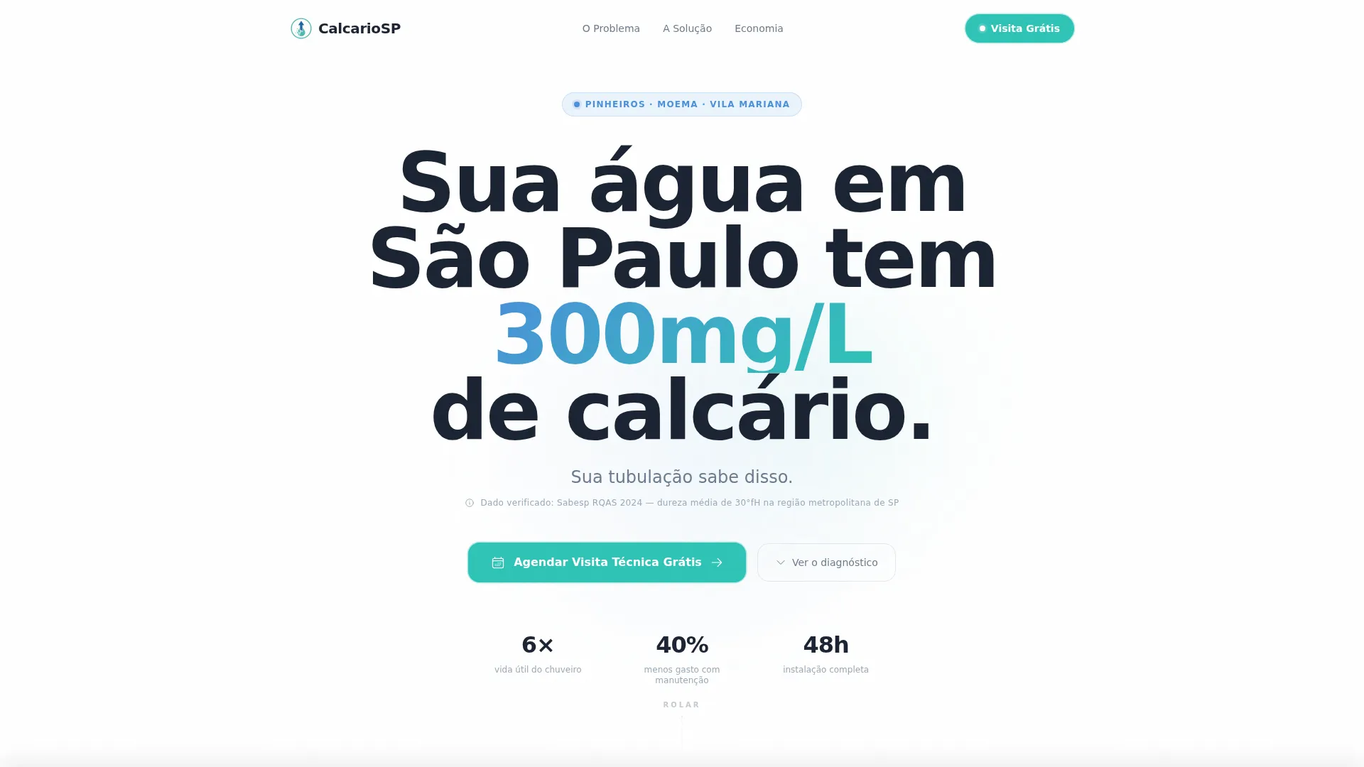
The header opens with a large, bold, centered headline referencing São Paulo's measured water-hardness level. A supporting line in galvanized grey cites the source data. There is no background image, no distraction, just the number and what it means for the visitor's building.
Logo Wall Authority Strip
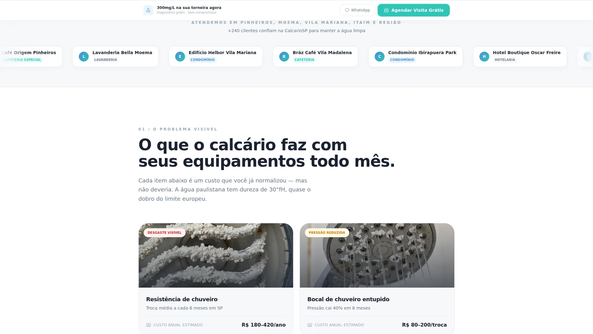
Immediately below the header, a horizontal band displays logos of served condominiums, laundries, and specialty cafés. No explanatory text is needed. The visual mass of recognizable clients does the trust work before a single product claim appears.
Diagnostic Scroll Sequence
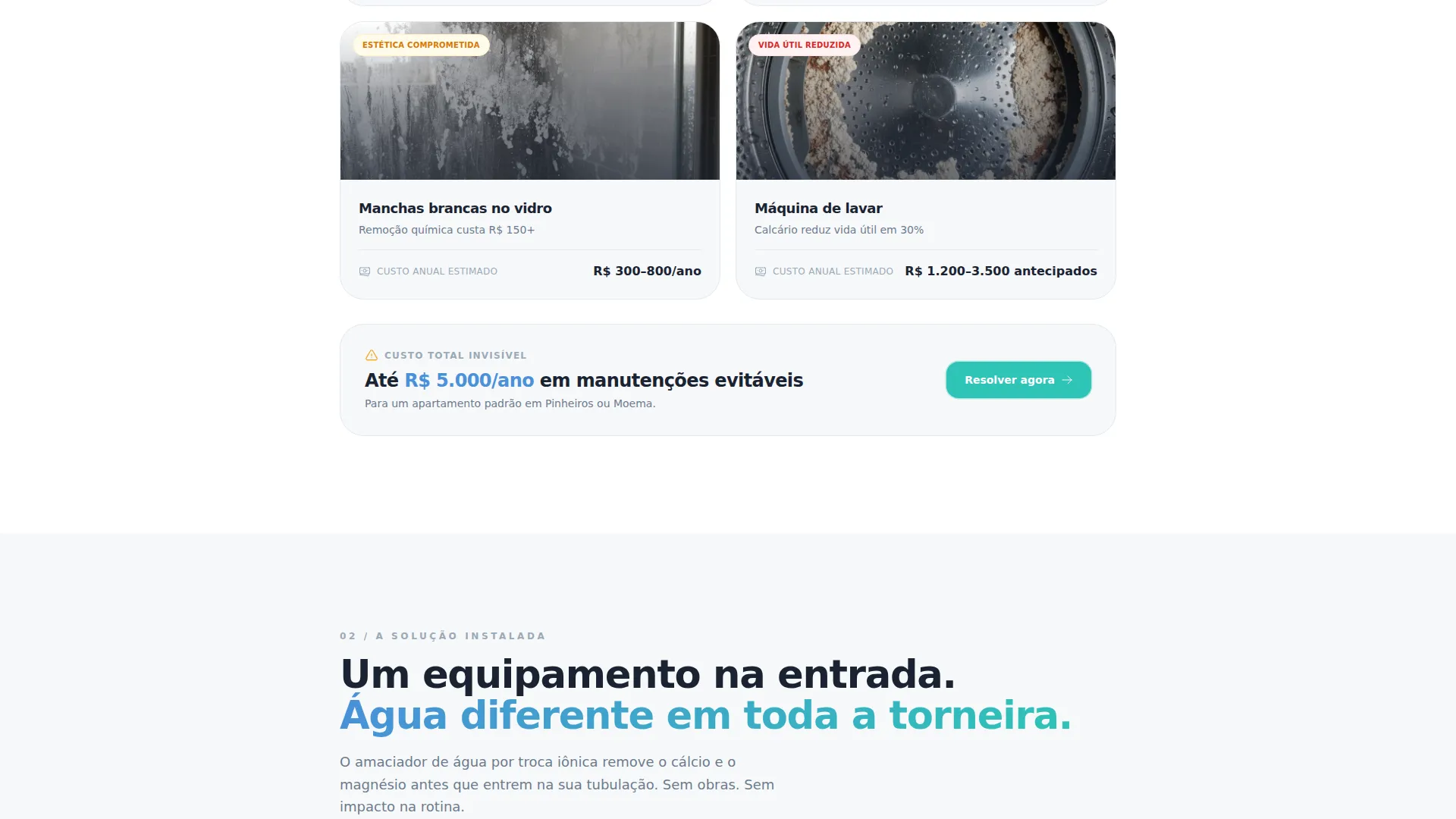
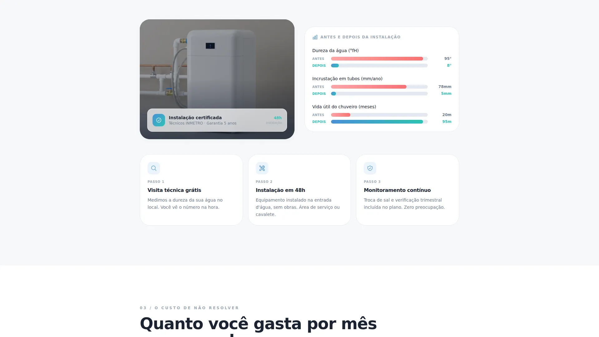
The page flows like a technical consultation. Each section reveals a new layer: visible damage with images of burnt heating elements and clogged shower nozzles, then an invisible-damage infographic showing pipe buildup over time, then a real installation photo in a São Paulo service area, and finally a monthly savings figure in Brazilian reais.
Repeating Teal Call-to-Action Button
The primary action button reads "Agendar Visita Técnica Grátis" (Schedule Free Technical Visit) and appears in the template-branded teal accent color after the header, after the logo wall, and in the fixed footer bar. Consistent repetition keeps the conversion goal visible at every scroll depth.
Fixed Footer Booking Bar
A persistent footer strip stays anchored at the bottom of the viewport throughout the entire page. It carries the same primary call to action. Visitors never have to scroll back up to find the booking entry point.
Booking Page Integration Placeholder
The call-to-action button links to a dedicated booking page. That page includes selection fields for São Paulo neighborhood, property type (apartment, house, or commercial space), and preferred visit time. The landing page itself contains no form, keeping the first commitment lightweight.
Page sections overview
| Section | Purpose |
|---|---|
| Bold statistics header | Anchors visitor attention with a verified local water-hardness figure |
| Supporting data line | Cites the source behind the headline number to build immediate credibility |
| Logo wall strip | Displays served client logos to establish trust before any product claim |
| Visible damage section | Shows photos of burnt heating elements and blocked shower nozzles |
| Invisible damage infographic | Illustrates pipe buildup over time with a clear visual diagram |
| Installed solution photo | Shows the actual equipment placed in a real São Paulo service area |
| Monthly savings figures | Breaks down cost reduction in Brazilian reais to make value concrete |
| Primary call to action button (mid-page) | Repeats the booking action after the logo wall section |
| Fixed footer call to action bar | Keeps the booking prompt visible throughout the full scroll |
Design & branding system
The visual identity follows a Service Utility theme built around the Cloud Canvas color system. The palette is intentionally minimal: it reads like looking at clean water held up to light, neutral, trustworthy, and free of visual noise.
- Background in new-water-tank white (#F7F8FA), body text and anchors in galvanized-pipe grey (#6B7B8D), icons and technical data in clean-filter blue (#4A90D9)
- Call-to-action buttons and active indicators use a teal-water accent (#2EC4B6) that reads like a drop of water landing on a clean surface
- Typography uses a bold, sans-serif display face for the headline at 70 percent viewport height, keeping the opening screen text-dominant and distraction-free
Mobile & speed optimization
The single-column layout adapts naturally to smaller screens without restructuring the content hierarchy. Every section stacks cleanly in a vertical flow, and the fixed footer call-to-action bar remains anchored at the bottom of mobile viewports as well.
- The text-dominant header requires no heavy image assets, which keeps the above-the-fold load lightweight on mobile connections
- The logo wall and infographic sections are designed as horizontal scroll or stacked grid elements that reflow cleanly on narrow screens
How this template helps you convert
This template is built around a single conversion goal: one button click to book a free visit. Every design and copy decision supports that goal by reducing friction, building trust, and making the cost of inaction visible before asking for anything.
- The statistics header creates immediate relevance by using a local, verifiable hardness figure. Visitors recognize their own situation before reading a second line.
- The diagnostic scroll sequence reveals the problem in layers, moving from visible symptoms to hidden costs to a concrete savings number. Each scroll makes inaction feel more expensive than the visit.
- The form-free structure means the only commitment on the page is a single button click. The booking details are collected on the next page, where intent is already confirmed.
Other information about this template
This template is part of the Calcrio design system, a template family built for local utility and home-services businesses in Brazilian urban markets. It pairs well with service categories where the problem is underestimated and the solution requires a site visit to demonstrate value.
- The template style follows a Comparison Table layout logic, making before-and-after cost data easy to present in a structured, scannable format
- The creative direction draws from a Testimonial Mosaic influence, using the logo wall as a visual credibility layer in place of written reviews
- The header concept is Stats and Metrics-led, consistent with Editorial Magazine themes where data carries the visual weight of the opening screen
- The template is aligned with a Lead Generation landing-page direction, optimized for click-through to a booking page rather than on-page form submission
Theme
Editorial Magazine
Creative direction
Testimonial Mosaic
Color system
Arctic White
Style
Comparison Table
Direction
Lead Generation
Page Sections
Statistics-led Hero Header
Logo Wall Authority Strip
Diagnostic Scroll Flow
Repeating Teal Call to Action Button
Fixed Footer Booking Bar
Form-free Conversion Structure
Related questions
Can I adapt this template for a service area outside São Paulo?
Does the landing page include a contact form?
Who is this template best suited for?
How many times does the booking button appear on the page?
Can I replace the color system with my own brand colors?



