Executive Coach Reviews Website Template
Calibrate is a single-column editorial landing page built for executive coaches who work one-on-one with senior leaders in transition. It opens with a typeset manifesto, moves through social proof, philosophy, and methodology, and closes with two deliberate calls to action. The design earns trust through restraint, not spectacle.
by Rocket studio
Quick summary
Calibrate is a single-column flow landing page designed for an executive coaching practice. It speaks directly to CEOs, founders, and newly promoted leaders navigating the gap between a new title and the instincts that title demands. Every design choice, the editorial serif, the charcoal-and-amber palette, the generous whitespace, signals authority without announcing it.
Who this template is for
This template is built for executive coaches who work with senior leaders one-on-one. The practice it represents is selective, high-trust, and operates at the intersection of identity and leadership transition.
- Executive coaches serving C-suite leaders, founders, and newly promoted directors
- Coaching practices that rely on referrals and want a page that validates the quality of the work before a conversation begins
- Coaches who want their online presence to feel like earned authority rather than a polished sales pitch
What problem this template solves
Most coaching websites try too hard. They lead with testimonials, bold outcome promises, and buttons that push before trust is built. For coaches working with serious leaders, that approach actively undermines credibility.
- Senior buyers need to feel understood before they consider a conversation, not sold to on arrival
- The gap between a new leadership title and the instincts required to fill it is a real, urgent problem, the template gives that problem language
- Coaches lack a page structure that demonstrates thinking, proves proximity to serious clients, and earns the click rather than demanding it
What you get with this template
This is a complete single-page layout built around one clear idea per scroll section. It unfolds like a long-form editorial feature, not a product page. Each section serves a specific role in building recognition, trust, and desire.
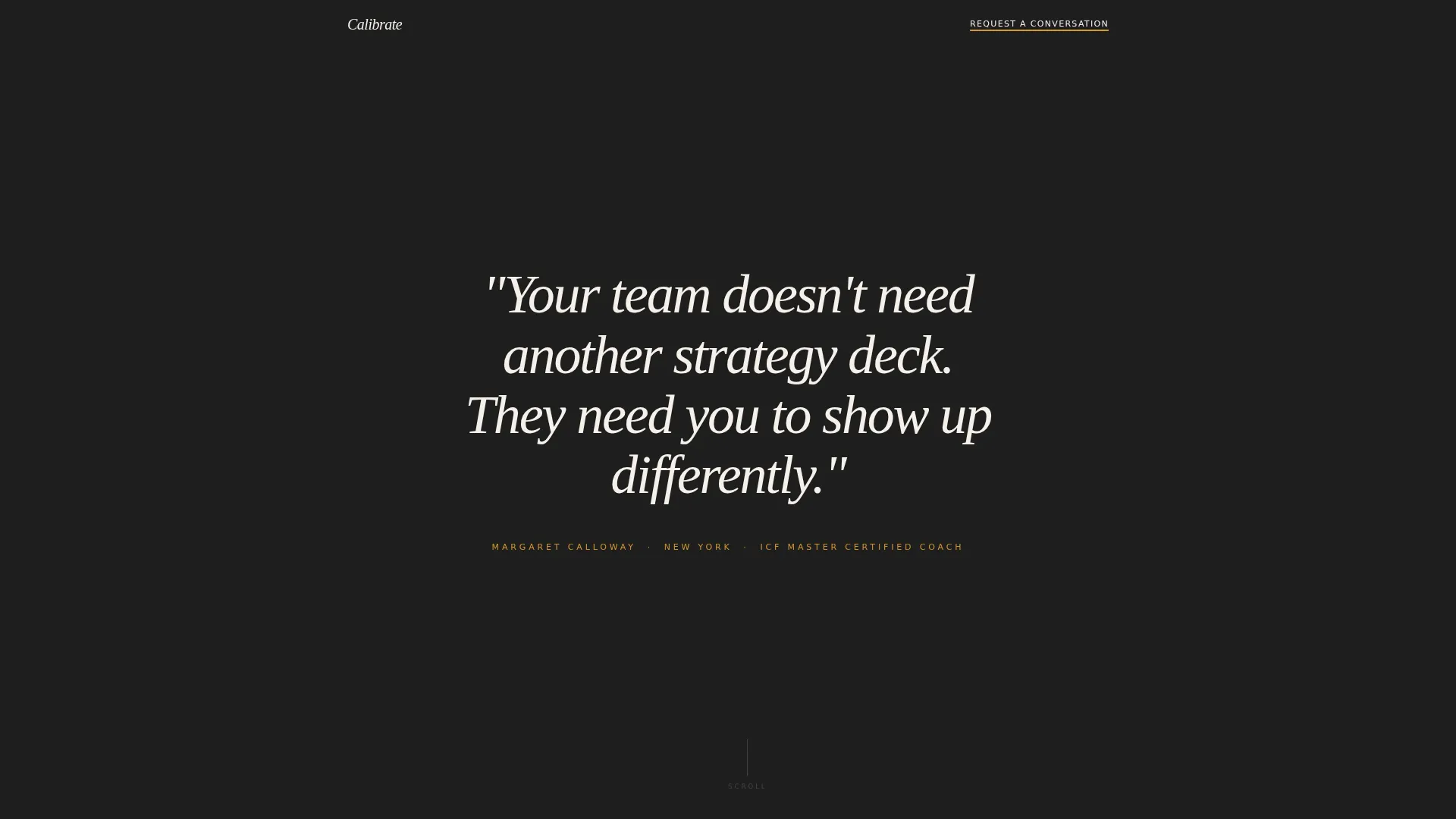
- A full-page manifesto header in editorial serif type on a black screen, with no images and no motion
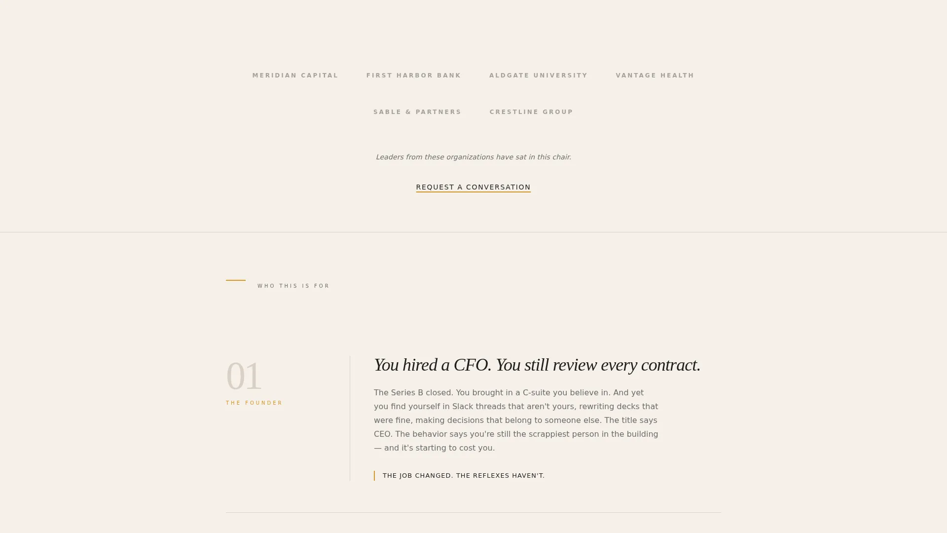
- A grayscale logo wall that proves client proximity without a headline, paired with two deliberate call-to-action links
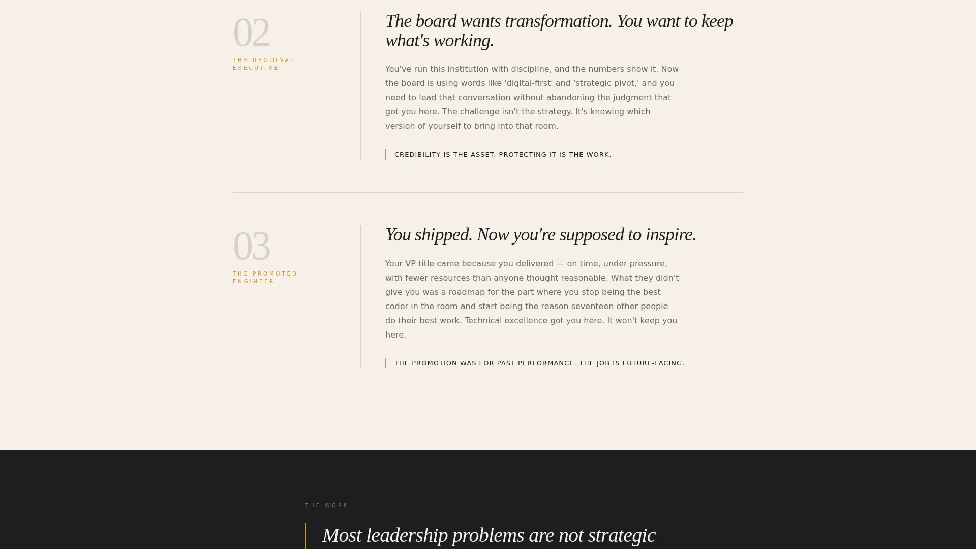
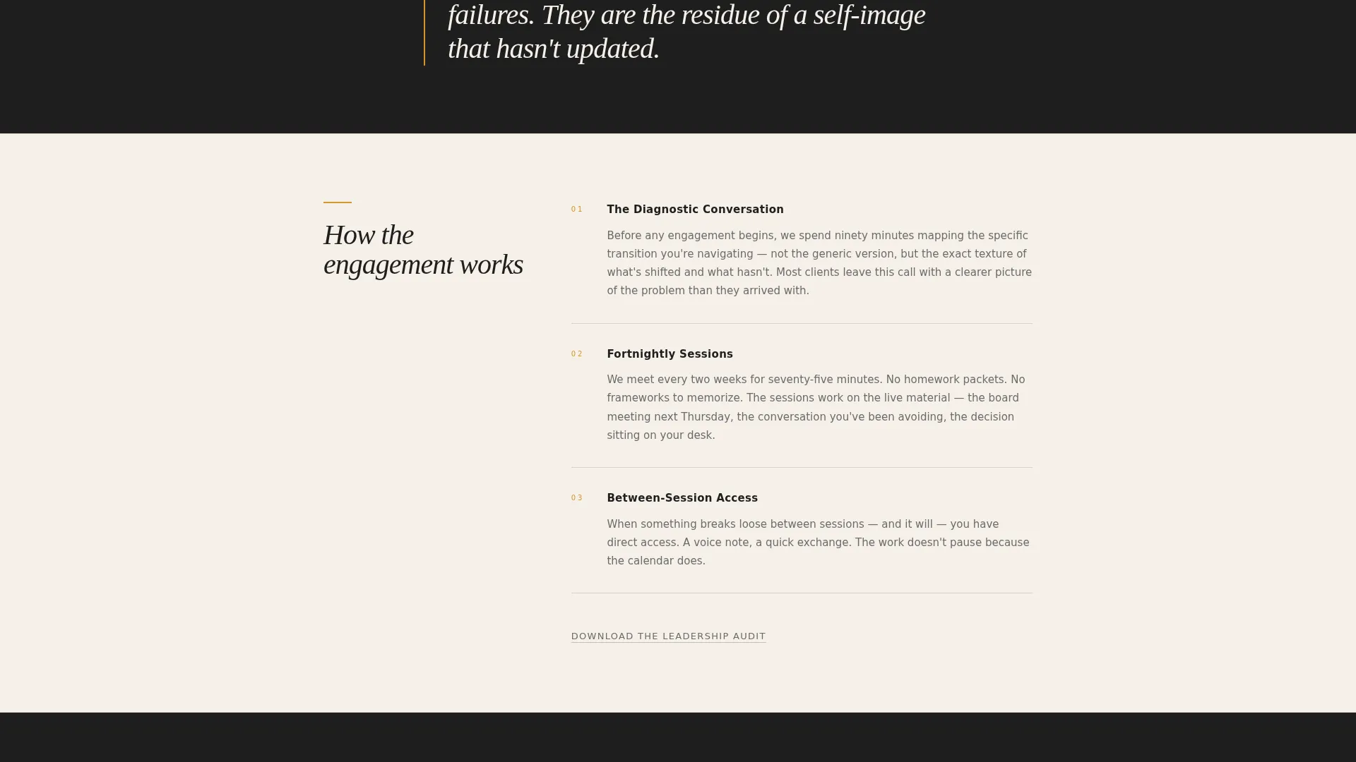
- Alternating philosophy and methodology sections that move at a read-pause-read rhythm, closing with a quiet repeat of the primary call to action
Feature list
This section outlines the core structural and design capabilities built into the Calibrate template.
Editorial Manifesto Header
The page opens on a black screen with a single typeset statement in a large editorial serif. Kerning and spacing are calibrated with the discipline of a magazine cover. Attribution sits below the quote in small amber caps. There is no image, no motion, and no navigation competing for attention.
Grayscale Logo Wall
After the manifesto, the scroll reveals a horizontal band of grayscale client logos from recognizable companies, regional institutions, and a university system. No headline introduces them. A single line of mid-gray italic copy beneath the logos provides context without overselling.
Dual Call-to-Action Structure
The primary call to action, "Request a Conversation," appears as an amber-underlined text link rather than a button. It sits first beneath the logo wall and repeats at the page close. A secondary gray link, "Download the Leadership Audit," offers a quieter entry point for visitors not yet ready to book.
Alternating Editorial Sections
Each scroll section presents one idea at a time. Short philosophical provocations alternate with concrete methodology descriptions. Whitespace is generous. The pacing is intentional, designed to be read rather than skimmed.
Charcoal and Amber Color System
The palette uses deep editorial charcoal, warm newsprint cream, whiskey-toned amber, and a quiet mid-gray for secondary text and ruled lines. Every color decision serves the editorial authority of the page without decorating it.
Single-Column Flow Layout
The entire page runs in a single column. There are no sidebars, grid cards, or competing visual tracks. The structure keeps the reader's eye moving through one coherent narrative from manifesto to closing call to action.
Page sections overview
| Section | Purpose |
|---|---|
| Manifesto Header | Opens on a black screen with a single editorial statement in large serif type and amber attribution |
| Logo Wall Band | Displays grayscale client logos with a single italic descriptor line beneath |
| Primary call to action Link | Places the "Request a Conversation" amber text link immediately after social proof |
| Philosophy Sections | Delivers short provocations that name the leadership transition problem in precise language |
| Methodology Sections | Describes the coaching approach with concrete specificity in alternating scroll blocks |
| Secondary call to action Link | Offers the "Download the Leadership Audit" gray link for visitors not ready to book |
| Closing call to action Repeat | Returns the primary "Request a Conversation" link at the bottom of the page |
Design & branding system
The visual identity follows an Editorial Magazine theme. Every element is chosen to feel like a well-produced print publication, not a digital service page. The restraint is deliberate: the fewer visual decisions that compete for attention, the more weight each one carries.
- Color palette: deep editorial charcoal (#1E1E1E), warm newsprint cream (#F5F0E8), whiskey-toned amber (#D4952A), and quiet mid-gray (#6B6B6B) for secondary text and ruled lines
- Typography: large editorial serif for the manifesto and section headers, with tight kerning and generous leading that mirrors a magazine feature layout
- Spacing and whitespace: each section breathes like a full-page pull quote, with ruled lines and mid-gray secondary text providing structure without visual noise
Mobile & speed optimization
A single-column layout is inherently well-suited for smaller screens. The page makes no structural compromises between desktop and mobile viewing because the layout was designed as a linear reading experience from the start.
- The single-column flow translates directly to mobile without reordering content or collapsing grids
- Typography-forward sections remain legible and impactful at smaller sizes because the design relies on text hierarchy rather than images or complex layouts
- The absence of motion, video, and heavy visual assets keeps the page light and responsive across devices
How this template helps you convert
The page is built around a click-through conversion model. It does not push. It earns. Every section is designed to move a qualified visitor closer to a decision without manufacturing urgency or using persuasion tactics that would read as noise to senior buyers.
- The manifesto header and logo wall establish credibility within the first scroll, so the visitor arrives at the first call-to-action link already qualified and curious
- The alternating philosophy and methodology sections sustain momentum and deepen trust, so by the closing call to action, the visitor has already made their own case for reaching out
- The secondary "Download the Leadership Audit" link captures visitors who are interested but not yet ready to schedule, giving the page a second conversion path without diluting the primary one
Other information about this template
Calibrate is designed specifically for the executive coach service area and location page use case. It works as a stand-alone page that can sit alongside a broader practice website or function independently as a direct-link destination for referrals and outreach.
- The template style is Single Column Flow, built under an Editorial Magazine theme
- The header concept is Quote/Manifesto and the creative direction is Logo Wall Authority, both optimized for a high-trust professional services context
- The landing page direction is Click-Through, meaning every design and copy decision points toward a scheduling conversation or a lead-capture download
Theme
Editorial Magazine
Creative direction
Logo Wall Authority
Color system
Charcoal & Amber
Style
Single Column Flow
Direction
Click-Through
Page Sections
Editorial Manifesto Header
Grayscale Logo Wall
Dual Call-to-action Structure
Alternating Editorial Scroll Sections
Single-column Flow Layout
Charcoal and Amber Color System
Related questions
Who is this landing page template designed for?
What are the two call-to-action paths on this page?
Can I adapt the manifesto header to my own voice?
Does this template work without a logo or brand mark?
Is this template suitable for a coach who specializes in a specific city or region?



