Obesity Care Education Website Template
Calibrate is a split-screen landing page template for obesity patient education platforms. It pairs a patient-clinician portrait with a reframing headline, then guides visitors through a scroll-triggered myth-versus-mechanism arc and expandable treatment pathway cards. The design uses a Soft Mist color system and unhurried typography to earn trust before routing visitors to a personalized learning assessment.
by Rocket studio
Quick summary
Calibrate is a single-page, desktop-first template built for obesity patient education platforms. It opens with a 50/50 split-screen hero, walks visitors through scroll-triggered biology lessons, and closes with a clear call to action that routes to a personalized assessment quiz. The Soft Mist palette and warm serif headline make clinical content feel approachable and trustworthy.
Who this template is for
This template is designed for health-tech teams and clinicians who want to give patients a better first look at obesity as a chronic disease. It fits platforms serving newly diagnosed adults, post-bariatric patients, and family caregivers alike.
- Newly diagnosed adults referred by a primary care physician who need more context than a short appointment allows
- Post-bariatric patients navigating long-term maintenance and researching ongoing care options
- Caregivers looking into treatment options such as glucagon-like peptide-1 (GLP-1) receptor agonist therapies for aging family members
What problem this template solves
Most patient-facing health pages either oversimplify or overwhelm. They either reduce obesity to a lifestyle choice or bury visitors in clinical jargon. Calibrate addresses that gap directly.
- Visitors arrive with misconceptions shaped by diet culture and insufficient appointment time
- They leave with a working understanding of obesity's neuroendocrine biology and available treatment pathways
- The page earns engagement before asking for commitment, so the call to action lands with genuine intent behind it
What you get with this template
You get a fully structured, scroll-driven landing page layout with five distinct content zones and two strategically placed calls to action. Every section is built to carry clinical content without losing the reader.
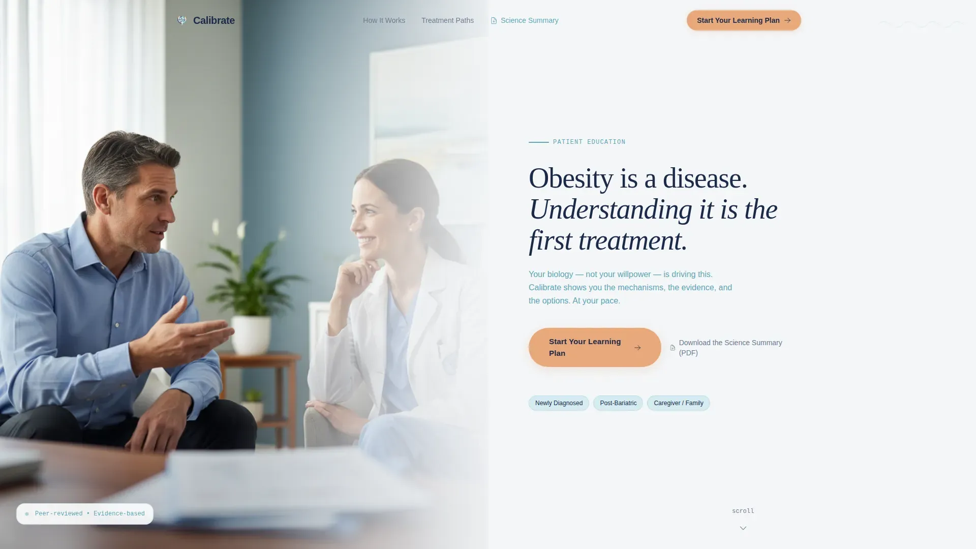
- A 50/50 split-screen hero with a portrait panel and a headline panel using a large serif typeface
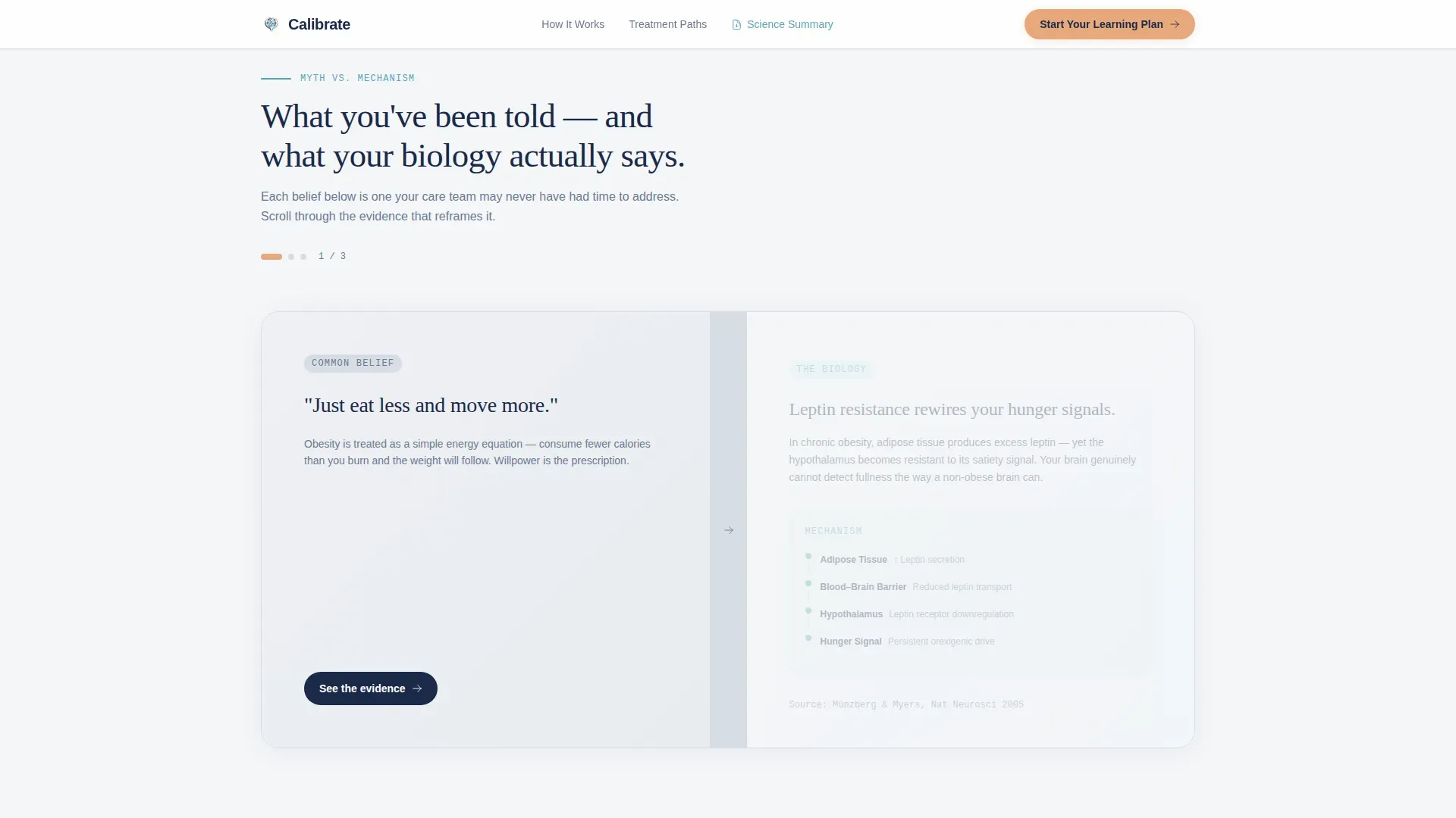
- Scroll-triggered myth-versus-mechanism transitions that dissolve common misconceptions and replace them with peer-reviewed biology diagrams
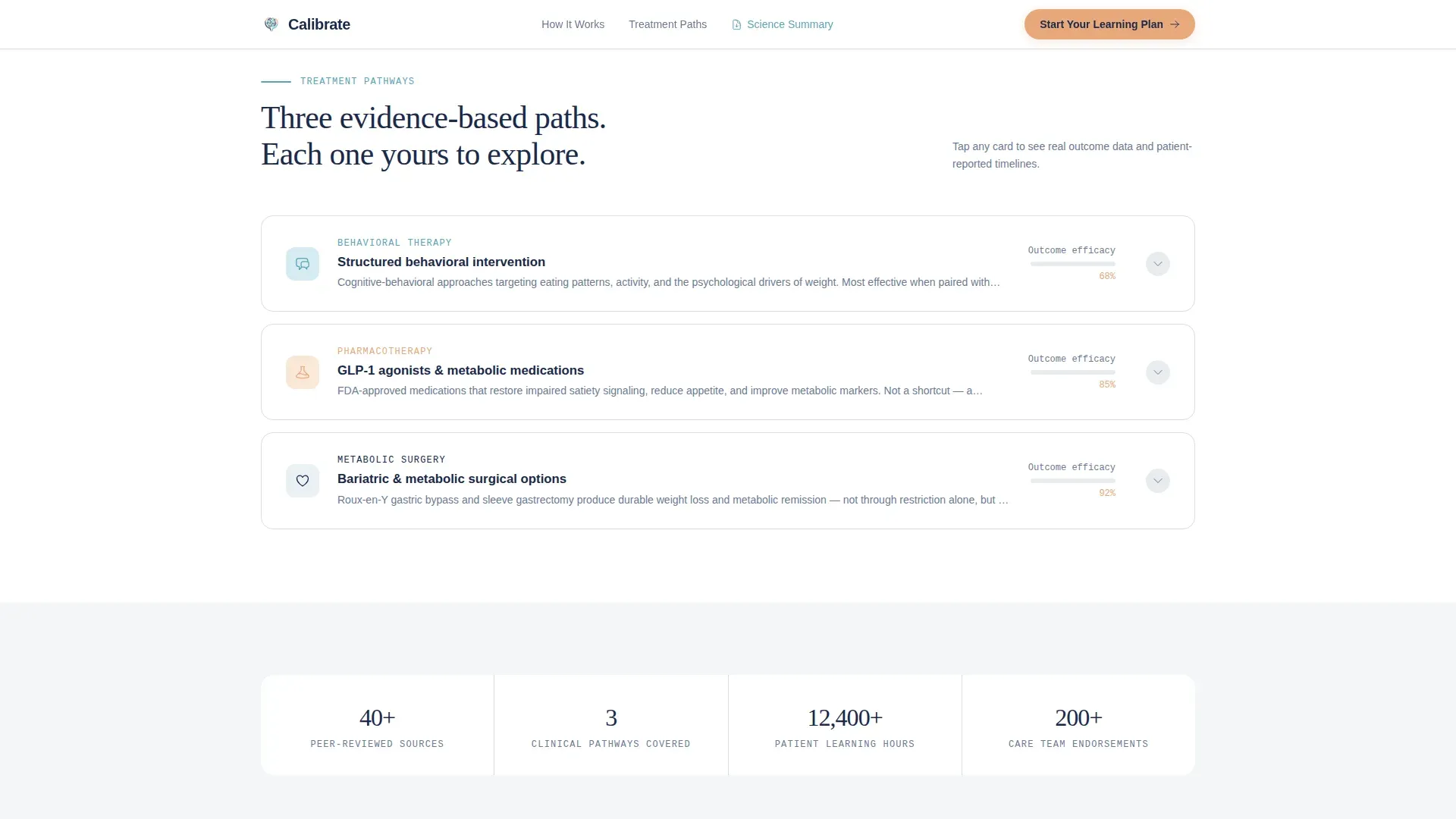
- Expandable interactive treatment pathway cards covering behavioral therapy, pharmacotherapy, and surgical options
- A secondary PDF download link for high-intent clinical visitors alongside the primary call-to-action button
Feature list
This section covers the core built-in capabilities that make Calibrate work as a patient education landing page.
Split-Screen Hero Layout
The hero divides the viewport into two equal panels. The left panel holds a shallow depth-of-field patient-clinician portrait that dissolves into Soft Mist tones. The right panel carries a single large serif headline and a teal subtext line. A downward-scroll cue invites progression without pressure.
Scroll-Triggered Myth Dissolve Transitions
As visitors scroll through the myth-versus-mechanism section, common misconceptions fade out and peer-reviewed biology diagrams fade in. The transitions are scroll-linked, so the pacing feels like a real clinical explanation unfolding rather than a slideshow.
Interactive Expandable Treatment Cards
Three treatment pathway cards cover behavioral therapy, pharmacotherapy classes, and surgical options. Each card is expandable and displays outcome data and patient-reported timelines when opened. This gives visitors a structured overview of their full range of options.
Dual Call-to-Action Placement
The primary call to action, "Start Your Learning Plan," appears once at the fold line and again anchored at the bottom of the page after the final treatment card. Placement is timed to match where visitor intent peaks. No form is required on this page.
PDF Download Secondary Link
A text link offering a downloadable science summary captures visitors who want to review clinical content offline or share it with a care team. It serves high-intent clinical readers without distracting from the primary conversion path.
Soft Mist Color System and Typography Pairing
The template uses four named colors: clinical fog white for backgrounds, steady-pulse navy for headers and body text, vitals-monitor teal for interactive elements, and reassurance peach for progress indicators and calls to action. DM Sans handles body text, Fraunces sets the hero headline in warm serif weight, and JetBrains Mono labels data points throughout.
Page sections overview
| Section | Purpose |
|---|---|
| Split-Screen Hero | Opens with portrait and reframing headline |
| Myth versus. Mechanism | Dissolves misconceptions into biology diagrams |
| Treatment Pathway Cards | Expandable cards for three treatment categories |
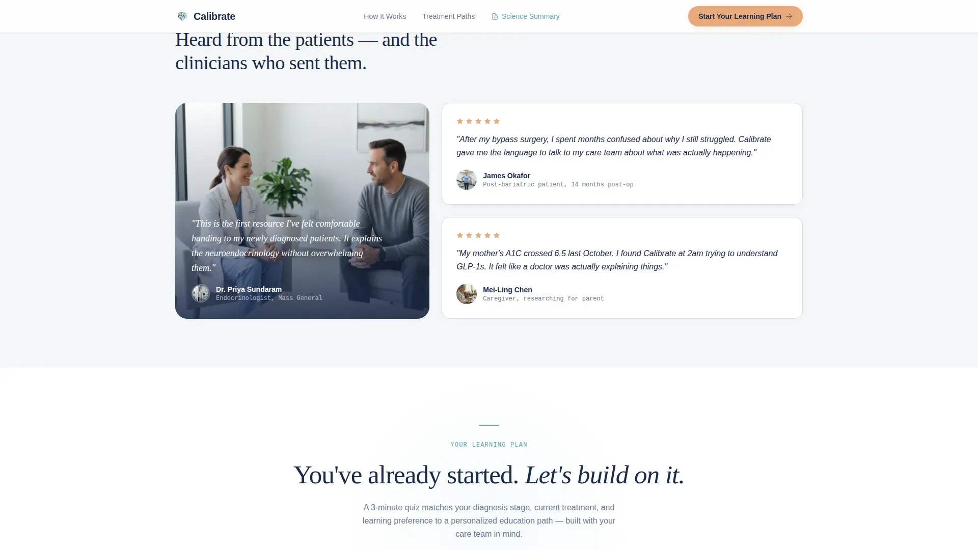
| Social Proof Block | Patient timelines and clinician credential badges |
| Call-to-Action Anchor | Final learning plan prompt after treatment module |
| Footer | Horizontal flow navigation and supporting links |
Design & branding system
The visual identity follows a Corporate Precision theme delivered through the Soft Mist color system. Every design decision reinforces the feeling of a calm, modern outpatient environment rather than a consumer health marketing page.
- Four-color palette: clinical fog white (#F4F6F8) as background, steady-pulse navy (#1B2A4A) for text hierarchy, vitals-monitor teal (#5BA4B5) on interactive and data elements, and reassurance peach (#E8A87C) exclusively on progress indicators and call-to-action buttons
- Typography trio of Fraunces for the hero headline, DM Sans for all body copy, and JetBrains Mono for data labels keeps reading comfortable at clinical detail levels
- Subtle parallax on the hero section and scroll-linked transitions through the myth arc keep animation purposeful without distracting from content
Mobile & speed optimization
Calibrate is designed desktop-first, reflecting the clinical tablet and laptop context in which patients most often engage with health education content. Responsive behavior ensures caregivers on mobile can still move through every section clearly.
- Server Components power the static hero, myth diagrams, and social proof sections to keep initial load lean
- Client-side rendering is scoped to the interactive treatment cards and scroll-triggered transition logic only
- The layout adapts for mobile viewports so that stacked panels, readable typography, and tappable cards remain functional on smaller screens
How this template helps you convert
Calibrate is built around a deliberate trust-before-ask structure. The page proves its value to the visitor before presenting any commitment.
- The scroll journey moves visitors from confusion to comprehension in a single session, so by the time the second call to action appears, the visitor has already learned something meaningful and feels ready to take the next step.
- The dual placement of the primary call to action, combined with the secondary PDF download link, captures both action-ready visitors and research-mode visitors without requiring a form on the landing page itself.
Other information about this template
Calibrate is categorized under Health & Medical, with a specific focus on obesity care and patient education platforms. It is built for B2C and business-to-business-to-consumer (B2B2C) health-tech deployments.
- The template uses US clinical terminology, English (US) localization, and 12-hour time formatting throughout
- Intersection match score of 13 reflects high alignment between the template style, creative direction, and the obesity patient education niche
- The footer follows a Vercel Horizontal Flow pattern, providing clean navigation without pulling visual focus from the primary content arc
- Social proof elements include patient-reported timelines and clinician credential badge placements built into the treatment card section
Theme
Corporate Precision
Creative direction
Problem→Solution Arc
Color system
Soft Mist
Style
Split Screen (50/50)
Direction
Click-Through
Page Sections
Split-screen 50/50 Hero Layout
Scroll-triggered Myth Dissolve Transitions
Expandable Treatment Pathway Cards
Dual Call-to-action Placement
PDF Download Secondary Link
Soft Mist Color and Typography System
Related questions
Who is this landing page template designed for?
Does this template include a form or sign-up flow?
What interactive elements are built into the template?
Can this template be used on mobile devices?
How many calls to action does this landing page include?



