HR Software & Platform Reviews Website Template
Calibrate is a comparison table landing page built for HR leaders who are done defending broken review cycles. It opens with social-proof logo bars, moves through a visceral problem arc, and delivers a three-column feature comparison that makes the gap obvious. A persistent demo call-to-action and a secondary research download close the page without friction.
by Rocket studio
Quick summary
Calibrate is a single-page template designed for a continuous performance management platform. It uses a Problem→Solution Arc to guide VP-level HR buyers from recognizing the cost of legacy review cycles to clicking a demo. The page is built around a three-column comparison table, social-proof logo ribbon, and a persistent bottom call-to-action bar.
Who this template is for
This template is built for HR technology companies selling continuous performance management software to mid-market organizations. It speaks directly to the person who owns the decision and feels the pain of broken review systems.
- VP of Human Resources or Chief Human Resources Officers at companies with 500 to 5,000 employees
- HR Operations Directors evaluating a migration away from spreadsheet-based or legacy annual review tools
- B2B SaaS teams in the HR tech space who need a high-converting, desktop-first landing page
What problem this template solves
Annual performance reviews are a retention liability. Managers copy-paste feedback, top performers go unrecognized, and HR leaders spend months defending a process that produces resentment instead of results. This template frames that problem sharply before offering a solution.
- It surfaces the gap between what legacy tools promise and what they actually deliver for continuous feedback and goal alignment
- It gives HR buyers a structured, visual argument they can take into an internal business case
- It replaces a generic hero-image layout with a credibility-first structure that earns trust before asking for a click
What you get with this template
This template delivers a complete, single-page layout structured around a clear editorial grid. Every section is purposeful and ordered to move a skeptical VP-level buyer from problem recognition to demo intent.
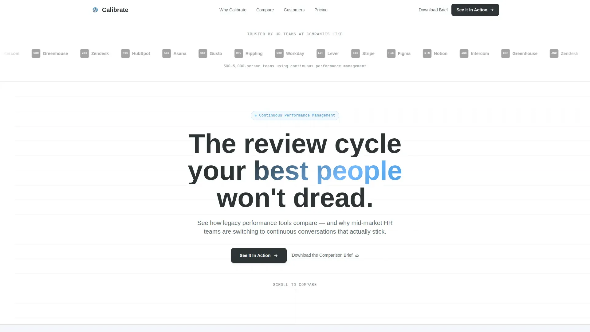
- A scrolling logo ribbon that opens with social proof before any feature is named
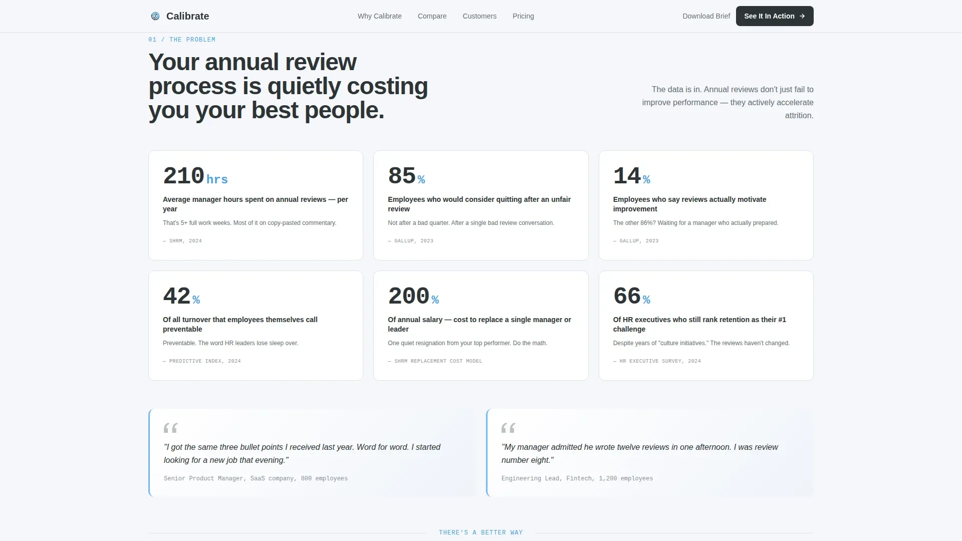
- A data-backed problem arc section with stat callouts designed to surface real engagement and turnover pain
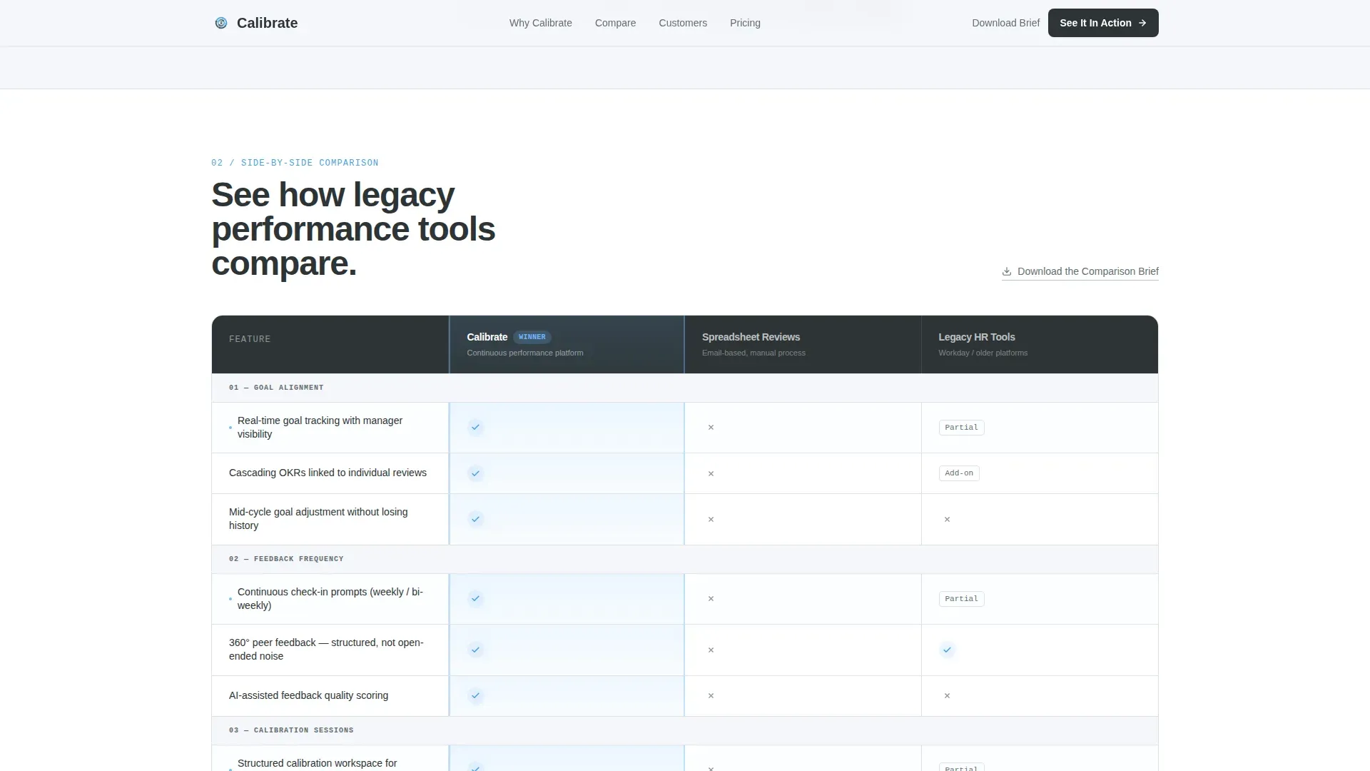
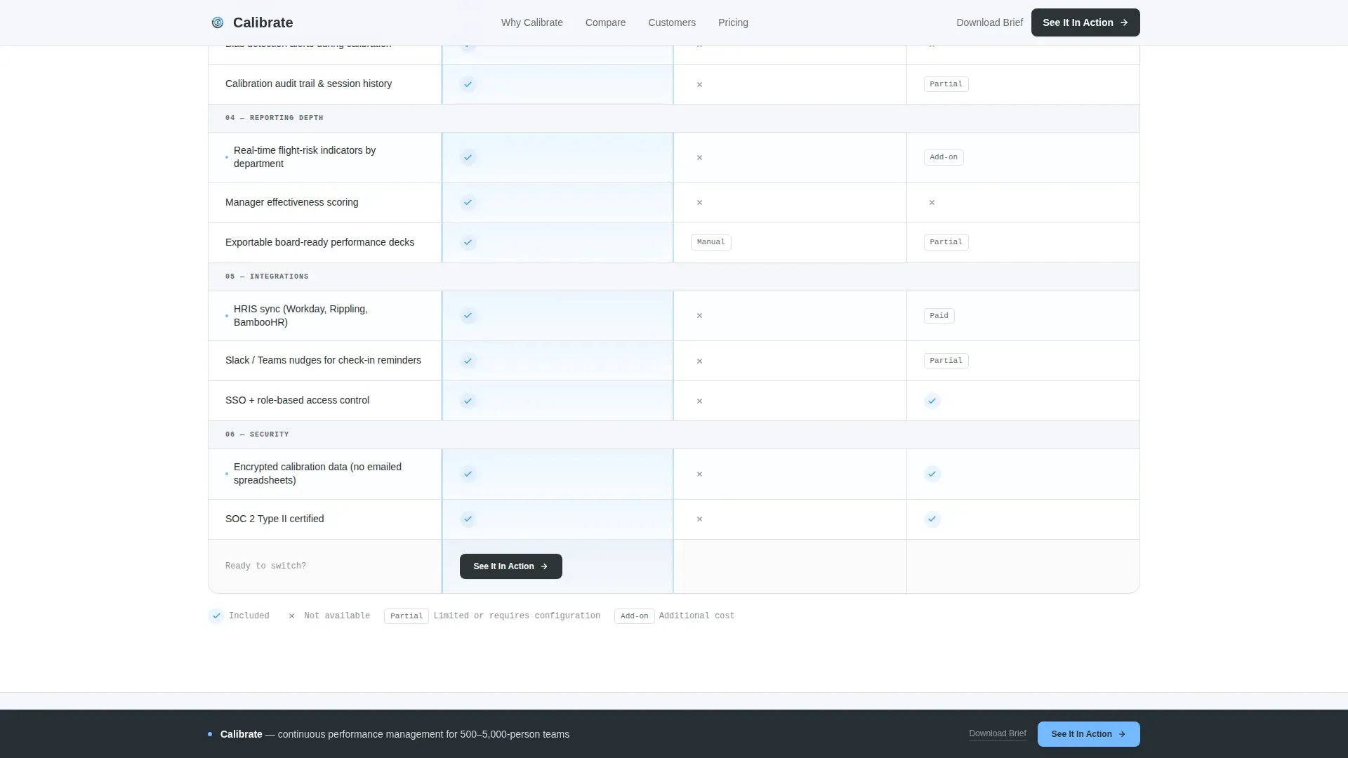
- A three-column comparison table benchmarking continuous performance management against spreadsheets and a legacy competitor category
- A case study snapshot section that delivers proof at the moment the buyer is closest to clicking
- A persistent bottom call-to-action bar triggered after 60 percent scroll depth, plus a secondary download link for researchers
Feature list
This template includes a focused set of built-in components, each designed to serve a specific role in the buyer journey.
Scrolling Logo Ribbon Header
A horizontal marquee ticker displays recognizable mid-market brand logos at a calm, unhurried pace. It runs beneath a single-line headline and a sharp subhead, delivering social proof before a single feature claim appears on the page.
Problem Arc Stats Grid
A dedicated section surfaces visceral, data-backed turnover and engagement statistics. Stat callouts use stagger-reveal scroll animations to hit one point at a time, keeping the emotional weight of each number intact.
Three-Column Comparison Table
The core of the page benchmarks the platform across goal alignment, feedback frequency, calibration tools, integrations, and reporting depth. Each row uses hover interactions and sky-blue checkmarks to make the competitive gap immediately readable.
Case Study Snapshot Block
A compact proof section follows the comparison table. It delivers concrete outcome metrics at the precise moment a buyer is ready to act, tightening the path to the primary call-to-action.
Persistent Demo Call-to-Action Bar
A "See It In Action" button appears pinned below the comparison table and reappears as a floating bottom bar after 60 percent scroll depth. No form is required; the click routes directly to a guided product demo experience.
Secondary Research Download Link
A text link labeled "Download the Comparison Brief" offers an off-ramp for researchers who need internal ammunition before committing to a demo. It captures intent without requiring the primary click.
Page sections overview
| Section | Purpose |
|---|---|
| Logo Ribbon Header | Opens with social proof via scrolling brand logos and a sharp headline |
| Problem Arc Grid | Surfaces turnover and engagement data to establish urgency |
| Comparison Table | Three-column benchmark across key performance management criteria |
| Case Study Snapshot | Delivers proof metrics to validate the platform's claims |
| Primary call to action Block | Pinned "See It In Action" button below the comparison table |
| Persistent Bottom Bar | Floating call-to-action activated at 60 percent scroll depth |
| Secondary Download Link | Text link capturing researchers not yet ready for the demo |
| Footer | Single-row linear footer with minimal navigation |
Design & branding system
The visual identity follows a Directory and Discovery theme with a Slate and Sky color system. The palette feels like a well-organized office on a clear morning: monitors on, everything labeled, data findable at a glance.
- Deep charcoal slate (#2D3436) dominates headers and navigation; mid-gray steel (#636E72) handles supporting labels and secondary text
- Open-sky blue (#74B9FF) marks interactive table rows, winning checkmarks, and call-to-action elements; cloud white (#F5F6FA) fills table cells to keep dense data from feeling heavy
- Typography uses Plus Jakarta Sans for headings and JetBrains Mono for data labels and table content, reinforcing the clean editorial grid aesthetic
Mobile & speed optimization
The template is built desktop-first, reflecting the reality that VP-level buying decisions happen on a full monitor. A mobile-responsive fallback ensures the page remains readable and functional on smaller screens.
- Server Components power the static sections of the page, keeping initial load fast for data-heavy layouts like the comparison table
- Client-side components handle scroll interactions, including the marquee ticker, table row hover states, and the persistent call-to-action bar trigger at 60 percent scroll depth
- Scroll reveals and stagger animations are set to medium intensity, providing visual engagement without degrading performance on standard desktop connections
How this template helps you convert
Every structural decision on this page is made in service of one outcome: getting a high-intent HR buyer to click "See It In Action." The layout removes friction at each step.
- Social proof arrives before any product claim, so the buyer's skepticism is lowered before they reach the comparison table
- The comparison table makes the competitive gap self-evident, reducing the mental work required to justify the switch internally
- The persistent call-to-action bar ensures the primary click is always one scroll away, while the secondary download link retains researchers who need more time
Other information about this template
This template was designed specifically for performance management platforms operating in the HR Software and Platform category, targeting mid-market companies in the 500 to 5,000 employee range. It is well suited for teams building a business case around continuous feedback, real-time goal tracking, and structured calibration sessions.
- The page does not include a contact form; all conversion paths route to either a demo click or a content download, keeping the experience frictionless
- The template style is a Comparison Table layout within a Directory and Discovery theme, making it a strong fit for any HR tech product that competes against entrenched spreadsheet workflows or legacy annual review software
- Animation intensity is set to medium, with scroll reveals, marquee tickers, and table row highlights available for teams who want engagement without visual overload
Theme
Directory & Discovery
Creative direction
Problem→Solution Arc
Color system
Slate & Sky
Style
Comparison Table
Direction
Click-Through
Page Sections
Scrolling Social Proof Logo Ribbon
Problem Arc Stats Section
Three-column Comparison Table
Case Study Snapshot Block
Persistent Demo Call-to-action Bar
Secondary Comparison Brief Download
Related questions
Who is the primary buyer this landing page targets?
Does this page include a lead-capture form?
Can the comparison table rows be customized?
What triggers the persistent bottom call-to-action bar?
Is this template suitable for a team without a dedicated designer?


