Fitness Consulting Specialist Professional Website Template
Calibrate is a single-column landing page template built for fitness digital transformation consultants. It pairs a Corporate Precision aesthetic with animated data storytelling and a transparent process architecture. Designed to convert multi-location gym operators and studio founders, the template drives qualified leads toward a scoping call through sharp specificity, real metrics, and a structured click-through flow.
by Rocket studio
Quick summary
Calibrate is a precision-engineered landing page template for fitness operations consultants. It opens on an animated dashboard scene built from real industry metrics, then guides visitors through a self-assembling methodology diagram. The single-column flow ends with a clear call to action built for operators who need digital infrastructure, not another opinion.
Who this template is for
This template is designed for consultants who work with fitness businesses at the operational level. It speaks directly to professionals helping multi-location operators replace fragmented tools with unified digital systems.
- Fitness digital transformation consultants serving gym chains and boutique studios
- Consultants targeting franchise directors who manage multiple locations and need real-time reporting
- Independent consultants or small agencies working with wellness businesses drowning in disconnected software dashboards
What problem this template solves
Fitness operations consultants often struggle to communicate technical credibility through a standard service page. Generic consulting templates fail to show a system. They show a list of services instead.
- Visitors cannot tell whether the consultant has a repeatable methodology or just a collection of opinions
- Operators with complex, multi-location needs cannot quickly see whether the consultant understands their specific infrastructure problems
- Earlier-stage prospects who are not ready to book a call have no intermediate path to stay engaged
What you get with this template
The template delivers a full single-column landing page structured around one goal: earning the click to a case study or scoping call. Every section is built to deepen technical credibility before asking for commitment.
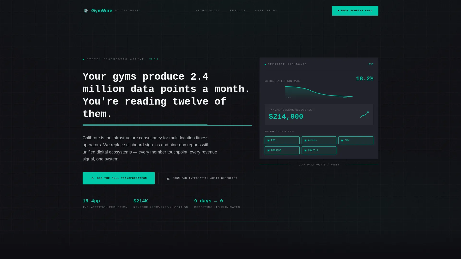
- An animated hero section that uses real fitness-industry data metrics as the visual centrepiece, with no stock photography
- A four-stage methodology sequence that builds itself on scroll, showing discovery, integration, training, and optimization as a literal system architecture
- A dual call-to-action structure featuring a primary conversion path and a secondary lead-capture option for earlier-stage visitors
Feature list
This template includes a set of purposefully assembled sections and interaction patterns rooted in the source brief.
Animated Data Hero Scene
The header opens on a slowly animating dashboard visualization. It displays a member attrition curve bending downward, a revenue-per-square-foot figure ticking upward, and integration status nodes lighting up one by one. A monospaced headline types itself onto screen. A teal underline draws left to right beneath it like a loading bar completing.
Scroll-Triggered Methodology Architecture
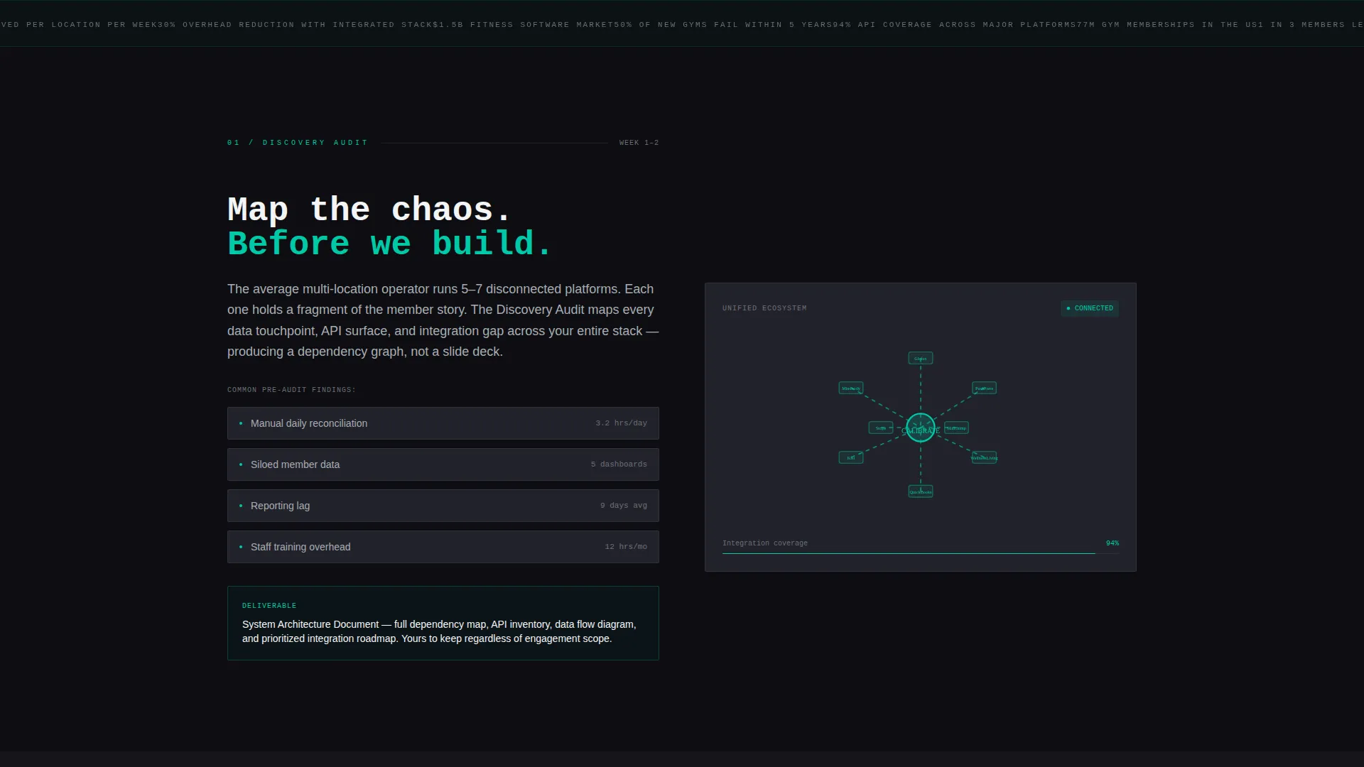
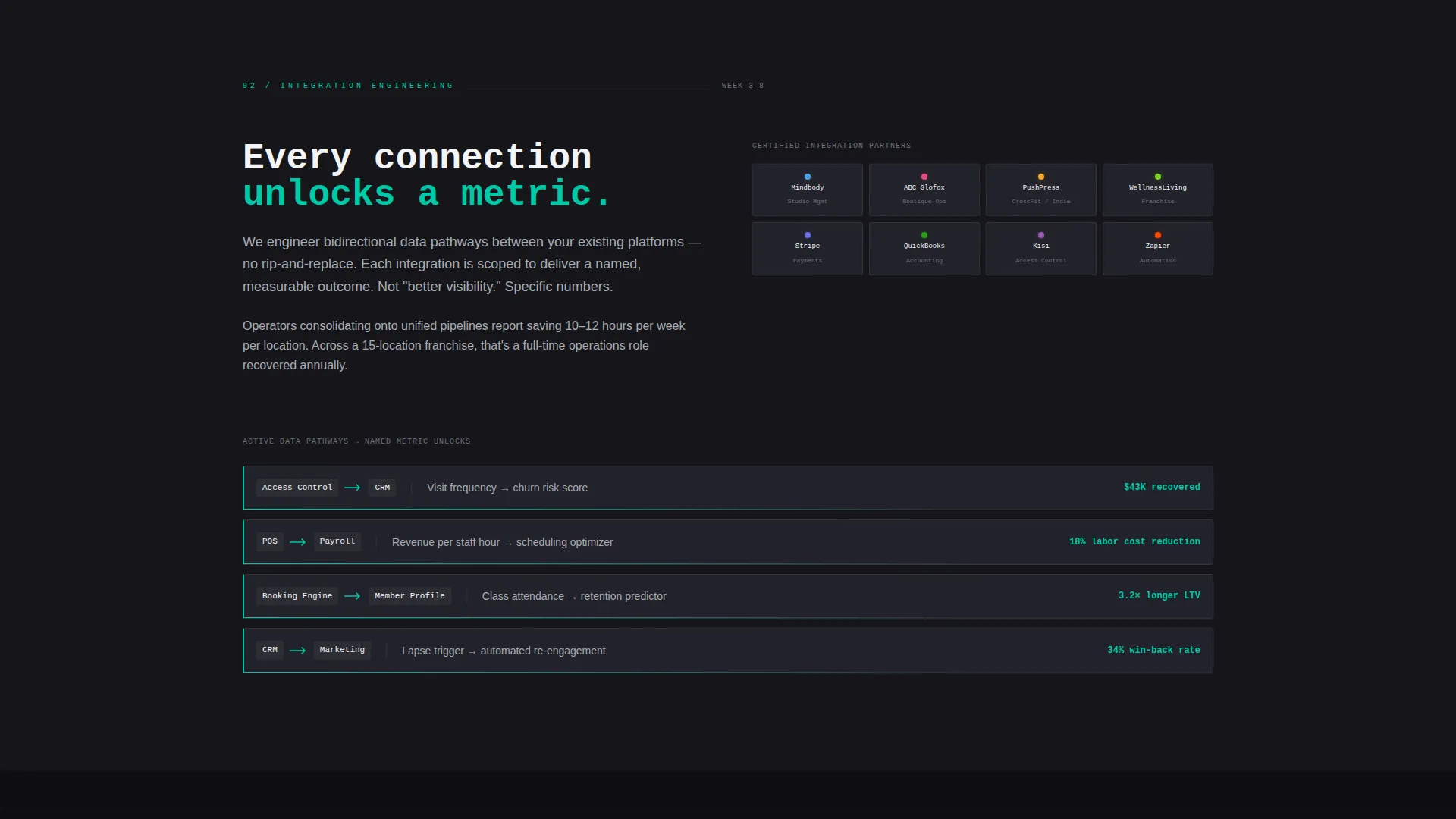
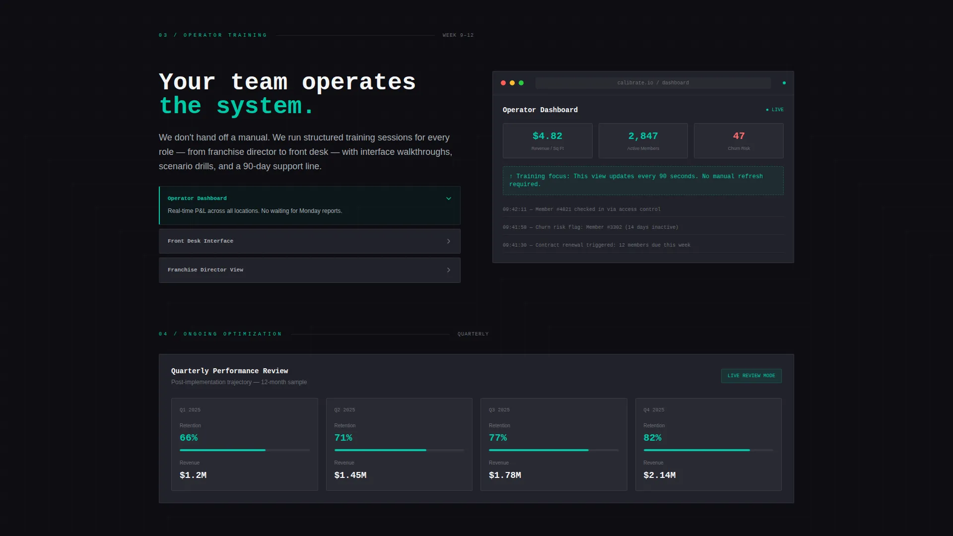
Four distinct methodology sections build themselves as the visitor scrolls. Each stage, from Discovery Audit to Ongoing Optimization, reveals a specific visual treatment. The sequence moves from a scattered before-state through mapped ecosystem diagrams, animated data pathways, interface screenshots, and a live-style quarterly review dashboard.
Dual Call-to-Action System
The primary call to action, "See the Full Transformation," appears first beneath the hero and then repeats as a persistent bottom bar after the second scroll. A secondary text link, "Download the Integration Audit Checklist," provides a softer conversion path for visitors who are researching rather than ready to book.
Metric-Led Proof Blocks
The template is structured to hold absolute-figure proof points rather than vague percentages. Named improvements such as "$214K recovered annually from attrition reduction" are built into the copy architecture. Real integration partner logos appear alongside these numbers to signal ecosystem depth.
Monochrome Steel Visual System
The entire page is built on a charcoal-to-black background range with brushed aluminum secondary surfaces and signal white for text and data callouts. A single electric teal accent is reserved for interactive elements, live data pulses, and call-to-action states. The palette communicates precision without decoration.
Teal Progress Indicator Navigation
The teal accent migrates downward across sections like a progress indicator as the visitor scrolls. Each flash of teal signals a system action: a connection confirmed, a metric unlocked, a stage completed. This interaction pattern reinforces the consultancy's core message without adding any extra copy.
Page sections overview
| Section | Purpose |
|---|---|
| Animated data hero | Establish credibility through live-style fitness metrics and a typed headline |
| Primary call to action block | Drive qualified operators toward the case study and scoping call page |
| Discovery Audit stage | Show before-state chaos and the mapped ecosystem that replaces it |
| Integration Engineering stage | Animate data pathways and name the metrics each connection unlocks |
| Operator Training stage | Display interface screenshots with highlighted interaction points |
| Ongoing Optimization stage | Present a live-style quarterly review dashboard visual |
| Metric proof blocks | Anchor trust with absolute-figure improvements and integration partner logos |
| Secondary lead capture | Offer the audit checklist download for earlier-stage visitors |
| Persistent bottom bar | Repeat the primary call to action after the second scroll for continuous access |
Design & branding system
The visual identity follows a Corporate Precision theme built entirely from the Monochrome Steel color system. Every color decision is functional. Nothing decorates for its own sake.
- Structural charcoal (#1E1E24) as the primary background, brushed aluminum (#A8ADB3) for secondary surfaces and divider lines, and signal white (#F4F5F7) for text and data callouts
- Electric teal (#00C9A7) used exclusively for interactive elements, live data pulses, and call-to-action states so every appearance carries weight
- A monospaced typeface family in the hero supports the data-terminal aesthetic, while body text in aluminum gray keeps long sections readable without softening the tone
Mobile & speed optimization
The single-column flow is a natural fit for mobile viewports. The template structure avoids heavy multi-column layouts that collapse awkwardly on smaller screens.
- Scroll-triggered animations are designed to work within a linear single-column sequence, which translates cleanly across device sizes
- The absence of stock photography and heavy image assets keeps the page visually lean, with data visualizations and text-based callouts carrying the content load
How this template helps you convert
The page earns its conversions through specificity before it ever asks for a click. Every structural decision is aimed at qualifying the right visitor and moving them forward.
- The animated hero confronts visitors with a data provocation that immediately frames the consultant's value: operators are sitting on millions of data points but acting on almost none of them, and the headline makes that visible before the visitor has even scrolled.
- The scroll-triggered methodology sequence replaces vague service descriptions with a visible system, giving operators enough technical detail to self-qualify before reaching the call-to-action, which reduces wasted discovery calls and raises the quality of inbound leads.
Other information about this template
This template is purpose-built for the fitness consulting niche and reflects the specific operational context of multi-location gym and studio businesses. A few additional details are worth noting for anyone evaluating it for their project.
- The template is categorized under Professional Services, Fitness Consulting, within a single-column flow format using the Corporate Precision theme
- The Transparent Process creative direction means the methodology is not hidden behind a contact form. It is the page itself, which is unusual in consulting templates and a deliberate strategic choice
- The Data Storytelling header concept means the hero section requires no photography budget. The visual impact comes entirely from animated numbers and system diagrams
- The Click-Through landing page direction means every section is oriented toward one action, not multiple competing goals. This keeps the conversion path unambiguous for operators who are already deep in a buying decision
Theme
Corporate Precision
Creative direction
Transparent Process
Color system
Monochrome Steel
Style
Single Column Flow
Direction
Click-Through
Page Sections
Animated Data Hero Scene
Scroll-triggered Methodology Architecture
Dual Call-to-action System
Metric-led Proof Blocks
Monochrome Steel Visual System
Teal Progress Indicator Navigation
Related questions
Who is this template designed for?
Does the template require custom photography?
Can the metric figures and integration logos be updated?
What makes this different from a standard consulting landing page?
Is this template suited for consultants working with smaller fitness businesses?



