Mechanical Engineer Profile Pre-Launch Website Template
Torque is a bento grid landing page template built for a mechanical engineer LinkedIn optimization consultancy. It pairs a full-screen drafting-table video header with a gallery-style scroll experience, annotation-inspired visuals, and a dual-conversion waitlist flow. The design follows an Ink and Paper theme in an Electric Indigo color system, built to earn trust from mid-career engineers at first glance.
by Rocket studio
Quick summary
Torque is a single-page bento grid template designed for a mechanical engineer LinkedIn optimization consultancy. It opens with an immersive top-down drafting-table video, guides visitors through a gallery of profile transformation artifacts, and closes with a waitlist form and a free diagnostic download. The Ink and Paper visual system gives every section the authority of a printed technical document.
Who this template is for
This template is built for consultants and specialist service providers who help mid-career mechanical engineers sharpen how they present themselves professionally. It suits a boutique, high-touch practice that needs its landing page to feel credible, precise, and a little unexpected.
- Mechanical engineer LinkedIn optimization consultants launching a waitlist or cohort intake
- Niche career strategists targeting professionals in fields such as HVAC design, manufacturing optimization, or finite element analysis (FEA) simulation
- Solo practitioners or small teams who want a premium page without commissioning a full custom build
What problem this template solves
Mid-career mechanical engineers often have impressive work buried under outdated, résumé-style LinkedIn profiles. The consultancy serving them needs a landing page that speaks directly to that gap and converts cautious, analytical visitors into waitlist sign-ups.
- Generic portfolio templates cannot carry the weight of a technical niche audience that instantly spots inauthenticity
- Standard lead-capture pages lack the layered conversion logic needed to catch both committed prospects and curious browsers
- Most landing page designs offer no visual shorthand for "this service is precise, credible, and worth the wait"
What you get with this template
You get a fully structured single-page layout with every major section pre-built and ready to customize. The design direction, copy architecture, and conversion flow are all resolved so you can focus on swapping in your real content.
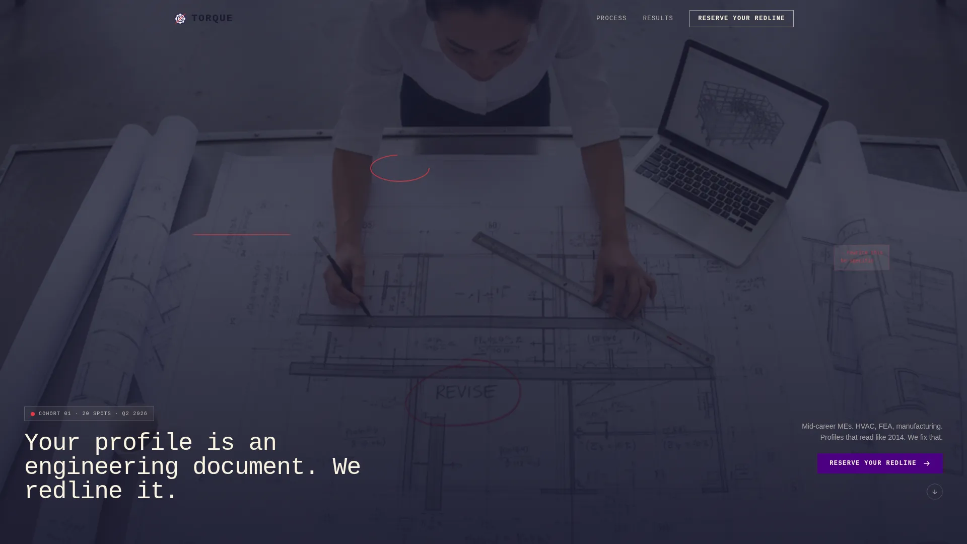
- A full-screen looping video header section with monospaced headline overlay
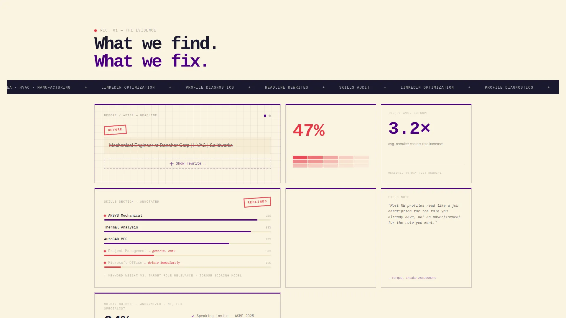
- A bento grid gallery section featuring before-and-after transformation cards, annotated profile excerpts, a recruiter heatmap cell, and a profile rewrite carousel
- A dual-conversion waitlist section with a persistent bottom bar, a live cohort-spot counter, a primary "Reserve Your Redline" form, and a secondary free PDF micro-conversion offer
Feature list
This template includes the following purpose-built components and design features.
Full-Screen Video Header with Typed Headline
The header plays a looping top-down video of hands annotating a printed LinkedIn profile on a drafting table. A single headline types itself over the footage in monospaced font, setting the consultancy's editorial voice from the first second.
Asymmetric Bento Grid Layout
The grid breathes unevenly by design. Some cells span two columns for dramatic before-and-after reveals. Others hold a single tight statistic. The layout guides the visitor through a gallery-walk experience without requiring them to read every word.
Annotation-Styled Transformation Cards
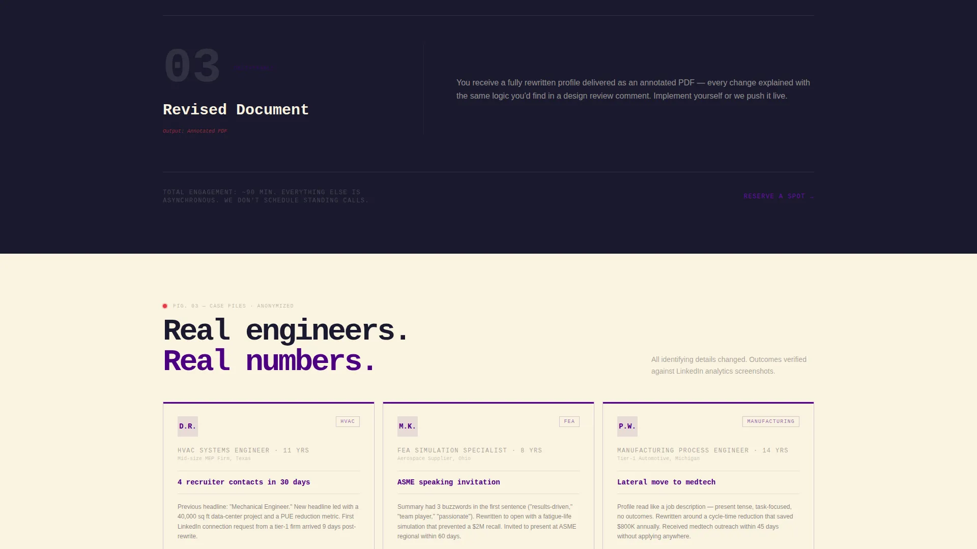
Profile transformation artifacts are displayed as ink-on-cream cards. Each card can show a before-and-after headline pair, a dissected Skills section with annotation lines, or a full anonymized profile rewrite. The visual language mirrors a professor's marked-up draft.
Dual-Conversion Waitlist Flow
The primary conversion asks for a LinkedIn profile URL first, then an email address. A secondary micro-conversion captures email alone in exchange for a free Profile Diagnostic Scorecard PDF. This two-path structure catches both ready prospects and early-stage browsers.
Persistent Scroll-Activated Bottom Bar
A bottom conversion bar stays visible as the visitor scrolls. It darkens progressively from cream to indigo, creating a visual signal that commitment is building. The call to action reads "Reserve Your Redline" and remains accessible at any scroll depth.
Live Cohort Scarcity Counter
A live counter displays remaining spots in the current cohort. A single supporting line reads "We take 20 engineers per quarter." This scarcity element is factual, not manufactured, and reinforces the high-touch, limited-intake positioning of the consultancy.
Page sections overview
| Section | Purpose |
|---|---|
| Video Header | Opens with top-down drafting-table footage and typed monospaced headline |
| Bento Gallery Grid | Displays transformation artifacts in an asymmetric, exhibition-style layout |
| Before and After Cards | Shows real anonymized profile rewrites as ink-on-cream annotation cards |
| Recruiter Heatmap Cell | Visualizes where recruiters actually focus attention on a LinkedIn profile |
| Profile Rewrite Carousel | Cycles through anonymized full-profile transformation examples |
| Waitlist Primary Form | Collects LinkedIn URL then email for cohort reservation |
| Diagnostic PDF Offer | Secondary micro-conversion capturing email in exchange for a free scorecard |
| Persistent Bottom Bar | Scroll-activated call to action bar that darkens from cream to indigo as visitor scrolls |
| Scarcity Counter Block | Live counter showing remaining cohort spots with "20 engineers per quarter" line |
Design & branding system
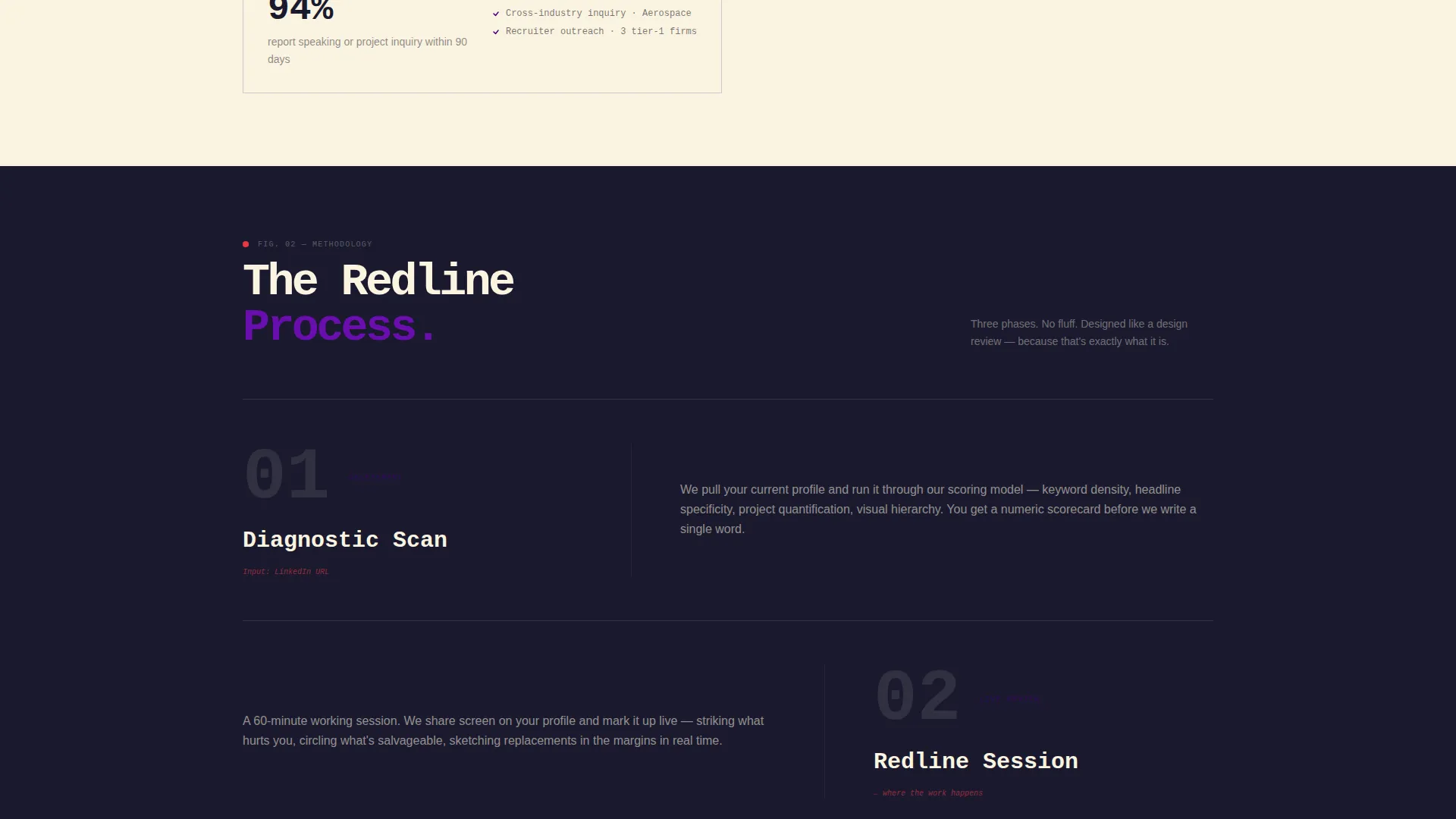
The visual identity follows an Ink and Paper theme expressed through an Electric Indigo color system. Every color has an assigned role, and the palette holds discipline across every section of the page.
- Deep drafting-table black (#1A1A2E) for body text, engineering-paper cream (#FAF3E0) as the dominant background, and electric indigo (#4B0082) anchoring headlines and card borders
- Annotation red (#E63946) reserved exclusively for hover states and callout markers, appearing only on interaction like a professor's approval markup
- Monospaced typography carries technical authority, and the overall aesthetic is described as a patent drawing traced over with a UV pen
Mobile & speed optimization
The bento grid layout is structured to reflow gracefully on smaller screens. Asymmetric column spans consolidate to single-column stacks on mobile, preserving readability and visual hierarchy without losing the gallery-walk feel.
- Full-screen video autoplay is loop-only with no audio, keeping the header lightweight on mobile connections
- Card-based bento cells scale independently, so transformation artifacts and statistics remain legible at any viewport width
How this template helps you convert
The page is built around two parallel conversion paths that serve visitors at different stages of readiness.
- The primary waitlist form leads with the LinkedIn URL field, signaling that prospects are committing to something real. URL-first ordering also lets the consultancy preview fit before the cohort fills.
- The secondary PDF micro-conversion captures emails from visitors who are curious but not yet ready to submit a URL, turning a "not now" into a warm lead.
- The persistent bottom bar and live scarcity counter keep the offer visible and grounded in real capacity limits, reinforcing urgency without resorting to artificial pressure.
Other information about this template
This template is part of a niche-matched design system built for the Personal and Resume category, specifically the Mechanical Engineer Profile subcategory. It is positioned at the intersection of specialist career services and engineering credibility.
- Template style: Bento Grid; Header concept: Full-Screen Video Background; Creative direction: Gallery Walk; Landing page direction: Waitlist and Coming Soon
- Theme: Ink and Paper; Color system: Electric Indigo; Category: Personal and Resume; Niche: Mechanical Engineer LinkedIn Optimization
- The page is designed for a consultancy taking 20 engineers per quarter, making the scarcity element a structural part of the business model, not a design trick
Theme
Ink & Paper
Creative direction
Gallery Walk
Color system
Electric Indigo
Style
Bento Grid
Direction
Waitlist/Coming Soon
Page Sections
Full-screen Video Header with Typed Headline
Asymmetric Bento Grid Gallery
Annotation-styled Transformation Cards
Dual-conversion Waitlist Flow
Persistent Scroll-activated Bottom Bar
Live Cohort Scarcity Counter
Related questions
Can I use this template for a different engineering niche?
Does the template include the header video footage?
How does the two-form conversion flow work?
Can I edit the bento grid cell sizes and column spans?
Is this template suited for a waitlist or coming-soon launch page?



